Today, millions of users will encounter cookie banners. Most will click “accept,” often without even realizing what they’re agreeing to.
Although most website cookie banners have the same harmless intent — to inform users about cookies and seek consent for non-essential ones — their implementation can often confuse or frustrate users, and even undermine their privacy.
In this guide, we’ll discuss the UX of cookie banners — from how they appear on screen to how they influence user choice and behavior. More importantly, you’ll learn how to create clear, non-obtrusive cookie banners that respect user privacy.
But first, let’s clarify what cookies are.
Editor’s note: This article was rewritten on 19 May 2025 by the author to provide deeper guidance around how to use cookies in your UX, including the benefits, how to display them, and how to design a better experience.
In the digital world, cookies are small pieces of data a website stores on your device when you visit. They record data about your preferences, session details, and usage patterns. By using these cookies, websites can deliver personalized and seamless user experiences.
However, before websites can use cookies, they need to seek consent. A website cookie banner allows users to accept or decline the use of these cookies:
Now that we’re clear on what cookies are, let’s look at how websites use them:
For website owners, analytics cookies help estimate traffic and understand user interactions by assigning unique IDs to track unique visitors and their actions.
While valuable for site optimization, these cookies require user consent under privacy laws like the EU’s GDPR (which mandates opt-in for non-essential cookies) and CCPA (which grants opt-out options for data sharing).
Cookies store authentication tokens and session IDs so users can stay logged in while browsing a site (via session cookies) or across visits (via persistent cookies). This eliminates the need for repeated logins.
Because cookies store information like your login status, preferences, and browsing history, they allow websites to tailor content, recommendations, or site behavior.
When a user clicks an affiliate link, the website places a cookie on their device. If they buy something within the cookie’s validity period, the affiliate earns a commission.
By using cookies, businesses can attribute sales or actions to the right affiliate, ensuring fair compensation and allowing them to track the success of their affiliate campaigns.
As you can see, websites rely heavily on cookies, so it’s no surprise that some restrict access if users decline them. But in all of this, what do users stand to gain by accepting cookies?
Websites use cookies to provide a tailored experience by remembering user preferences and activity on their platform. For example, if an ecommerce site recommends items similar to what you previously viewed, cookies most likely played a role in making it happen.
You know how you can add items to your cart while shopping online, leave the site, and find them still there when you return? It’s the work of cookies that remember your selections so you can pick up right where you left off.
Cookies store data like your preferences and login details locally, saving you the stress of entering your username and password each time you need to access the site.
Cookies store user data and preferences locally, making them somewhat helpful in accelerating load times by reducing repeated requests to the server.
Although security isn’t a primary function of cookies, they can help make your online experiences safer. For example, if someone is trying to log into your account from a different country or device, cookies can help the website detect the unusual activity and trigger security checks.
Ultimately, when used correctly, cookies can offer significant benefits to users. Speaking of using cookies correctly, let’s look at cookie policies, which dictate how websites use and protect user data.
A cookie policy is a document (or statement) that a website provides that explains how it uses cookies to collect and process user data. It details the types of cookies used (essential ones for core functions like logins and cart persistence, and non-essential ones for tracking, ads, or analytics), the type of data collected, why it’s collected, and whether data is shared with third parties.
In addition, it guides users on how to manage cookies, such as opting out of non-essential ones through the cookie banner or adjusting browser settings. With third-party cookies phasing out in 2025 and first-party cookies becoming the norm, having a clear policy ensures transparency and compliance with data privacy laws.
Many global data privacy laws, such as the EU’s General Data Protection Regulation (GDPR) and California’s Consumer Privacy Act (CCPA), require websites to have a cookie policy if they use cookies to collect user data, even essential ones.
These privacy laws require transparency so users understand how their data is used and can stay in control. For non-essential cookies, websites must seek consent when users first visit or when there’s an update (e.g., the addition of new cookies).
To meet the California and EU law requirements, your cookie policy should state:
Having a thorough cookie policy on your website is essential for building user trust, boosting a website’s credibility, and ensuring legal compliance. Your cookie policy can be a separate document or a part of your privacy policy, but it should be easily accessible through a link in your cookie banner.
Now that we’ve covered what to include in a cookie banner, let’s focus on something just as important — how to present the banner in an informative and non-intrusive manner.
Did you know that how you display your cookie banner can impact compliance? Research shows that even a small layout tweak in a cookie banner design can increase consent rates by up to 17 percent.
This goes to show that presentation matters just as much as content. Cookie banners are typically displayed in one of these two forms:
These cookie banners are fixed to the top or bottom of the screen and stay visible without blocking the content. The messaging is concise, and users can usually browse the site without interacting with the banner immediately.
Horizontal banners are ideal for:
These banners appear as pop-ups, usually at the centre or corner of the screen. They sometimes dim or partially obscure the content until users interact with them (e.g., accept, reject, or customize).
Box overlay banners are ideal for:
So, we’ve looked at how cookies are displayed on a website. But what happens when a user encounters them? Let’s shift gears and explore how users interact with these banners.
Before designing cookie banners, it’s important to recognize the broad spectrum of user behavior, from privacy-conscious individuals to those who just click and go, and everything in between. Broadly, these behaviors can be grouped into four categories:
These users take their data privacy seriously and are skeptical of tracking. They actively read through cookie categories, customize settings in detail, and even refuse non-essential cookies outright.
To build trust with users who care deeply about their privacy, consider the following when designing cookie banners:
These users are somewhat privacy-conscious, but not overly strict. They review cookie settings briefly and adjust them to their preferences. For example, they may allow performance cookies but reject all marketing ones.
To help such users make informed choices, consider the following when designing cookie banners:
These users have limited privacy concerns, but that doesn’t mean they don’t value transparency. They typically accept all cookies without much thought, often to access content quickly.
To ensure transparency when designing for such users, consider the following:
These users are either uninterested in privacy or cookie management, or don’t understand them. They view banners as a nuisance and will usually click whatever dismisses them, without considering the implications.
To encourage informed decision making and minimize frustration, consider the following when designing for such users:
As we’ve discussed, many users — especially passive acceptors and indifferent clickers — are unlikely to engage deeply with cookie settings. They either trust by default or simply want to dismiss the banner and move on.
And this is where there’s usually a problem. Instead of designing cookie banners to respect these user behaviors, some websites take advantage of them by using deceptive tactics to nudge users into giving consent. These deceptive techniques trick users into doing things they didn’t mean to and are referred to as dark patterns.
Now, let’s look at three negative effects of such deceptive cookie practices on users.
When users are nudged to accept cookies without full clarity, they may unwittingly agree to intrusive tracking. This data can be used to build detailed profiles for targeted advertising and shared with third parties like ad platforms, or even exposed in data breaches, without the user’s informed consent.
The lack of transparency involved in dark patterns can leave users feeling like they’re not in total control. A clear example of this is confirm-shaming, a method some websites use to guilt users into providing consent. By using imagery or opt-out buttons labeled in a derogatory way, users are made to feel shame for opting out.
While some first-party cookies enhance user experience, like remembering login info or saving cart items, others, especially non-essential ones used for analytics and tracking, can compromise user privacy. These concerns grow with more invasive techniques like digital fingerprinting or third-party cookies, which often operate behind the scenes.
When websites use dark patterns to push consent, users are unaware of how widely their data may be shared, eroding their trust.
For your cookie banner to be effective, user-friendly, and meet data privacy law requirements, here’s what you should do:
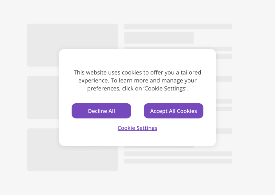
Users need to understand what they are consenting to. Therefore, your cookie banner should briefly describe why the website uses cookies, what purposes they serve, and who can access the data.
Use plain language that’s easy to understand and ensure that the button copy explicitly states what actions the buttons perform:
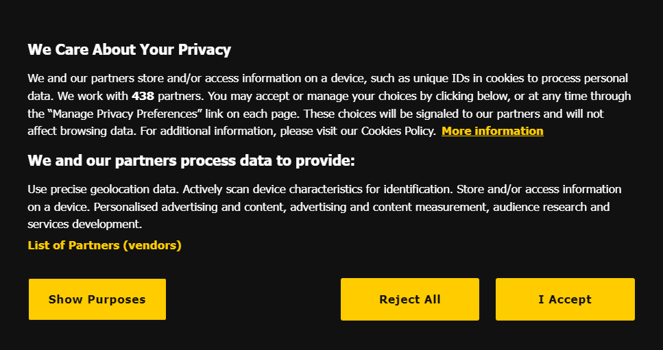
The above example clearly explains why the site uses cookies, the type of data it collects, and who has access to it. It even tells users how to manage their choices and what happens when they make changes. Everything is as clear as day.
Additionally, the buttons are prominent, of equal visual weights, and have clear copies to help the users make a well-informed choice.
Give users real choice and control over cookies by doing the following:
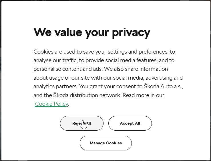
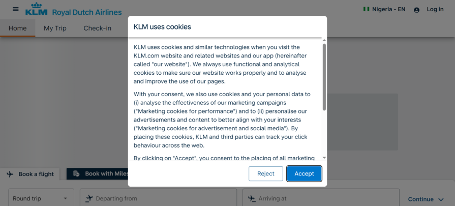
In the example above, the accept, reject, and manage Cookies buttons are all given equal visual prominence. When a user clicks “manage cookies,” they’re presented with four clear categories — three of which are non-essential cookies that can be toggled on or off. Only the essential cookies stay active by default.
Dark patterns are deceptive design tactics that push users to act in ways that benefit the business, not the user. They’re often used in cookie banners to make it harder for users to reject cookies. If consent is given this way, it may not meet the requirements for a valid General Data Protection Regulation (GDPR) consent.
Examples of dark patterns to avoid are:
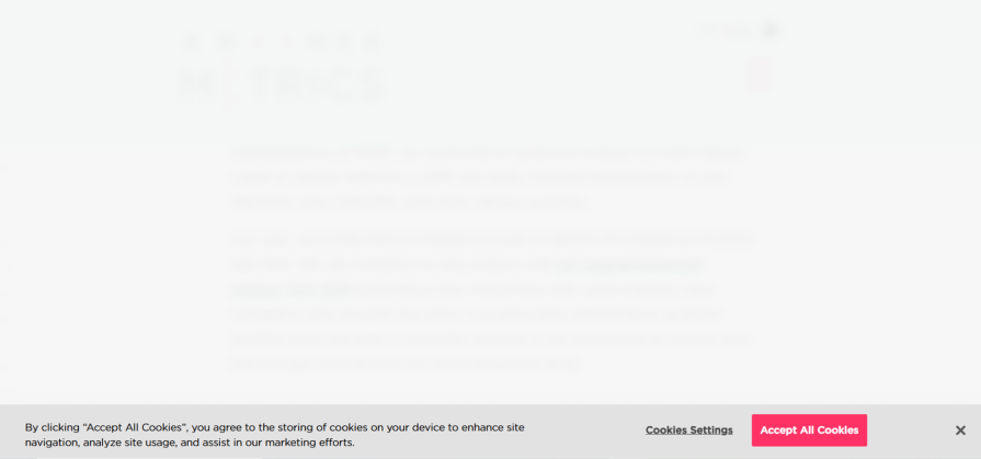
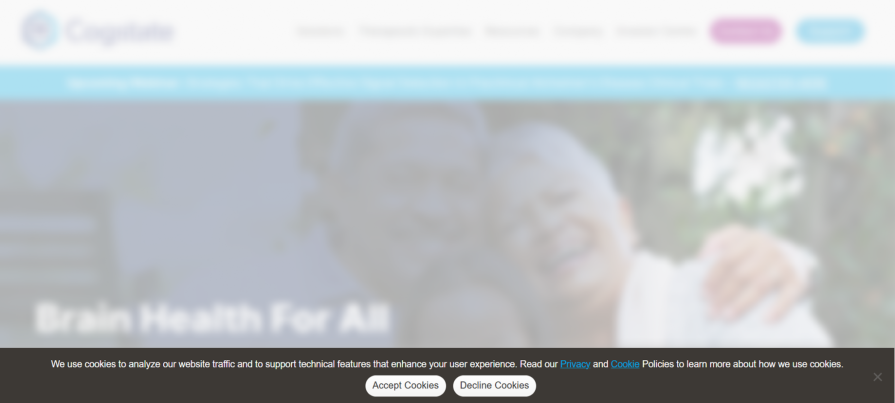
In the example above, the “accept all cookies” is the most visually prominent option, while the more privacy-conscious choice is buried behind a less direct “cookies settings” link, forcing users to take extra steps to reject cookies.
Your cookie banner should be minimally sized but easy to spot. One of the most common placements of cookie banners is the header and footer areas. Such placements work well because they’re immediately visible to the user without being obtrusive.
Also, ensure that buttons and controls are easy to spot and interact with:
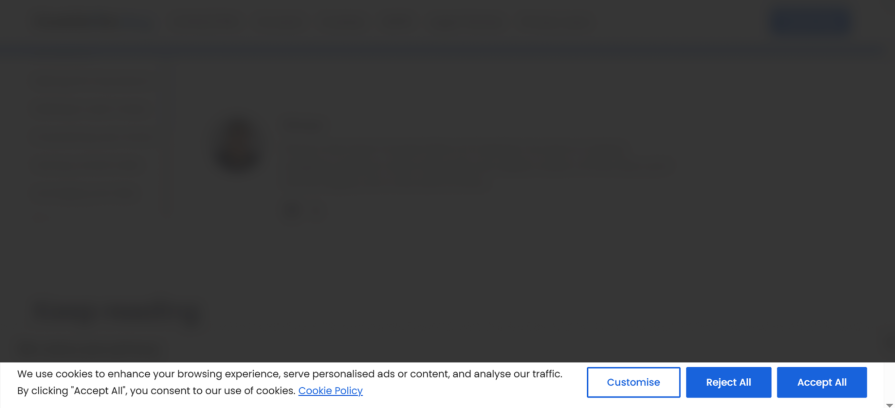
In the example above, the cookie banner appears as a compact, fixed bar at the bottom of the screen. The “accept” and “reject” buttons are also easy to spot and use.
An ideal cookie banner would include an accessible way for users to adjust their preferences. Additionally, it should provide a straightforward option for users to withdraw their consent if desired:
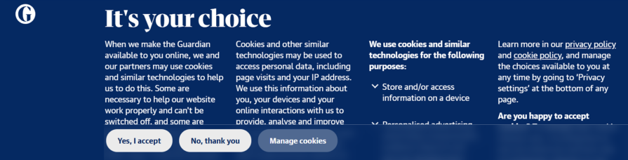
In the example above, users can adjust their preferences by clicking the “manage cookies” button. They can also reject all unnecessary cookies by clicking the “no, thank you” button. The banner also tells the user how and where to adjust their choices whenever they want to.
This practice aligns with privacy regulations regarding giving users control over their data and ensuring their choices are respected.
Cookie banners are important touchpoints that can make or break a user’s experience. As such, they should be designed to build trust, respect user autonomy, and align with good UX principles.
By adopting practices such as ensuring transparency, keeping users in control, having a comprehensive privacy policy, ensuring accessibility, and avoiding dark patterns, you can create cookie consent experiences that do the job without getting in the users’ way.

LogRocket's Galileo AI watches sessions and understands user feedback for you, automating the most time-intensive parts of your job and giving you more time to focus on great design.
See how design choices, interactions, and issues affect your users — get a demo of LogRocket today.

AI has accelerated design execution, but speed can come at the expense of intentionality. Learn how UX teams can preserve product thinking and judgment.

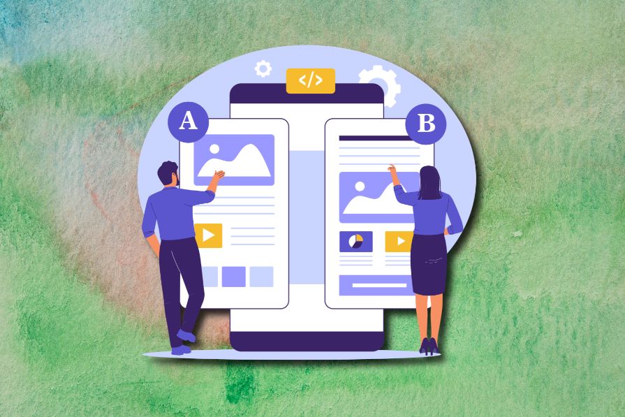
UX testing is not limited to layouts, copy, and visual design. Full-stack and server-side experiments help teams evaluate how backend logic, APIs, algorithms, and product flows affect the overall user experience.
In A/B, A/B/n, or multivariate testing scenarios, using p-value with traditional null-hypothesis-based statistical analysis is so common, and most designers […]

Traditional A/B testing splits traffic evenly, but multi-armed bandits dynamically send more users to the better-performing version. Here’s how the method works, where it helps, and when UX teams should use it over classic A/B testing.


