The Comic Sans font has been the subject of heated debate in the design world since its creation in 1994. Initially conceived as a simple, playful font, its overuse in inappropriate texts quickly made it into one of the most famous fonts for the wrong reason.
In this article, I share the history of Comic Sans, its unexpected rise, and why it became one of the most disliked fonts in the industry while also examining whether it still has a place in modern design, especially for accessibility purposes.
The tale of the Comic Sans font starts in 1994, within Microsoft’s offices. As engineers prepared for the launch of Windows 95, Vincent Connare, a typeface designer, was crafting new fonts for the OS. Connare, born in 1960 in Boston and raised in Massachusetts, studied Fine Arts at the New York Institute of Technology. After joining Microsoft in 1993, he quickly dove into a project called “Microsoft Bob,” a software meant to simplify computing for beginners.
Bob was a strange project. Instead of a typical interface, it featured a living room where users interacted by clicking on different furniture pieces to access various applications.
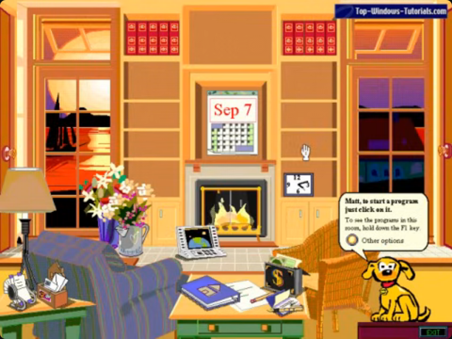
It looked chaotic — overly detailed, visually inconsistent, and poorly designed. Microsoft tried something based on skeuomorphism and pushed it to its boundaries. The software obviously failed.
One character, a dog named Rover, guided users through the program. Connare noticed an issue — the default font didn’t fit the playful tone of the cartoonish environment. The instructions tend to be read in a very formal tone, which wasn’t the intended effect. To solve this, he began sketching a new typeface inspired by comic book lettering, giving birth to what would become the Comic Sans font.
By the time Vincent Connare finished Comic Sans, Microsoft Bob was too far along to switch the fonts, so the new font was excluded from the project. However, Microsoft decided to include it in the core font package of Windows 95.
Back then, Comic Sans was a breath of fresh air. It felt approachable and relaxed, unlike traditional fonts such as Times New Roman. In the early days of personal computing, when technology was seen as complex and rigid, Comic Sans made websites appear friendlier and less formal.
Comic Sans became a standard in every Windows font pack and Internet Explorer. For many, it was their first interaction with typography on computers, making it a popular choice for websites and printed materials.
Initially embraced for its friendly vibe, people started to use it in professional works, too. It was often chosen by amateurs trying to add a touch of “design” to their work or, on the contrary, by people who didn’t care at all about typography. Its widespread use, which made it iconic in the 90s, eventually led to its downfall as people began to see it as unprofessional and overused.
Comic Sans is widely disliked today due to its overuse in the late 90s and early 2000s. Initially, it stood out as one of the first “designed” fonts accessible to everyday users, differing from the traditional serious fonts used in print media. People wanted to show they knew about typography and used it everywhere, often inappropriately. This misuse made the font lose credibility. It’s not the font itself that bothered people; it was Comic Sans that was used as a default font even when it was inappropriate.
Fonts play a crucial role in conveying tone and message — Comic Sans, with its playful appearance, clashed in contexts demanding professionalism, leading to a backlash against it. For those interested, The Elements of Typographic Style by Robert Bringhurst delves deeper into the nuances of typography. I like this citation that summarizes everything:

When we see a font’s shape, we instinctively read it in a certain tone. Comic Sans was designed to fit a playful cartoon dog, so it feels uncanny when it’s used elsewhere, even more so with serious messages.
While the font made sense in its original context, it became problematic due to misuse. Using Comic Sans for safety warnings or serious topics undermines the intended message.
Today, the default font tends to be Arial, Helvetica, or Roboto — less likely to clash because they feel more neutral than Comic Sans.
Overusing any font can still result in poor design choices.
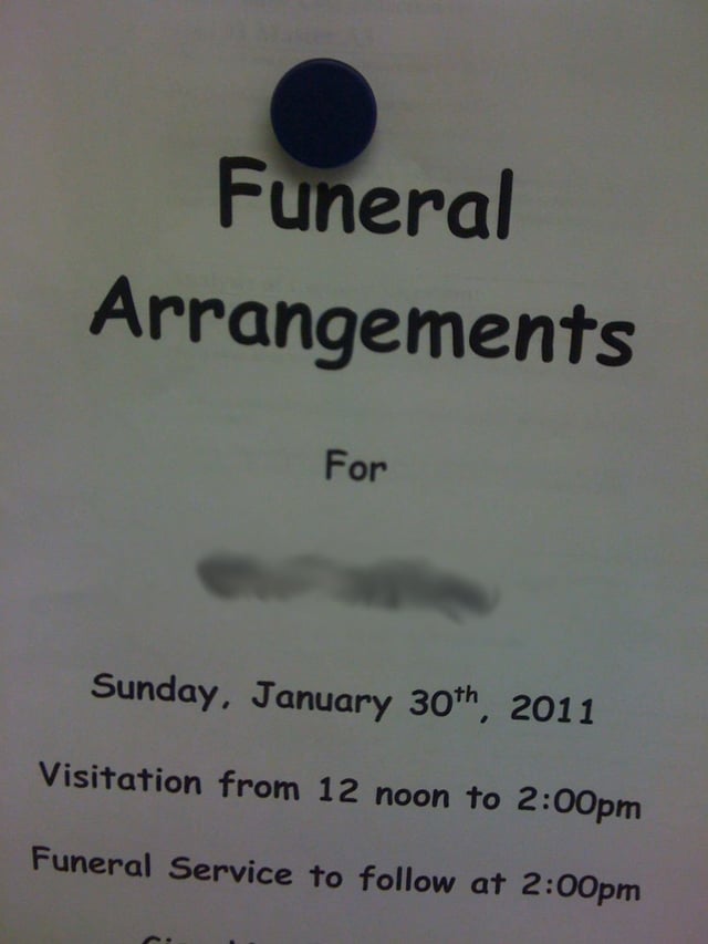
As graphic design grew in popularity, seeing Comic Sans repeatedly misused became a running joke. Even non-designers noticed how absurd it looked in places like legal documents or financial reports, sparking a global backlash. The joke escalated to the point where petitions called for its ban.
Personally, I don’t see the need to ban anything, especially since Comic Sans still has legitimate uses in specific use cases and for accessibility.
The backlash against Comic Sans often feels like an “ok boomer” stand. It started as a genuine effort to explain why the font wasn’t suitable for all situations, but it soon devolved into a simplified rule: Comic Sans = bad.
This oversimplification prevents designers from analyzing the font’s real flaws and from understanding where it could still be used effectively. Instead of digging deeper, it became a quick joke that hindered constructive discussion.
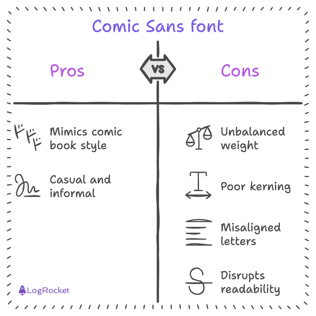
Now that it is understood that this font’s main problem is its misuse, what can be said about the type of font itself? The main problems of Comic Sans can be summarized in three points:
Comic Sans imitates comic book lettering, where strokes are made to look uniform, like using a marker. This approach results in all lines, vertical, horizontal, or diagonal, having the same thickness. Because of this, crossings in letters such as “t” or “e” appear disproportionately heavy compared to other fonts, where designers use varying stroke thickness to balance the letters visually. Balanced strokes are easier on the eye, aiding readability by creating a natural flow, which Comic Sans struggles to achieve due to its uniformity.
Kerning refers to the space between letters; in Comic Sans, this is an area of concern. Due to the irregular sizes of the letters, it’s crucial to manually adjust the spacing for each letter combination. For instance, the space between wide letters like “m” and “o” should differ from that between narrow letters like “l” and “f.” However, Comic Sans fails to manage this effectively, resulting in awkward word formations that can disrupt reading flow and overall legibility.
When compared to popular fonts like Helvetica, Comic Sans’s letters lack consistent alignment on a baseline.
In Helvetica, invisible lines guide the heights and alignments of letters, ensuring that elements like the horizontal bars of “t” and “f” are properly aligned.
In contrast, Comic Sans mimics handwriting, leading to irregularities that result in misaligned letters. This inconsistency can make reading more difficult and disrupt the overall flow of the text.
Beyond its informal appearance due to its roundness and unbalanced characteristics that feel like a child’s handwriting, the Comic Sans font presents objective challenges that can reduce readability for many users.
Effective fonts should maintain consistency to help the eye quickly identify letters and guide the reading flow. Examining these design flaws is far more productive than simply criticizing the font’s aesthetic. Interestingly, these characteristics make the font a nice aid for users with dyslexia.
Typography plays a crucial role in shaping user perception by conveying tone and trustworthiness, which affects how information is received.
With its informal and childlike style, Comic Sans is ill-suited for professional contexts, as it can trivialize serious content. While playful fonts work well for children or casual settings, professional environments benefit from fonts like Helvetica or Georgia, which communicate clarity and reliability.
The right typography aligns visual style with the message, enhancing overall experience and content credibility.
One positive aspect of Comic Sans is that some dyslexic individuals have found its quirky design helpful for reading. While this effect might be coincidental since the font wasn’t designed for accessibility, it’s great that it works for some.
This association with dyslexia is well-known, but to my knowledge, no scientific study proves that Comic Sans is actually better for people with dyslexia. However, organizations like the British Dyslexia Association and AIGA still recommend using Comic Sans.
People who are well-read about this topic are best suited to discuss it, but even without formal proof, we should still follow the guidelines of renowned institutes and associations.
To cite a study anyway and maybe give an idea for a thesis subject, one study gives a general direction, pointing out that no font significantly impacted reading by people with dyslexia. However, the study didn’t include the Comic Sans font; rather, Arial was used.
Ricardo Baeza-Yates conducted a study available online to compare the impact of fonts on the reading of people with dyslexia:
Reading time was higher for Arial It, Helvetica, and CMU. Fixation duration was lower with Helvetica and Courier and higher with Arial It. Verdana, Arial, Helvetica, and Times were generally but not significantly preferred.
It’s a shame that Comic Sans wasn’t included in this study, as the preference is generally what is talked about the most online.
The study concludes that fonts do impact readability. Most of the results match the empirical recommendation made by the Design Association, and sans-serif Roman text is better than serif and italic text.
Here’s the main takeaway from this study — the empirical recommendation seems to match the results, and there is a chance that the same is true with Comic Sans. There is not one but multiple fonts that can improve readability and accessibility.
If you believe that multiple options are available despite Comic Sans, you should test it with real users to get feedback.
In the study cited above, the font made specifically for dyslexic people — OpenDyslexic — didn’t score higher than Arial or Helvetica; they didn’t score significantly worse either.
Those fonts can be used instead of Comic Sans to balance playfulness and legibility. Designing for everyone also means that a balance must be found between accessibility and design. If non-dyslexic people don’t like your work because of Comic Sans, it would be a problem.
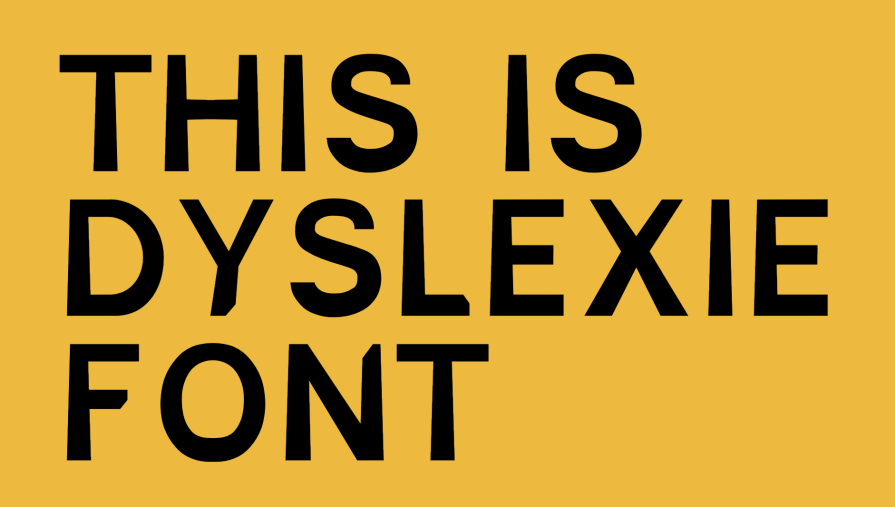
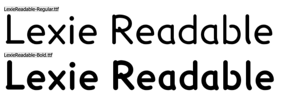
The most known fonts specifically designed to fight against dyslexia are — Open Sans, Lexie Readable, and Dyslexie:

Is there professional use of Comic Sans today? As we saw, the hate toward Comic Sans comes from its misuse in the early days of the internet. The right use case means using it as intended initially or using its bad reputation to its advantage.
Comic Sans can be used in dialogue bubbles as it was first intended. This will give a friendly feel to what a character says. This is the case for a character from Undertale — Sans — who speaks in Comic Sans to showcase his easy-going personality:

With its childish look, the font can be used in pedagogical tools to help children learn to write and read, as the letters are closer to how they will draw them.
One app to cleverly use Comic Sans is, ironically, for designers.
Balsamiq chose Comic Sans to reflect two aspects of its brand. First, the brand seems sketched by hand, so having an irregular font makes sense in this case. Second, it is a wireframing tool, and using the most hated font out there helps set a boundary for clients, saying, “No, this is not the final look; focus on the layout, not the detail.”
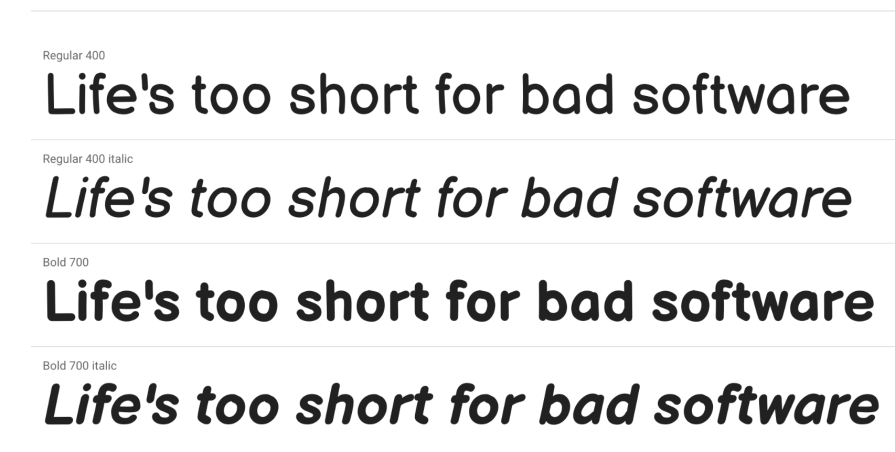
Today, Balsamiq dropped Comic Sans and created Balsamiq Sans, but the spirit is still here:
The last use case I can imagine would be an accessibility parameter. Allowing users to choose between a standard font and Comic Sans can be a nice compromise to accommodate users with and without dyslexia.
Wondering how Comic Sans could be modernized? Well, it’s been ten years already!
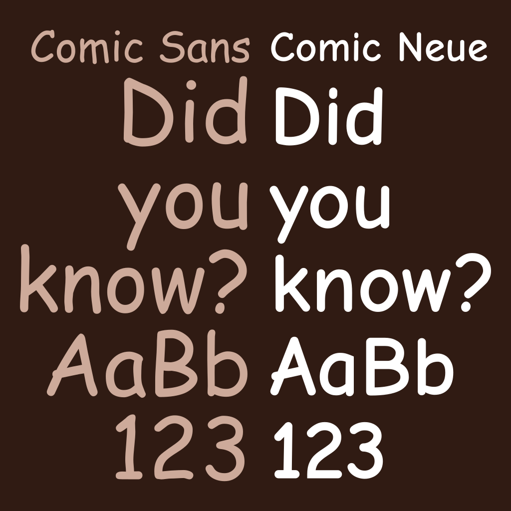
Instead of banning the font, Craig Rozynski and Hrant Papazian tried to update it to fit the modern typeface version. They based their work on Comic Sans and did a redraw of the letter for better weight distribution and kerning. This updated version is called Comic Neue.
By keeping the essence of Comic Sans and considering the modern considerations acquired over the twenty years since its creation, the designer modernized the font and even created variants with angular edges. This font isn’t yet so much discussed, and I’d like to see if getting something straighter impacted the legibility liked by people with dyslexia.
If you need to consider using Comic Sans for a project, you can try Comic Neue, which has a more professional look but keeps the hand-drawn aspect of the original:
Despite its negative reputation, Comic Sans is more complex than a simple “bad font.” Its strengths in specific contexts, like accessibility for dyslexic readers, show that it wasn’t inherently flawed, just misused.
Over time, designers have learned to appreciate the nuance of typography and its impact on user experience. Comic Sans serves as a case study on how important it is to match a font’s tone with its intended message.
Whether Comic Sans will ever reclaim its place in mainstream design remains a reminder of the importance of typography in design.
LogRocket's Galileo AI watches sessions and understands user feedback for you, automating the most time-intensive parts of your job and giving you more time to focus on great design.
See how design choices, interactions, and issues affect your users — get a demo of LogRocket today.
Multimodal UX goes beyond designing for screens. Learn how context-aware systems, progressive modality, failover modes, and accessibility-first design create better digital product experiences.
Learn how context-aware mode prioritization and seamless transitions improve multimodal UX and reduce mode confusion.

Research is becoming more democratized, product cycles are accelerating, and AI is transforming synthesis and ResearchOps. Here are the three trends shaping UX research in 2026.

Voice support is not the same as multimodal UX. Here’s how to design systems with true mode continuity and context-aware interactions.