When we navigate the web, we rely on UI elements like buttons and icons. But text? It’s just as powerful — often referred to as clickable text.
But clickable text isn’t just about navigation; it can trigger actions like submitting a form, copying text, or even opening a modal. And just like a button needs to look like it can be pressed, text needs to be designed for interaction.
In this article, I’ll talk about how to make text look clickable — what works, what doesn’t, and when it’s the best choice over other UI elements.
Clickable text is one of the primary ways users interact with digital interfaces. The challenge? Making sure clickable text stands out from the regular, non-clickable text.
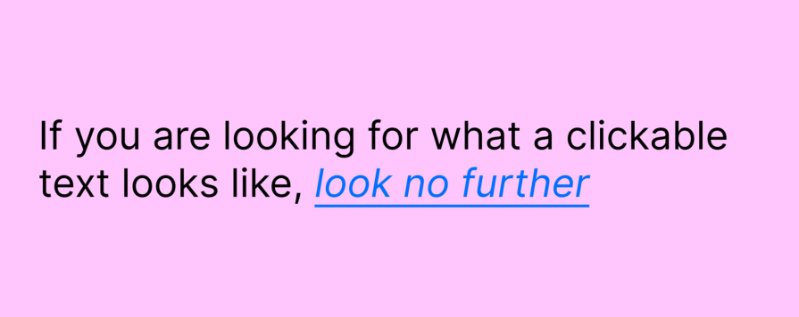
When text is designed to look clickable, it sends a strong visual cue — essentially yelling — “CLICK ME!” If your clickable text doesn’t do that, is it really clickable? Not really.
Users instinctively look for familiar cues when navigating. If the clickable text doesn’t stand out — through color, underlining, or other visual signals — users might overlook it entirely, leading to frustration and missed interactions.
Every time a user has to pause and think, “Is this clickable?” it adds friction to their journey. If the interaction cost is too high — meaning users struggle to identify links or hesitate before clicking — they might abandon the task altogether. Lowering this cost ensures a smoother, more intuitive experience. Low interaction cost on the clickable text also:
In the case of clickable text, affordances are the cues that indicate to users that they can interact with it. These can be as simple as underlines, color changes, or even subtle hover effects that give the text an interactive feel. Just as a door handle signals that it can be pulled or pushed, clickable text needs to signal that it can be clicked.
Users might hesitate when these affordances are absent or unclear, adding unnecessary friction to their experience. By clearly showing that text is clickable, you reduce cognitive load and make navigation smoother.
Designers need to consider several factors when making text interactive, including typography, color choices, and hover effects. The ultimate goal is to reduce interaction cost — the cognitive and physical effort required for users to complete a task.
When clickable elements are obvious, users navigate effortlessly. But when they have to second-guess whether something is interactive, frustration creeps in. The best clickable text is clear, intuitive, and effortless to use.
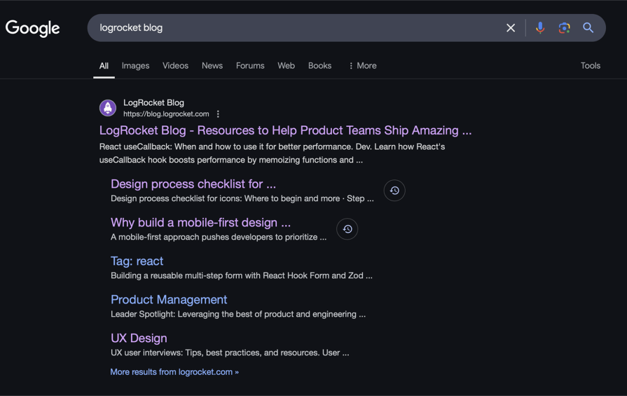
Short answer — No. But blue has been the default hyperlink color for decades. Early browsers like Mosaic set the standard with blue for unvisited links and purple for visited links. And Google follows this convention even today:
Why blue?
Blue has become synonymous with clickable text due to its strong visual impact and historical use across web design. It’s a color that naturally attracts attention without being overly aggressive. Early web designers chose blue for its clear visibility on light-colored backgrounds, and this practice became a standard. Over time, blue became associated with interactivity, making it a go-to choice for links.
Blue is actually a great choice because:
That said, clickable text doesn’t have to be blue — I’ll talk more about that in the next section. The key is to maintain clear contrast and consistency with your brand’s color scheme.
When designing clickable text for paragraphs, the goal is often to limit the visible text while giving users the option to read more if they choose. Instead of displaying the full content upfront, adding a “Read more” link + an arrow (→) at the end of the snippet helps set expectations and guide users toward additional content:
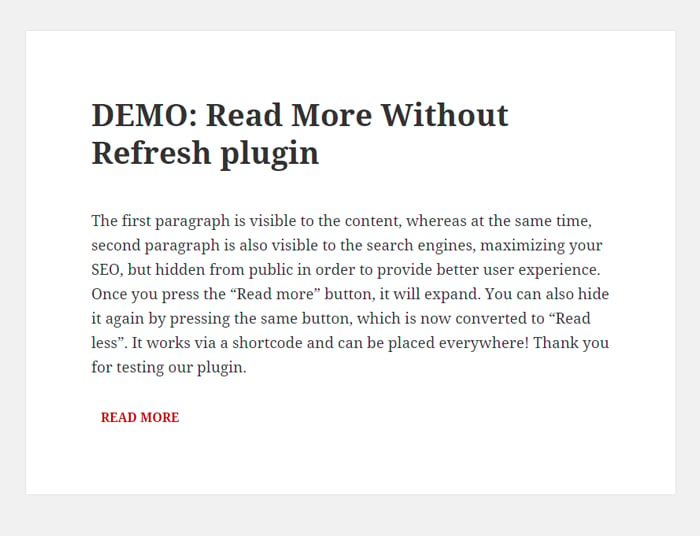
However, the “Read more” link must clearly look clickable — not just blend in as regular text. Use visual cues like underlining, a different color, or a hover effect to reinforce interactivity. This ensures users instantly recognize it as an action they can take rather than just part of the paragraph.
Clickable text isn’t just about visual cues — it also needs to be easy to tap on touchscreens. Unlike a cursor, which allows for precise clicking, fingers are less accurate, so spacing and touch target size plays a crucial role in usability.
For a seamless touchscreen experience:
If clickable text is too small or packed too closely, users may struggle to tap the right link — especially on mobile devices. To improve tap accuracy:
By optimizing touch targets and spacing, you ensure clickable text is just as effective on touchscreens as it is on desktop
Designing clickable text sounds straightforward — until it isn’t. Users expect interactive elements to be obvious, yet many websites still hide links in plain sight. Whether it’s text that blends into the background or clickable elements that look just like regular content, these missteps can create unnecessary friction.
One key concept in UX that plays into this is affordances — the cues that tell users what an element does. A button that looks raised invites pressing, just as a link should visually suggest interactivity. If the text doesn’t signal that it’s clickable, users might not engage with it at all.
So, how do you ensure users can instantly recognize clickable text? Here are some key tips to improve clarity, usability, and accessibility:
Clickable text should be visually distinct from surrounding content, ensuring users can instantly recognize it as interactive. This can be achieved through contrasting colors, underlines, or other design elements that differentiate it from static text. Some key considerations:
Interactive elements should respond when users engage with them. Some common hover effects include:


Even with the best intentions, clickable text can sometimes fall short. Poor design choices can make links hard to spot, confusing to use, or even inaccessible to some users. Avoid these common pitfalls to ensure your clickable text is effective and user-friendly:
While text formatting like color changes and underlines are common ways to indicate clickability, there are additional techniques that can be of help to enhance clickability:
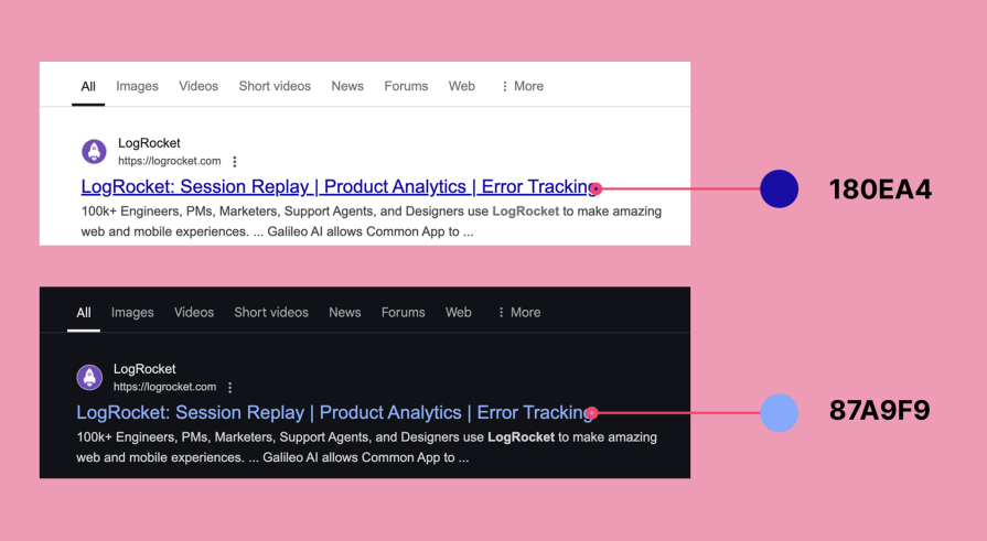
Not really. The same principles apply in both light and dark modes — clickable text should be clear, distinct, and interactive. The main difference is the color. In dark mode, desaturated colors work better to avoid glare.
For example, Google uses #180EA4 in light mode but desaturates the color to #87A9F9 in dark mode. The key is to balance contrast for readability and accessibility:
Sometimes clickable text is inside buttons and other times, it’s just a simple hyperlink. But when should you use which?
Buttons work best for:
Inline links work best for:
Ask yourself these questions to ensure you’ve got it all right:
A well-designed link isn’t just about making something clickable — it’s about making sure users immediately recognize it as clickable. By applying these principles, you ensure that clickable text is not just functional but also intuitive and accessible for every user!
Clickable texts shouldn’t be complicated for users. Simply making them stand out from regular text can do the trick, but there’s more to it than that.

LogRocket's Galileo AI watches sessions and understands user feedback for you, automating the most time-intensive parts of your job and giving you more time to focus on great design.
See how design choices, interactions, and issues affect your users — get a demo of LogRocket today.

I was working with an intern on a UX research project, and before we even started, we both had private […]

AI has accelerated design execution, but speed can come at the expense of intentionality. Learn how UX teams can preserve product thinking and judgment.

UX testing is not limited to layouts, copy, and visual design. Full-stack and server-side experiments help teams evaluate how backend logic, APIs, algorithms, and product flows affect the overall user experience.
In A/B, A/B/n, or multivariate testing scenarios, using p-value with traditional null-hypothesis-based statistical analysis is so common, and most designers […]

 Learn more →
