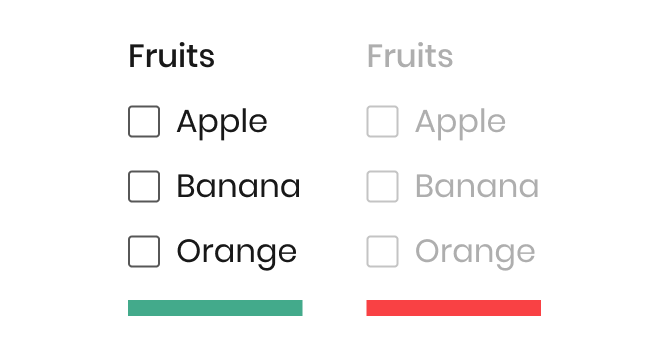
A checkbox is a common UI component used in almost any application on the market.
It can be used for tasks like filling in a job application form or as a filter in an ecommerce shop. The advantage of this component is that it gives the user the ability to select more than one option while using it.
As a commonly used component, it’s important that you watch for accessibility issues when designing and implementing it into the code.
The guidelines of this component are clear, but many times designs don’t provide this info for the developers. This can ultimately make for a poor experience for users.
For example, the user must be able to navigate with a keyboard, and the checkbox must be usable with a screen reader.
Apart from desktop devices, you have to think about mobile devices too. You need to consider the size of the checkbox and the space between each element so that the user can easily tap on them.
To help you get started, this article looks at more checkbox features, including style and interaction. This’ll help you use this simple component well in your product and ensure it’s intuitive and easy to use.
Editor’s note: This blog was updated 7 July 2025 by the author to add comparison tables, provide a checklist and best practices around accessibility, and cover how you can test your checkbox UX.
A checkbox component has a simple anatomy. It consists of an input element, a label, and a sign, which can be one of three options: none, checked, or intermediate state:
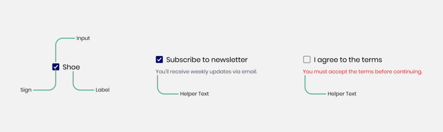
In addition, the checkbox can also display an error or helper text to communicate information to the user.
The checkbox size can change depending on the user’s device. Usually, the size for desktops is 24×24 pixels so the user can click it easily and see it clearly. For mobile, the minimum size is usually 44x44px so users can tap it easily.
Different design systems use slightly different sizes, but they’re mostly similar. For example, Material Design uses 24x24px for desktop and the Carbon Design system uses 16×16 pixels.
For mobile, the Apple Human Interface Guidelines recommend a minimum size of 44x44pt, while Google Material Design suggests a minimum touch target size of 48x48dp.
A checkbox can have up to five different states: enable, disable, hover, focus, and pressed:
| State | Image | Description | Desktop Interaction | Mobile Interaction |
| Enabled |
|
Indicates to the user that the checkbox is ready to use |
|
Tap |
| Disabled |  |
Non-interactive state. Shows users cannot click on it. Usually, the element will appear in gray to indicate this | Not focusable or clickable | Not tappable |
| Hover |  |
Appear when the user hovers above the element to show they are above it | Mouse only | Not applicable on mobile. Touchscreens don’t support hover interactions |
| Focus |  |
This state appears when a user navigates with the keyboard, usually by pressing the Tab key .
The checkbox shows a line around it to highlight focus. This helps people who use the keyboard to see where they are and is important for accessibility |
Keyboard only (Tab to navigate) | Rarely visible. It appears mainly when using a screen reader or keyboard, like on a tablet with an external keyboard |
| Pressed |  |
This state appears when the user clicks the checkbox. It may show a small visual change, like a shadow, to show it’s being pressed. Not all apps use this state |
|
Tap (short visual feedback) |
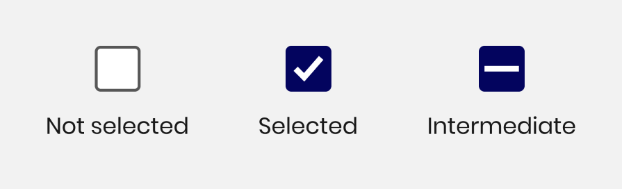
A checkbox has three types of selections associated with it:
Let’s compare the differences between a checkbox, a radio button, and a toggle switch with this table:
| Aspect | Checkbox | Radio button | Toggle switch |
| Behavior | Allows multiple selections | Allows only one selection | Select between
ON or OFF |
| How it looks |  |
 |
 |
| Use cases and examples |
|
Answering single-choice questions | Enabling or disabling settings like airplane mode |
| Default behavior | Usually starts unchecked | Can be pre-selected or left blank depending on context | Reflects the current system state |
| Label | Label should be clickable to improve usability | Label should be clickable to improve usability | The entire switch and associated label should be clickable |
| Keyboard interaction |
|
|
|
| Common issues |
|
Use for up to seven options | Should trigger an immediate action upon clicking |
| Group behavior | Each one stands alone | Must be grouped because the user can select only one option | Use alone, not in groups |
The following tips will help you design an effective checkbox for your digital product.
As a designer, you want to make things stand out, and you investigate new, groundbreaking ways to do things.
However, this isn’t the case when you work on checkbox design. This is because this component is a very common one, and many people know how to use it. So, keep things as simple as possible so the users will understand its function quickly.
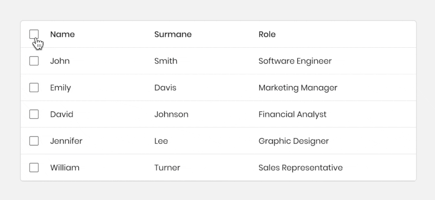
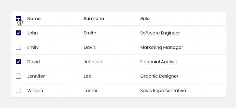
Apart from the standard checkbox that comes alone or in a list, there’s also a type of checkbox that appears in a tree view or nested list.
The checkbox works the same, but because the tree view has its hierarchical structure, if the user clicks on the parent checkbox in the list, it’ll affect all the child checkboxes.
This structure is useful for cases where users want to make multiple selections simultaneously. The tree view makes it easier to select multiple items at once; for example, in a table of many items, if the user wants to select all the items, they can select the parent item, and all the other items will selected:
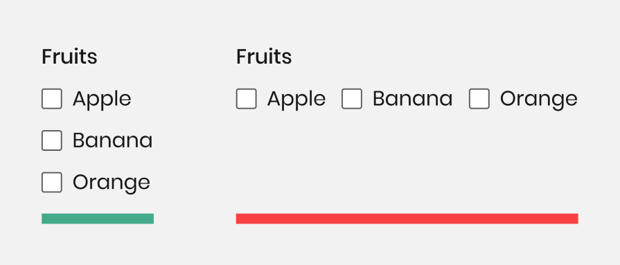
Lists of multiple checkboxes should be organized vertically instead of horizontally because vertical lists are easier to read and scan, allowing users to navigate and find what they search for faster:
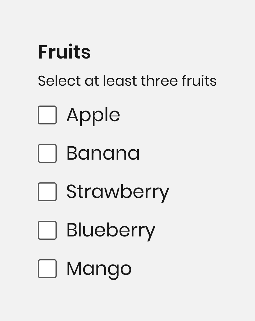
If the user has to select a minimum number of elements from a checkbox group, mention it. By doing so, they’ll understand how many elements they must select. This ensures the user knows what to do to complete the task:
What happens after the user clicks on the intermediate state is a classic edge case in designing the checkbox component.
Will all the elements in the list be checked or not? There’s no one answer to that, and it depends on the users’ needs whether to make all the checkboxes selected or deselected after clicking on the intermediate state:
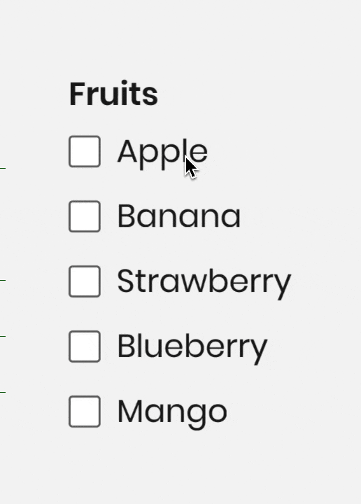
Clickable labels enable users to select the checkbox more easily because they can click or tap on a larger area:
Test the color contrast, and make sure the screen readers and keyboard navigation work well to ensure all users can use the component easily:
In case there are many checkboxes in the list, try to break them into groups so users can find the information easily.
In most cases, users need to confirm their selection by clicking a button after checking a checkbox. For immediate action, toggle buttons are more suitable.
Don’t choose a default option for users. If you do, they may feel forced to choose a specific option. Let them decide for themselves.
Writing isn’t every UX designer’s strength, but labeling checkboxes doesn’t have to be overly complicated. Here are a few tips to ensure your copy is easy to read and understand:
As with any component, accessibility is an important part of the quality of your interface. Here are some simple things to keep in mind when making checkboxes easy for everyone to use:
Here’s a quick checklist I put together to help you review the key things before you finish designing a checkbox component.
In this article, you looked at one of the most common elements in UX design: the checkbox. You learned about the anatomy of the feature, the different states of it, and the distinct types of selection, such as selected, not selected, and indeterminate checkbox states.
Checkboxes are essential, but they need to follow a consistent design language. This isn’t a design element to experiment on; it’s one to create as familiar and accessible.
Header image source: IconScout

LogRocket's Galileo AI watches sessions and understands user feedback for you, automating the most time-intensive parts of your job and giving you more time to focus on great design.
See how design choices, interactions, and issues affect your users — get a demo of LogRocket today.

AI has accelerated design execution, but speed can come at the expense of intentionality. Learn how UX teams can preserve product thinking and judgment.

UX testing is not limited to layouts, copy, and visual design. Full-stack and server-side experiments help teams evaluate how backend logic, APIs, algorithms, and product flows affect the overall user experience.
In A/B, A/B/n, or multivariate testing scenarios, using p-value with traditional null-hypothesis-based statistical analysis is so common, and most designers […]

Traditional A/B testing splits traffic evenly, but multi-armed bandits dynamically send more users to the better-performing version. Here’s how the method works, where it helps, and when UX teams should use it over classic A/B testing.


 Learn more →
