Editor’s note: This article is a refreshed take on an earlier piece, bringing in new insights and refined best practices for UX navigation. Special thanks to both the original author, Ross Dillon, and the revising writer, Shalitha Suranga, for their contributions to making this guide even more valuable for designers.

Navigating a software product shouldn’t feel like getting lost in a maze. Yet, when interfaces have multiple levels, relying solely on primary navigation — like menus, dashboards, or tabs — can leave users struggling to retrace their steps. Screen titles help, but they’re not always enough.
That’s where breadcrumbs come in. As a secondary navigation aid, they provide users with a clear path back through hierarchical screens, making multi-level navigation more intuitive. While simple back arrows offer a way to return to the previous screen, breadcrumbs often provide a smarter, more flexible solution.
In this article, I’ll break down the role of breadcrumbs in UX, compare them with simple back arrow-based navigation, and explore how to create better breadcrumbs. I’ll also evaluate examples from popular software products to see what works — and what doesn’t.
A breadcrumb or breadcrumb trail is a secondary navigation UI element that helps users maintain context awareness of the navigational structure.
Unlike a main menu, which helps you start navigating, breadcrumbs keep track of where you are, making it easier to backtrack without relying on the primary navigation again. And a breadcrumb trail shows your current location in a multi-level structure and lets you jump back to a previous screen instantly:

Like you can see in the breadcrumb trail above, a typical breadcrumb consists of two key elements:
Not all breadcrumbs work the same way. UI/UX designers use three main types:
Each type has its own role, and choosing the right one depends on how users move through your product.
Breadcrumbs and back arrows both help users navigate, but they serve different purposes. Breadcrumbs provide a structured, multi-level path, while back arrows offer a simple way to step back. In most cases, breadcrumbs enhance navigation, but they’re not always the right choice.
To avoid usability pitfalls, let’s compare them across key factors:
Breadcrumbs support backward, forward, and ad-hoc navigation since the breadcrumb segment hosts multiple navigation links — so there’s just a lot more freedom. Users can jump to a previous or top-level screen in one click, making multi-step navigation seamless.
For example, on BestBuy’s website, you can click breadcrumb links to return to a product category instantly:

Back arrows, on the other hand, only allow step-by-step backward navigation. If users want to return several steps, they’ll need to tap multiple times.
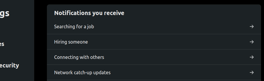
LinkedIn’s settings menu is a perfect example — getting back to the root page requires several clicks:
Breadcrumbs offer better navigation features than the back arrow-based approach. That said, back arrows provide a more accessible way to go back one step since they use a single, familiar signifier rather than a set of links.
Breadcrumbs show the full navigation path, making it clear where the user is without relying solely on screen titles.
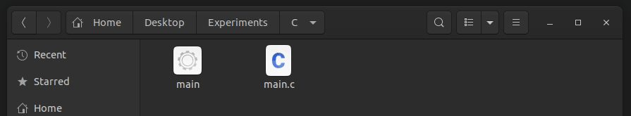
For example, Ubuntu’s file manager displays the current directory as a breadcrumb, giving users instant clarity:
Back arrows, however, only indicate the possibility of returning to the previous screen. Some apps, like Google Drive on Android, improve this by displaying the previous screen’s title next to the back arrow — functioning like a lightweight breadcrumb.
Look at how the Google Drive Android app shows the previous directory name as follows:

Breadcrumbs take up horizontal space, which can become a problem on small screens. If your product has deep navigation layers, breadcrumb trails can get long, cluttering the UI. That’s why Google Drive uses breadcrumbs on desktop but switches to back arrows on mobile:

Back arrows, in contrast, are compact and minimalistic. They work well in space-limited UIs, making them the better choice for mobile. Trying to cram breadcrumbs into a small screen reduces usability, especially if the links are hard to tap.
Breadcrumbs are more complex to design and develop. Location-based breadcrumbs require mapping out the full navigation hierarchy, while path-based ones need to track user history dynamically. Fortunately, design tools and pre-built breadcrumb libraries can help streamline the process.
Back arrows are much simpler. A basic back button is easy to implement, though adding the previous screen’s title next to it slightly increases design effort.
Users already understand both navigation methods — but expectations shift depending on the device. On desktop, users expect breadcrumbs for multi-level navigation. On mobile, they expect back arrows. Using breadcrumbs in a mobile app can feel unnatural, just like forcing users to repeatedly click “Back” on a desktop UI.
The key is to match user expectations. Breadcrumbs and back arrows both work — just not in the same scenarios.
As a UI/UX designer, I recommend you explore targeted user mental models to create user-friendly, productive, intuitive product designs by reducing the Gulf of execution and evaluation — by effectively mapping user mental models and actual behavior.
You may have already imagined scenarios where we should use breadcrumbs when you went through the above comparison. Let’s summarize scenarios where you should consider using a breadcrumb component as a navigation aid.
Consider using breadcrumbs if:
Breadcrumbs offers a productive, self-explanatory navigation option for software products that contain multi-level, complex navigation structures. Adding a breadcrumb component for a simple navigation structure containing only one level adds unwanted complexity to the UI.
Moreover, breadcrumbs aren’t mobile-friendly elements. You should consider using a simple back arrow-based navigation for one-level navigation hierarchies and mobile products.
Consider using back arrows over breadcrumbs if:
Not really — breadcrumbs and back arrows serve different purposes, and swapping one for the other won’t magically improve usability. Their effectiveness depends on the design context and navigation structure.
Sometimes, a product evolves beyond its original design. For example, a navigation system built around back arrows might start feeling restrictive as more screens are added beyond the first level. If your product now has deep, multi-level navigation, relying solely on back arrows forces users into a tedious, step-by-step journey.
If your product has unexpectedly grown into a complex navigation structure, it might be time to introduce breadcrumbs — at least for desktop users. Breadcrumbs provide direct access to higher levels without forcing users to backtrack screen by screen.
You know now that traditional breadcrumbs don’t work well on mobile due to limited screen space. Instead, consider a hybrid approach, like iOS’s file manager, which combines a back arrow with the previous screen’s title. This creates a mobile-friendly breadcrumb that improves context without overwhelming the UI:

Ultimately, breadcrumbs and back arrows aren’t interchangeable — but choosing the right one (or a mix of both) ensures a seamless navigation experience.
We’ve covered when and why to use breadcrumbs, factoring in usability, complexity, user mental models, and accessibility. Now, let’s dive into the UI best practices for designing effective breadcrumbs:
The Gestalt grouping laws help users recognize patterns and relationships between UI elements. Use the law of proximity to create consistent spacing between breadcrumb items and separators. Proper spacing prevents visual clutter and ensures easy readability.
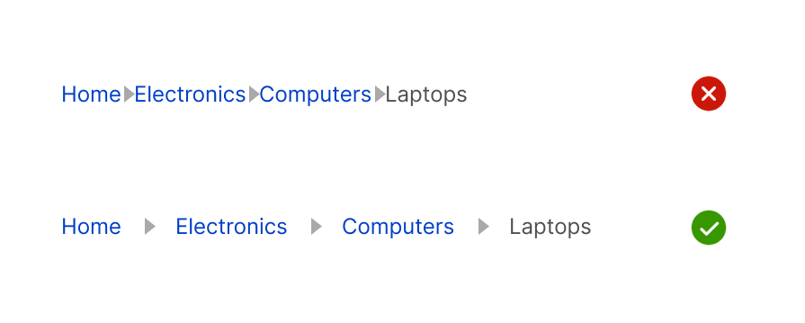
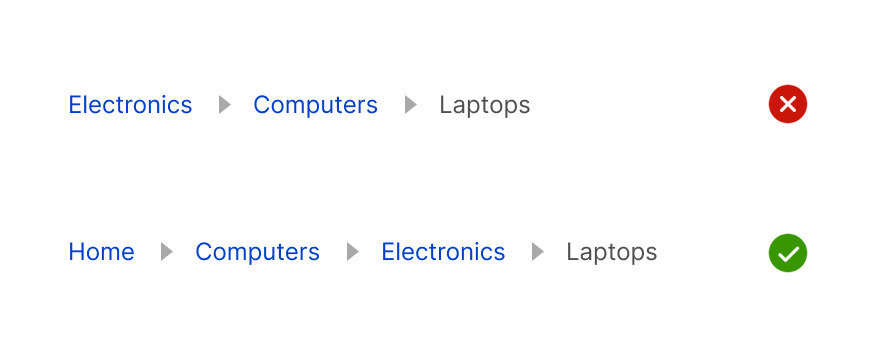
The separator element show indicates the hierarchical navigation structure for location-based breadcrumbs. Using an incorrect separator element breaks the hierarchical nature and turns the breadcrumb into a menu:
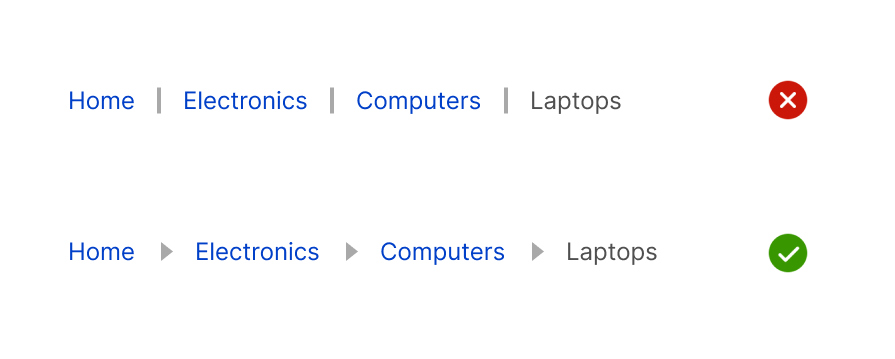
Apart from right arrow icons, designers can use the slash ( / ) sign in hierarchical navigation flows since within the computer technology context, the slash sign represents a directory tree path that most computer users are familiar with.
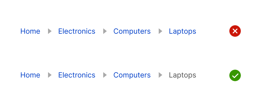
If the last breadcrumb represents the current screen, it shouldn’t be styled as a link — this prevents confusion and makes it clear that the user has arrived at their destination:
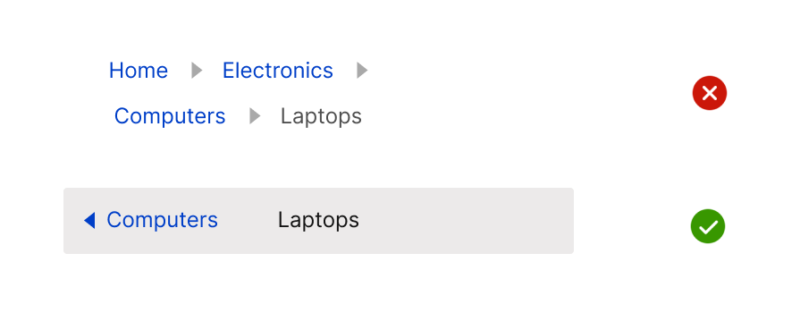
Breadcrumbs should remain in a single, horizontal line. If space is limited, opt for a mobile-friendly breadcrumb alternative rather than allowing them to break into multiple lines, which disrupts readability and hierarchy:
Users expect a way back to the beginning. The first breadcrumb should always lead to the root screen (e.g., homepage), ensuring users can quickly return to the starting point:
There are no fixed, strict rules in the UI/UX design field — you have the freedom to innovate new UI elements by modifying existing common UI elements that most software products use without affecting usability. You can modify the traditional breadcrumb without harming its core concept.
We can use the back arrow navigation with a breadcrumb to offer quick back navigation and ad-hoc navigation, as the Adidas website does, as shown in the following preview:

We can also turn the last breadcrumb element into a dropdown menu and display options for the current screen context, as Google Drive does:
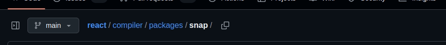
Adding trailing quick action buttons that initiate some actions related to the navigation path is another idea that the GitHub desktop website already implements:
Creating a custom breadcrumb by carefully evaluating user mental modes creates intuitive, minimal UIs.
Let’s evaluate breadcrumb designs of popular, well-designed product interfaces to explore breadcrumb design practices further.
Booking.com is an online travel reservation company. The Booking.com desktop website offers features for users to book hotels, flights, cars, airport taxis, and travel services. The website renders a well-designed breadcrumb as a secondary navigation option while browsing hotels:

Here are the facts that we can understand from Booking.com breadcrumb design:
Booking.com desktop website’s breadcrumb helps users instantly browse hotels in the country, state, and city when they visit a specific hotel. Overall, the website implements a well-designed breadcrumb that boosts user productivity.
eBay is a popular online ecommerce store that lets users buy and sell products. The eBay.com desktop website lists various products that fall under different sub-categories, so it implements a well-designed custom breadcrumb element to track navigation context in the available hierarchical navigation flow:

Here are the facts that we can understand while observing the website’s breadcrumb design:
eBay.com uses a custom breadcrumb by combining the back arrow-based navigation with a common breadcrumb. The back arrow element clearly states the action name to prevent user confusion, i.e., “Back to search results.”
Overall, eBay.com implements a well-designed custom breadcrumb to let users productively browse products.
In this article, we compared breadcrumbs with back arrow-based navigation and explored when to use breadcrumbs over back arrows. We also covered best practices for designing effective breadcrumbs and analyzed real-world implementations in popular digital products.
Breadcrumbs provide flexible, ad-hoc navigation, making them invaluable for multi-level structures where users would otherwise have to tap a back arrow repeatedly. However, when screen space is limited, or navigation is shallow, back arrows offer a cleaner, more efficient solution.
Ultimately, the best approach isn’t just about choosing one over the other — it’s about adapting breadcrumbs to fit your product’s needs. Consider hybrid solutions, such as integrating back arrows within breadcrumbs, adding context menus, or incorporating trailing action buttons, to strike the right balance between usability and simplicity.

LogRocket's Galileo AI watches sessions and understands user feedback for you, automating the most time-intensive parts of your job and giving you more time to focus on great design.
See how design choices, interactions, and issues affect your users — get a demo of LogRocket today.
Skeuomorphism helped define early digital interfaces by mimicking real-world objects to make technology more intuitive. Learn how it compares with flat design and neumorphism, why it declined, and where it still has a place in modern UX.
Memos don’t have to be complicated. Just keep them clear, concise, and focused on actionable items. More on that in this blog.

AI has made polished, confident content easy to generate, but that does not make it trustworthy. This article explains how UX teams can design stronger quality signals using source transparency, validation, confidence communication, and reputation.
Inclusive design is evolving beyond accessibility alone. This guide explains how UX designers can create more inclusive products through usability, accessibility, neurodiverse UX, adaptive personalization, multimodal design, and culturally aware product experiences.

 Learn more →
