While some designers are afraid of losing their jobs due to the rapid development of AI tools, the truth about AI lies somewhere in the middle — AI-generated content should certainly be curated by humans. It cannot replicate your creativity and the unique value that you contribute as a designer, but AI can automate and simplify tasks, analyze data, and improve the decision-making process. AI-powered design tools can be helpful at different stages of the UX design process — from research to visual design.
The goal of this article is to explore various AI tools and show how UX and visual designers can implement them into their workflow. If you pick up these tools quickly and use them to streamline your workflow, you’ll have an edge over the competition. You’ll probably even recognize a few names and be surprised that you’ve been working with AI all along.
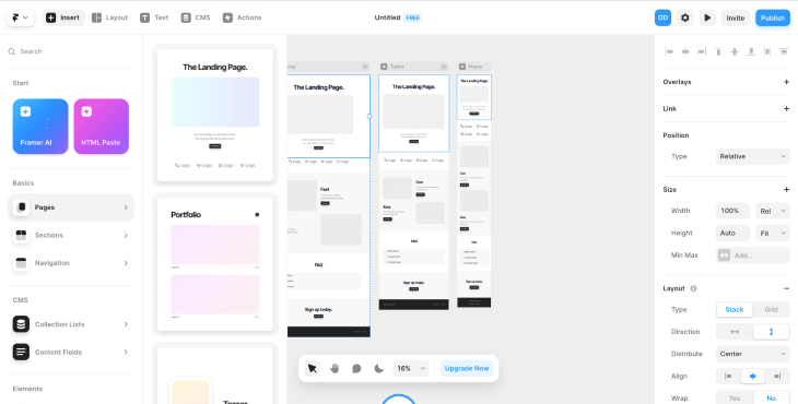
Framer is excellent for prototyping and ideation. You can create wireframes for landing pages or use a website generator when you need to create an event page or something simple quickly. What’s notable about Framer is that it provides three versions — desktop, tablet, and mobile — all of which are already responsive.
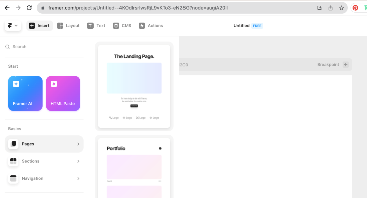
Here’s how you create a page wireframe in a click: click pages and choose the type of page you need. I chose the landing page:
One click, and voilà — versions for desktop, tablet, and mobile are ready:
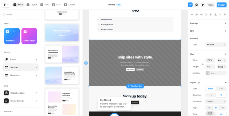
You can also go to sections and manually add or replace existing sections with those you need for your project:
One of the recent Framer updates is an AI-powered tool that can create a website in minutes. Of course, as a designer, you should optimize it before publishing, but it’s a quick way to get inspiration and ideas.
Framer can also be a perfect solution for junior designers because it can help them understand which sections to include in the site structure, experiment with fonts and color palettes, and check margins, font sizes, and other design elements. More experienced designers can use it for quick ideas and sketches to develop.
Here’s how you use Framer’s webpage builder:
Choose Framer AI and write a task. Mention the type of website you want to create, its purpose, and the sections to include. The more detailed description you give, the more successful the result you’ll get. I wrote the following instruction as an example:
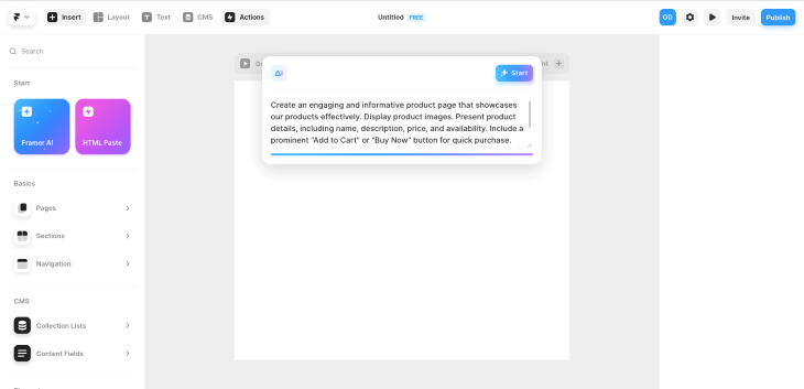
Framer will generate responsive versions (desktop, tablet, and mobile) just in a few seconds. It will be a simple site with standard sections, but it’s a good start. Another option is changing the color palette and typography, so you can easily customize the design and gain some ideas on the final look:
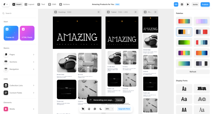
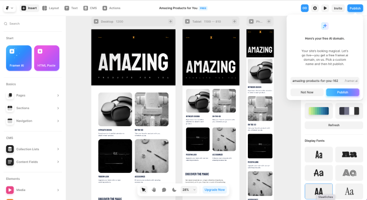
If you want to see me use Framer step by step to work on a website, I’ve created a Loom video that will show you my process:
Untitled – Framer – 15 September 2023
No Description
ChatGPT is a language model-based chatbot that can answer questions, provide you with valuable information, and even write code. While it is primarily associated with content, it can be used almost in all stages of the UX Design process.
You can ask ChatGPT about anything and everything, and it will provide you with ideas in seconds. For instance, if you want to find out the trends in a particular field:
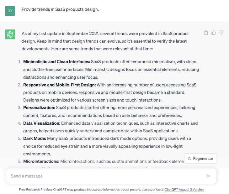
Or if you need a font for a specific project and require some ideas, ChatGPT can assist you:
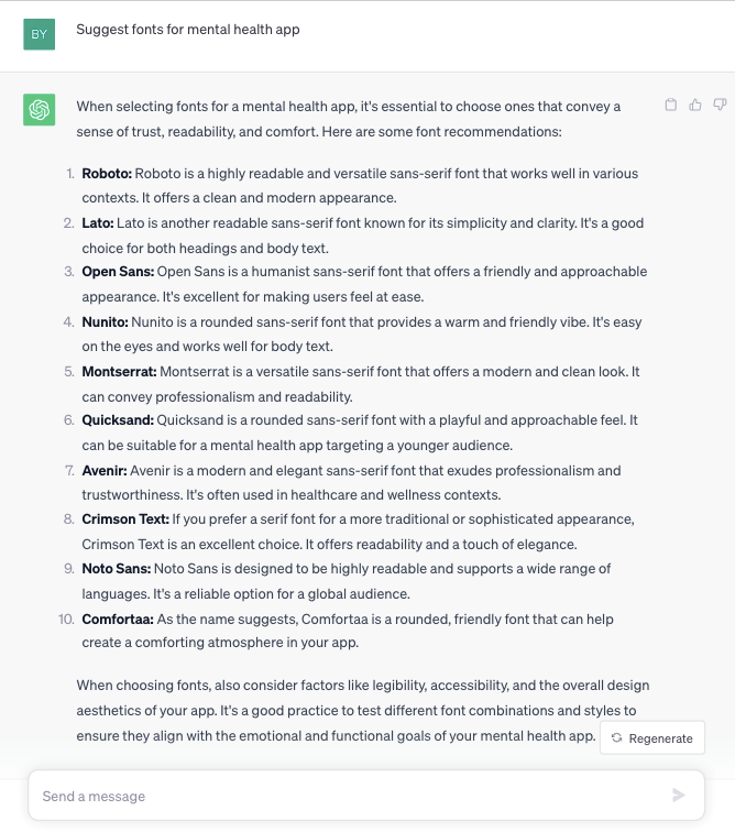
ChatGPT can also help you with your design decisions. As an example, I asked for ideas on how to create an onboarding process for an ecommerce app.
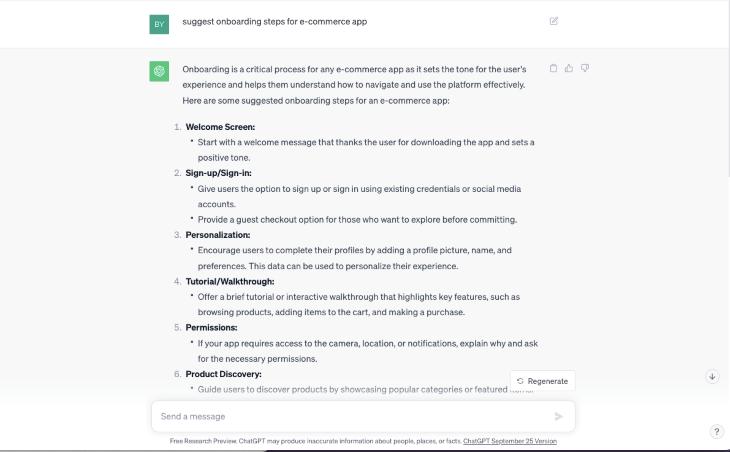
In the next example, ChatGPT provided me with a landing page structure:
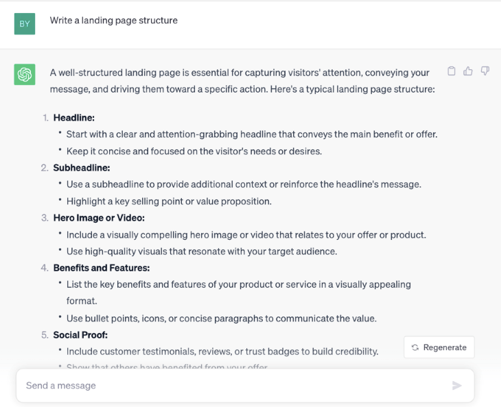
Having unique content is critical for SEO; it’s not recommended to rely on ChatGPT for the final copy, especially since its content is not copyrightable.
However, ChatGPT can be a valuable tool for generating ideas and structure. You can rewrite suggestions and create your unique content to ensure originality.
In the example below, it’s great to take the structure and add your unique text:
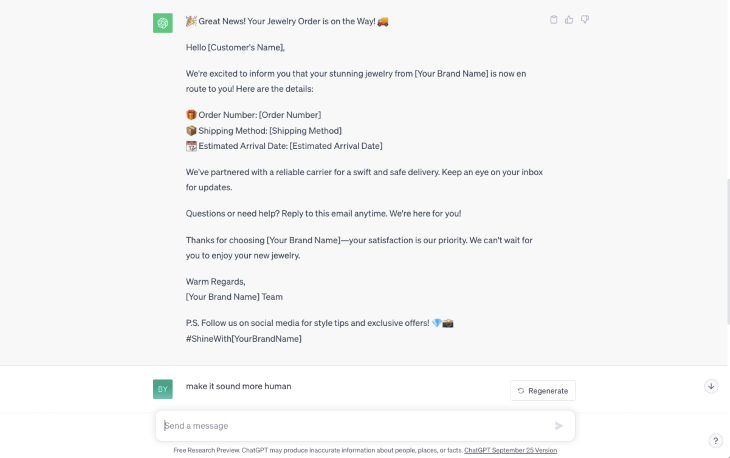
This chat gives you a bulleted list of all the things you’ll want to include in a delivery notification email.
From that, you can build a template.
You can rapidly generate text for which uniqueness is not essential, such as research questions or feedback requests:
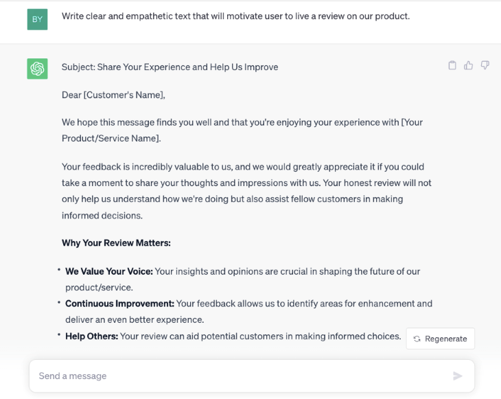
ChatGPT is also helpful during the prototyping stage. Instead of using Lorem Ipsum for your wireframes, you can generate relevant content for each section, which is more helpful when you present your ideas.
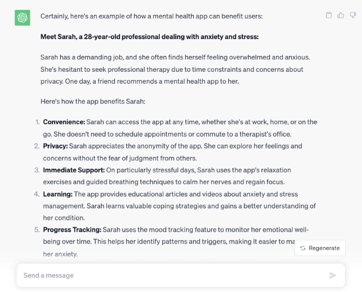
Later when it is replaced with unique content, a writer can see examples of what you need for each section. In the following example, I asked ChatGPT to write the benefits of using a mental health app:
The number of AI-powered visual design tools is now rapidly growing. They are perfect if you are looking for inspiration and guidance.
Let’s go deeper and discover which tools can assist you in creating a design, finding a successful color palette, generating font pairings, and even creating amazing illustrations!
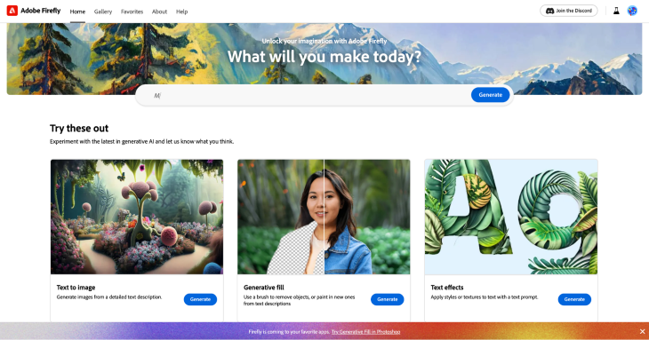
Adobe Firefly is amazing. It has a variety of AI tools, like text to image generation, generative fill, and text effects. These features can add a new background to your image, recolor it, and, what I personally like the most, create great images!
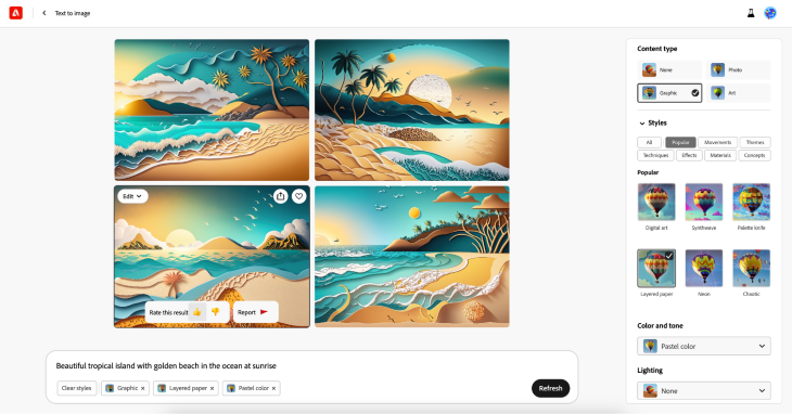
Just look at this! I created this illustration with Adobe Firefly in seconds.
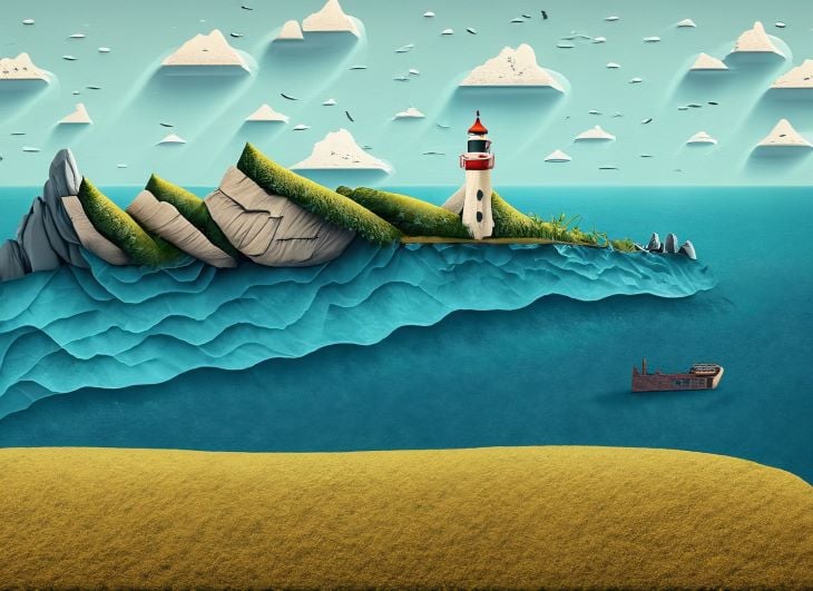
So, how does it work? Firstly, you write a task to generate. Remember, your instructions should be clear and detailed. I wrote: “Beautiful tropical island with golden beach in the ocean at sunset.”
I got a pretty standard result:
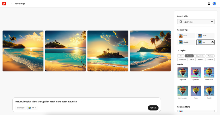
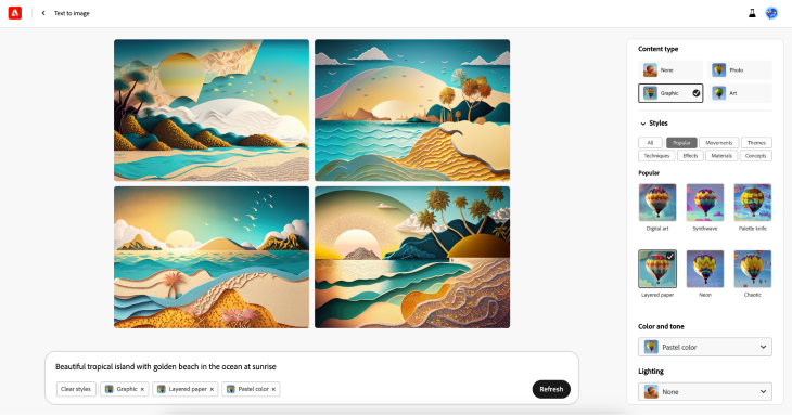
These are what AI-generated islands look like without your design participation. But with Firefly functionality, you can play further with the design. I chose options for graphic and layered paper and had a completely different result:
If you are satisfied with the result, you can click on the image you like and choose “use as a reference image” and generate more similar illustrations!
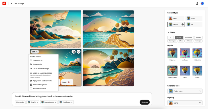
You can also like or dislike generated pictures to train the AI:
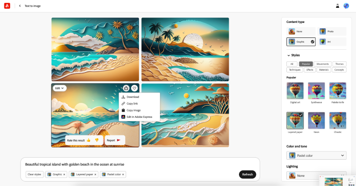
The last step is to download a picture!
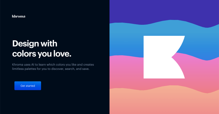
Khroma is an AI-powered tool for color inspiration and palette generation. It helps designers to save time when selecting a color palette for their projects. This tool visualizes color combinations across typography, gradients, and custom images without manually matching each color:
How to use:
To begin, Khroma asks you to select 50 of your favorite colors. My advice is to choose the ones you’re planning to use for a particular design project:
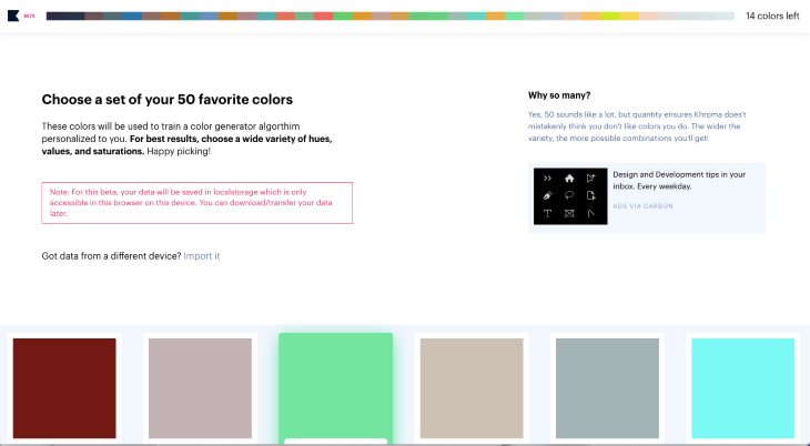
Then Khroma analyzes your choice:
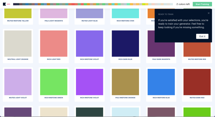
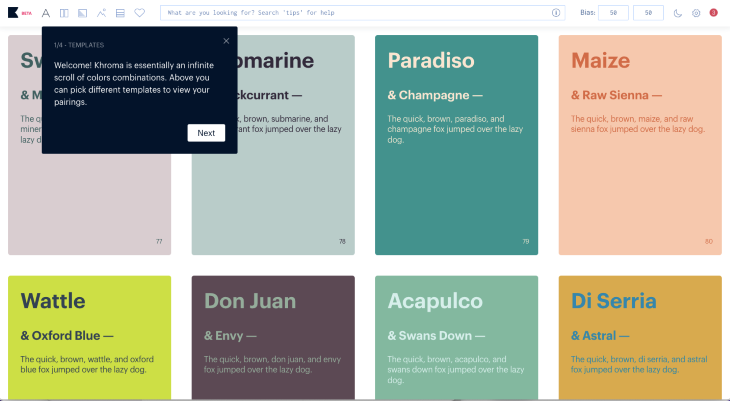
And gives you variations of colors you’ve chosen. What is helpful is that it provides color combinations using typography, so you can evaluate the readability of color combinations:
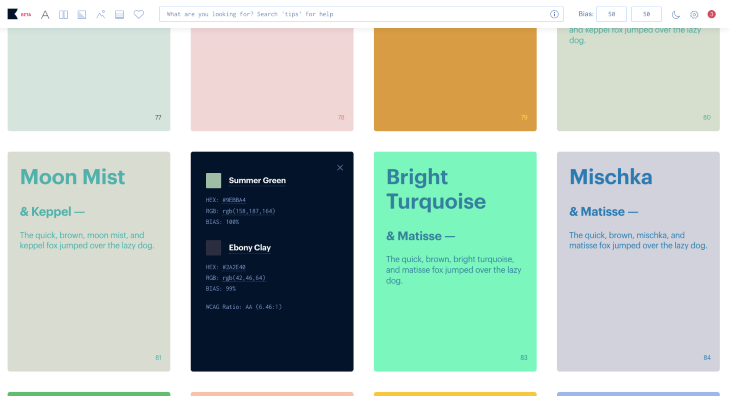
When you click on each card, Khroma provides you with all the necessary details about the color:
Update: As of 28 November 2023, Colormind is not in operation. We recommend trying Huemint below, which can also help with color palettes.
Colormind is another AI-powered tool that can help you to generate a color palette. I’d be surprised if you haven’t run into it already! It’s as straightforward as can be.
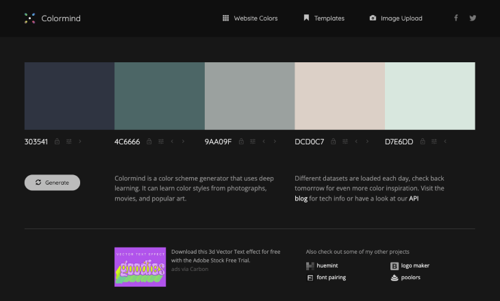
One of the great functions that I love about Colormind is its ability to extract a color palette from an image. It works simply; you just upload an image, and Colormind displays its color palette:
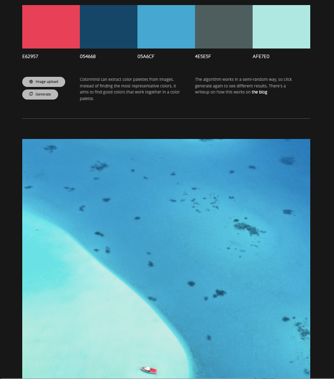
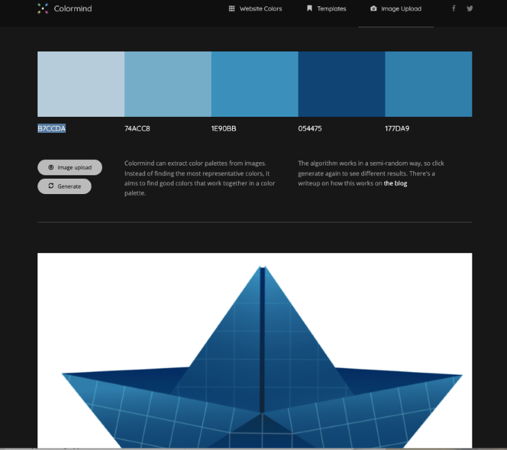
Colormind can extract colors from any image you upload, even a monochromatic one:
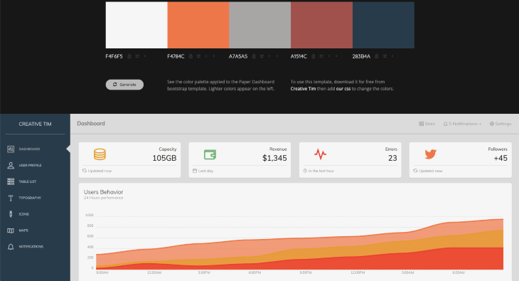
Another great function UI designers will find useful is that Colormind offers a dashboard template to show how the color palette will look in an application.
It also offers color palettes for web design and showcases them with a demo webpage:
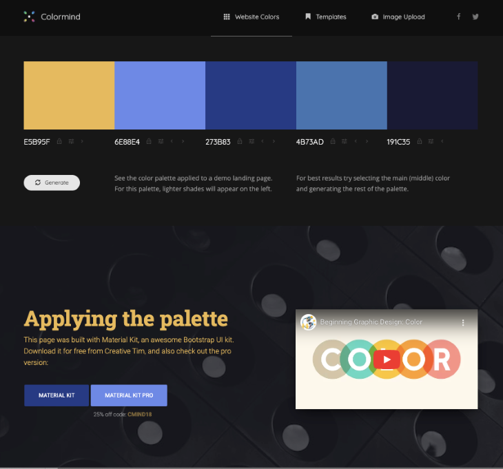
If you lock colors you like, Colormind will generate alternatives for the unlocked ones, allowing you to experiment with colors until you find the ones you need for your project.
This video tutorial demonstrates more ways to create a color palette with Colormind. If you’ve just been using it to cycle through colors, you’re leaving a lot of potential untapped!
Additionally, Colormind offers a video on the color theory topic, which can be extremely helpful for designers who are just starting or those looking to refresh their knowledge about creating color schemes.
One more exciting free tool that can assist you with visuals is Huemint. With its functionality, you can discover harmonious and unique color combinations. You can generate a color palette from an image or create an illustration using this tool:
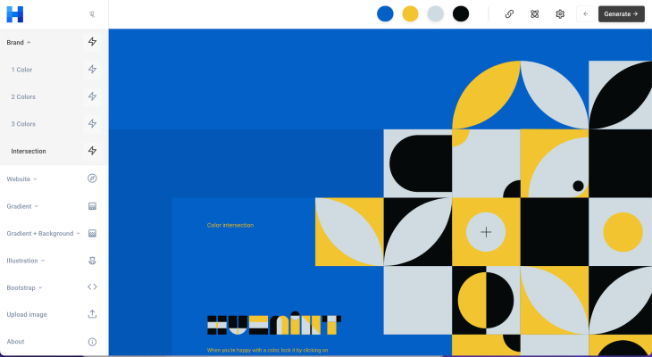
You can experiment with the number of colors, too:
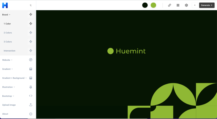
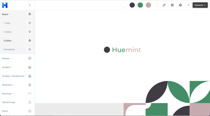
It’s a bit like Canva with more AI features: a color palette generator that can be customized, a branding alignment tool that checks if your palettes and design elements harmonize with your brand guidelines, an image quality improvement tool that refines image quality in seconds, and a website creation tool that helps you visualize your design on a webpage.
Huemint suggests perfect color combinations that complement your vision. And what’s great is that it’s not just following trends; it’s adapting to your unique preferences.
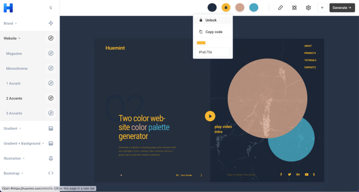
Huemint’s website AI tool does something really cool — it generates color palettes and shows you how they’d look on your web page. Just choose the colors you like, lock them, and create the ideal palette for your project:
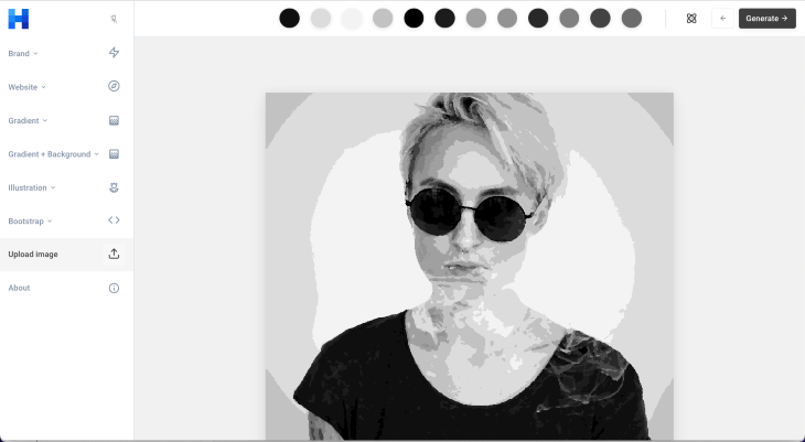
And the piece de resistance: You can create an illustration from a photo.
It’s as easy as it sounds: simply upload a photo:
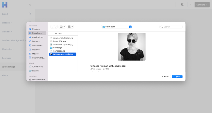
And you’ll get a result:
AutoDraw is a cool and simple drawing tool created by Google. It’s easy to use on any device from a tablet to a desktop:
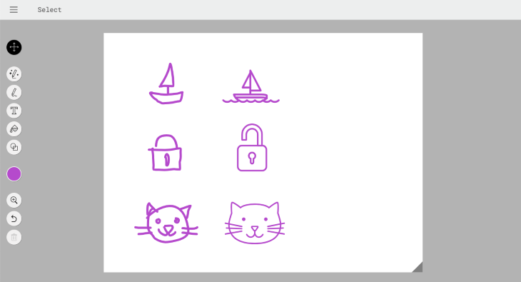
Here’s how it works: you draw any doodle, no matter how rough it is, and AutoDraw guesses what you’ve drawn. The tool suggests drawings, and you just have to choose the one that matches. You can use it for creating primitive illustrations, icons, or whatever you need. In the example below, I draw my doodles using the touchpad of my laptop. Look how it cleans the doodles up:
When you work for a small business that’s in the process of creating company branding and need something temporary that doesn’t cost a lot of money, or if you’re looking for some branding inspiration, it’s a good idea to use Looka, an AI logo maker tool.
Looka can generate a custom logo for free. It provides you with all you need for company branding. The logos may not be perfect, as AI-generated tools don’t have taste or designer vision. However, they can provide a lot of ideas that you can further develop:
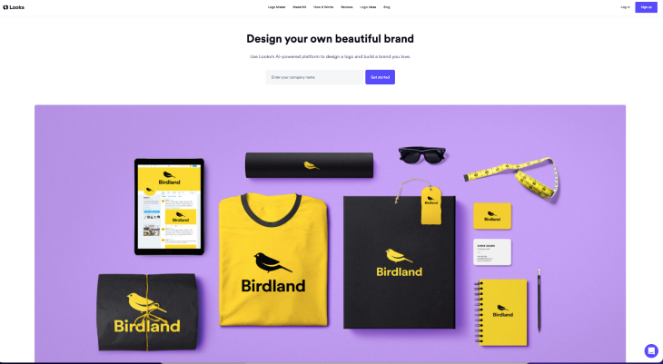
These are the steps you follow on your way to logo ideas. Firstly, you write the name of the company:
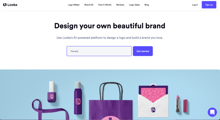
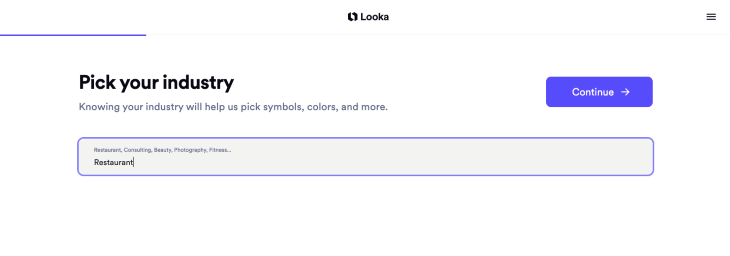
Then you add the industry:
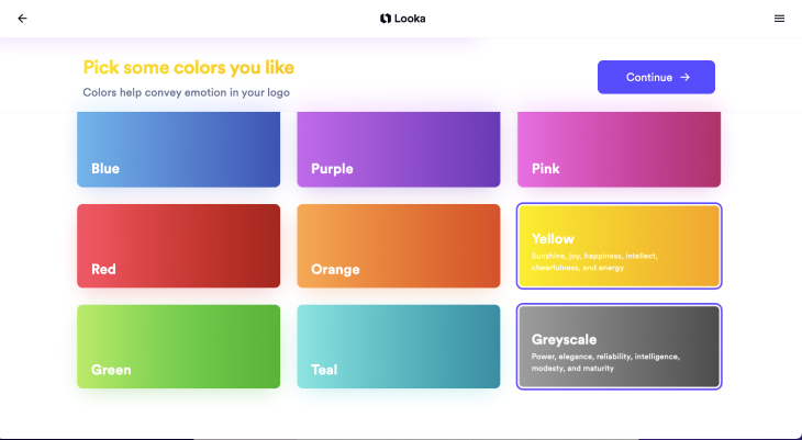
After that, Looka suggests you choose the colors you like:
Then you choose several logos that you like:
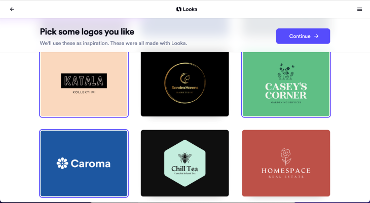
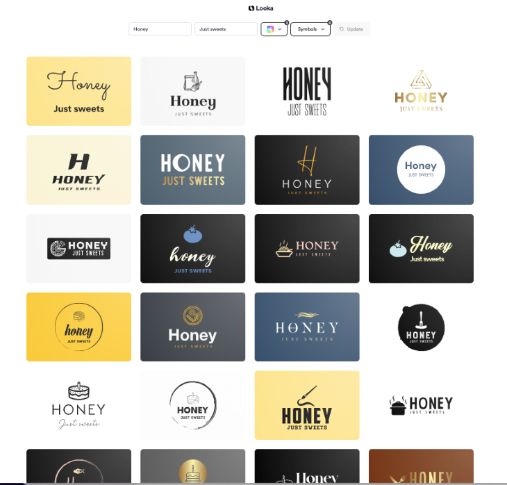
Finally, Looka generates logo ideas for your project!
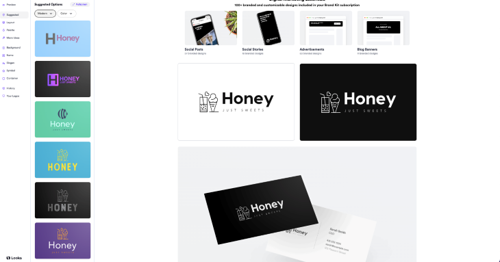
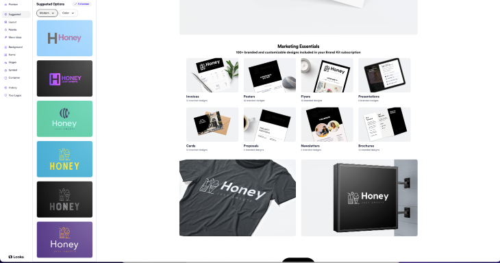
When you select a logo you like and click on it, you can see what your branding will look like. It’s a cool way to envision branding possibilities:
Typography is crucial for web design not only because of its visual aspect but also because it influences accessibility, branding, and user experience in general.
Choosing successful fonts for a website requires time and careful research. Previously in this article, I wrote about ChatGPT as a tool to find ideas on successful fonts for a particular design task. Now, I want to tell you about the tool that can help you visualize font pairings very quickly.
Fontjoy is the perfect tool to discover font pairings in seconds:
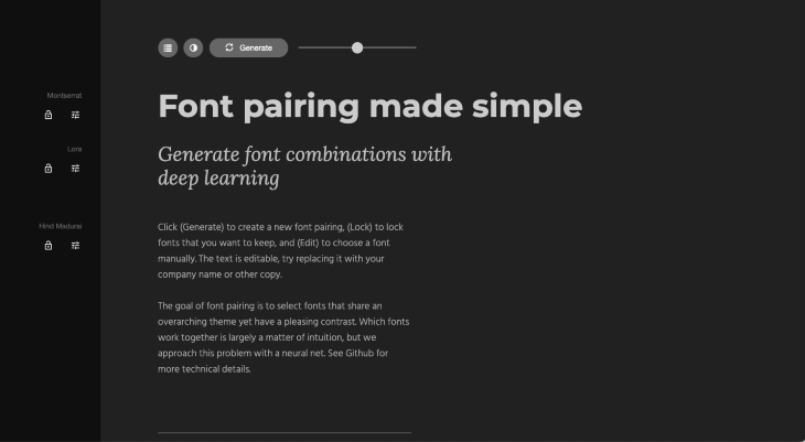
It’s incredibly user-friendly — simply click the Generate button, and Fontjoy will instantly provide you with a harmonious font pairing. You can also fine-tune the results manually by adjusting some of the fonts to achieve the desired look for your project. Fontjoy’s simplicity makes it accessible to designers of all skill levels.
You can check out how easy it is to use Fontjoy through my video demo:
Library | Loom – 11 September 2023
No Description
AI-powered design tools can give you a lot of inspiration, simplify time-consuming processes like research, and even teach you new skills.
I hope you’ll try some of the tools I wrote about in this article, and discover even more creative AI tools to implement in your workflow. Share your findings with your team to make a design thinking process enjoyable and innovative!
LogRocket's Galileo AI watches sessions and understands user feedback for you, automating the most time-intensive parts of your job and giving you more time to focus on great design.
See how design choices, interactions, and issues affect your users — get a demo of LogRocket today.
A three-week mobile banking project taught me that the “proper” UX process is not always realistic. Sometimes, the better approach is to work with what you know, identify what you still need to learn, and make the strongest decision possible under real constraints.
A/B testing compares two versions of a design to see which performs better with real users. Here’s how UX teams can use it to test hypotheses, measure outcomes, and make smarter product decisions.
This case study shows how one ad experience redesign increased total ad exposure while lowering perceived friction, proving that timing and context can matter more than raw interruption.

As products evolve into ecosystems, navigation becomes a system-level challenge. This article explores how to align structure, context, and user journeys to create seamless movement across tools without confusion.