Bottom sheets have become a staple in mobile interfaces, offering a flexible and intuitive way to present additional content without having your user navigate away from your main screen. Not only that, bottom sheets help reduce cognitive load and improve your loading and rendering performance compared to traditionally navigating to a new page.
However, because handheld devices have limited screen space and rely on touch interactions, they can be difficult to use. To help you overcome this, the following article outlines what a bottom sheet is, when and why they’re useful, and how to make them as accessible as possible.
Editor’s note: This blog was updated 28 May 2025 by the author to provide the most up-to-date information, expand on benefits of bottom sheets, and discuss the differences between modal and non-modal bottom sheets.
A bottom sheet is a dialog that slides up from the bottom of the screen, filling up the entire horizontal space. While traditional dialogs appear in the center of the screen (not touching any of its sides), bottom sheet dialogs touch the left, right, and bottom sides of the screen.
They’re typically modal but can be non-modal. Similarly, it’s a UX pattern that can be used on desktop but certainly has more advantages on mobile:
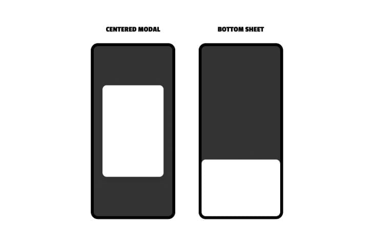
The main UX benefit of bottom sheets is that they provide more space than traditional dialogs, since they snap to three out of four edges of the screen. Alongside this, traditional dialogs don’t work well when they’re designed to be scrollable, whereas scrollable bottom sheets tend to work a little better. Bottom sheets also provide greater visibility of the main document so that users can see where they are in the main document and get back to it without having to reload the page.
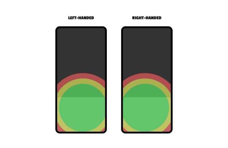
If the user’s thumbs are near the bottom of the screen, a bottom sheet can be easier to interact with than a centered dialog:
However, if the user’s thumbs are near the top of the screen (e.g., because they just clicked on something at the top of the page), consider using a top sheet instead:
Modals are dialogs that, when open, render the main document inert, essentially causing the dialog to feel like a new page, even if users can still see the main document behind it. Naturally, users won’t be able to interact with the main document while the modal is open — this is called a focus trap because the goal of a modal is to trap users in the current context until the modal is closed.
Software development has advanced enough that the implementation of modals is quite simple now, but you’ll need to remember to design a translucent backdrop to obscure the main document (to convey that it’s inert). Modals should also have their own heading hierarchy because, remember, they’re like pages within pages.
None of this is needed for non-modal bottom sheets. Use a non-modal bottom sheet when the bottom sheet needs to be paired with the main document (think: mobile Google Maps when the “place” bottom sheet is paired with the main document that shows its location on the map).
Like with all UX patterns, it’s important that users are able to engage with bottom sheets easily and quickly. Keep reading to learn how to design a bottom sheet UX.
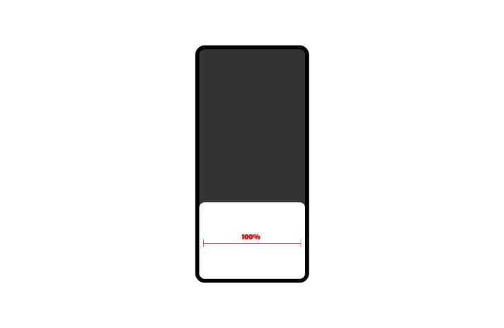
To ensure that the bottom sheet has as much breathing room as possible, use all of the horizontal space and snap the bottom sheet to the bottom of the screen:
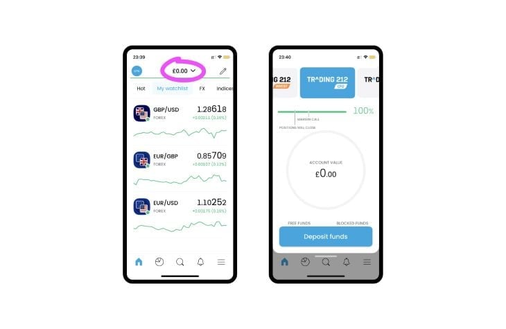
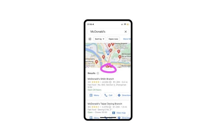
Bottom sheets can be interactive and dynamic. Google Maps is an example of this, where the bottom sheet provides information about places and the main document shows their location on a map, which remains functional and interactive.
The bottom sheet is resizable, indicated by a horizontal line near the draggable edge. Without this line, users might assume that it’s not resizable:
Scrollability is implied by the cut-off content rather than by scrollbars, which would require an allocation of space that frankly isn’t available. This isn’t inherently a bad UX practice, but it’s not a good UX practice either:
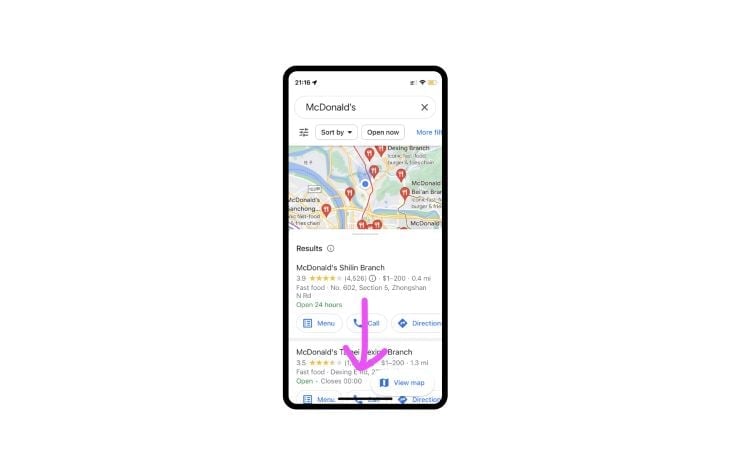
Both of these interactions can be finicky and frustrating, so avoid them whenever possible. As a best practice, you don’t want to have multiple interaction types. For instance, in the example below, are you scrolling, dragging, or clicking?
Sometimes, devices get them all mixed up and make apps and websites really difficult to use. In fact, in this scenario, I often trigger a swipe-up gesture accidentally, which dismisses the app entirely. It doesn’t help that the map is 100 percent interactive too:
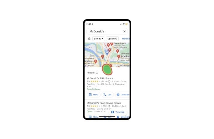
If the bottom sheet is very interactive, it’s probably best to forgo it and just take users to a new page instead. Another option in this scenario is splitting the map and placing information into tabs.
One feature it certainly should’ve avoided is the bottom sheet’s awkward snap-resizing. Snapping is inherently bad because there aren’t any visual cues to communicate what’s going to happen, and to what degree. In this case it provides no benefit to the user at all.
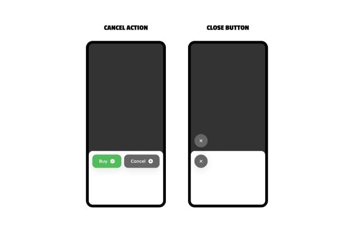
Some bottom sheets will need a close button. Dialogs with binary actions (e.g., buy/cancel) won’t because the cancel action acts as the close button, but informational bottom sheets and other bottom sheets without cancel actions will need a close button.
Since bottom sheets are at the bottom, it only makes sense for the close button to be there too. The place where it’s most comfortable for right-handed users (which is the majority of users) is near the top-left corner — place the close button just above the bottom sheet or within it:
A popular practice is to give modal backdrops (bottom sheet backdrops, in this case) the ability to dismiss the modal, because it’s so large and easy to click. However, users can end up dismissing the modal accidentally and lose their data as a result. Definitely avoid this practice — again, especially if the bottom sheet is scrollable or adjustable, as this increases the risk of accidental error.
The only thing you want to be doing with bottom sheet backdrops (if modal) is obscuring them in some way, like this:
You’ll likely want to include some interaction transitions, not only because they look awesome but also because it makes it clearer to users what’s happened as a result of their interaction.
For a bottom sheet, the most obvious transition is sliding up from below.
In any case, keep the transitions quick and simple. A slowly transitioning bottom sheet will feel frustrating to use, and one that uses complex transitions might feel janky depending on the user’s device.
Between the limited screen space on smaller devices and how finicky dialogs can be, it’s best to keep things simple, especially in regards to interactive elements — how many there are, how big they are, and how close they are together.
The WCAG (Web Content Accessibility Guidelines) clarifies that touch targets should be at least 44 x 44px (although web.dev recommends 48x48px) plus a minimum of 8px distance between touch targets. Here’s a great example with great usability:
The worst-case scenario is the aforementioned Google Maps example, which is extremely convoluted. Almost everything on the screen is interactive in multiple ways, which causes frequent, frustrating misclicks.
If you add this to the fact that everything animates, you end up with a constant fear of doing the wrong thing and losing information. It’s a very unpleasant experience, especially on older devices that have trouble rendering the animations and interactivity.
Bottom sheets (and other dialogs) aren’t really included in the navigation history. Enabling users to navigate with a back and forward button and save any user data while doing so typically requires complex code.
Well-known examples of bottom sheets and dialogs in general (Pinterest, Twitter, etc.) have since switched to a more traditional paged navigation flow, which is telling. So again, design simple bottom sheets and go with other UX patterns for more complex needs.
All-in-all, bottom sheets can be a better alternative to centered dialogs (and also drawers). By snapping to the bottom of the screen (conveniently where the user’s thumbs are), and also using more of the horizontal space, bottom sheets can feel like a page-in-page experience with reduced cognitive load. This enables users to complete their task quicker and without having to “give up” their place in the main document.
To ensure that bottom sheets have the intended effect, make sure to use all of the horizontal space, use visual cues to communicate interactivity (but limit interactivity overall), use subtle transitions, and go easy on the amount of content. In short, keep them very simple.
If you enjoyed this read and/or have something else to add, please feel free to do so in the comment section below, and thanks for reading!
Header image source: IconScout

LogRocket's Galileo AI watches sessions and understands user feedback for you, automating the most time-intensive parts of your job and giving you more time to focus on great design.
See how design choices, interactions, and issues affect your users — get a demo of LogRocket today.

Learn what makes a great login screen through real-world examples and UX best practices for creating secure, accessible, and low-friction authentication flows.
Skeuomorphism helped define early digital interfaces by mimicking real-world objects to make technology more intuitive. Learn how it compares with flat design and neumorphism, why it declined, and where it still has a place in modern UX.
Memos don’t have to be complicated. Just keep them clear, concise, and focused on actionable items. More on that in this blog.

AI has made polished, confident content easy to generate, but that does not make it trustworthy. This article explains how UX teams can design stronger quality signals using source transparency, validation, confidence communication, and reputation.

 Learn more →
