If you’ve ever left a website because you got stuck at the sign-up, chances are the form was to blame. In fact, complications — often due to poor design — account for more than 67 percent of UX form abandonment. And every abandoned form is a missed opportunity for conversion.
Forms aren’t just data collectors; they’re the bridge between users and their goals. Whether it’s signing up or purchasing an item, users must navigate forms to reach their goals. With that in mind, Form design must be strategic, intentional, and, above all, user-centered.
This guide shows you how to design high-converting forms — including everything from form anatomy and best practices, to the tools you can use to create frictionless forms.
But first, why should you even care about how you design forms?
Editor’s note: This blog was updated 4 April 2025 by Chinwe Uzegbu to ensure information is up to date and provide new insights relevant to designers in 2025. For a visual tutorial on how to upgrade your form design, check out our YouTube channel:
Think of form design as the art of making it easy for users to enter and submit information. Every input field, label, and button plays a role in guiding users seamlessly through the process.
Remember, a user typically encounters forms at crucial points in their journey, like during account registration, payments, and when contacting customer support. This means that a well-designed form can literally be the difference between a happy customer and a lost conversion.
But, make no mistakes, a well-designed form is more than just aesthetics — it directly impacts how users interact with your product in the following ways:
A well-crafted form, no matter how simple, should include four key components: actions, descriptors, input controls, and feedback mechanisms:
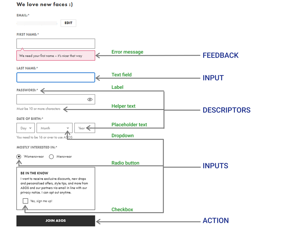
These are the system’s responses to a user’s inputs. Their main purpose is to guide users and reduce submission errors. Feedback can show up in any of these forms:
Inputs are interactive elements that allow users to enter their data. Depending on the specific information you need, here are some inputs you can use:
Descriptors provide the context and guidance that help users understand the information needed and how to enter it correctly. They can take various forms:
An action is the button or link users interact with to submit a form or proceed to the next step. It can represent a final action, such as “Login” or “Sign up,” or serve as a way to guide users through a process, like “Next” or “Previous buttons.
In UX design, forms come in various types. The type of form you need to design depends on the goal of the interaction, the complexity of the information you want to collect, and the user’s journey.
Sometimes, a short form with just a few fields will do. Other times, a more complex form with multiple input fields, steps, and even pages is necessary. But your forms will typically take on any of these three structures:
These forms are usually short, containing just a few input fields and an action button. They allow users to enter their information and submit it in one step. If the input is correct, the system processes it and moves the user to the next screen.
Simple forms are ideal when only a small amount of information is needed, such as for login and sign-up, newsletter subscriptions, contact forms, and one-step checkouts.
These are a series of connected simple forms that guide users through a process one page at a time. Each page has its own set of input fields, and once completed, the user moves to the next page with new inputs.
Wizard forms usually have a single call-to-action button at the end, with navigation buttons on every page that let users move forward or backward as needed. They also save progress along the way, so users don’t lose their information if something goes wrong.
These forms are perfect for multi-step processes like job applications, user onboarding, and e-commerce checkouts:
Navigable forms are similar to wizard forms, but instead of presenting each section on a separate page in a strict sequence, they display multiple steps on a single page, expanding or collapsing sections as needed.
Unlike wizard forms, navigable forms let users access different sections in any order. They often use UI elements like accordions or side navigation tabs to toggle between form fields seamlessly.
These forms are handy for complex, multi-step processes that may take more than one session to complete.
Now that you know the components and types of forms, implement these 10 best practices for effective form design.
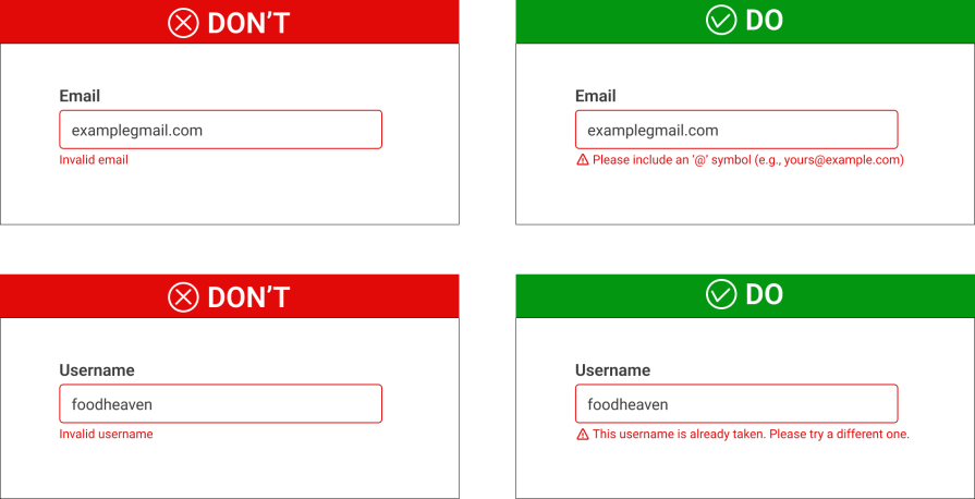
Did you know that form length is one of the top reasons users abandon forms? To keep users engaged, only ask for the essentials. For example, do you need their phone number right now, or can it wait?
In cases where it’s absolutely necessary to have multiple input fields, consider using progressive disclosure to keep things simple.
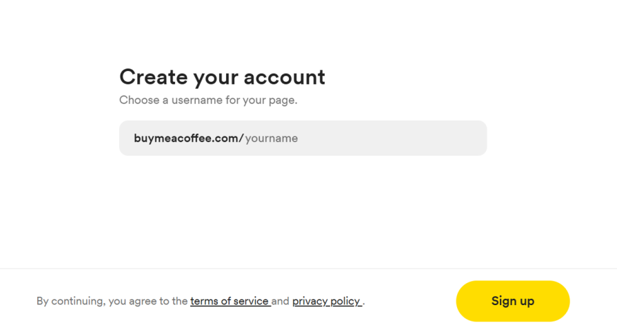
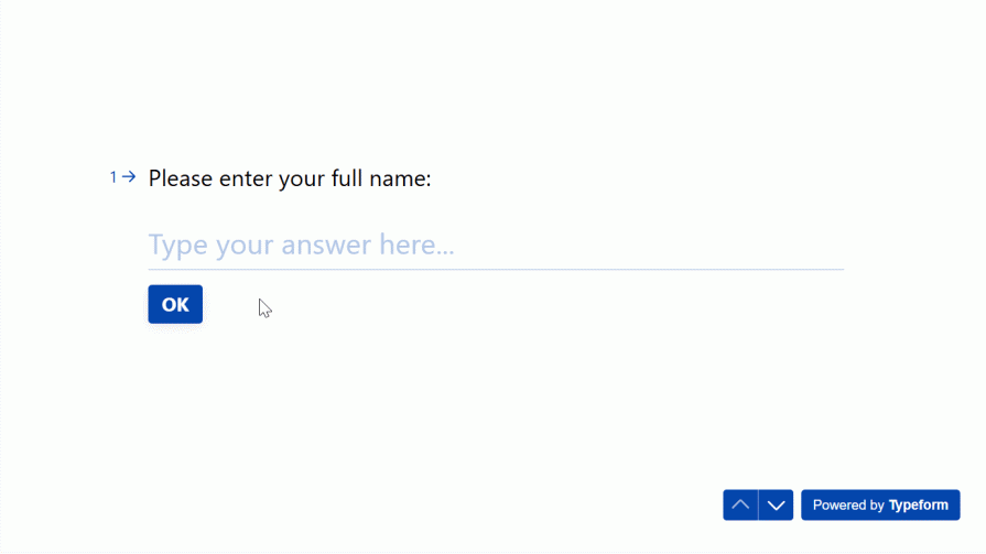
This form from Buy Me a Coffee keeps things super simple with just one input field and a clear CTA:
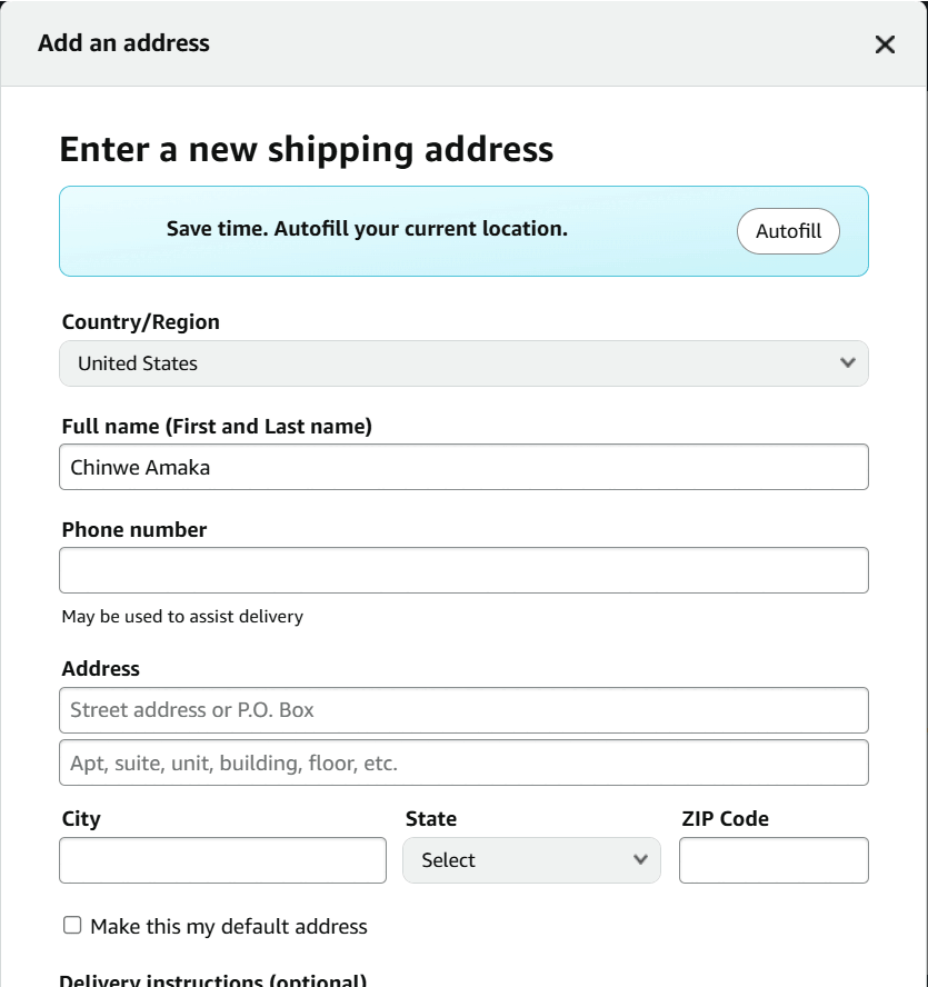
Another way to make forms simpler is by leveraging AI. Smart AI features such as autofill, speech-to-text input, error detection and correction, and AI-powered form personalization can reduce the time users spend on forms. Here’s how:
This example from Amazon uses AI to automatically populate the address fields based on the user’s current location:
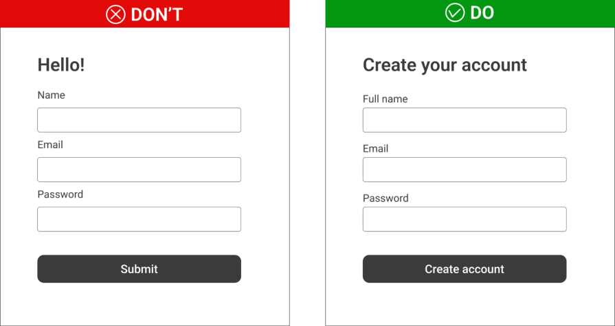
Labels help users understand what the elements in a form are for. For example, input field labels let users know what information they need to enter, while button labels indicate the actions they’re about to take.
A good label is concise, descriptive, and close to the corresponding input fields. For example, instead of a vague label like “Submit” or “Complete,” use action-driven language that tells users what they’re doing, like “Sign up” or “Create account:”
Placeholder texts are great descriptors. They help prevent input errors by providing hints that guide users. But here’s the thing: they should never be used as the only source of guidance.
Once a user starts typing, the placeholder disappears. Without a clear label, they might lose track of what they were supposed to enter. That’s why you should always pair placeholders with labels. For example, if the label says “Date of Birth,” the placeholder can be “MM/DD/YY,” to indicate the correct format.
In cases where the label itself is descriptive enough to guide the user’s input, you can skip the placeholder altogether.
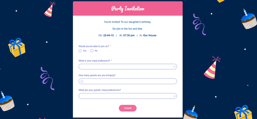
Information chunking by grouping related elements is a great way to reduce cognitive load on users. This allows users to process information in manageable chunks rather than as scattered, disconnected pieces, making the form easier to understand and complete.
It allows users to mentally process one type of information (e.g., personal details) before moving on to the next (e.g., payment information).
Airbnb’s booking form uses visual separators to organize content into sections:
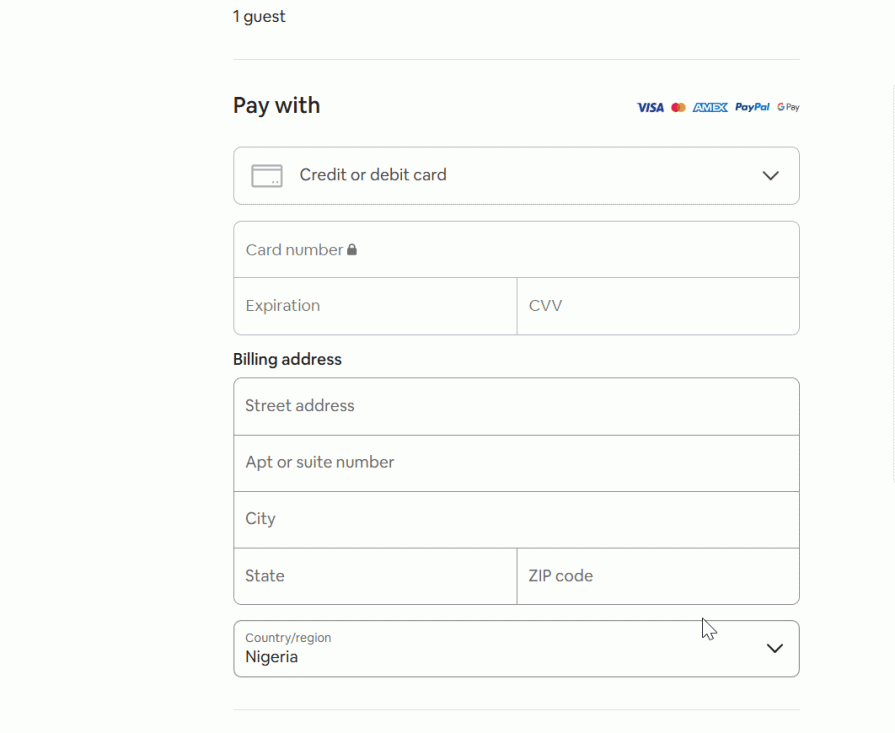
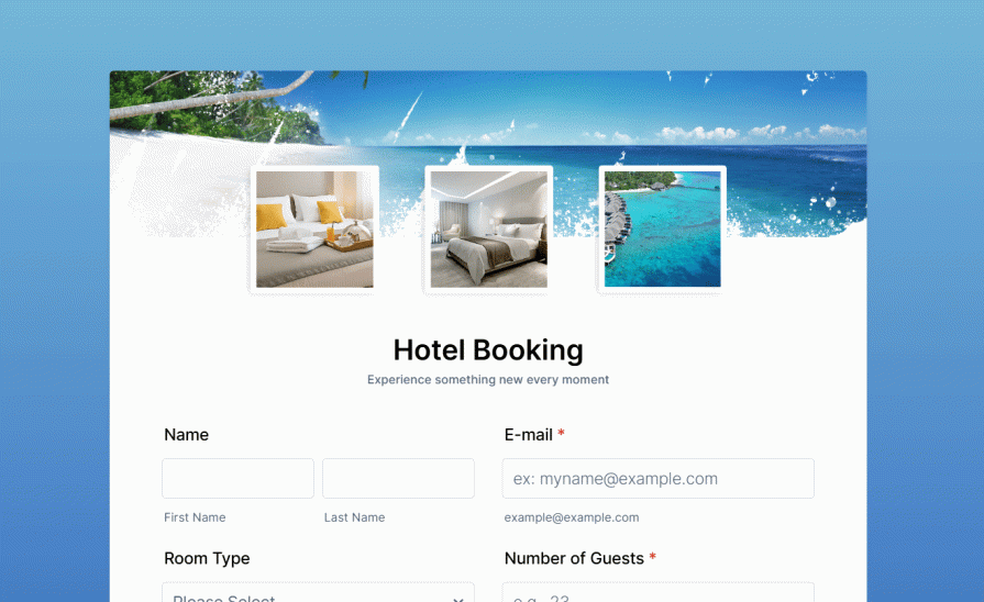
You might not realize it, but your form’s layout has a huge impact on how easy it is to fill out. A single-column layout guides users in a top-to-bottom progression, which is a natural reading pattern.
Multi-column forms, on the other hand, force the eyes to move horizontally and then vertically. Worse still, users might struggle to determine the correct order of fields, leading to increased cognitive load and slow form completion.
This is even more of a problem for users with disabilities, particularly those using screen readers. As screen readers navigate forms linearly, a poorly-structured multi-column form, without the correct tabindex order, can disrupt the flow and confuse users.
Yes, it’s possible to maintain accessibility with multi-column forms — if they’re well structured. However, it usually requires more effort to design and code. So, whenever possible, stick to a single-column layout. If you must use multiple columns, ensure the flow is logical and compatible with screen readers.
Even with great designs and clear instructions, users are still humans and make mistakes. How you handle these errors determines how much of a setback they become.
Ideally, a solid error message should:
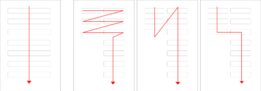
For example, instead of using a generic message like, “Oops…something went wrong,” a better alternative would be, “We couldn’t process your request. Check your internet connection and try again.” The second version is specific about the issue and lets the user know how to fix it.
Even after nailing your error message, how you display it can affect its effectiveness. Be sure to:
Do you know what’s even better than effective error handling? Preventing the error from happening in the first place.
Error prevention is a key part of effective form design. By giving users clear, helpful guidance upfront, you help them get it right the first time and avoid frustration. Here’s how you can reduce the guesswork and ensure accuracy:
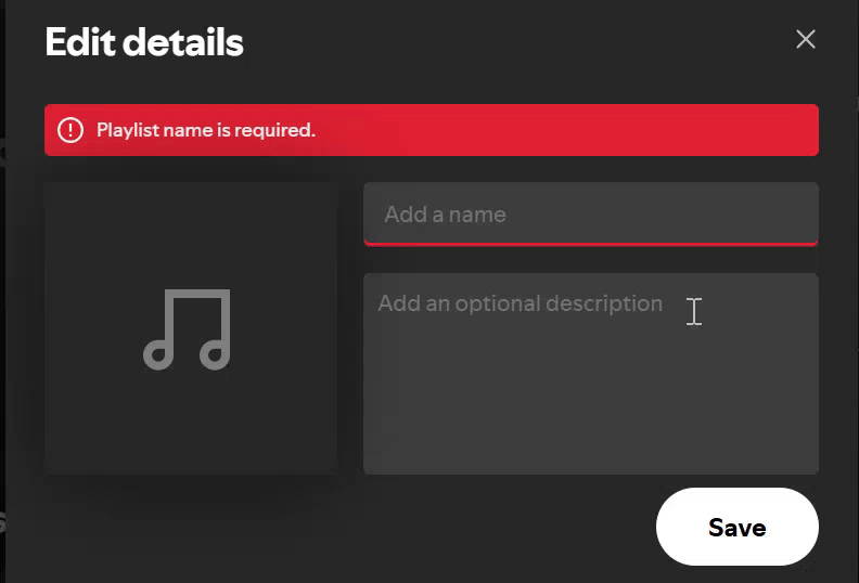
Another key way to prevent errors is inline validation — providing real-time feedback as users enter their input, and letting them know immediately if they need to correct something.
For example, if a user is typing their data in an incorrect format, the form immediately flags the error and lets the user know what’s wrong:
Even the most well-designed forms lose their value if they exclude certain users. Accessible design ensures that everyone can engage with your forms without barriers, regardless of ability.
Here’s how to eliminate barriers and create more accessible forms:
With mobile devices accounting for over 62 percent of web traffic, mobile-first design is no longer optional — it’s compulsory. Here’s how you can design forms that are intuitive, efficient, and accessible on smaller screens:
Modern form-building tools can help you create beautiful, functional forms too. This section covers some of the most popular ones you should consider as a UX designer.
Typeform is an online form-building and survey platform designed for creating interactive forms, surveys, and quizzes. With its form builder, you can create intuitive forms from scratch or existing questions, or even let AI generate questions.
After creating your form you can share it via a link, embed it in an email, or add it to your website seamlessly.
Zoho Forms is an online form builder that lets you design customizable forms, gather data, and manage submissions. Whether it’s a basic sign-up form or a more complex application form, Zoho lets you create it from scratch or customize a predesigned template to suit your needs.
After creating your form, you can share it as a link or embed it on your website.
Jotform is an online form builder that allows users to create custom forms and surveys without coding skills. You can design your forms from scratch or select from a library of over 10,000 premade templates.
It offers a wide range of features such as AI-powered conversational forms, autofill, fillable PDFs, and more.
Forms are an inevitable part of online interactions. While filling them out may never be delightful, thoughtful design can make them feel less like a chore. As a designer, you owe it to your users to create forms that guide them effortlessly toward their goals.
This guide has extensively covered best practices to help you create high-coverting forms. But if you remember just one thing, let it be these key takeaways:
And just in case you need a headstart, tools like Typeform, Zoho Forms, and Jotform offer powerful features for designing beautiful and functional forms. With these insights and tools at your fingertips, there’s no excuse for a poorly designed form.

LogRocket's Galileo AI watches sessions and understands user feedback for you, automating the most time-intensive parts of your job and giving you more time to focus on great design.
See how design choices, interactions, and issues affect your users — get a demo of LogRocket today.

AI has made polished, confident content easy to generate, but that does not make it trustworthy. This article explains how UX teams can design stronger quality signals using source transparency, validation, confidence communication, and reputation.
Inclusive design is evolving beyond accessibility alone. This guide explains how UX designers can create more inclusive products through usability, accessibility, neurodiverse UX, adaptive personalization, multimodal design, and culturally aware product experiences.

I was working with an intern on a UX research project, and before we even started, we both had private […]

AI has accelerated design execution, but speed can come at the expense of intentionality. Learn how UX teams can preserve product thinking and judgment.

 Learn more →
