Mobile phones have been around since 2008, when Steve Jobs introduced them to the world with his now ubiquitous iPhone. Today, nearly everyone owns at least one, and sometimes even two, smart mobile devices, which they use extensively every day for both work and personal use. Given all this data, as designers, we need to know how to design a seamless experience to give the user the best interaction they can have with their small (but effective) devices.
Editor’s note: This article was rewritten by Edward Chechique on 20 March 2025 to ensure the most up-to-date findings and provide new insights relevant to designers in 2025. It covers the fundamentals of designing an application for a mobile app to give your user the best experience.
When it comes to differences between desktop and mobile, the most noticeable factor is real estate. However, there are more parameters that affect the way people use mobile phones. It’s critical to remember that:
When designing for mobile, you need to consider these differences. Most guidelines are based on these points. For example, mobile buttons are larger because you use your fingers instead of a mouse.
To make this article easier to read and understand, you should be familiar with the following key design terms:
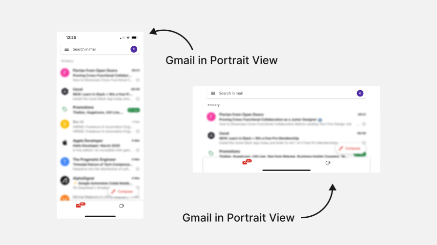
In contrast to desktop users, mobile users use mobile in horizontal and vertical orientations, and many applications support both.
Depending on your case, you may want to adapt the design to both. For example, if you design an email app, you can allow users to use it in vertical and horizontal modes.
However, in some cases, you may want to force the user to keep it in horizontal or vertical modes.
For example, a gaming app might need a horizontal view for a better experience. On the other hand, a reading app might be better with a vertical view.
If this isn’t your case, make the app work in both orientations, giving users the choice:
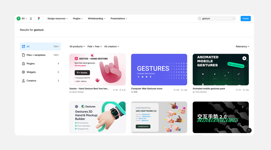
Mobile design requires knowing gestures, like swipe, pinch and spread. This is the “language” designers use when using an app on a mobile, and many solutions are based on these gestures.
For responsive websites, it’s less critical because there are fewer functions. However, when adapting a desktop app to a mobile, these gestures are crucial for interaction.
The most popular gestures include:
One more tip: If you need to explain a gesture to the developer, you can select a file from the Figma community that shows all the gestures:
In 2025, the two most common operating systems for mobile are iOS by Apple and Android by Google. Although many best practices are the same, there are some differences you need to know:
When mobile design entered the world, responsive design helped you adapt a design to a different bunch of interfaces. This meant that no matter what size your phone was, the design adapted to it.
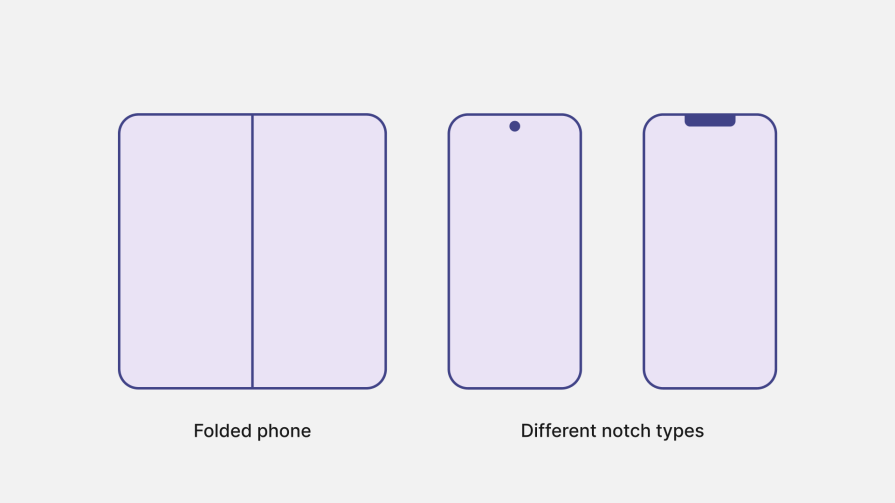
But, with time, mobile displays changed. Today there are mobiles with a notch on the top, folded mobiles, and apps that can open two different windows on one screen. Because of this, the design isn’t about the device size, it’s about what the user sees on the screen.
To explain it one more way, adaptive design uses an advanced grid system to make the experiences unique for each device, so it maintains usability and aesthetics across devices.
For example, if a friend and I have the same mobile size and we open the same app but his device has a notch, the design must adapt for his device because if not, he’ll miss part of the screen, so the design must take it into account when designing for mobile. Again it’s not only about the device size, it’s about what the user sees on the screen.
Because of this change, it’s become more complex to design for a large number of devices. This is where I think AI will come into play.
Shortly, I believe code will be written for specific devices. Designers will create general layouts, and the code will adapt to each device based on certain rules. This will make the experience tailored for each device automatically.
One topic that I predict will grow soon is applications that adapt exactly to the user’s specific needs.
For example, if you write emails and use a specific but not very common button on the app many times, the app will automatically recognize it. It’ll suggest you add it to a priority place in the interface so you have an experience tailored to your needs and preferences.
Let’s take Microsoft Excel as an example. It has many buttons on the screen that you don’t use often. Over time, the AI will study how you use the app and customize the menu to fit your needs. This will clean up the interface and create a unique experience for you.
Another example is if you use your phone and switch to dark mode every night. The app can detect this and suggest automating it, making the app work like an assistant to improve your experience.
AI-powered layouts can change how apps look based on what you like. For example, if you like reading in the morning, a social media app can show you more text. If you like watching videos at night, it can show you more videos.
This already exists in some ways, like TikTok’s algorithm that knows what you want to watch. It will grow and become more common in the future as companies use more AI.
In the past, designers had to create new screens for different devices like desktops, mobile and iPads.
Today, this process is starting to become easier. Many designers build the UI kit with components that automatically adjust to different screen sizes. Then they just need to select the layout, and the components are built for various sizes. This is possible due to the advanced Figma components and variables feature.
The next step is that AI will build the screens for us, creating different design sizes with one click. We can do this with Figma AI but also with tools like V0 and Lovable, which generate code that adapts to different devices. This means designers will check if the design is correct, rather than moving all pixels.
My prediction is that AI will design very specific layouts for each user. The designer will not be deeply involved in this process:
When it comes to designing for mobile, remember the following best practices to design more effective interfaces:
Use the correct image size and resolution for images in your app — not too big but not too small. This will improve performance and ensure visuals load quickly. Whenever possible, use SVG files for icons and logos, as they load faster and adapt better to different sizes.
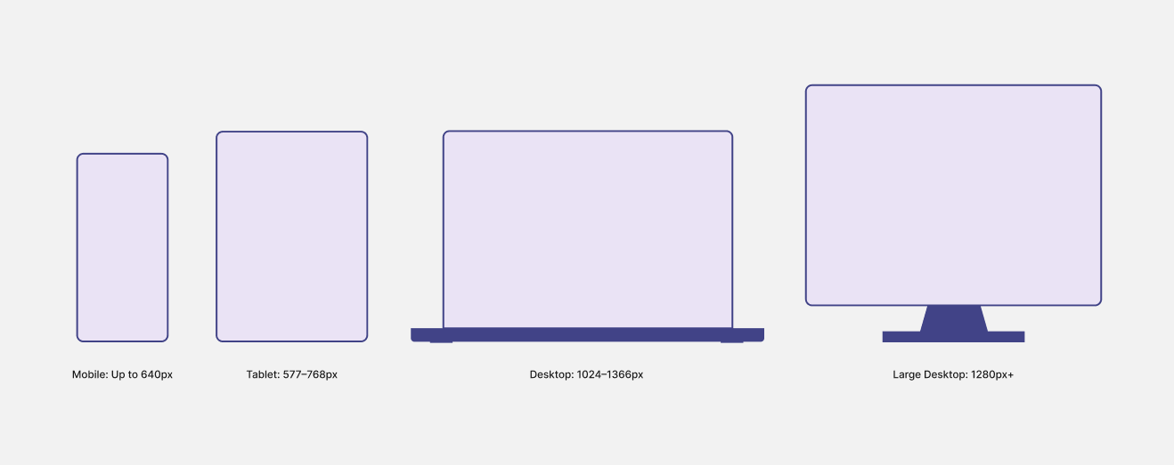
To create a fluid mobile design experience, you need to set breakpoints for the screen. This means the design will adapt to the size of the user’s device. You can use many different breakpoints, but the most common are large desktop, desktop, iPad, and mobile.
Here are some examples:
Mobile space is limited, so don’t overload it with information. Show only what’s needed for the user to complete their task. For example, if you create a bank account page to transfer money, include only the necessary functions like where to send the money, the amount, and a send button. Don’t include a mortgage info button.
A good technique is progressive disclosure, which shows people only the information they need at each step.
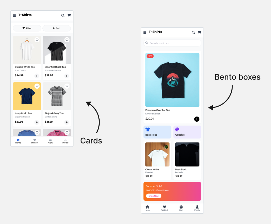
Many apps use cards to make info more organized, like in ecommerce. This makes the interface look more organized and manageable for the user. A common trend now is to use the bento grid. This technique is inspired by Japanese bento boxes and helps divide information into different cards or groups:
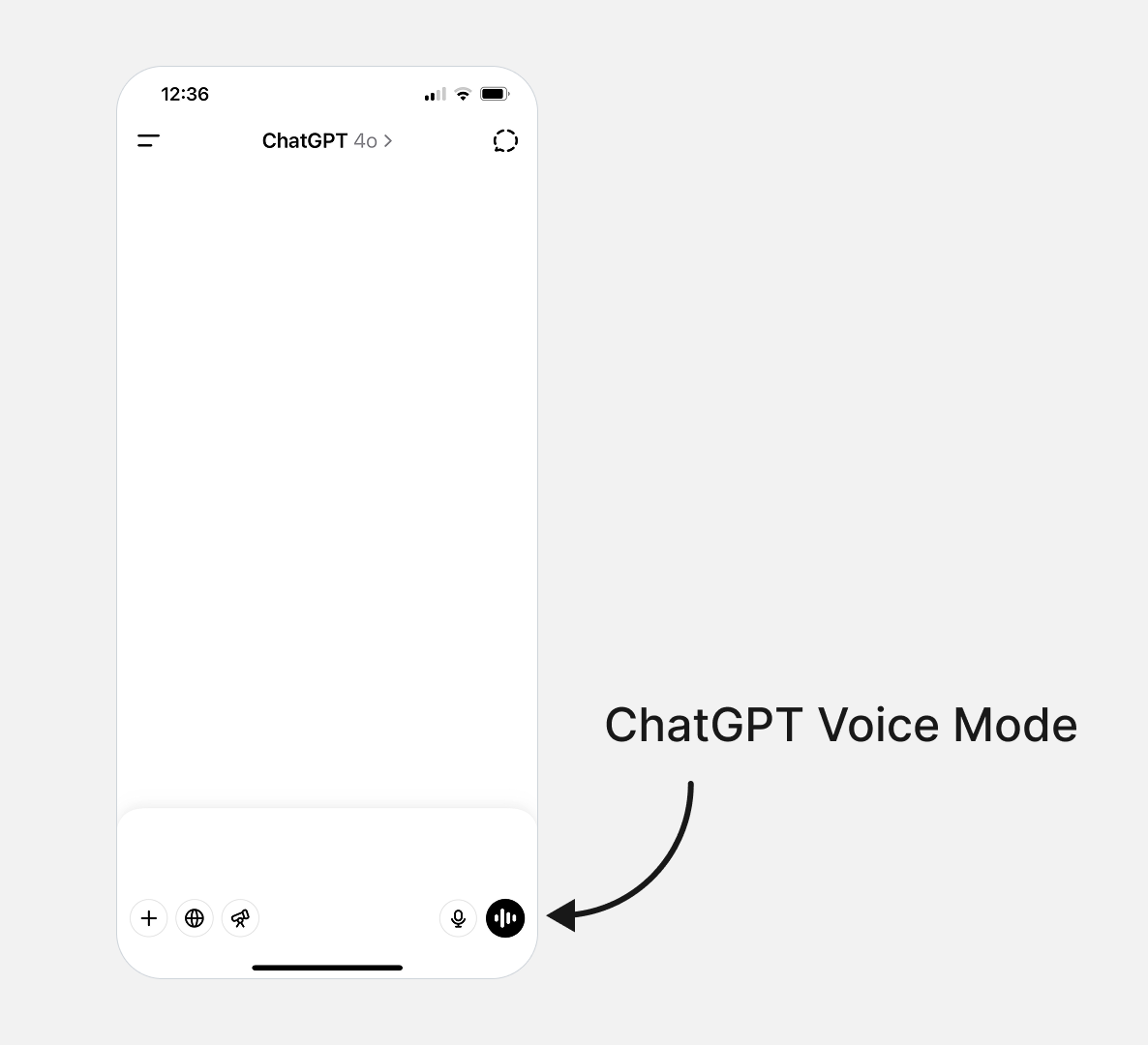
One of the new ways to use mobile phones is to speak instead of typing. Voice was already growing in popularity, but with the new advances in AI technology, this solution has become more and more popular.
For example, the voice option in the ChatGPT app lets you talk to the chat instead of searching Google for information. Many people also use the iPhone 16 action button as a shortcut for this option because it makes using the iPhone easier. Instead of opening the phone and searching for information, they click this button and chat with AI:
Because mobile devices come in many different sizes, it’s necessary to test on a variety of models to ensure the app looks right on them. You can do it manually with mobile devices in the office, but also use specific solutions for this task.
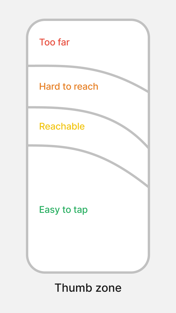
The thumb zone is the area on the screen where the user can interact with their phone the easiest.
It usually ranges from 2.4 cm to 3.9 cm from the screen edge. When phones were small, this wasn’t a big issue, but as phones got bigger, it became more important. This means the most important actions like navigation should be in this zone to make it easier for users to use their phones and complete tasks:
Lazy loading means that information not visible to the user isn’t loaded until the user scrolls to see it. This saves time when loading the page, so the user doesn’t have to wait for the entire page to load before seeing the information.
Mobile displays also come with unique accessibility concerns. To help mitigate them ensure that you:
When designing for mobile, remember to adapt typography for accessibility. Sometimes, you can use the same size as on desktop or mobile, but sometimes, you need to adjust so users can read the information easily.
You don’t need to reinvent the wheel. Follow the guidelines. For example, Apple’s guidelines recommend a minimum typography size of 17pt for body text, while Google Material Design suggests a minimum of 14pt. Of course, it also depends on the typography because some types need to be larger, but others can be smaller.
When using colors, follow the WCAG guidelines. The contrast between elements should be at least 4.5:1 for normal text and 3:1 for large text. This makes sure users can read the information easily. You can use Figma plugins like Stark to check the contrast.
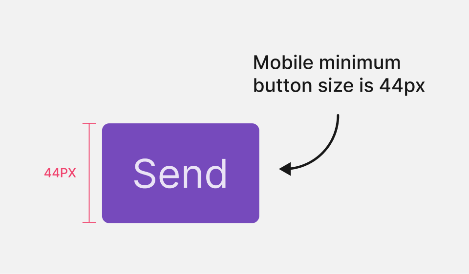
Mobile users use fingers, so elements need to be large enough for users to click on them. For example, Apple suggests buttons should be at least 44 x 44 points. The WCAG says they should be at least 44 X 44 pixels:
Screen readers are tools that help people with disabilities use their mobile phones. They allow users to navigate and access information. For example, iOS users can use VoiceOver to have their phones read information aloud, making it easier to navigate apps.
To make screen readers work, use HTML tags and alt text so the voiceover feature can understand the information.
AI has vision capabilities, so we might see more advanced features in the future. AI could read information to users without relying on HTML or alt text, based on what it sees on the screen, providing a more natural experience. Additionally, users might be able to navigate their phones entirely by voice.
This final section covers the most asked questions about responsive mobile UX so that you’re better prepared to navigate your design process.
Responsive AI helps adapt content like apps or websites to different screen sizes. It’s an additional layer that helps adapt not only the size but also other elements on the screen. For example, if an app needs to work on one screen with a notch and another without a notch, adaptive design ensures a good experience on both.
AI directly influences mobile UX design. Rather than typing on the screen, you can interact more with our voice.
For example, if you want to search for something, you don’t need to type anything. You can open the ChatGPT app or use the new Siri AI and talk to it like a normal conversation, and it responds to you.
This means that in the near future, you might have more voice experiences and less interaction with screens by typing on them.
Another thing is that mobile devices will know you better and configure themselves accordingly. For example, if you use a button in a certain application many times, it can move it to a priority place on the screen.
The accessibility guidelines are adapting and changing with time, adding more advances. Today, the most advanced guidelines are the WCAG 2.2 standards. You can visit this page to see all the new guidelines.
Designers can optimize mobile performance by taking some simple steps. These include reducing image sizes to a minimum, using lazy loading for the application, and reducing heavy animations and motion on the screen.
The secret is balance. Add only what’s necessary for the experience — not more and not less.
A helpful trick to experience the speed is to test the application at low internet speed to really feel how the experience is when conditions aren’t ideal.
When approaching responsive mobile design, avoid:
When designing for mobile, it’s very important to test on different mobile sizes to see if the layout is smooth on all devices. Apart from that, remember that today, not only the size is a factor, but also what the user sees on the screen. Some mobiles have notches on the screen, and people also use folded mobiles, not just one mobile size.
This article looked at how designers can design for mobile to give users a seamless experience when using your app or website.
First, you examined how designing for mobile is different from designing for desktop. In doing so, you learned how it’s not just about screen size but also where you use them. For example, you can use your mobile device anywhere, however you need to sit at a table to work on desktop size.
You also learned some basic mobile terms, such as breakpoints, fluid grid, and viewport and considered how users would use your app, whether horizontally, vertically, or both.
Moving forward, remember to keep an eye on the way AI continues to reshape how users interact with devices, especially the increased use of voice commands. As technology advances, interfaces will have to adapt to keep up with user demand.
And as a final tip, make sure that you always consider accessibility guidelines so that as many people as possible can use your app.

LogRocket's Galileo AI watches sessions and understands user feedback for you, automating the most time-intensive parts of your job and giving you more time to focus on great design.
See how design choices, interactions, and issues affect your users — get a demo of LogRocket today.

I was working with an intern on a UX research project, and before we even started, we both had private […]

AI has accelerated design execution, but speed can come at the expense of intentionality. Learn how UX teams can preserve product thinking and judgment.

UX testing is not limited to layouts, copy, and visual design. Full-stack and server-side experiments help teams evaluate how backend logic, APIs, algorithms, and product flows affect the overall user experience.
In A/B, A/B/n, or multivariate testing scenarios, using p-value with traditional null-hypothesis-based statistical analysis is so common, and most designers […]

 Learn more →
