Younger designers often say, “Accessibility is a hassle.” I can’t blame them because accessibility is a vast topic in UX design that very few want to specialize in, even though everybody knows about it.

Compared to UI design, VR, motion design, and all those flashy topics, a list of rules about the minimum size of an element, typography, and contrast seems uninteresting. However, accessibility is not only referred to in every major design system, but it also differentiates an okay design from a great one. We create and follow accessibility guidelines to improve the usability, ergonomics, and global satisfaction of every user.
It also forms a strong basis for answering common questions like, “How big should this button be?” To answer this question and start delving into accessibility, let’s discuss target sizes.
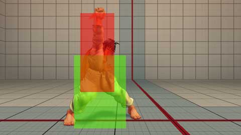
In video games, characters have complex forms on screen, but in the backend of the game, an invisible square surrounds them, defining when the game considers the character in contact with a wall or an enemy. This invisible square is known as a “hitbox.”
There is always a small difference between what appears on screen and the game’s interpretation. Game developers don’t try to perfectly match the hitbox with the characters’ curves but to be coherent between the player’s input and the game’s response. In the following picture, part of the feet and hand of the character extend beyond the hitbox:
The very same logic applies to UI, but when video games tend to make the hitbox smaller than what the players see on screen, in UX we need to make the hitbox larger. A clickable element must behave the same if the user hits the target perfectly or if he misses by a few pixels.
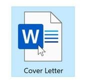
That’s even more important today as most of our devices are touchscreens, used directly with fingers that will hide the target when clicking. On a computer we can see the hitbox of an icon when selected, for instance on Windows when the cursor gets close to a file, it will get a focus even if the cursor isn’t perfectly on it:
On the tactile interface, users can’t see where they are clicking exactly and we get a problem called “fat fingers.” Users with large thumbs will often take too much space by clicking and either miss the target or touch two at the same time.
To prevent this kind of missclick, it’s important to give enough space between two elements. If a clickable element is small, the simplest way to ensure clickability is to put it inside a container acting as the button’s hitbox. By doing so we also ensure that there is enough space between two elements preventing the user from clicking on the wrong element.
Some might question the necessity of hitbox logic, arguing that spacing between elements should suffice. However, there are two straightforward answers to this. First, following guidelines and utilizing containers helps designers determine the appropriate amount of spacing for every component. It’s always nice to know exactly what to do. For instance, if the minimum space required for an element is precisely 44 pixels, this helps in making layout decisions for the page.
The second answer is simply to accommodate users. People often interact with mobile interfaces in challenging environments. For example, if a user is running and needs to check something without stopping, their movements will not be very precise. Similarly, if a user is holding a baby and can’t use both hands to reach an element with precision, small targets will be difficult to hit.
In my personal case, if a user has both hands wet from doing the dishes and clicks with their nose, the target size must be larger than a finger. These scenarios, among many others, cannot be addressed in any other way than by following accessibility guidelines. Additionally, I haven’t even mentioned disabled users who simply cannot interact with an interface if it doesn’t adhere to these guidelines.
What I like about accessibility is that even if it was initially thought to accommodate disabled people, in the end, it ensures better usability for all users, that’s why it’s so important and why many big players have a whole section about accessibility in their guidelines.
The minimum target size that should be used is a very precise problem that required a lot of research by HCI specialists, but once we concluded, it became super simple to know and to use.
The global number to remember is 24. Nothing clickable should be smaller than a square of 24px.
This number is the good practice recommended by the WCAG, a figure of authority in the theme of accessibility. Every recommendation about accessibility was first emitted by the WCAG.
To add a bit of context, what the guideline says exactly is:
“There are two levels of accessibility AA (acceptable) and AAA (really compliant). To meet the first level of accessibility, a target should be within a circle (or a square) of 24 pixel (px) CSS. That’s true for every kind of button, icon, and dropdown menu. Note that there are some exceptions to this rule if there is an alternative button to perform the same action or link in the text. The target, like an icon, can be smaller than 24px as long as the 24px square surrounding it doesn’t intersect with another, which means that it can either function with an effective space or with padding.”
The same rule applies to the maximum level of accessibility (AAA), just change 24px to 44px. Ensuring that every clickable element is either 44px wide or inside a container of a minimum of 44px means that your interface is fully compliant for accessibility.
Now, if we search on Google “minimum target size,” the short answer given will be 44px, not 24px. That’s because we want to promote a fully accessible world and so it’s better to push the higher criteria. And by “we” I mean the major IT companies.
Google’s Material Design recognizes a minimum height of 48 Density-independent Pixels (dp). “For most platforms, consider making touch targets at least 48 x 48dp.”
Google acknowledges that others’ guidelines recommend smaller target sizes but also states that it’s better to try to “accommodate a larger spectrum of users”.
Density-independent Pixels are based on the physical density of the screen. These units are relative to a 160 dpi screen, so one dp is one pixel on a 160 dpi screen, by using dp instead of px UI elements look uniform on screens with different densities.
Microsoft changed its guidelines for Fluent Design in 2018 to switch from 44epx to 40epx. 40 pixels is the smallest advised size in the major IT companies’ guidelines.
Effective pixels (epx) are used to express layout dimensions and spacing, independent of screen density. (In Microsoft’s guidelines, epx, and px are used interchangeably.)
Apple’s iOS asks “hit target” to be at least 44×44 pt, crushing the AAA criteria of the WCAG. Points (pt) are a measure that comes from typography a point is 1/72 of an inch. Using a converter, 44pt= 59px.
Apple is also the one giving the largest recommendations for its brand new visionOS to design for their VR headset: 60pt (80px). That’s because the spatial computing control is less precise than using a cursor or fingers, thus increasing the minimum wide of hit target is a necessity.
The new way to design for Apple’s Vision Pro reflects perfectly the logic of making target size accessible. The 24px and 44px recommended by the WCAG are only here to set a base for developers and designers. It’s a minimum value adapted for standard interfaces. If there is a necessity, it’s necessary to increase this value. Apple knows that the new way to hit buttons by watching them needs larger space and pushes the limits over the WCGA recommendation.
To wrap it up:
| Style | Target size |
| WCGA (AA) | 24px |
| WCGA (AAA) | 44px |
| Fluent Design (Microsoft) | 40px |
| Material Design (Google) | 48px |
| iOS (Apple) | 44pt (59px) |
| VisionOS | 60pt (80px) |
I found two extreme use cases to illustrate the importance of target size. The bad one is on a simple interface with three buttons on iOS 11. The users can’t hit them properly and misclick every time. He ends up using a pen to see the hitbox for each button.
The one on the right takes so much space that it’s still activating when hitting the one in the middle. The one on the left is almost impossible to hit. To use this interface normally, the user should remember to always hit the left of his target. I hope it was just a temporary bug:
Some of the touch targets in iOS 11 are ridiculous
Please support my channel by subscribing ✅
On the other hand, Citymapper has apparently a secret functionality. I say apparently because I couldn’t confirm that myself, but in any case, the idea is nice. At some specific times and days, typically after a heavy Friday night, around 2 am, the layout changes to make the Get Me Home button extra large, in the hope to accommodate exhausted drunk users that need to go back.
If true, they adapted their interface for one specific use case that could impact the user experience and enhanced the button size. This is typically a case of temporary handicap. When drunk, ision is blurry, motricity is limited, and our coordination is really poor. Having one giant button is the best way to keep the interface usable for this kind of situation:
A lot of research had to be done to come to straight numbers that are easy to remember and accessible when designing something. If you are using Figma resources to design following a design system, every component will be made to be accessible, it’s pretty easy to use, but it’s also good to know why it was made this way.
The minimum space needed for an element is 24px, but aiming for 48px can’t hurt and will be compliant with every design system. I think that the advent of spatial computing will push the norm toward the 60pt simply to have UI suited for every kind of device at the same time.
LogRocket's Galileo AI watches sessions and understands user feedback for you, automating the most time-intensive parts of your job and giving you more time to focus on great design.
See how design choices, interactions, and issues affect your users — get a demo of LogRocket today.

Multimodal UX goes beyond designing for screens. Learn how context-aware systems, progressive modality, failover modes, and accessibility-first design create better digital product experiences.

Learn how context-aware mode prioritization and seamless transitions improve multimodal UX and reduce mode confusion.

Research is becoming more democratized, product cycles are accelerating, and AI is transforming synthesis and ResearchOps. Here are the three trends shaping UX research in 2026.
Voice support is not the same as multimodal UX. Here’s how to design systems with true mode continuity and context-aware interactions.