
A hero section is often the first prominent content block on a website. It should help visitors understand the product and choose a next step without waiting for a large image, animation, or video to load.

Every user is unique and has different abilities, so you should design your hero section with accessibility in mind to offer the same high-quality UX for all users, ethically considering their abilities and special circumstances. Moreover, you should optimize its performance to load it fairly fast on low-end devices and slow network connections to create a good first impression, regardless of the user’s device setup.
Accessibility-focused UX design and improving perceived performance are two major strategies to make your hero section accessible and performant for all users.
Key Takeaways
Editor’s note: This article was updated in November 2026 to clarify the LCP benchmark, distinguish field data from lab tests, refine media-budget and WCAG 2.2 guidance, and add interaction, layout-stability, rich-demo fallback checks, related reading, and FAQs for teams reviewing hero sections in 2026–2027.
Design for the implemented page, including narrow viewports, keyboard navigation, and motion preferences:
prefers-reduced-motion with a static alternative. For automatically moving content that lasts more than five seconds alongside other content, provide a way to pause, stop, or hide it, unless the motion is essential. Reduced-motion support does not replace a pause control for other visitors. For implementation examples, see adapting to user motion and theme preferences.
Largest Contentful Paint (LCP) measures when the largest eligible image, text block, or video becomes visible in the viewport. It can help assess a hero’s loading experience, but it is a page-level metric, not a timer for every hero asset or a complete measure of usability.
A good LCP is 2.5 seconds or less at the 75th percentile of page loads, assessed separately for mobile and desktop. It is not an average across devices. The largest element can change with the viewport, so identify the actual LCP element before optimizing.
Google’s PageSpeed Insights documentation explains the data sources and reporting windows.

A hero can look ready while its CTA still responds slowly. For a 2026–2027 refresh, extend the review beyond loading speed to interaction and stability:
Use prototype stress tests to check slow loading, long content, narrow layouts, and repeated actions before sign-off. Judge the finished implementation as well as the prototype.
Designers and developers should agree on loading behavior, accessible controls, and fallback states before handoff. Use these details alongside the hero section examples and best practices to turn the design into a usable implementation:
Reviewing your hero section design specification and actual implementation accordingly, using the following practical accessibility and performance checklist, helps you make your hero section well-accessible and performant for all users:
Video is optional. Use it when motion helps explain the product or supports the message, then test whether that benefit justifies its loading and accessibility costs. A static hero is often sufficient.
| Pros | Cons |
|---|---|
| Can deliver complex, deep messages effectively | Can compete for bandwidth and rendering resources; the effect on LCP depends on the implementation |
| Can convey atmosphere or demonstrate movement | Requires more work on design, accessibility, and performance |
| Can reinforce a product’s visual identity | Can reduce importance of other hero elements if not optimally designed |
Accessibility in hero sections makes your design inclusive and ready for everyone, and a performance-prioritized design makes hero sections instantly visible, preventing user confusion and frustration. Accessible, fast hero sections create trust even before users act, so making your hero section accessible and performant is crucial.
Aim for page LCP of 2.5 seconds or less at the 75th percentile, separately for mobile and desktop. Check the measured element: it may be the hero image, a heading, or another eligible element in the viewport.
No. File size is one input. Server response, resource discovery, network conditions, and rendering work also matter. Treat a byte budget as a starting constraint and validate the page.
Avoid lazy-loading an above-the-fold image that is the LCP element. It can delay loading the main content. Use appropriately sized responsive images and coordinate loading priority with developers.
It can be, but muting it alone is insufficient. Keep essential information in accessible text, provide required motion controls and media alternatives, and support reduced motion. Test controls with a keyboard and assistive technology.
The real-user section aggregates field experiences, while Lighthouse runs a controlled lab test. Differences in devices, connections, caching, and test conditions are expected. Use field data to assess user experience and lab diagnostics to investigate problems.
No. Automated checks do not cover every accessibility requirement. Manually test keyboard access, focus visibility, text reflow, media alternatives, and motion controls, and include users with access needs in research where possible.
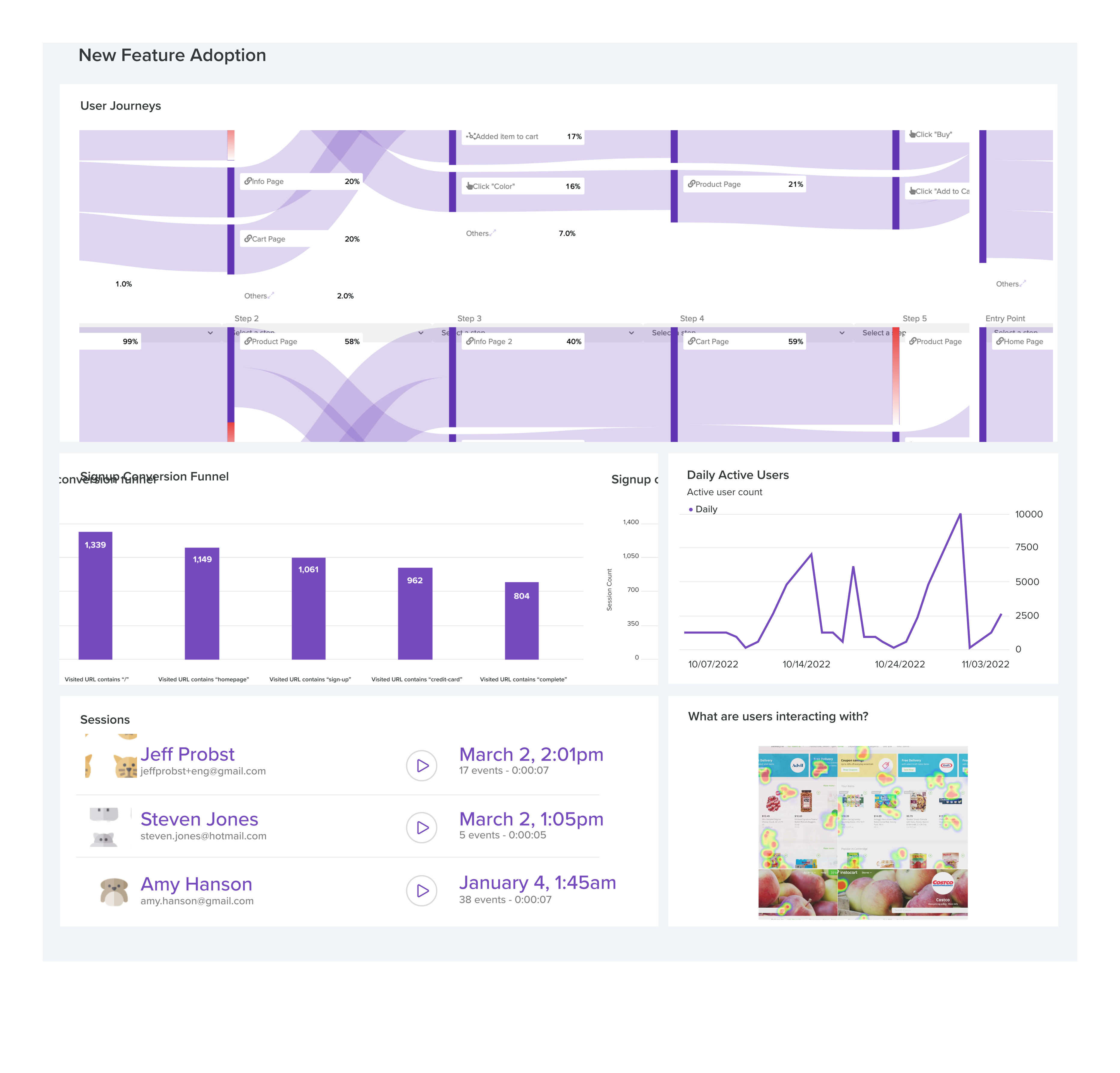
LogRocket's Galileo AI watches sessions and understands user feedback for you, automating the most time-intensive parts of your job and giving you more time to focus on great design.
See how design choices, interactions, and issues affect your users — get a demo of LogRocket today.

AI-generated prototypes can drift from the product you intended to build. Learn how to detect missing requirements, anchor prompts to your design system, and combine AI generation with careful review and manual refinement.
How four Figma AI plugins fit into a UX workflow, from ideation and wireframing to UX writing and design critique. Compare free limits, account requirements, and data handling.
Learn how to size usability tests, interviews, surveys, and experiments based on the decision, the users you need to cover, and the evidence you need.
Design critiques help teams predict outcomes. UX postmortems connect those predictions with what happened after launch. Learn a six-step framework for reviewing assumptions, combining evidence, identifying surprises, and sharing lessons without adding a heavy process.

 Learn more →