The debate about management processes for software development teams is as old as the technology itself, which isn’t surprising. Software development is conceptually complex, intensely collaborative, and requires proficiency in ever-evolving markets, expectations, and technologies. Agile and Lean have long been dominant methodologies and, without getting into the differences between the two, suffice it to say that they each intend to help teams create value as quickly as possible with as little waste as possible.

Process should always defer to context. Rather than conform to a prescribed software methodology, teams should regularly scrutinize their approach to see if it’s working for them — for their product, their customers, and their industry.
Here, I’ll share some rules of thumb I’ve found helpful in my experience as a product designer in both agency and in-house contexts across a range of team structures. These principles aren’t a process in and of themselves, but rather considerations as you practice Lean. And while I have more experience with Lean UX, a design-oriented interpretation of the methodology, these are applicable in Agile environments, too.
Drawing on automotive production principles used by Toyota in the mid century, Lean is a management approach that prioritizes efficiency, iteration, and, notably, hypothesis-driven experiments. Lean is often contrasted with waterfall management approaches where a solution is defined at the start, then designed and built in sequential phases as teams hand off work to one another (the “waterfall”). With Lean, teams accept that they don’t know the solution from the start and treat the product development process as one of continual learning while they test small-scale ideas to determine the best solution given the context and constraints at hand.
Lean attempts to mitigate the risk of investing resources in solutions that may not succeed. In fact, it assumes that most ideas will fail and so emphasizes the need for rapid, iterative development and validation with customers.
Lean UX introduces practices that help teams understand their users; create ideas to test, prototype, and validate these ideas; and decide how to proceed. The methodology encourages cross-discipline collaboration as designers, developers, project managers, and others work together on each phase of the validation process, drawing on their individual strengths and insights, avoiding the fragmentation of work and thinking that often occurs in waterfall approaches.
To learn more about Lean UX, I recommend the Interaction Design Foundation’s “Simple Introduction to Lean UX,” as well as Jeff Gothelf’s Lean UX and, for a broader treatment of the topic, Eric Ries’ The Lean Startup.
Designers’ visual talent is often a strength and a weakness when it comes to solving complex problems. Eager to see and share progress, we are often tempted to immediately begin working in a visual medium, whether sketching ideas, making wireframes, or working with an established design system at high fidelity.
And while it can be helpful to get initial ideas out of our heads, we are inevitably biased by our first creations; subsequent ideas tend to be variations on the initial theme. Better to start with words, which open us to possibilities we may not have initially considered.
Concise, plain language descriptions of the context for a problem, the problem itself, and the proposed solution serve a few purposes. Having to explain an idea to someone else requires us to uncover assumptions about the problem and solution that we may have only been half aware of.
Well-written problem and solution statements also serve as a reference point for evaluating design ideas, requiring designs to meet criteria outside themselves. They are a way for designers to hold themselves accountable for solving defined problems as they work through the design intricacies at hand. I can think of times I’ve spent hours working through a complex interaction design only to realize I veered off into another problem territory entirely.
Whether written documentation takes the form of a product brief, feature pitch, or something unique to your team, it’s important that designers themselves participate in the writing and deliberation itself, because the design process begins long before pixels are arranged on a screen.
And the documentation should be written in a conversational manner; not bullet-point grunts, not the stilted language of user stories. Plain language forces us to avoid jargon and clarify our thoughts.
The Lean methodology emphasizes shipping products as fast as possible to quickly learn what’s valuable and iterate accordingly — to start with and elaborate a minimum viable product.
Yet this applies to features as well as overall products. This means that even discrete features should always be broken down into the cheapest implementations that can be meaningfully used to infer their value to users.
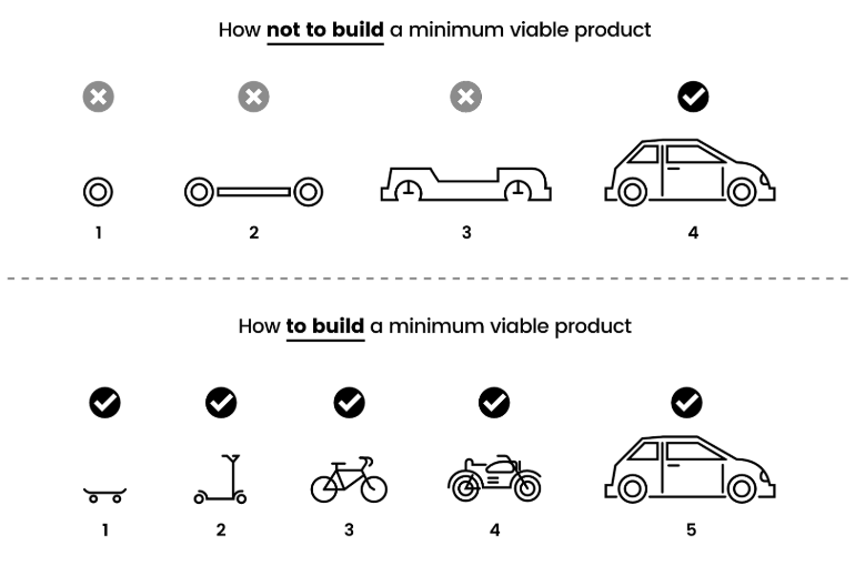
Skateboards are often used as a metaphor for proper MVP development. If your goal is to build a car, don’t start by making a wheel; start with a skateboard to see if and how people use it, then refine it into a scooter, then a bike, and so forth.

Defining solutions at the skateboard level requires designers to get comfortable creating what may feel like incomplete solutions. Yet the upside of this approach is that they avoid time potentially wasted designing motorcycles that no one wants to ride.
For example, say you’re designing an onboarding flow for a writing app and want to suggest templates to new users. You create a set of templates for target audiences and start outlining a questionnaire that asks newly signed-up users about their intended use cases.
It might then make sense to work with an engineer to build the interface and logic for recommending these templates, yet is there a less-expensive way to test whether new users would find these templates valuable? Perhaps an automated email flow that includes the templates could provide clues about what people would truly use. Or maybe surfacing the templates more effectively in the app itself could do the same.
Some features may require extensive design and engineering in order to test their value. However, teams need to remember that every feature is a hypothesis about what will work, and proceeding with small, testable hypotheses is a more sustainable approach (for a product’s finances and team morale) than big, risky investments.
The risk, of course, with the skateboard mentality is that products can become inundated with minimum-valuable features to the detriment of the overall product experience. Call it the skateboard snowball effect.
Any product is defined by the cumulative effect of its interactions. Users may tolerate minimally-valuable features of a product as long as demand for it is high enough. Yet it will become increasingly vulnerable to competitors. Craigslist is a good example of this, its features forever toeing the line of just-good-enough, likely surviving only as long as it remains free.
Sensitivity to skateboard proliferation can help teams determine when to refactor individual or collective features. As inconsistencies or shortcomings accumulate, as they inevitably do, teams can identify tipping points for redesigning, systematizing, and consolidating portions of their product.
One of the insights of Shape Up, a reinterpretation of Lean by the folks at 37Signals, is that work shouldn’t be scoped by estimates but rather by the amount of time a team is willing to invest.
Rather than rely on error-prone estimates, teams should decide how important or valuable a feature is, then spend that time building the best possible version of the feature.
To continue the writing app example, say you want to allow people to suggest changes to a file. A full-fledged version of the feature could take months or more to design, test, and build.
Yet, is it more valuable than other things you could build with that time? Say you decide it’s worth a month of time. The commenting feature built by the end of the month may not be the best possible version of it, but then you have the chance to decide whether to continue refining it or focus on something potentially more valuable.
This way of thinking corresponds with the concept of “affordable loss,” which encourages entrepreneurs to consider investing not based on what they think they stand to gain — results that are ultimately out of their control — but rather based on what they’re willing to lose. Teams cannot control the outcome of their work, but they can control how much time they’re willing to invest.
The core of Lean UX is an emphasis on continuous discovery, the open-minded process of learning what works and what doesn’t. The methodology assumes that we never know enough about a problem space or audience to come up with a successful solution from the start, but rather that solutions emerge through trial and error as teams test product hypotheses.
In his book Inspired, Marty Cagan, in questioning the value of long-term roadmaps, goes so far as to say that “the most important lesson in [product development] is to fall in love with the problem, not the solution.”
Devotion to a problem space, whether in healthcare, education, analytics, personal finance, whatever niche a business serves, is what motivates teams to continue through the difficult work of building, testing, and throwing away good ideas that didn’t solve the problem.
Building minimum-valuable features based on the time a team is willing to invest is one way of mitigating attachment to any specific solutions. But curiosity about a problem, developed and clarified through rounds of tested hypotheses, is a reliable way of seeing the shortcomings of any single solution. Curiosity is the basis for critical thought, helping us to find our way forward to the next possible solution.
Regardless of the product process your team follows, it should be flexible enough to help you prioritize the next most valuable thing to work on while providing enough structure to allow your team to operate in sync with the rest of the organization. This requires a significant amount of autonomy, and only works in environments where teams are trusted to test ideas that will, in all likelihood, fail, and to learn accordingly.
Cultivating this kind of psychological safety in an organization is a difficult yet invaluable task. But the alternative is the kind of close-mindedness that Lean UX was created to oppose.
LogRocket's Galileo AI watches sessions and understands user feedback for you, automating the most time-intensive parts of your job and giving you more time to focus on great design.
See how design choices, interactions, and issues affect your users — get a demo of LogRocket today.

As products evolve into ecosystems, navigation becomes a system-level challenge. This article explores how to align structure, context, and user journeys to create seamless movement across tools without confusion.

Figma’s AI features have exploded in 2026 — from text generation and image editing to full UI drafts and code handoff. But speed isn’t the same as quality. This guide breaks down every major feature, what it’s good at, and where human judgment still does the heavy lifting.

Zero UI works well for screenless, voice-first experiences, but most digital products still require visual interaction. Here’s why multimodal UX offers a more scalable foundation for the future of design.

Multimodal UX goes beyond designing for screens. Learn how context-aware systems, progressive modality, failover modes, and accessibility-first design create better digital product experiences.