As the digital universe rose to prominence, designers created symbols that represent certain expressions that are reflections of the real world we were born into. These symbols make user experience more meaningful and comfortable because they are familiar to us.
Universal icons in particular are symbolic representations that have transcended cultural and language barriers, allowing users from different backgrounds to understand their meanings intuitively. This article explores the significance of universal icons, delving into how they effectively convey meaning and promote seamless user understanding across diverse cultures and contexts.
Let’s start with the history of universal icons!
Skeuomorphism is an approach in digital design or interface where the physical characteristics of real-world objects are imitated or simulated by the use of graphical elements. It is a design style that was widely used, especially in the early days of digital product design.
For example, during a period when skeuomorphic design was commonly used, digital note-taking applications would feature a notebook view, desktop simulations, bookshelves, and buttons with textures mimicking real-world touch, among other features. You can see how this applies to our icons as I elaborate.
Taking a step back to the 1970s, we arrive at the era of graphical user interfaces (GUIs) and human-computer interaction (HCI). During this period, designers developed icons to represent functions and actions, aiming to transcend language and cultural barriers.
For instance, Xerox PARC played a pioneering role at that time by introducing early GUI icons in its Xerox Star computer system, such as the trash can for deletion and the folder for organization.
With the rise of personal computers and smartphones, designers faced the challenge of creating culturally neutral and intuitive icons. By taking inspiration from familiar objects, they used existing associations to create easily understandable and clear icons. For example, the image of a telephone handset symbolized communication, while a gear icon represented settings.
As we step into the twenty-first century, we witness a paradigm shift in iconography. The era of skeuomorphic designs, imitating real-world objects, gave way to a minimalist approach known as flat design. This design philosophy emphasizes clarity and purpose, aligning with user experience principles.
However, we still hold to many of the universal icons themselves, whether flat or skeuomorphic in presentation.
Designers create more effective icons connected to the real world for several reasons:
Real-world objects and symbols are naturally familiar and understandable to people. Icons symbolize complex concepts, simplifying them and enabling users to easily recognize functions, thus enhancing the user experience and facilitating interactions with digital products.
Real-world objects and symbols establish conceptual connections within digital products, helping users quickly grasp functionalities and features. For instance, a trash bin icon representing the delete function immediately conveys its purpose to users.
Well-designed real-world-based icons aid users in quickly recognizing and recalling functions. This enhances user efficiency and effectiveness when using digital products.
Real-world objects and symbols provide visual consistency in the user interface. Icons representing similar or related functions should appear similar, ensuring a coherent user experience and instilling confidence in users.
Certain real-world symbols can evoke strong emotional connections with users. These emotional bonds can lead users to respond more positively and emotionally to digital products.
However, it is important to note that designers are not obligated to use real-world icons at all times because icon design can include various approaches depending on the target audience, the product’s purpose, and the overall design language and style of the digital product. Thus, designers should approach icon design effectively and meaningfully, taking into account users’ needs and preferences.
This list could be longer, but let’s look at the most common universal icons — do they seem familiar?
Home usually symbolizes a return to the main page or starting point. It began appearing on early GUIs in the late 1970s and early 1980s. It was used to provide users with a quick way to return to the main screen or starting point.

As in the Linkedin example, when the home icon is highlighted, I know that I am at the homepage of the website.
Search is used to look for something in the application or website. The magnifying glass symbolizes the act of zooming in to examine details, and its use as a search icon reflects the idea of examining content more closely to find specific information. The search icon gained prominence with the rise of search engines

Back indicates going back to the previous page or screen. The left-pointing arrow symbolizes a step backward in a linear progression. As digital platforms became more complex, the “back” icon’s use expanded to web browsers, software applications, and mobile devices, allowing users to easily backtrack through their navigation history.

The trash bin signifies the action of discarding or removing something. The trash bin icon was popularized by Apple’s Macintosh operating system in the 1980s, where deleted files would be moved to a “trash” folder before being permanently removed. Its meaning has since become widely recognized, reflecting the analogy of throwing something away in a digital environment, similar to how physical objects are discarded into a trash bin.
The pencil represents the editing or writing function. Even though this example below includes a word from Google Docs used in Turkish, I am sure that it was easy for you to understand that it is an icon offering an edit feature!

As you can guess, the like icon (a thumbs up) originated on Facebook in 2009 as a way for users to express their approval or positive sentiment toward a post. It quickly became a global symbol for online engagement and appreciation (despite different cultural associations with a thumbs up).
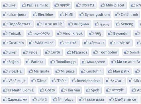
Like in this Facebook example, the same icon in different languages gives the same message.
There’s also the heart as a like symbol. It has its origins in the universal symbol of affection, love, and emotion.
The heart shape has been used for centuries to represent the center of human emotion and sentiment. Its association with love can be traced back to ancient cultures. In the context of digital interfaces, the heart icon gained prominence as a way of liking or favoriting content.

The plus symbol for add has its roots in mathematical notation and early user interfaces. It signifies the action of adding or creating something new. The plus sign’s simplicity and universality made it an ideal choice for denoting addition in various contexts, from calculators to software interfaces.

This plus-shaped icon helps you to add a new tab on Safari.
The x close icon expresses closing a window or dialog box. The cross symbol has been used historically to indicate negation or incorrectness. It was adopted into digital interfaces for similar purposes.
In this example, the close icon serves to exit from this search page.

It represents a hidden menu that can be revealed by clicking or tapping on the icon. The origin of the term “hamburger menu” is believed to be associated with the three horizontal lines resembling the layers of a hamburger sandwich.
The icon’s history can be traced back to the 1980s, where it was used in early computer interfaces to represent a list of menu options that could be expanded. Its adoption increased with the proliferation of mobile devices and the need for compact navigation menus that could be hidden to maximize screen space.

The clock represents the concept of time in digital interfaces. It’s used to indicate time-related actions such as setting alarms, scheduling events, or indicating the current time.

A notification bell indicates that the user has received an alert or message. It signifies the presence of new information, updates, or alerts. The concept of notifications can be traced back to early computer systems and messaging platforms, but it became more common with the ascending usage of mobile devices and smartphones.
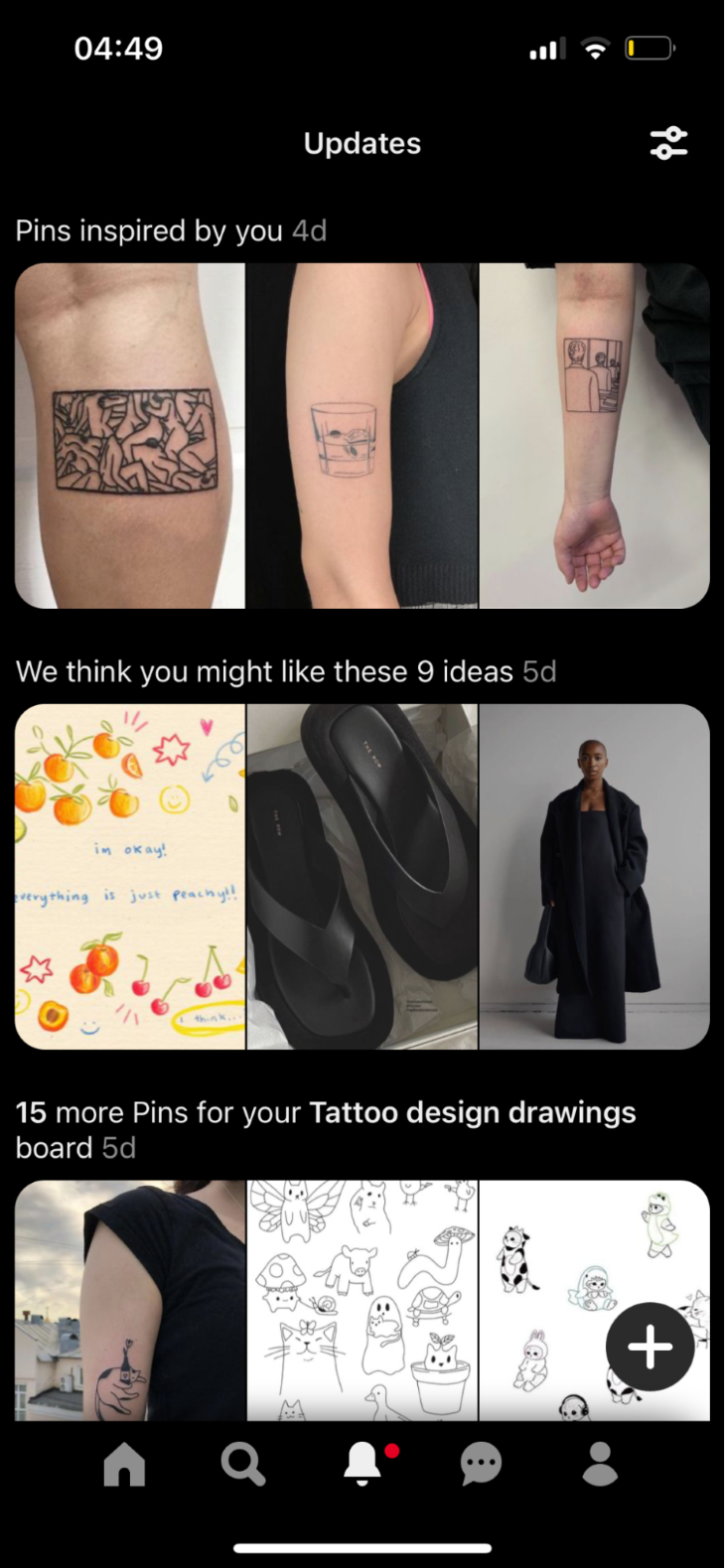
The i in a circle is used to view additional information or details. It was designed in 1973 by the British graphic designer Margaret Calvert as part of the signage for the British Motorway system. It aimed to provide travelers with essential information.

The star has been used for rating and favoriting items for a long time. It became widely recognized with the advent of user reviews and online ratings.

When you see 4.4 Stars, you can decide whether you can eat here or not accordingly.
A gear provides access to user settings or configurations. It was introduced in the late 1960s on various technical devices and interfaces. It symbolizes a mechanism for adjusting or configuring different aspects of a system.

A question mark indicates that the user is seeking help or information.

A forward arrow starts playing audio, video, or media content, and it originated from the music industry in the 1950s. It was used on reel-to-reel tape players to indicate the start of playback. This symbol transitioned to other media devices, including video players, over time.

Two vertical lines halts the playback of audio, video, or media content. Like the play icon, the pause icon also originated from the music industry.

The filter originated with the need to refine or narrow down information within digital interfaces. The concept of filtering data can be traced back to database systems and information retrieval. In the context of digital interfaces, the funnel shape symbolizes the idea of channeling or refining options, similar to how a physical funnel narrows down substances. The filter icon gained prominence with the rise of online content, search engines, and ecommerce platforms.

The spinner signifies that a process is in progress, often involving data retrieval, processing, or loading. The concept of a loading icon can be traced back to the early days of computing when systems needed time to retrieve or process data before displaying it.

This pin icon indicates a specific location or point of interest. Its roots can be traced back to early cartography. It gained prominence in the digital age with the rise of online maps and navigation services.

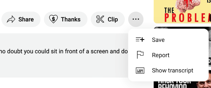
The ellipses signifies the presence of additional options or actions that are not immediately visible. In the example below, save or report actions are not primary actions for this screen and they are included in the “more” icon.
The calendar is an ancient tool used to organize and track days, months, and years. The icon’s form resembles traditional paper calendars, with squares representing days and numbers indicating dates. In digital interfaces, the calendar icon signifies the availability of a scheduling feature, allowing users to view and manage dates, appointments, and events.

In the late 2000s with the advent of social media platforms, the forward arrow started to be used as the action of sharing content with others.

This symbol dates back to early battery-powered devices like flashlights. It became standardized with the growth of portable electronics.

The concept of locking or securing information has roots in physical locks and keys used to safeguard valuable items. In digital contexts, the padlock symbolizes protection and access control, too. It commonly indicates that certain content, data, or features are secure and require authentication or authorization to access.

A camera captures images through its lens, so the camera icon also became synonymous with taking photos using digital cameras and mobile devices.

This symbol came to the forefront with email users in the 1990s. It symbolized the action of forwarding a received email to another recipient, enabling easy sharing of information.

The mail icon showed up in the 1970s, the earliest days of electronic communication, with the advent of email systems like ARPANET, a precursor to the modern internet.

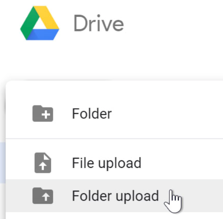
The file with an up arrow (or sometimes simply an up arrow) signifies the action of sending or transferring files from a local device to a remote server or platform. The concept of uploading files can be traced back to the early days of the internet when users needed to submit files to websites or servers.
The upward-facing arrow symbolizes the direction of data transfer from the user’s device to the server. As technology advanced, the upload icon became a standard visual cue for actions such as submitting documents, images, videos, and other content to online platforms.
The concept of downloading files predates the digital era; it was used in bulletin board systems and early computer networks to exchange files. The downward-facing arrow symbolizes the movement of data from a remote location to the user’s device.
As digital content distribution grew, the download icon became a widely recognized symbol for actions such as saving documents, images, music, videos, and software from the internet to local storage. In the example below, the download icon is used to show the number of downloads:
The print symbol emerged as personal computers became more prevalent in the 1980s. It represented the action of printing documents onto physical paper.

The Wi-Fi symbol series of curved lines resembling signal strength bars. It gained prominence in the late 1990s with the expansion of wireless networking and the proliferation of mobile devices.

This blog post highlighted some common universal icons and their history and usage. The list could be longer — there are thousands of icons out there — and designers may use them in different ways according to their design goals and the context of their product. Thus, it is important to note it is not mandatory to use them as they are listed above.
Ultimately, universal icons serve as powerful tools in promoting seamless user understanding across diverse cultures and contexts, contributing to more intuitive and user-friendly digital experiences. So, whether it’s a star signifying favorites or a gear representing settings, these icons make our digital journey smoother and easier.
Header image source: IconScout
LogRocket's Galileo AI watches sessions and understands user feedback for you, automating the most time-intensive parts of your job and giving you more time to focus on great design.
See how design choices, interactions, and issues affect your users — get a demo of LogRocket today.
A three-week mobile banking project taught me that the “proper” UX process is not always realistic. Sometimes, the better approach is to work with what you know, identify what you still need to learn, and make the strongest decision possible under real constraints.
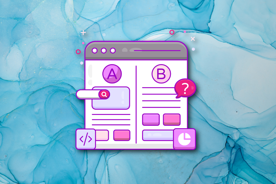
A/B testing compares two versions of a design to see which performs better with real users. Here’s how UX teams can use it to test hypotheses, measure outcomes, and make smarter product decisions.

This case study shows how one ad experience redesign increased total ad exposure while lowering perceived friction, proving that timing and context can matter more than raw interruption.

As products evolve into ecosystems, navigation becomes a system-level challenge. This article explores how to align structure, context, and user journeys to create seamless movement across tools without confusion.