As the technological capabilities of hardware and software grow, it generally becomes more expensive to build products. We now have more devices and web browsers to support, more laws and regulations to abide by, and more corporate pressure to be better and faster whether there’s room for improvement or not.
Luckily, there are an abundance of design resources out there to help designers avoid having to reinvent the wheel, so in this article, we’ll take a look at some of the best Figma community templates that you probably don’t know about!
When designing user interfaces, the first few mockups are typically wireframes, low fidelity at first before moving up to mid fidelity.
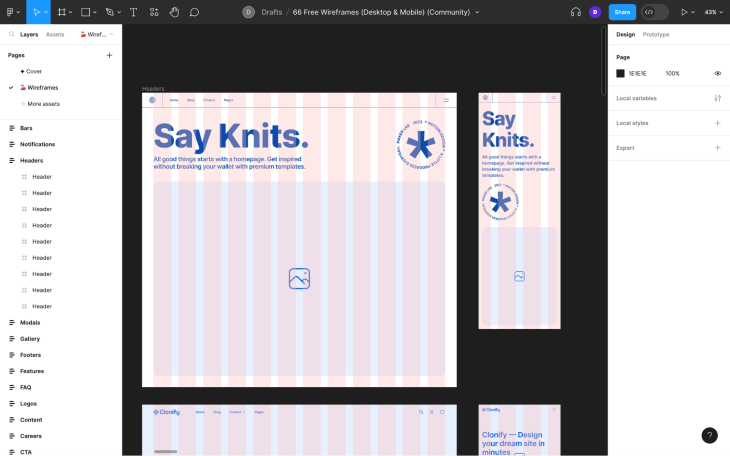
This wireframe kit by Clonify hasn’t been rated by anyone yet, which is a shame because it’s so just so bright and pleasant to use. I’d recommend adding it to your team/organization based on how well it genuinely promotes minimalism. You can tell that it was born from real projects (ecommerce, it seems):
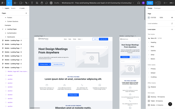
The Wireframes Kit by Junrong Wu is another great one but is geared toward SaaS products:
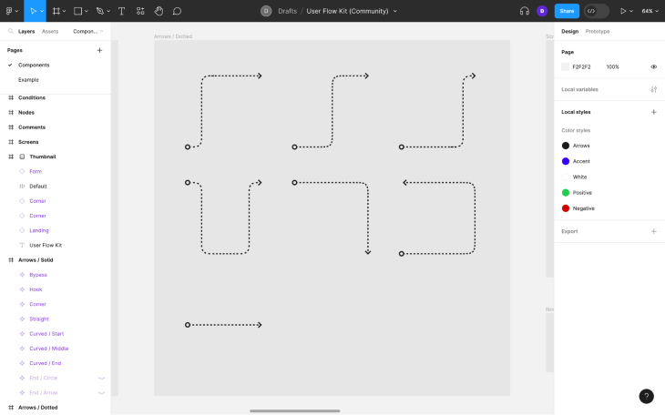
You can pair your wireframe kit with this user flow kit by Javier Alaves to plan and document how users should flow from one screen to the next and brighten up your canvas even more!
There’s no need to purchase a wireframe tool or user flow diagramming tool, nor to break apart your workflow by using multiple tools — both of these are ideal for UX planning and enjoyable to use:
The objective with illustrations on apps and websites is always to create your own if you have the resources to do so. This is because illustrations or even just illustration styles are so recognizable that they can enable brands to create a unique identity.
That being said, it’s important to get real illustrations (as opposed to generic placeholder squares) into your mockups so that you can more accurately visualize what the design might look like with the real illustrations.
Some illustrations are blocky whereas others have transparent backgrounds, and some are three-dimensional whereas others are flat — the different styles can have a different impact on emotion, mental model, and visual identity, so it’s important to use illustrations that are at least in the style of what you’re aiming for, with the intention of swapping them out for the real ones later.
There are two distinct illustration styles in fashion right now, the first of which is hand-drawn, flat, and on a geometric background rather than contained within a rectangular shape — a vector.
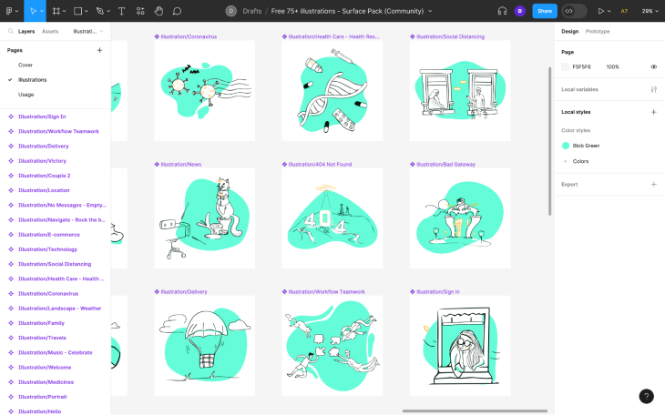
Free 75+ illustrations – Surface Pack is a great option because there are 75 illustrations to choose from, which is a decent amount for a free collection.
As an added bonus, the set contains illustrations for welcome pages, 404 not found pages, 502 bad gateway pages, and so on, so they’re a bit more purposeful than many other illustration packs out there:
3D-rendered illustrations are the newer of the two illustration styles that are trendy right now.
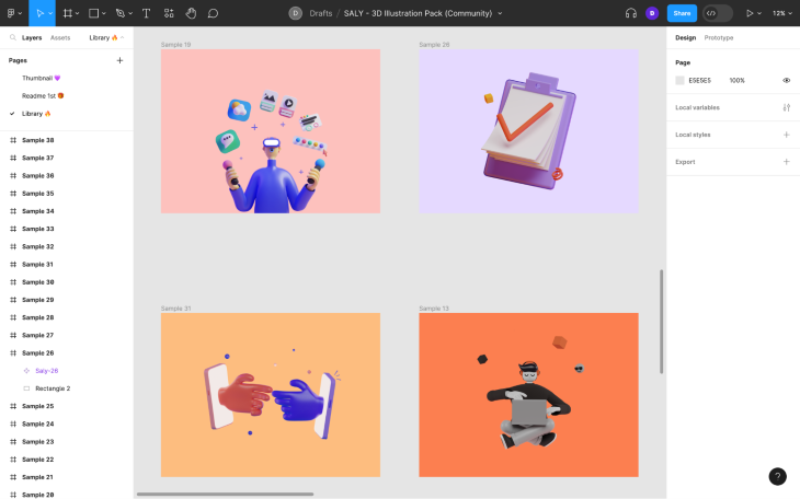
SALY – 3D Illustration Pack by Alzea gives you 30 of them in a variety of aspect ratios, perfect for testing out different layouts with three-dimensional illustrations to complement them. For example, most illustrations have a ratio of 1:1 or similar, but in this illustration pack you’ll see some horizontal ones too:
Starting a design system is arguably the most time-consuming thing that a designer can do — so time-consuming that designers typically build them over time. Luckily, the Figma community has plenty of design system templates for you to use.
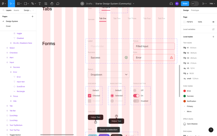
Starter Design System by Gleb is the perfect design system for getting a head start on building your own. As you would expect, the template has been remixed quite a few times (which is what you’ll end up doing), but this is the best iteration of it in my opinion.
It’s pretty basic, so just change what you need to change — colors, fonts, etc. — and then go on foot from there:
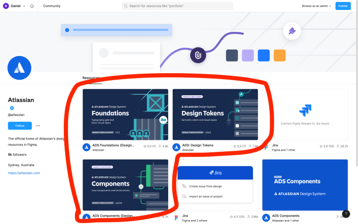
Atlassian uses its own design system for all of their digital products, and you can use it too. What’s interesting about it is that it’s atomized, split into three different files that you can find on Atlassian’s Figma profile.
One file covers the design tokens (the atoms), another covers the typography, grid, and basic visual styles (the molecules), and another covers the components (the organisms). This makes the design system easier to fork, so if you’d like to utilize their design token template but not the styles or components, for instance, you’d be able to do that.
For clarity, the design token library is included in the foundations library and both are included in the components library:
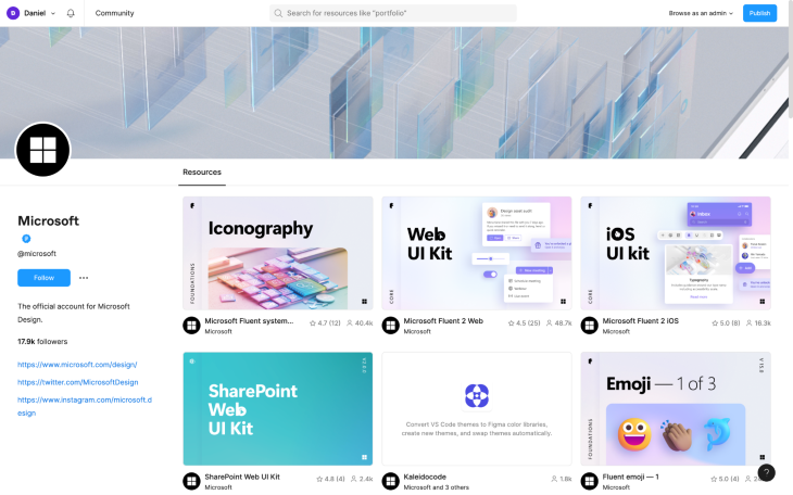
Microsoft’s Fluent Design System was built to help designers create digital products built for Microsoft platforms such as Windows. However, not many people know that you can use the Fluent design system to build non-Microsoft products.
Fluent supports the web and even provides UI kits to help designers design apps that feel distinctly iOS/Android and Microsoft at the same time. Did I mention that the Fluent design system is extremely well regarded by UI designers? It’s definitely worth a look even if you’re not building for Microsoft platforms.
Head over to Microsoft’s Figma profile to explore what they have to offer:
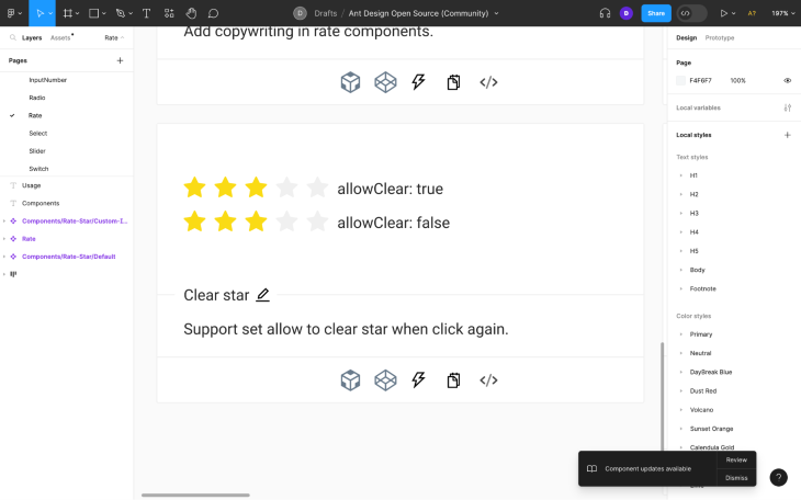
You might be aware of the popular React-based design system for developers called Ant Design System.
Several people have ported this design system to Figma; however, Ant Design Open Source by Mr.Biscuit is the only free/open source version of it. It’s far more ambitious than the starter design system mentioned above, perhaps better suited to prototyping or using it as-is with your own theme applied rather than as a fully-tailored design system:
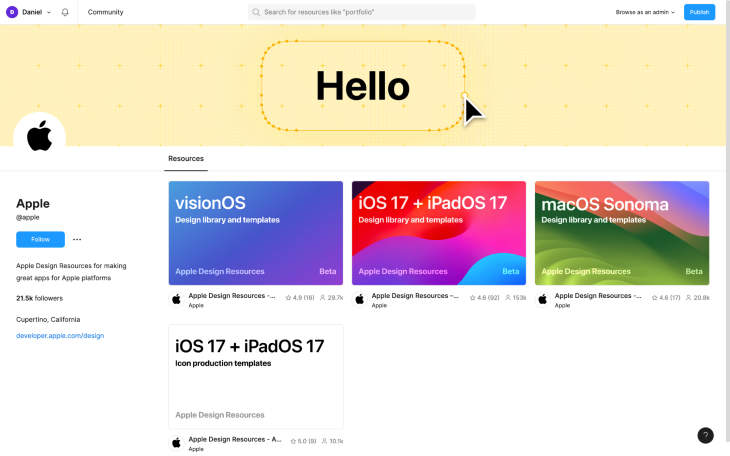
There are an insane amount of fan-made Apple UI kits out there; however, what you might not know is that Apple released official versions of them earlier this year.
Head to Apple’s Figma profile to grab the visionOS, iOS 17 + iPadOS 17, and macOS Sonoma design library and templates for Figma. These are for designing apps meant for Apple platforms that leverage parts of the native Apple UI for a seamless feeling experience:
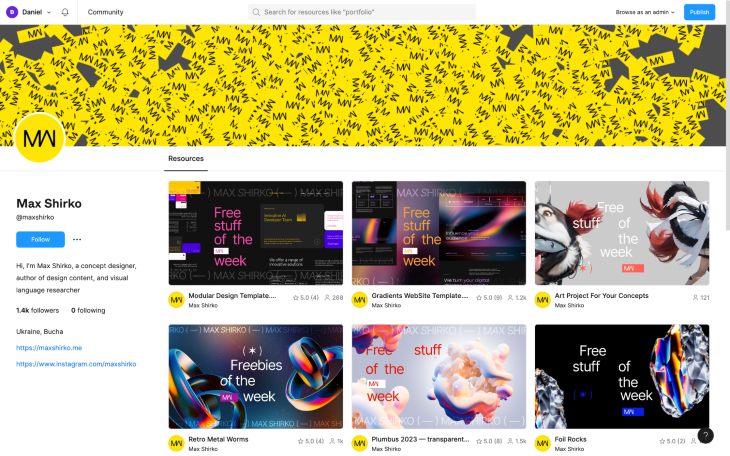
Max Shirko has an incredible collection of visual effects for Figma — 3D stuff, typography stuff, and some website templates with their own visual effects inside. Max also does a “free stuff of the week” series, so in addition to adding his Figma files to your team/organization, I’d also recommend following him for future goodies:
Figma and UI design tools in general aren’t as capable as dedicated prototyping tools such as ProtoPie when it comes to prototyping advanced interactions. If I’m being honest, prototyping using UI design tools (as opposed to code) is such a bother that I tend to just use Figma’s smart animate exclusively.
That being said, there are some really good Figma community templates showing off advanced interactions, the sort you’d see on Codrops. For example, these MODERN PAGE TRANSITIONS by Or. This is far better than anything that I could do, which is fine because these are awesome and customizable (with a smaller amount of effort). Or has a few more on his Figma profile too.
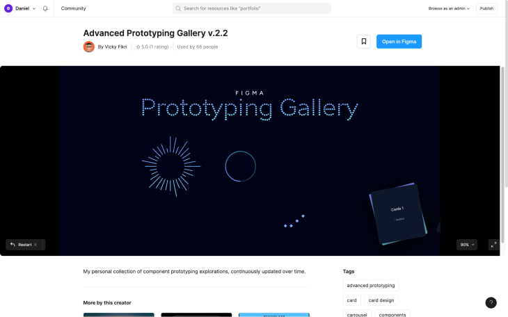
The Advanced Prototyping Gallery v.2.2 by Vicky Fikri has some good ones, too. They’re mostly loading animations, but they can be repurposed for decorative use cases as well:
The 20,000+ Ultimate Icon Library by Ken combines the icons from Material Design, IconPark, Boxicons, Unicons, Ionicons, CoreUI Icons, Bootstrap Icons, Font Awesome, and Line Awesome into a single Figma template that’s kept up to date, so if you’re storing multiple icon libraries, you might be pleased to know that you don’t actually have to do that:
![]()
If you’re just looking for something different, Basil Icons by Craftwork is my personal favorite. However, it only contains 500 icons, so Phosphor Icons (which is more than twice as large) might be more suitable in some scenarios.
Both are great alternatives to the same old icon libraries we’ve been looking at for years, and unlike many other alternative icon libraries, these two are free:
![]()
![]()
Figma has always had an incredible plugin ecosystem built to help designers do certain things faster and easier, but in more recent times Figma templates and Figma widgets have become a welcomed addition to this ecosystem. It’s particularly useful that Figma plugins can be installed on documents now, enabling anybody that uses the document to automatically have access to the plugins needed to operate it. Figma plugins can also be used without installing them, which is ideal for when you only need to use them one time.
Figma widgets are not only installed on documents but any instances of them live on the canvas as permanent extensions to the Figma UI available to all members of the document. We’ve got a great list of Figma widgets for you to sink your teeth into.
If you’ve got any hidden gems that you think designers should know about, drop them into the comment section below — and thanks for reading!
LogRocket's Galileo AI watches sessions and understands user feedback for you, automating the most time-intensive parts of your job and giving you more time to focus on great design.
See how design choices, interactions, and issues affect your users — get a demo of LogRocket today.

Multimodal UX goes beyond designing for screens. Learn how context-aware systems, progressive modality, failover modes, and accessibility-first design create better digital product experiences.
Learn how context-aware mode prioritization and seamless transitions improve multimodal UX and reduce mode confusion.

Research is becoming more democratized, product cycles are accelerating, and AI is transforming synthesis and ResearchOps. Here are the three trends shaping UX research in 2026.

Voice support is not the same as multimodal UX. Here’s how to design systems with true mode continuity and context-aware interactions.