Figma widgets are the new thing in Figma. Think of them as plugins except that they become a part of the shared workspace, so if you do something in a document using a widget, everyone that has access to that document will see it too (unlike plugins, which are for private use).
Product teams can use widgets to create notes, create to-do lists, link to external webpages, and so on.
Let’s take a look at some widgets that you and your team might appreciate — they’re intended to help you save time and make your job easier.
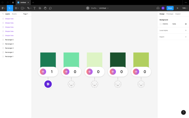
Simple Vote enables product teams to vote on ideas (or anything really). There are several Figma widgets that accomplish the same thing, but in my opinion Simple Vote works best because it shows the number of votes (naturally) and the avatars of those who voted (which produces a nice community/collaborative vibe). Anonymous voting, secret (i.e., reveal later) voting, and multiple voting can be enabled in the settings.
To use the widget (or any Figma widget), navigate to Resources (shift + I) > Widgets from the horizontal toolbar, search for the widget you’d like to use (Simple Vote in this case), and then click on the Run button.
Next, specify the settings you’d like to use, then click on the Start button to have the widget placed onto the canvas. If you have any objects selected prior to running the widget, then each selection will get its own widget — there’s no need to run the widget for every voting option.
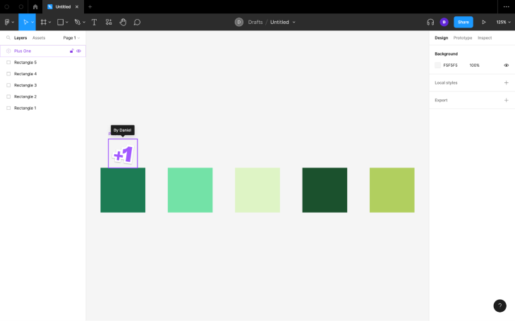
If you don’t really care about the community vibe, Plus One does the same thing but without the avatars. Just run the widget to place an instance of it on the canvas, then click on the +1 to increment the number. Hover over it to see who voted.
The last one that I want to mention is Emoji, which I only recommend using if you don’t think that you’d spend absurd amounts of time looking for the perfect emoji or trying to understand what other people are trying to communicate. If you don’t think that’d be an issue, then this Figma widget offers something different to the other two widgets mentioned above.
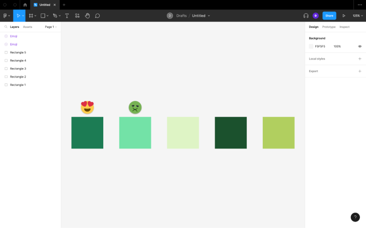
They’re all pretty easy to use, no explanation necessary (as is the case with most Figma widgets).
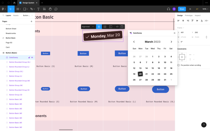
Every list has one “Huh? Why that?” item — DateStamp is that item. I’m not sure what the intended use case is, but I find it useful for letting others know when a design style or component was last updated. Although you can find out this information using design handoff tools, design system tools, or even Figma’s own versioning features, this little stamp places the information right there on the canvas.
Apart from being able to customize the size and date, you’ll also be able to add a label — Approved, Discussed, or Flagged.
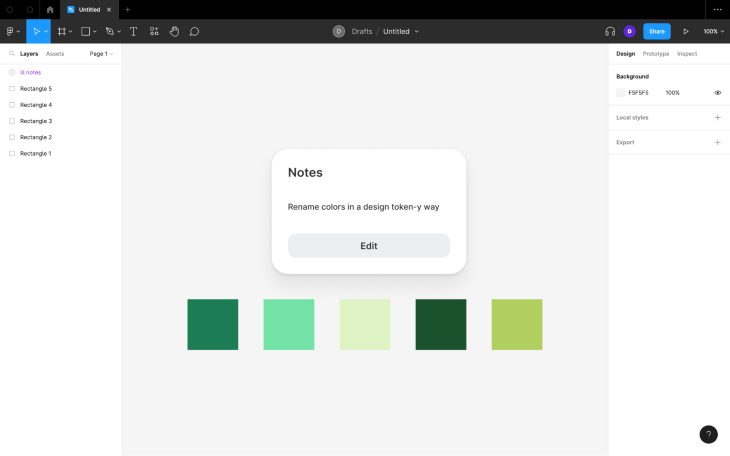
lil notes does exactly what you think it does: it enables users to write notes on the canvas. As you can imagine, there are quite a few Figma widgets that do the same thing, but this one in particular is very minimal and thus more pleasant to use.
You’d probably want to use it to write low-key documentation, personal notes that you’re happy for others to see (sort of like thinking aloud), and anything else that you don’t want to appear in the document’s “official” comment log.
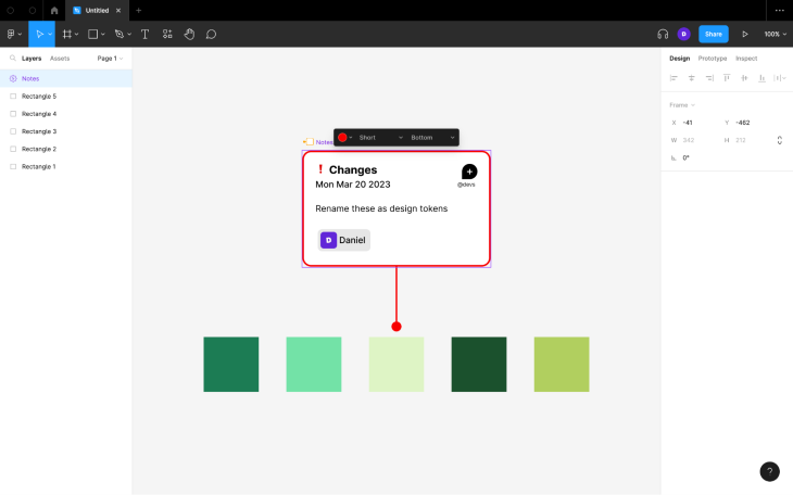
Notes on the other hand is better for async collaboration, perhaps replacing Figma’s commenting features, since it displays the date and the user’s name and enables them to tag teammates. It also enables them to add statuses — Note, Changes, Conditions, Update, and New — which Figma doesn’t offer natively.
I agree with the commenters that both widgets would be better with markdown support, but perhaps it’s not possible?
Made by the creator of lil notes, lil todo brings to-do list features to Figma (in the minimal style of lil notes). These are great for creating checklists of repeatable processes; for example, design system processes, versioning processes, and so on.
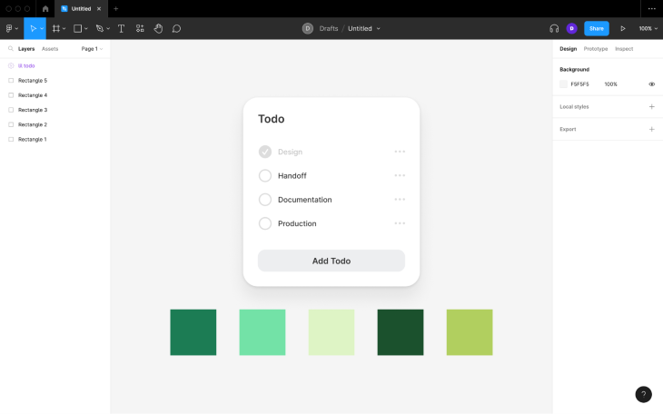
For more traditional types of to-dos (e.g., “Make the logo bigger”), again, you’ll just want to use Figma’s commenting features.
Jira’s Figma widget can pull Jira Cloud issues into Figma, where they can be discussed using Figma’s collaboration features and then solved. You’ll be able to adjust the issue’s assignee, priority, status, and issue type if needed, and if any new problems arise, you’ll also be able to document them as Jira issues, referencing any Figma designs if needed.
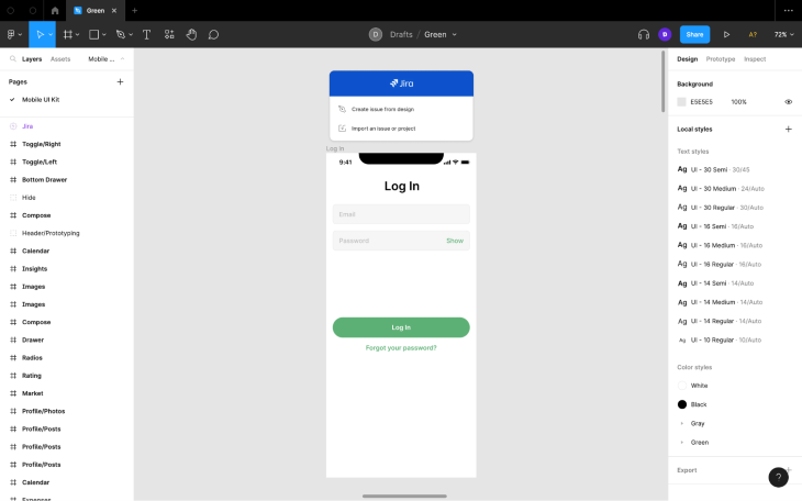
The Asana widget essentially does the same thing but for Asana. The only real difference is that Asana is used for general project management, whereas Jira is used to keep track of development issues.
There’s also a Figma widget for GitHub, although this might be a bit too developer focused. It’s not as popular as the Jira and Asana plugins.
Similarly to DateStamp, you’re probably wondering why you’d ever need a table in Figma that isn’t a part of the design. Well, I find that tables can be used to document various things. Product teams can use Table to document:
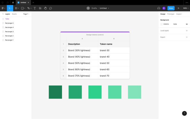
If needed, you’ll be able to import data from Google Sheets or CSV files, and export as CSV files.
The tables can be customized a little bit, and for the most part they act just as you’d expect in terms of populating them with data and arranging them. That being said, there are a few keyboard shortcuts that aren’t immediately obvious:
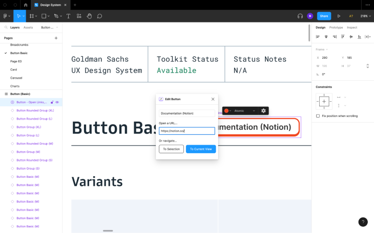
Button enables product teams to place functional buttons on the canvas. These buttons can provide quick access to external webpages (e.g., documentation or a top-level frame’s production webpage equivalent) or direct users to specific objects/frames/layers (e.g., a prototype starting point).
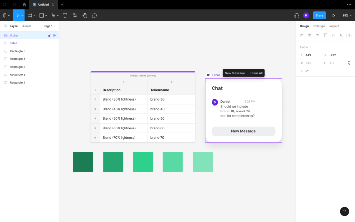
lil chat, made by the creator of lil notes and lil todo, enables product team members to chat with each other. The only native feature that comes close to this is Figma’s audio conversations feature (which isn’t everybody’s cup of tea, at least not all the time).
Besides, lil chat can facilitate both syncronous and asyncronous collaboration, whereas audio conversations only facilitate syncronous collaboration. As an added bonus, lil chats can be left on the canvas for nonparticipants to close after they’ve read them, whereas audio conversations only exist in real time.
Although this is essentially what Figma’s native commenting features achieve, lil chats won’t clog up the official comment log or produce notifications, which is the key difference between lil chats/audio conversations and Figma’s commenting features.
Combining the functionality of audio conversations and lil chat, Voice Memo facilitates async audio comments for product teams working asyncronously that don’t want to be shut out from using audio to communicate. As an added bonus, the avatars of those that have listened to the audio clip will appear underneath, so product teams will always know who has listened to what.
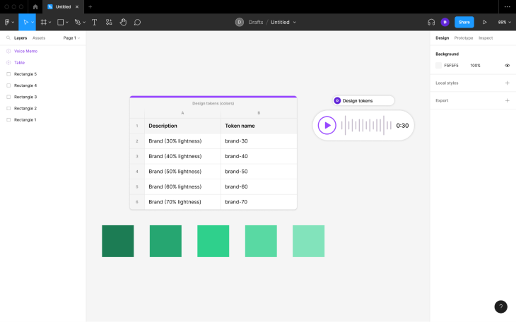
The downside is that only those with edit access can listen (this is a major downside if you ask me, however, all Figma widgets work like this).
Also keep in mind that audio clips cannot exceed 30 seconds (this is probably for performance reasons).
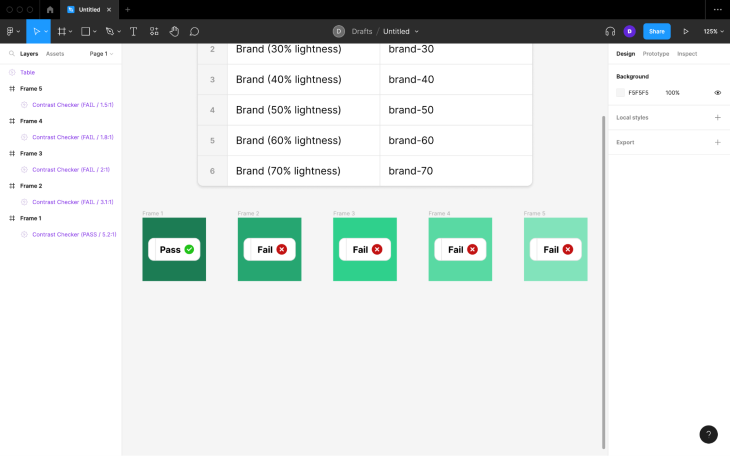
There are many plugins that help designers check color contrast, however, they don’t allow you to keep the seal of validation on the canvas so that product teams can always be in the know regarding which colors are optimally contrasted and which aren’t. Contrast Checker can do that.
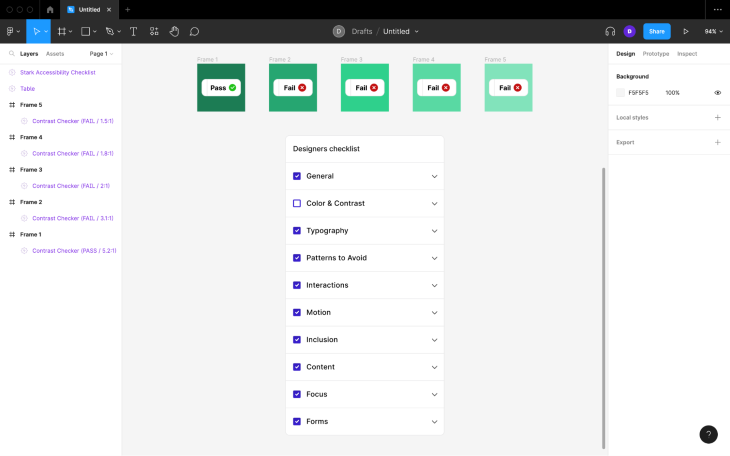
Accessibility is something that you’ll want to add to your design checklist, so naturally you’d place this widget alongside your standard list-based checklist.
It’s also worth taking a look at Stark, an accessibility checklist that includes color contrast. It’s not free, but it does include role-specific checklists (e.g., different checklists for designers and developers) along with short explanations, links to further explanation, and the ability to add design-specific notes. The core benefit is, ironically, being able to access the checklists and information from within Figma, alongside the designs themselves.
Activity Tracker is great for ensuring that you don’t spend too long on things. In particular, it’s useful for rapid prototyping activities. For example, “crazy 8s” requires that people mock up 8 ideas in 8 minutes (1 minute each) and “solution sketch” requires that people spend 8 minutes on an idea.
![]()
As you can see, Figma widgets can be quite useful. People don’t rave about them as much as they do about plugins, but that’s probably because they’re still somewhat new and they don’t know a whole lot about them. Also, the fact that only editors can run and interact with widgets is a dealbreaker for some.
It’s probably not a good idea to load up your shared workspace with too many widgets (mostly for performance reasons), but hopefully you’ve discovered one or two that improve the way that you and your team use Figma.
Thanks for reading!
LogRocket's Galileo AI watches sessions and understands user feedback for you, automating the most time-intensive parts of your job and giving you more time to focus on great design.
See how design choices, interactions, and issues affect your users — get a demo of LogRocket today.

Multimodal UX goes beyond designing for screens. Learn how context-aware systems, progressive modality, failover modes, and accessibility-first design create better digital product experiences.
Learn how context-aware mode prioritization and seamless transitions improve multimodal UX and reduce mode confusion.

Research is becoming more democratized, product cycles are accelerating, and AI is transforming synthesis and ResearchOps. Here are the three trends shaping UX research in 2026.

Voice support is not the same as multimodal UX. Here’s how to design systems with true mode continuity and context-aware interactions.