After brainstorming, workshopping, and rounds of review with stakeholders, you think you’re homing in on a perfect solution for your company. But what do your users think?
Every UX specialist needs to test their product with end users eventually, and you have countless resources to help us do so. But how do you know which testing tools to work with?
That’s why you’re here.
In this article, I’ll walk you through ten great options for usability testing and go over the criteria you should use if you’re willing to invest in a usability testing tool.
Editor’s note: This blog was updated 12 May 2025 by Neil Nkoyock to update the list of tools for 2025, remove discounted or poorly reviewed tools, and add a comparison table for easier decision-making.
There are many usability testing tools on the market. To select the right tool, I suggest you consider the following:
Now considering the factors above, review the following list of tools to determine which one makes the most sense for your context. I also suggest involving the whole UX team in the decision-making process and encouraging them to start usability testing to gain insights from users!
Lookback is a video usability testing tool designed specifically for qualitative research on websites and applications. Lookback can capture participants’ cameras and screens, allowing your team and stakeholders to observe together and gain insights:
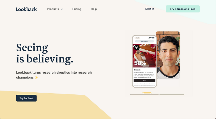
Overview of Lookback:
Maze is a usability testing tool that you can use at any stage of the design process, from concept and idea validation to wireframe testing and live website testing:
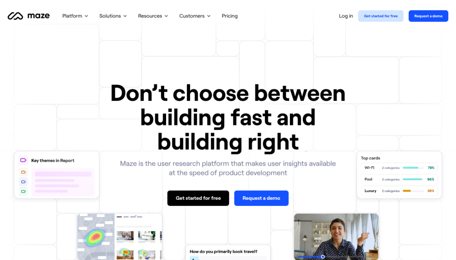
Overview of Maze:
Optimal Workshop is a usability testing tool that enables you to improve your websites, apps, and products using a range of user research methods:
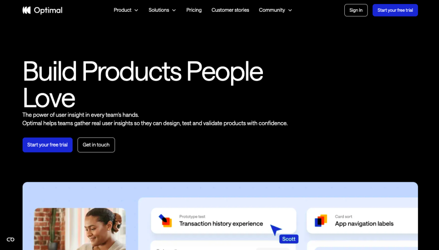
Overview of Optimal Workshop:
Trymata is a platform for you to conduct product analysis and usability testing. It allows you to uncover user frustrations that impact the digital experience of your key user journeys. One of my favorite features is that Trymata can run iterative usability tests:
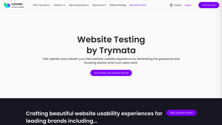
Overview of Trymata:
Lyssna is a tool for beginners to start usability testing, which can combine different research methods into a single test:
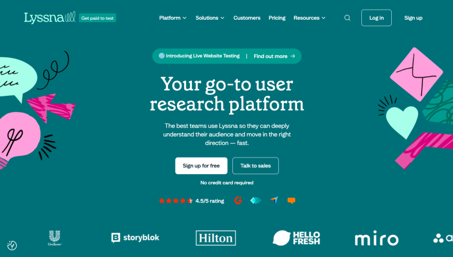
Overview of Lyssna:
Useberry is a usability testing tool that mainly focuses on the design process and prototype testing for websites:
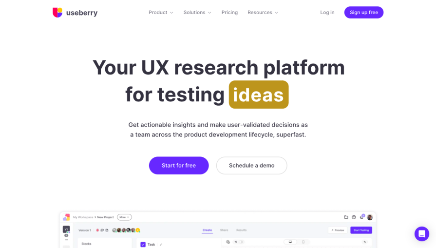
Overview of Useberry:
Userlytics is a massive market research and usability testing tool for prototype and website testing. Userlytics is capable of testing websites, mobile apps, and VR devices:
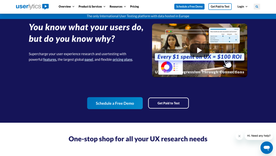
Overview of Userlytics:
UserTesting is a video usability testing tool where you can see and hear the experiences of real people as they engage with your products, designs, apps, processes, concepts, or brands.
A particularly unique feature of UserTesting is the template gallery, with pre-made test templates that users can customize and build upon to create their own test without having to start from scratch:
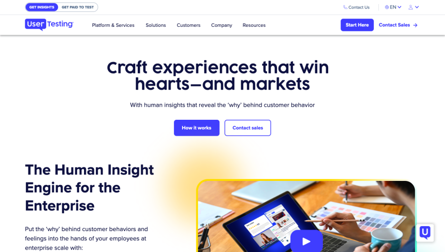
Overview of UserTesting:
Userfeel is a pay as you go user testing tool making it easy to gather insights and pain points from your target audience. Rather than heatmaps and A/B testing the platform focuses on user issues, frustrations, doubts, needs and desires to improve usability, fix bugs, and increase conversion rates:
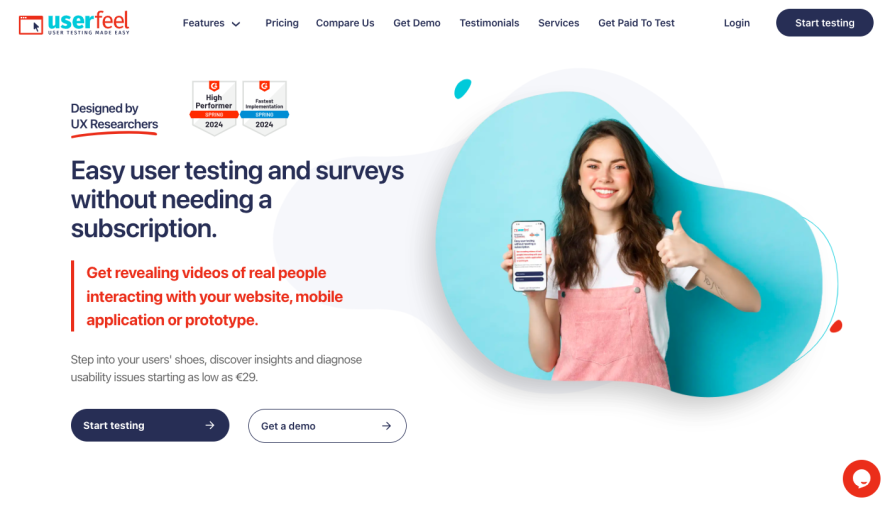
Overview of Userfeel:
UXtweak is an all in one UX research platform offering participant recruitment usability testing tools. It helps research teams uncover valuable insights by guiding users through every step of the usability testing process:
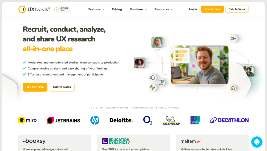
Overview of UXtweak:
Userbrain is a user testing platform focused on quick and easy usability evaluations. With AI powered insights it allows teams to quickly gather video-based feedback on their digital product:
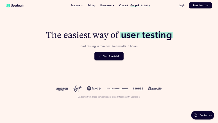
Overview of Userbrain:
Hotjar is a comprehensive user analytics tool addressing usability issues and helping teams further optimize web, mobile or app performance:
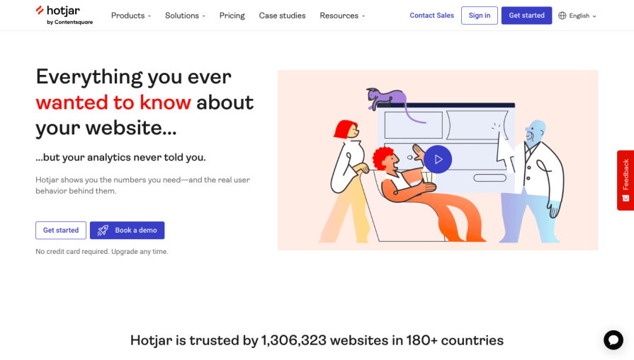
Overview of Hotjar:
| Tool | Best for | Testing methods | Key integrations | Pricing |
| Lookback | Screen recording and collaboration | Moderated and unmoderated tests (live interviews, usability tasks, mixed methods) | Figma (via shareable link) | 60‑day free trial, paid plans start at $299 per year |
| Maze | All in one platform with usability method variety | Unmoderated tests (card sorting, wireframe testing, surveys, live website tests) | Figma, Adobe XD, Sketch, InVision | Free plan, paid plans start at $99 per month |
| Optimal Workshop | Usability method variety, niche and international panels | Unmoderated tests (card sorting, tree testing, first‑click tests, surveys) | N/A | Seven day free trial, $107 per month or more |
| Trymata (formerly TryMyUI) | Iterative design processes and testing user journeys | Moderated (add‑on) and unmoderated task‑based tests, post‑test surveys | N/A | 14 day free trial, paid plans start at $399 per month |
| Lyssna (formerly UsabilityHub | Usability beginners, remote answer based research | Unmoderated tests (card sorting, prototype testing, preference tests, tree testing, five‑second tests) | Figma | Free plan, paid plans start at $75 per month |
| Useberry | Usability method variety, niche and international panels | Unmoderated tests (card sorting, tree testing, first‑click, five‑second tests, surveys) | Protopie, Adobe XD, Sketch, Figma, InVision, Marvel | Free plan, paid plans start at $79 per month |
| Userlytics | Niche and international panels | Moderated and unmoderated tests (think‑aloud, interviews, heuristic evaluation, diary studies, etc.) | Figma Adobe XD, Axure, Framer, InVision, Sketch | As low as $34 per session; paid self recruitment plans start at $699 per month |
| UserTesting | Usability beginners and big budget studies | Both moderated and unmoderated tests (live interviews, diary studies, card sorting, etc.) | FigJam, Figma, Canva | Price not publicly shared |
| Userfeel | On‑demand, pay‑as‑you‑go testing | Moderated and unmoderated tests (tasks with surveys and ratings) | N/A | Pay-as-you-go mode, $60 per credit |
| UXtweak | All‑in‑one UX research with strong recruitment | Moderated and unmoderated tests (card sorting, tree testing, first‑click, five‑second, preference, etc.) | Figma | Free plan, paid plans start at €125 per month (for 1 user license) |
| Userbrain | Quick video‑based feedback with AI‑powered insights | Unmoderated tests (tasks including redirections, ratings, multiple‑choice, and written responses) | Figma Adobe XD, Axure, Framer, InVision, Sketch | 14 day free trial, free plan, paid plans start at €124 per month |
| Hotjar | Comprehensive user analytics | Unmoderated tests (session recordings, heatmaps, surveys, voice‑of‑customer) | N/A | Free plan, paid plans start at $40 per month, ideal package build starts at $119 per month |
Generative AI and the integration of AI tools in usability testing platforms has changed how design teams analyse data, speeding up user studies and offering real-time user analysis. Automation allows testing platforms to easily isolate important pain points for UX researchers and provide them with actionable insights.
The use of AI for usability testing and within the UX sphere as a whole has resulted in faster prototyping and more intelligent user simulations. This will ultimately result in smarter user experiences as the industry continues to leverage AI.
With so many usability testing tools on the market, make sure to carefully review them based on your needs. For example, Userberry focuses more on prototypes while UserTesting is more general.
Most of the usability testing tools I’ve mentioned here can conduct summative usability testing and quantitative usability testing. To help narrow down your selection, I recommend the following:
Good luck!
Header image source: IconScout
LogRocket's Galileo AI watches sessions and understands user feedback for you, automating the most time-intensive parts of your job and giving you more time to focus on great design.
See how design choices, interactions, and issues affect your users — get a demo of LogRocket today.

Multimodal UX goes beyond designing for screens. Learn how context-aware systems, progressive modality, failover modes, and accessibility-first design create better digital product experiences.

Learn how context-aware mode prioritization and seamless transitions improve multimodal UX and reduce mode confusion.

Research is becoming more democratized, product cycles are accelerating, and AI is transforming synthesis and ResearchOps. Here are the three trends shaping UX research in 2026.
Voice support is not the same as multimodal UX. Here’s how to design systems with true mode continuity and context-aware interactions.