What comes to mind when you think of accessibility? If it’s an expensive, complicated process that only benefits a minority of users, allow me to enlighten you.
For anyone new to accessibility, it can be a daunting task. Issues such as lack of resources, lengthy legal jargon, and the manual nature of the process can act as barriers to creating accessible designs.
But, what if I told you that accessibility isn’t exactly quantum physics?
In this post, I’ll help you understand the importance of accessibility and give you ten Figma accessibility plugins that make creating accessible designs easy. Before we delve into the Figma plugins, let’s tell you why you should even bother with accessibility.
Designing for accessibility means ensuring everyone has equal access to information, functionality, and experience on digital platforms, regardless of their abilities. It’s about creating solutions that take into account the full range of human abilities.
However, achieving accessible design isn’t a random occurrence; it requires intentional decisions at every stage of the design process. And Figma is one tool that makes creating accessible designs easy.
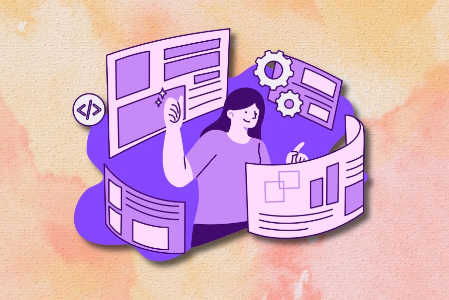
Although Figma boasts a commitment to accessible design, its inbuilt features for accessible design are limited. Figma recognizes this and makes up for its limitations by offering a growing collection of accessibility-focused plugins to help you create more accessible designs. So, here are ten standout plugins for accessible design in Figma:
If you want to create accessible designs but know nothing about designing for accessibility, choose Stark. This one plugin can help you scan your entire Figma artboard for accessibility issues, identify any issues present, and fix them instantly. Impressive, right?
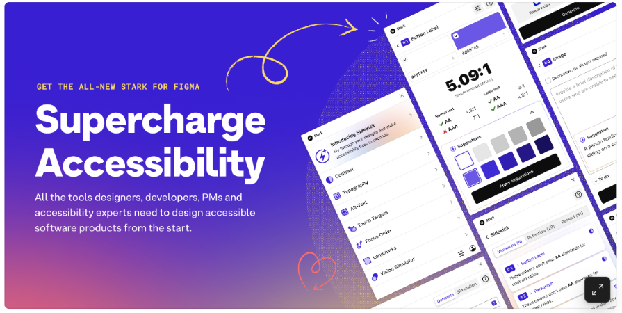
With features such as Vision Simulator, Contrast Checker, Alt-Text Annotations, Typography Analysis, Touch Targets, and more, you practically have every aspect of accessibility covered:
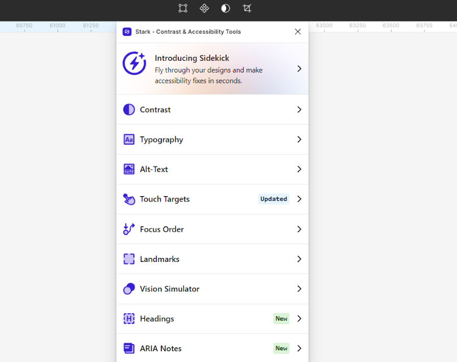
Although this tool isn’t entirely free, the features on the free plan are enough to address most accessibility issues.
If you’ve ever wondered how your designs would look to someone who is color blind, this free plugin can help. It allows you to simulate eight different types of color blindness. With this, you can view your designs through the lens of a color blind person and identify any potential issues that might affect their user experience:
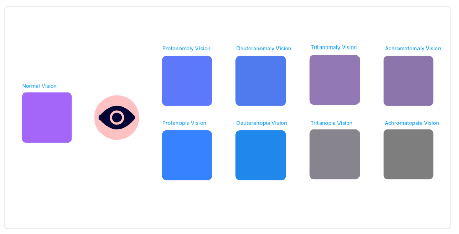
Using this plugin is easy. Simply select the design you want to test and open the plugin. You can choose varying degrees of color blindness, and the plugin will replicate your design based on your selection.
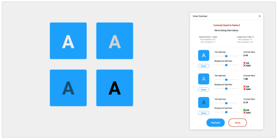
As a designer, you most likely know how crucial color contrast ratio is for ensuring accessibility. This free plugin can help ensure your designs have the right contrast level. You can use it to check the color contrast ratio of all visible text in a frame and receive feedback on whether it meets WCAG’s compliance level.
But that’s not all this tool does. It also has color sliders that you can use to adjust both the background and foreground colors and see how the contrast ratio changes in real time:
If you need a more seamless way to ensure adequate color contrast in your designs, use Able. Once you open this free plugin, you can select any two layers in your design, and it automatically checks the color contrast ratio for you — no need to keep re-running the plugin each time you want to check for contrast ratio:
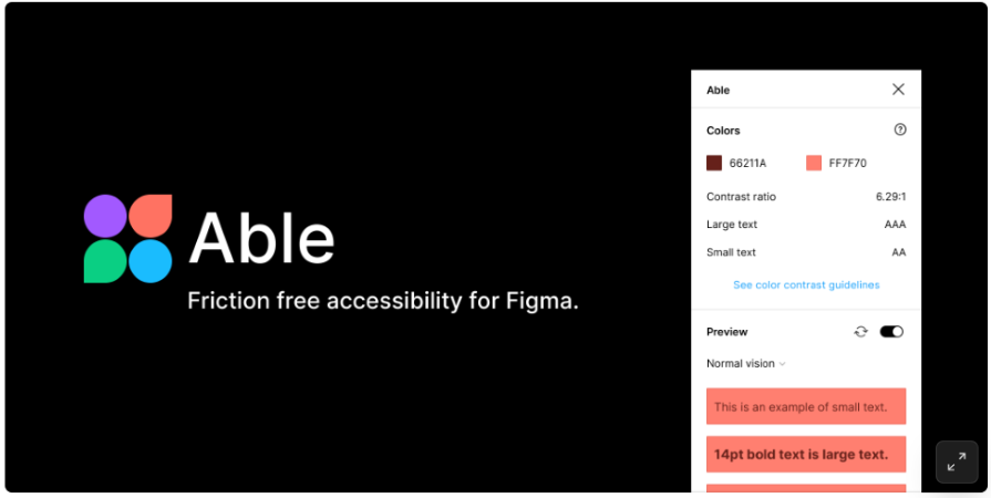
But that’s not all. You can also use Able to simulate the eight different types of color blindness to identify potential accessibility issues.
The last three plugins we discussed are focused on helping you create more inclusive experiences for users with low vision and color blindness. But if you need a tool that covers a broader spectrum of visual impairments, this plugin is for you.
Accessibility Simulator is a more comprehensive plugin that can help simulate various vision issues, including low vision, color blindness, and light sensitivity. And the best part? It’s free:
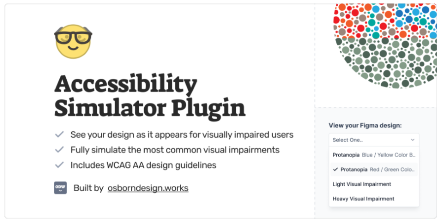
When you choose a form of visual impairment, your entire Figma board will change to reflect how your designs would look to someone with that impairment. With this, you can identify and fix any potential accessibility issues.
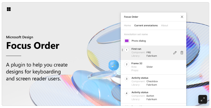
If you’re like most designers, you probably focus more on visual aspects of accessibility, such as color contrast and type readability. But that’s not all it takes to make your designs accessible. For a design to be truly accessible, users should be able to navigate it easily, even if they’re not using the standard cursor-based input mode.
Focus Order is a free plugin that allows you to add accessibility annotations to the interactive elements of your designs and share them with engineers and content designers. That way, everyone is on the same page regarding how users might navigate your designs with various input modes:
To understand how to use this plugin, check out this tutorial.
Include is another accessibility annotation plugin that helps you and your developers stay on the same page regarding accessibility by guiding you on what needs to be communicated.
You can use this free plugin to add annotations for landmarks, headings, focus order, alt text, and more. Additionally, you can run accessibility checks on your entire Figma artboard to identify and fix any accessibility issues:
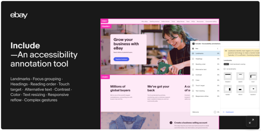
Simply choose a top-level frame and run the checker. Include will assess your designs and return a list of action items such as recommendations to add alt text.
Adee is a multi-purpose accessibility tool that caters to visually impaired and physically disabled users. With this plugin, you can test color contrast, simulate eight forms of color blindness, add alt text, and even test touch targets to ensure they meet the various device standards:
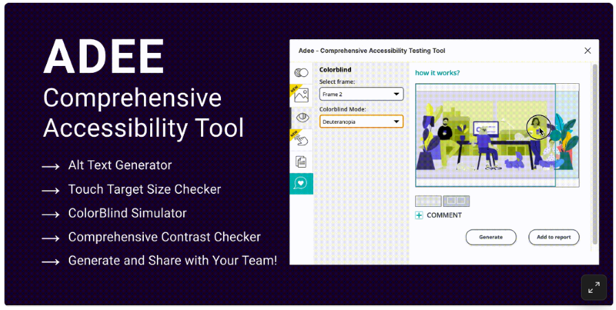
While this is a handy plugin for every designer, the alt text generator still needs work. Since it’s an alt text generator, one would expect it to generate alt text for images using AI. But that’s not the case. You literally have to write your alt text yourself. It just adds it to your image.
That said, we’ll cut them some slack because it’s still a new feature and will likely improve over time. In the meantime, if you need a quick way to generate alt text for your images, you can try tools like AltText.ai and the Ahrefs alt text generator.
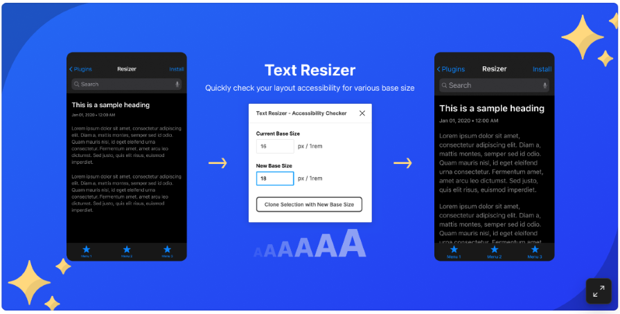
If you’re a designer who cares about readability, this plugin is for you. Text resizer allows you to easily update your designs with respect to the base font size to ensure that your text adapts well to various viewing environments:
If you need to create inclusive designs but only have room for one accessibility plugin, make it Axe. It’s an all-in-one accessibility plugin that can help review your designs for WCAG compliance by checking aspects such as color contrast, touch targets, heading hierarchies, and more:
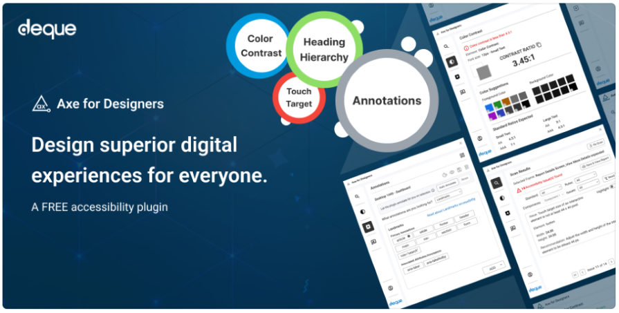
You can also use it to add accessibility annotations to make your design handoffs more effective. Whether you prefer to add the annotation manually or leave it to the AI-powered auto-annotation feature, the choice is yours.
There you have it! Ten Figma accessibility plugins that cover various aspects of accessibility.
Accessibility shouldn’t be an add-on but a core part of your design process right from the start. To help you incorporate accessibility in your design process, we’ve shared ten Figma accessibility plugins that you can use to bridge the gap left by the platform’s limited inbuilt options.
With these diverse plugins covering disabilities such as color blindness, low vision, complete loss of vision, and mobility impairment, there’s no reason to overlook accessibility in your designs anymore.
By incorporating these tools into your workflow, you can create inclusive digital products, reach a broader audience, and ultimately enhance the user experience of all users.

LogRocket's Galileo AI watches sessions and understands user feedback for you, automating the most time-intensive parts of your job and giving you more time to focus on great design.
See how design choices, interactions, and issues affect your users — get a demo of LogRocket today.

AI has accelerated design execution, but speed can come at the expense of intentionality. Learn how UX teams can preserve product thinking and judgment.
UX testing is not limited to layouts, copy, and visual design. Full-stack and server-side experiments help teams evaluate how backend logic, APIs, algorithms, and product flows affect the overall user experience.
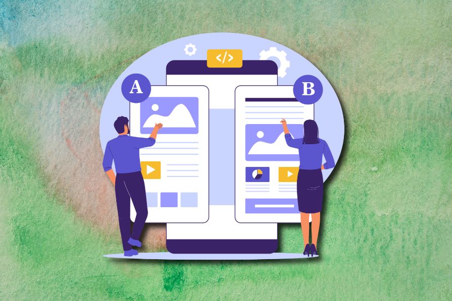
In A/B, A/B/n, or multivariate testing scenarios, using p-value with traditional null-hypothesis-based statistical analysis is so common, and most designers […]

Traditional A/B testing splits traffic evenly, but multi-armed bandits dynamically send more users to the better-performing version. Here’s how the method works, where it helps, and when UX teams should use it over classic A/B testing.

 Learn more →
