If you’re tasked with creating clear user interfaces, design systems are a good starting point and reference for any stage of the design process. A successful design system can educate team members, streamline work, and empower designers to solve complex UX problems.

This article outlines the main components of a successful design system and explains its benefits for companies and designers. Let’s dig into the topic, and study the examples of the best design systems we can learn from.
A design system is a set of patterns and reusable components, principles, and guides that help teams collaborate and support the best practices of visual design. The way a design system is implemented can differ depending on the company’s needs.
Many people associate component libraries with design systems, but it is important to note that they are just a part of a design system. A successful design system is more than just a library of components — it includes standard brand guides, design vision, visual elements, and rules implemented in the design and code that can help design teams optimize their efforts.
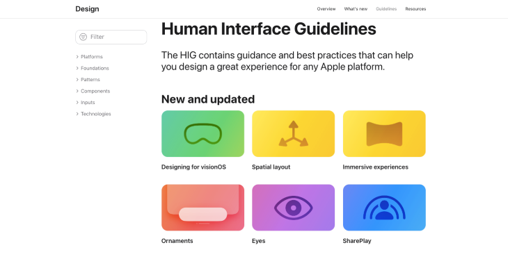
For instance, Apple provides guidelines for designers and developers to work more efficiently.
Design systems are crucial in the world of UX design. They help companies structure their design workflow, collaborate design decisions between product team members, and craft reusable and consistent design elements. Let’s discuss three key benefits a company can gain from a design system.
When a company has a design system, designers do not waste time solving design challenges that other designers have already solved. It enables quick updating of user interfaces and reduces time spent on the research required when creating new elements.
Increased development speed helps companies implement design decisions faster to become leaders in their industry. The other advantage of having a design system is that it speeds up the onboarding process for the new team members, which means the company saves time and money.
Consistency helps to make products user friendly, and any design system standardizes patterns across products and channels. When a user interacts with your interface, they see design elements, and they will look for the same patterns across other platforms.
Reusing the same patterns and components can reduce users’ mental overload and make their experience more enjoyable. Better user experience leads to user loyalty and better conversion.
A design system helps UX teams and personnel share experiences within the product team. Firstly, it is a perfect reference for junior-level designers, and secondly, it is an important guideline for developers or product managers. Setting up a design system helps any member of the team to refer to necessary rules or components any time they need them.
While some designers may worry about using a design system because they think it would limit their creativity, others believe a design system can add to important designer skill sets.
Many great companies decided to keep their design systems open to the public, and these systems help creatives advance their skills. Successful design systems include guidelines, tools, and tutorials that can guide any designer, especially with limited design experience, to solve UX design problems properly.
As we talk about learning from a design system, it’s helpful to remember that you can look to the design systems of top companies to study the patterns they use in their products and to see their design solutions.
For example, if you, as a designer, have no experience in ecommerce, Shopify’s design system Polaris might be extremely helpful to study solutions for merchants:
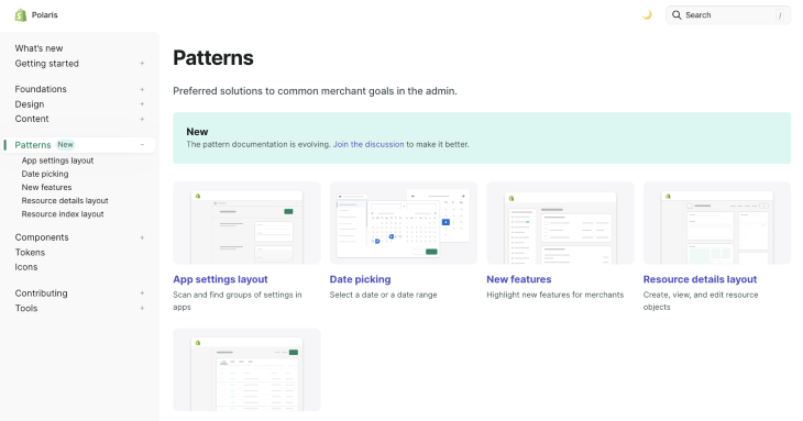
You don’t need to reinvent solutions that were already made by one of the most successful ecommerce platforms; it’s better to study from the leaders of the industry and have more time for research or other crucial UX challenges.
Each design system is unique. The specific components included in a design system will depend on the company’s goals and the needs of the product team. In a nutshell, it’s a great knowledge base that includes a UI kit, documents, guidelines, and even more to make a company’s design standard across platforms and enable teams to build better products faster. Let’s go through the essential elements of the design system.
An overview is usually an introductory section that includes general information about the design system. Most design systems embrace their design principles to share their values, set the same goals, and tell a story.
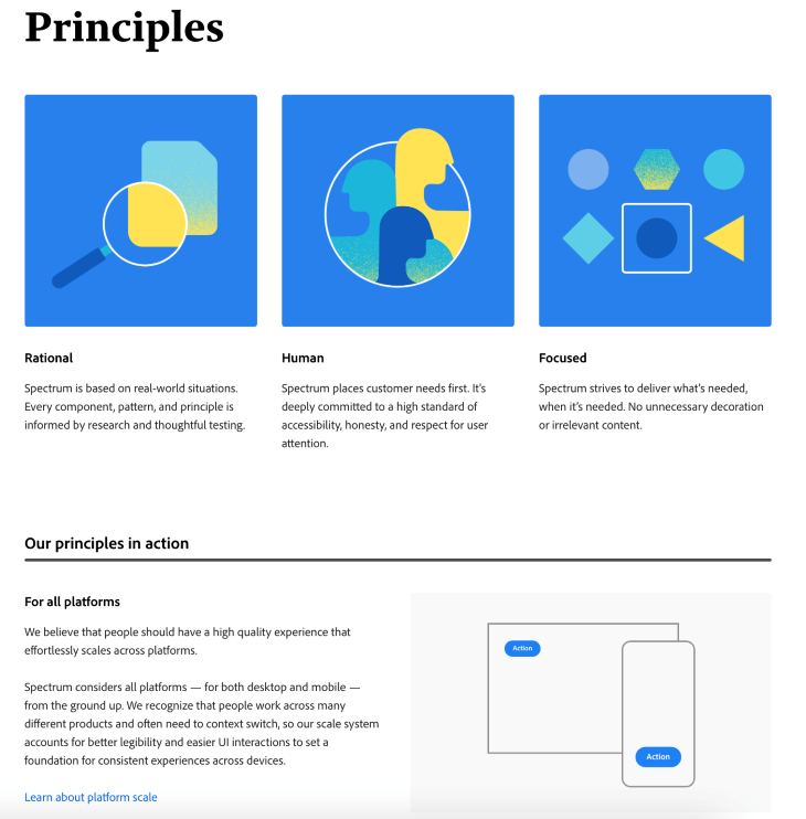
They focus on how a company’s product should look and which principles could help the team to achieve the desired result. As an example, take a look at Adobe’s Spectrum design system.
A UI kit, also called a component library, includes modular user interface components, such as buttons, dropdown menus, forms, typography, icons, and more.
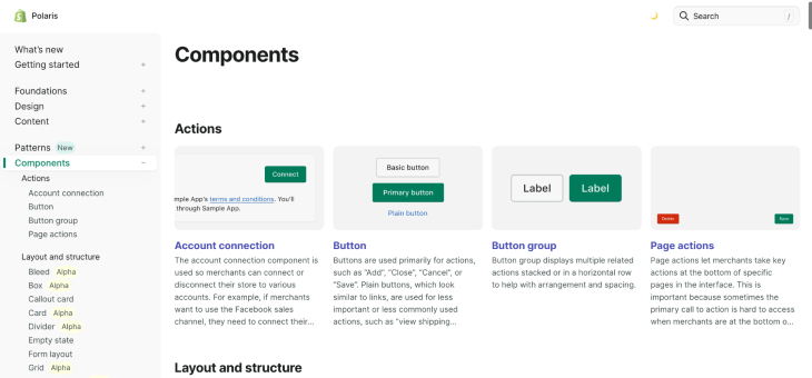
UI components have a visual consistency which makes them reusable. They help to provide an intuitive user experience. The following example is the components section of Shopify’s design system Polaris:
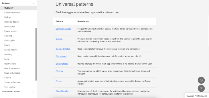
Patterns are the collection of components that are usually grouped in a separate library and meant to be reusable, the same as components. Patterns help designers reuse functionality and design. Check out IBM’s design system Carbon pattern library as an example:
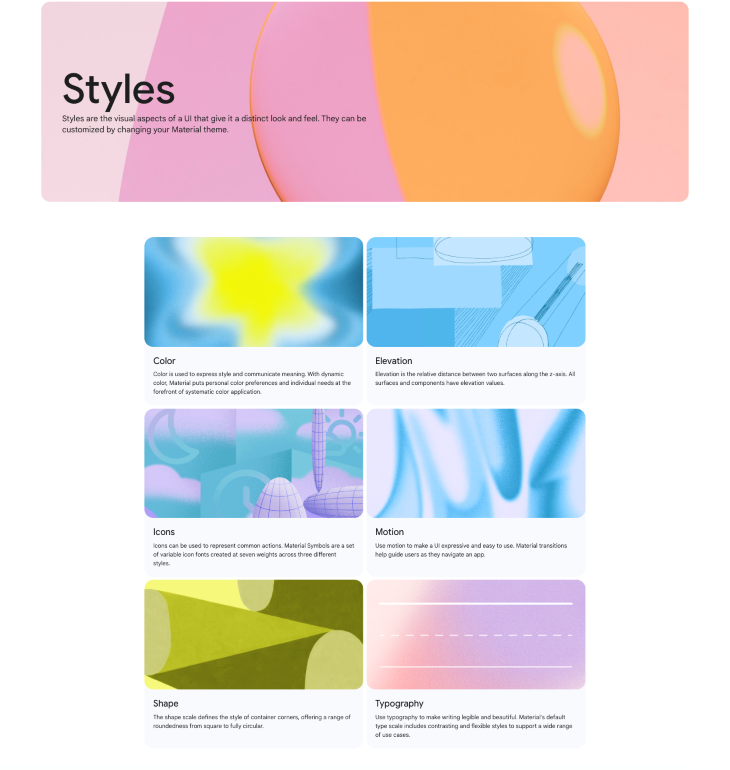
Branding guidelines usually outline a company’s vision and general look and feel of its branding. The brand guidelines explain how product teams should use their visual styles to stay on the same page.
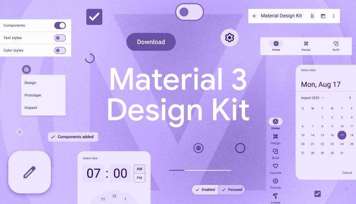
Check out the following example. These are the elements of Google’s Material Design style guide:
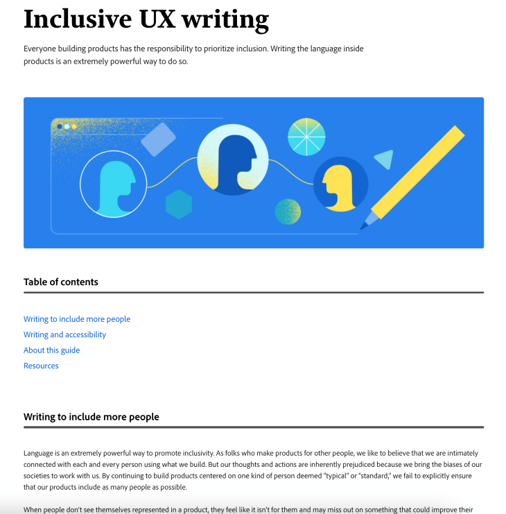
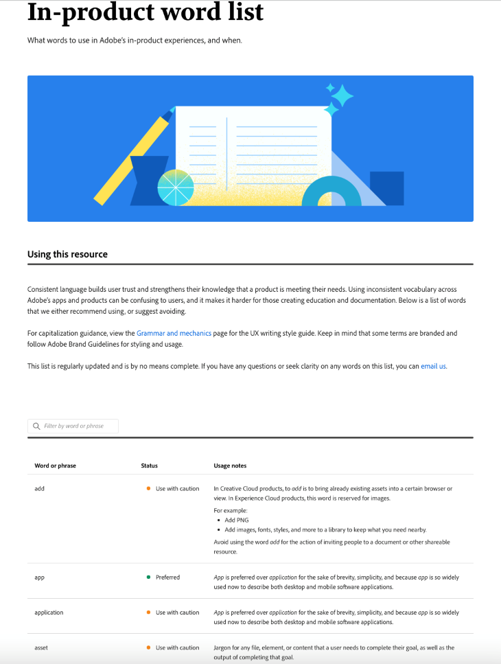
Companies care not only about the visual identity of their brand but also about their voice. Content guidelines help them to speak consistently to the user. Adobe’s Spectrum includes guidelines about tone and voice, grammar, language, and inclusivity:
They even give a list of words to use in Adobe’s in-product experiences:
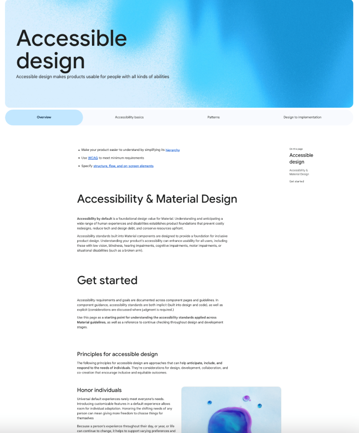
Accessible design is for everybody. Many companies understand the importance of accessibility: accessibility builds trust and makes it possible for people with disabilities to use the product. The main benefit of an accessible product is that it helps to make it enjoyable and easy to use for all users.
Most design systems include accessibility recommendations to make their product respond to the needs of users with different abilities. For example, Google’s Material Design guideline includes principles for accessible design, patterns, and implementation guidelines:
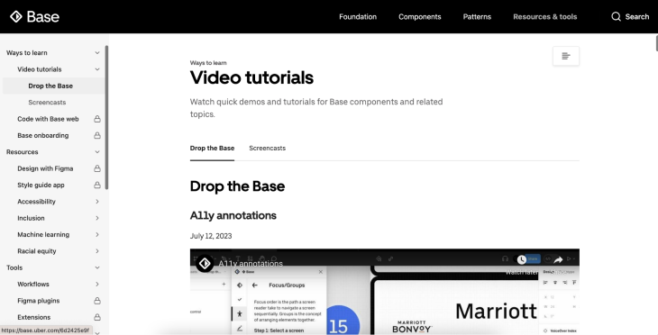
Shareable resources are an important part of the design system. This section usually includes video tutorials, plugins, and tools supporting the design creation process. For instance, Uber Base Web includes apps, plugins, extensions, and even more:
Great design systems significantly help UX Designers craft and implement better user interfaces and user friendly experiences. You can gain inspiration from the best design systems by studying their components, patterns, and layouts.
Besides, you can use them as a guide to create a product in a particular field. Here is a brief overview of the 10 best design systems each designer should know.
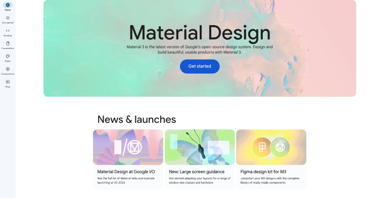
Google, a leading tech giant, created its Material Design in 2014. It is a design language developed by Google for Android devices. Their design system is crafted and supported by Google designers and developers.
Google’s Material design includes UX guidelines for everything: typography, grids, color, content, and even more. It combines principles, guidelines, and tools for crafting successful digital experiences. Google pays great attention to accessibility and gives super helpful layout tutorials.
The system includes documentation on how to use and implement UX solutions. Material Design is perfect to design for apps built for the Android platform because it will feel like a native Android app.
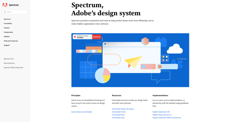
The main principles of Adobe’s design system Spectrum are “rational, human, and focused.” Adobe cares about the accessibility of its products, so each component of Spectrum meets WCAG (Web Content Accessibility Guidelines) standards.
The Spectrum design system provides a structured approach to design. Their goal is to create consistent experiences across both desktop and mobile devices. Spectrum is the perfect solution for designers and programmers who create plugins for Adobe applications.
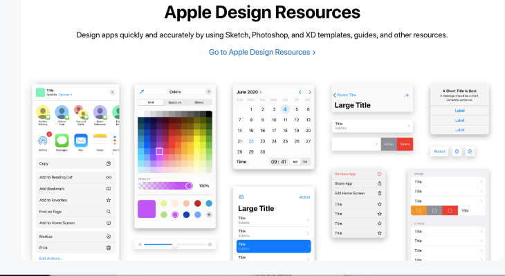
Apple’s human interface guidelines focus on the connection with users. Designers can quickly learn it because it offers step-by-step procedures. It is perfect for designing appealing apps that integrate seamlessly with Apple platforms.
You can advance your product using resources and tools for designers — menus, app architecture, themes, design templates, and much more. HIG also guides the development of all of Apple’s platforms and products, from the iPhone to the Apple Watch.
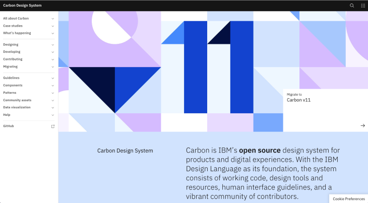
Carbon is a design system based on IBM’s design philosophy and principles. It consists of code, design resources, guidelines for user interfaces, and a vital contributor community.
Instead of repeatedly creating fundamental components, UX Designers can use Carbon’s prebuilt and universal assets to customize their products to address specific user needs. In addition, Carbon includes great tutorials on designing for accessibility.
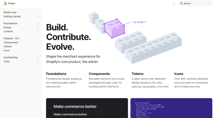
Shopify’s design system Polaris focuses on commerce and entrepreneurship. Polaris includes foundations, components, tokens, and icons as well as tools and interface content. Polaris can benefit Shopify designers because it provides solutions that easily integrate with Shopify.
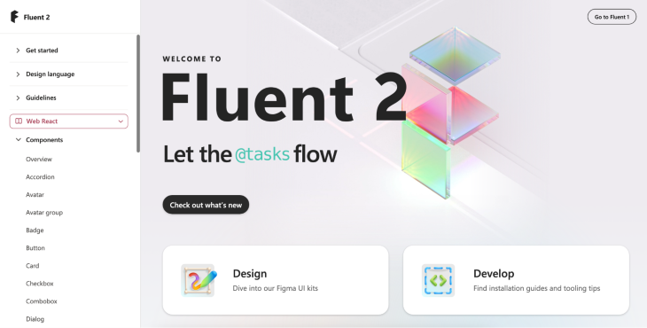
Microsoft developed its design system Fluent in 2017. It places a high priority on accessibility and internationalization, ensuring their designs are adaptable across different devices such as tablets, laptops, PCs, and televisions.
Fluent components give the UI and UX a distinctive appearance and feel. Fluent can help designers and developers create responsive, inclusive, modern, and aesthetically pleasing cross-platform interactions.
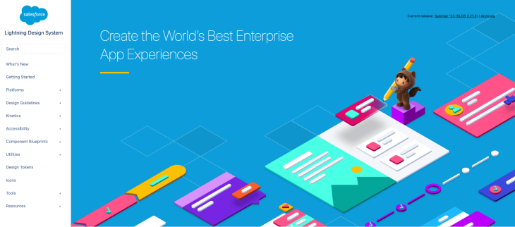
Created in 2015, the Lightning design system is perfect for custom applications that can be integrated with Salesforce. It includes a huge component library, which offers a consistent user interface.
The Lightning design system enhances collaboration, strengthens branding, and helps to create a user friendly design. Using Lightning, designers can quickly develop concepts and test interfaces.
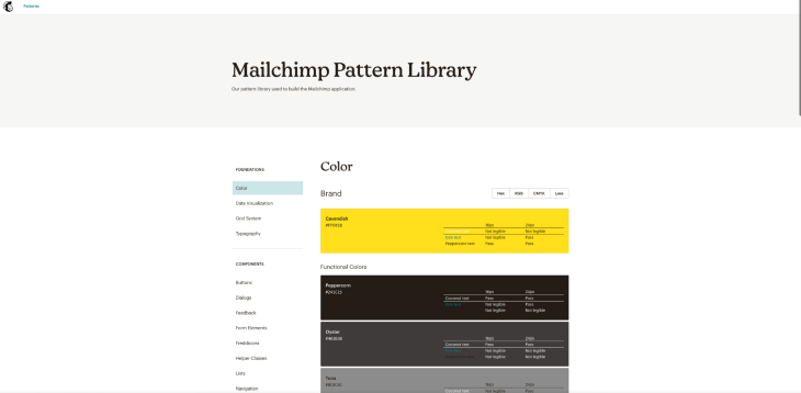
Marketing automation platform Mailchimp created its pattern library in 2018. It includes color, typography, grid systems, and data visualization. Helper classes enable designers to style elements easily across the application, and the visualization section helps to tell a clear and engaging data story.
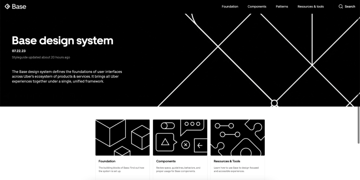
By moving the world, they create opportunities. Uber crafted its design system as a base for developing, iterating, and unifying its web products. Uber Base Web is a clear and concise design language that includes components, patterns, resources, and tools. If you need to tackle UX problems in transportation or traveling, the Uber design system is the best choice to gain ideas.
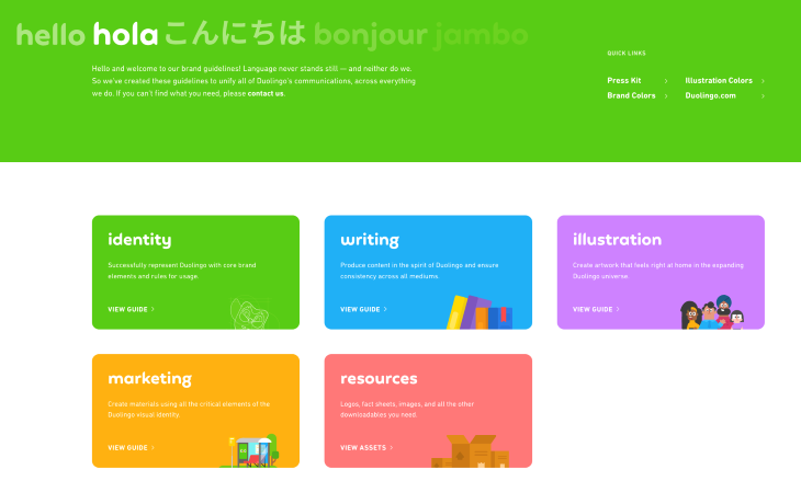
Duolingo’s mission is to create accessible language learning experiences worldwide. It is a valuable resource to gain insights for learning experience designers to design and improve learning courses.
Its brand guidelines can help you with your own branding and content creation. The Duolingo brand guidelines include considerable instructions on brand identity, illustration, color scheme, and valuable marketing materials.
Design systems are great resources to inspire UX designers and help them to build their products with a unified look and feel. They provide professionals with all the necessary tools and guidelines to create successful UX experiences across different platforms and devices, including desktop computers, and mobile phones.
A lot of these design systems are lauded for their clear guidelines and consistency — we designers could all learn something from them. Hopefully you’ve found one in this article that can inform your design decisions moving forward.
LogRocket's Galileo AI watches sessions and understands user feedback for you, automating the most time-intensive parts of your job and giving you more time to focus on great design.
See how design choices, interactions, and issues affect your users — get a demo of LogRocket today.
Figma’s AI features have exploded in 2026 — from text generation and image editing to full UI drafts and code handoff. But speed isn’t the same as quality. This guide breaks down every major feature, what it’s good at, and where human judgment still does the heavy lifting.

Zero UI works well for screenless, voice-first experiences, but most digital products still require visual interaction. Here’s why multimodal UX offers a more scalable foundation for the future of design.

Multimodal UX goes beyond designing for screens. Learn how context-aware systems, progressive modality, failover modes, and accessibility-first design create better digital product experiences.

Learn how context-aware mode prioritization and seamless transitions improve multimodal UX and reduce mode confusion.