Providing users with form field options to select from, rather than requiring them to manually enter information, can greatly improve the usability of your app. An example is a registration form, where a user may need to enter their state, country, or date of birth.

In this article, we’ll explore using Apple’s UIPickerView to provide users with a selection of data choices presented in a wheel format.
We’ll demonstrate how to add UIPickerView to a Swift form to provide users with choice selections for each field.
Let’s get started!
Jump ahead:
The Replay is a weekly newsletter for dev and engineering leaders.
Delivered once a week, it's your curated guide to the most important conversations around frontend dev, emerging AI tools, and the state of modern software.
UIPickerView?UIPickerView is a subclass of UIView. It is useful for iOS apps that use a spinning wheel with many choices for the user.
@MainActor class UIPickerView: UIView
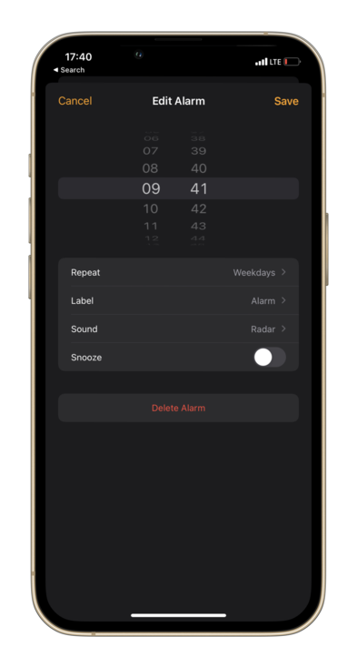
One example of this type of app is a slot machine, where a user spins the wheels to play the game. Another classic example is the iOS Clock app, in which the wheel is used to set the alarm. This app uses UIDatePicker, a custom subclass of UIPickerView, to set the alarm time.

UIPickerViewDataSource protocol?The UIPickerViewDataSource protocol helps to provide the number of components and rows for the picker view. We conform to this protocol to provide the data source for the picker view like the number of components, and the number of rows in each component, for displaying the picker view data.
This protocol has two methods for providing the counts for the picker view. Both methods are required to be implemented for any objects that conform to the UIPickerViewDataSource protocol.
The first method sets the number of components or columns that the picker view should display:
func numberOfComponents(in pickerView: UIPickerView) -> Int
In the case of the alarm screen, we have two components.
The second method sets the number of rows in each component that the picker view should display:
func pickerView(_ pickerView: UIPickerView,
     numberOfRowsInComponent component: Int) -> Int
Let’s consider the alarm screen example again. The first component (hours) has 24 rows, and the second component (minutes) has 60 rows. The specified component is a zero-indexed number identifying a component of UIPickerView. The components are numbered from left to right. So, the first component is 0 and the second component is 1.
Now, let’s look at some of UIPickerView’s main methods:
UIPickerViewDelegate protocol?The UIPickerViewDelegate protocol is used to provide the counts for the picker view to display. However, the UIPickerViewDelegate protocol is used to provide the picker view with the data it will need to construct itself.
@MainActor protocol UIPickerViewDelegate
The UIPickerViewDataSource protocol’s methods return:
The rowHeightForComponent method is used to return the row height for each component that the picker view will need to draw the content on the screen:
optional func pickerView(_ pickerView: UIPickerView,
              rowHeightForComponent component: Int) -> CGFloat
We return a float value indicating the height of the row in points.
Similarly, we have another method, widthForComponent to set the row width for each component:
optional func pickerView(_ pickerView: UIPickerView,
              widthForComponent component: Int) -> CGFloat
In order to provide content for the component’s rows, we must implement either a title, an attributed title, or a view for each row.
The simplest method, titleForRow, provides the title as a string for each row, like so:
optional func pickerView(_ pickerView: UIPickerView,
              titleForRow row: Int,
              forComponent component: Int) -> String?
Here, we have a new parameter row, which is a zero-indexed number identifying a row of a component. Remember that the rows are numbered from top to bottom.
To customize the string for more than a basic use case, we can create an attributed string and use the following attributedTitleForRow method:
optional func pickerView(_ pickerView: UIPickerView,
              attributedTitleForRow row: Int,
              forComponent component: Int) -> NSAttributedString?
This returns a styled title for the individual rows of the picker view.
N.B. if we implement both of these methods, the picker view will prioritize the attributed title method; if it returns a nil value, then the picker view will use the normal title instead
For advanced customization, we can create and return a whole UIView for each row:
optional func pickerView(_ pickerView: UIPickerView,
              viewForRow row: Int,
              forComponent component: Int,
              reusing view: UIView?) -> UIView
The UIView is called by the picker view when it needs the view to use for a row in a given component. We also have access to the view object that was previously used for a row but is now hidden and cached by the picker view.
We can have a UILabel, UIImageView, or even a custom view to use in the picker view!
When the user makes a selection by clicking on a given row in a given component, the UIPickerViewDelegate calls the following method:
optional func pickerView(_ pickerView: UIPickerView,
              didSelectRow row: Int,
              inComponent component: Int)
Based on the row that’s selected for a given component, we can store its value in the app.
Next, let’s look at a custom subclass of the UIPickerView for working with a picker that handles date and time.
UIDatePicker subclass?The UIDatePicker is a subclass of UIPickerView that is used to display dates and times. As mentioned previously, this subclass can be seen in action in the Alarm app on your iPhone.
This subclass has an instance property, datePickerMode, that we can set to have either date, time, time interval, or both date and time. We can also provide minimum and maximum dates. Unlike the delegation pattern of UIPickerView, UIDatePicker uses a target-action pattern for us to get the date or time. iOS14 provides a new date picker style that gives us an inline picker apart from the wheels picker by setting the preferredDatePickerStyle property.
Finally, we add a target on the picker for the valueChanged event:
datePicker.addTarget(self, action: #selector(onDateValueChanged), for: .valueChanged)

@objc func onDateValueChanged(_ datePicker: UIDatePicker) {
/// Use the latest date to update the view.
}
We’ve covered the basics of UIPickerView, the delegates that will help us to set the number of rows and components, the dimensions, the views, and the action for row selection. Now, we can move forward and create a sample form that uses a picker view, set the delegates, and then implement the corresponding methods!
UIPickerViewTo understand a practical example, we’ll create a Swift form with multiple picker views that have both single and double components, with each component having a different number of rows. Then, we’ll have a few labels that display the results when the user manipulates the picker wheel to select a particular row.
This demo will provide you with a thorough understanding of how to use UIPickerView in your own project.
The view controller will have three picker views: one for selecting the type of the income, a second for the source, and a third for the date when the income is received. The second picker will have two components: one for the source and a second that indicates if the income tax is fixed or variable.
N.B., this app demo is just for demonstration purposes, to show everything we can do with pickers; there are other ways to represent this kind of data
We have different enumerations to represent the various lists of options that a user may choose from:
enum Income: Int, CaseIterable {
  case source
  case type
}

enum IncomeTax: String {
  case fixed
  case variable
}

extension IncomeTax: CustomStringConvertible, CaseIterable {
  var description: String {
    rawValue.capitalized
  }
}

enum IncomeSource: String {
  case salary
  case interest
  case dividend
  case capitalGains = "Capital Gains"
  case royalty
  case rental
}

extension IncomeSource: CustomStringConvertible, CaseIterable {
  var description: String {
    rawValue.capitalized
  }
}

enum IncomeType: String {
  case primary
  case secondary
  case passive
}

extension IncomeType: CustomStringConvertible, CaseIterable {
  var description: String {
    rawValue.capitalized
  }
}
As the enumerations conform to CaseIterable protocol, we can get all the cases from it to show in the picker form.
We have three picker views (incomeSourcePickerView, incomeTypePickerView, and incomeMonthPickerView) and three labels (incomeSourceLabel, incomeTypeLabel, and incomeDateLabel)that show the selected data for the particular picker:
class IncomeViewController: UIViewController {
  private let incomeSourcePickerView: UIPickerView = {
    let pickerView = UIPickerView()
    pickerView.translatesAutoresizingMaskIntoConstraints = false
    return pickerView
  }()

  private let incomeTypePickerView: UIPickerView = {
    let pickerView = UIPickerView()
    pickerView.translatesAutoresizingMaskIntoConstraints = false
    return pickerView
  }()

  private let incomeMonthPickerView: UIDatePicker = {
    let datePicker = UIDatePicker()
    datePicker.datePickerMode = .date
    datePicker.preferredDatePickerStyle = .wheels
    datePicker.translatesAutoresizingMaskIntoConstraints = false
    return datePicker
  }()

  private let incomeSourceLabel: UILabel = {
    let label = UILabel()
    label.translatesAutoresizingMaskIntoConstraints = false
    return label
  }()

  private let incomeTypeLabel: UILabel = {
    let label = UILabel()
    label.translatesAutoresizingMaskIntoConstraints = false
    return label
  }()

  private let incomeDateLabel: UILabel = {
    let label = UILabel()
    label.translatesAutoresizingMaskIntoConstraints = false
    return label
  }()
}
Then we have three types for defining the data of the picker views:
private let sources = IncomeSource.allCases
private let types = IncomeType.allCases
private let taxes = IncomeTax.allCases
Since we’re creating the picker views programmatically, we’ll add the constraints for it manually. The source picker view is on the top, followed by the type picker, and the date picker is last. We’ll add these views inside a stack view, like so:
private func setupStackView() {
  stackView.addArrangedSubview(incomeTypePickerView)
  stackView.addArrangedSubview(incomeTypeLabel)

  stackView.addArrangedSubview(incomeSourcePickerView)
  stackView.addArrangedSubview(incomeSourceLabel)

  stackView.addArrangedSubview(incomeDatePicker)
  stackView.addArrangedSubview(incomeDateLabel)

  view.addSubview(stackView)

  stackView.centerXAnchor.constraint(equalTo: view.centerXAnchor).isActive = true
  stackView.centerYAnchor.constraint(equalTo: view.centerYAnchor).isActive = true
}
With the constraints set up, let’s add the delegate and data source for the picker views. UIPickerView uses delegates to communicate, but UIDatePicker uses a target action pattern, as mentioned earlier.
override func viewDidLoad() {
  super.viewDidLoad()

  view.backgroundColor = .white

  incomeTypePickerView.delegate = self
  incomeTypePickerView.dataSource = self

  incomeSourcePickerView.delegate = self
  incomeSourcePickerView.dataSource = self

  setupStackView()

  incomeDatePicker.addTarget(self, action: #selector(onIncomeDateValueChanged), for: .valueChanged)
}

@objc private func onIncomeDateValueChanged(_ datePicker: UIDatePicker) {
  incomeDateLabel.text = datePicker.date.formatted(date: .long, time: .omitted)
}
When the date value is changed, we get the date from the date picker, format it to show a long date, omit the time, and show it in incomeDateLabel.
After setting the delegate and dataSource for both picker views to self, we have to provide the corresponding methods of both protocols.
UIPickerViewDataSource methodsFirst, we’ll provide the UIPickerViewDataSource methods. We have to provide the number of components and the number of rows in each component for each picker view:
// MARK: - UIPickerViewDataSource
extension IncomeViewController: UIPickerViewDataSource {
  func numberOfComponents(in pickerView: UIPickerView) -> Int {
    // 1
    let incomePicker = Income(rawValue: pickerView.tag)

    // 2
    switch incomePicker {
      case .type:
        return 1
      case .source:
        return 2
      default:
        return 0
    }
  }

  func pickerView(_ pickerView: UIPickerView, numberOfRowsInComponent component: Int) -> Int {
    let incomePicker = Income(rawValue: pickerView.tag)

    // 3
    switch incomePicker {
      case .type:
        return types.count
      case .source:
        // 4
        let sourceComponent = IncomeSourcePicker(rawValue: component)

        // 5
        switch sourceComponent {
          case .sourceName:
            return sources.count
          case .taxType:
            return taxes.count
          default:
            return 0
        }
      default:
        return 0
    }
  }
}
Let’s review this code.
Income from the picker view’s tag property. We previously set the tag for each picker view; this helps us to uniquely identify the view.type: picker view has 1 component (column), whereas income .source: picker view has 2 components (columns).type: picker view, we return the count of all types.source: picker view, we have an interesting case as it has two different components. We create an enumeration, IncomeSourcePicker, from the component’s integer valuesources and taxes for the given cases of IncomeSourcePickerUIPickerViewDelegate methodsNext, we’ll provide the UIPickerViewDelegate methods. This involves displaying the title for each row and responding to user selection of a row.
// MARK: - UIPickerViewDelegate
extension IncomeViewController: UIPickerViewDelegate {
  func pickerView(_ pickerView: UIPickerView, titleForRow row: Int, forComponent component: Int) -> String? {
    // 1
    let incomePicker = Income(rawValue: pickerView.tag)

    switch incomePicker {
      case .type:
        return types[row].description
      case .source:
        let sourceComponent = IncomeSourcePicker(rawValue: component)

        switch sourceComponent {
          case .sourceName:
            return sources[row].description
          case .taxType:
            return taxes[row].description
          default:
            return nil
        }
      default:
        return nil
    }
  }

  func pickerView(_ pickerView: UIPickerView, didSelectRow row: Int, inComponent component: Int) {
    let incomePicker = Income(rawValue: pickerView.tag)

    switch incomePicker {
      case .type:
        incomeTypeLabel.text = "Income type is \(types[row].description)."
      case .source:
        let sourceComponent = IncomeSourcePicker(rawValue: component)

        // 2
        switch sourceComponent {
          case .sourceName:
            incomeSourceLabel.text = "Income source is \(sources[row].description)."
          case .taxType:
            incomeSourceLabel.text = "\(taxes[row].description) taxes."
          default: ()
        }
      default: ()
    }
  }
}
Again, let’s review the above code:
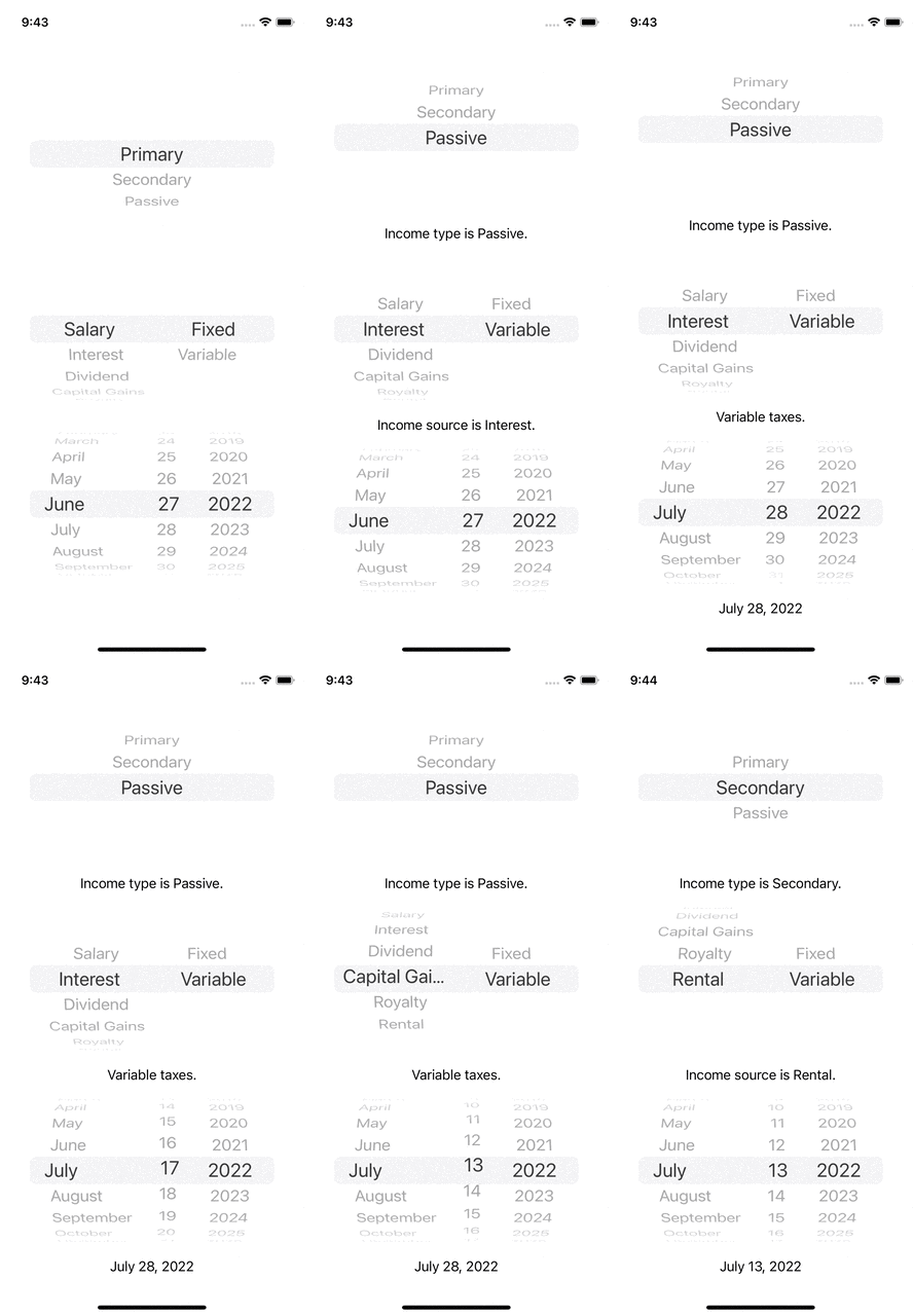
didSelectRow method is called. We use this method to update the labels for the particular row and componentWe’ve set up two picker views and one date picker! Now, let’s build and run the app to see how it looks when the user manipulates the different pickers:

For views that require selecting from multiple options, consider using UIPickerView in your iOS app. To provide an option for your user to select a date and time, UIDatePicker is the go-to view. With the delegation pattern in UIPickerView, you provide and handle the data in your app and use a target-action pattern for UIDatePicker.
In this article, we explored working with UIPickerView and h UIDatePicker. as well as the various methods available for you to use. We also explored a practical example, using UIPickerView in a Swift form, to provide you with a solid understanding of working with picker views.
I hope you find this article helpful and will try using UIPickerView in your iOS apps!
Install LogRocket via npm or script tag. LogRocket.init() must be called client-side, not
server-side
$ npm i --save logrocket

// Code:

import LogRocket from 'logrocket';
LogRocket.init('app/id');
// Add to your HTML:

<script src="https://cdn.lr-ingest.com/LogRocket.min.js"></script>
<script>window.LogRocket && window.LogRocket.init('app/id');</script>

A hands-on test of Claude Code Review across real PRs, breaking down what it flagged, what slipped through, and how the pipeline actually performs in practice.

CSS art once made frontend feel playful and accessible. Here’s why it faded as the web became more practical and prestige-driven.

Learn how inline props break React.memo, trigger unnecessary re-renders, and hurt React performance — plus how to fix them.

This article showcases a curated list of open source mobile applications for Flutter that will make your development learning journey faster.
Would you be interested in joining LogRocket's developer community?
Join LogRocket’s Content Advisory Board. You’ll help inform the type of content we create and get access to exclusive meetups, social accreditation, and swag.
Sign up now