The rise of multi-framework projects in recent years has opened up new possibilities for web developers seeking increased flexibility and efficiency in their workflows. Sveltris is one such experimental framework for building interoperable apps that is currently gaining traction.

In this article, we will delve into the world of Sveltris, exploring its purpose, features, and benefits, as well as the benefits and drawbacks of using multiple frameworks in a single project. Jump ahead:
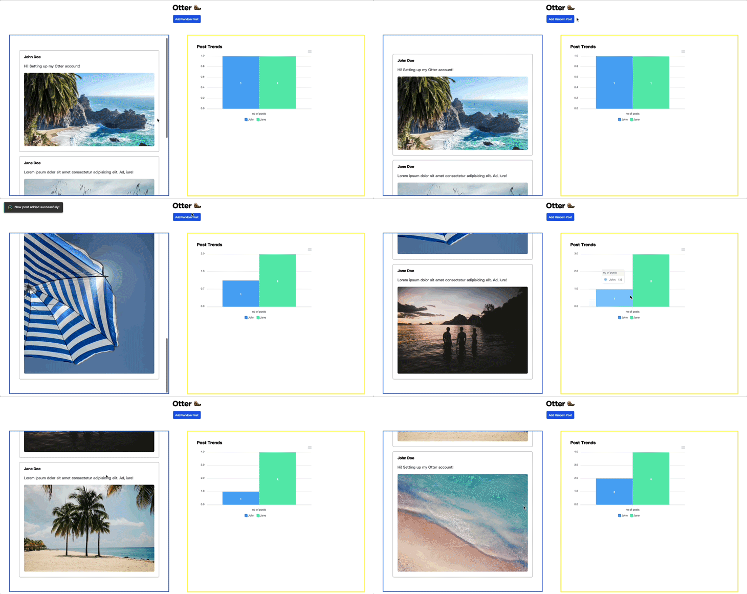
Toward the end of this article, we’ll build a social dashboard that leverages both React and Svelte for different parts of the application. The final output will look like this:
You can also preview the live project here.
Sveltris is a relatively new framework that enables the seamless integration of React and Svelte in a single application. With Sveltris, you can leverage the power of both frameworks by intermixing UI primitives like components and state primitives like Hooks.
Under the hood, Sveltris leverages React and the React DOM to render the application. However, for state primitives like Hooks, Sveltris utilizes the lightweight react-nil renderer instead of the React DOM, as state primitives don’t require rendering to DOM nodes.
Sveltris offers enhanced flexibility and allows you to leverage the unique strengths of both React and Svelte frameworks, resulting in more efficient and tailored solutions.
For example, you can combine React’s virtual DOM and component-based architecture with Svelte’s small bundle size and runtime efficiency. You can also take advantage of React’s vast ecosystem of third-party libraries and components.
Another key advantages of Sveltris is its ability to integrate existing codebases seamlessly. You can easily incorporate React and Svelte components without the need for a complete rewrite.
Even in legacy projects, either framework can be gradually introduced, replacing specific components and transitioning to a more efficient and reactive architecture.
Sveltris also provides out-of-the-box support for server-side rendering (SSR) without requiring additional configuration. This ensures that components work seamlessly in SSR environments, further enhancing the versatility and compatibility of Sveltris applications.
Additionally, Sveltris enhances collaboration when working with teams comprising members with expertise in either React or Svelte. With Sveltris, you can build features in your preferred framework and seamlessly combine them, fostering a more flexible and efficient development process.
Sveltris allows you to integrate React into an existing Svelte app or vice versa. You can also configure it to work with React and Svelte applications built with esbuild, webpack, or Vite. We’ll use Vite in this tutorial.
To begin using Svelte in a React application, run the command below to create a new React application:
npm create vite@latest sveltris-react -- --template react
# OR
yarn create vite sveltris-react  --template react
Change to the app’s directory and install all default dependencies:
cd sveltris-react
npm install
Next, run the command below to install Sveltris and the Svelte Vite plugin as a dev dependency:
npm install sveltris
npm install --save-dev @sveltejs/vite-plugin-svelte
Finally, modify the vite.config.js file to import the Svelte and Sveltris plugins and to make Svelte hydratable:
import { defineConfig } from "vite";
import react from "@vitejs/plugin-react";
import { sveltrisVitePlugins } from "sveltris";
import { svelte } from "@sveltejs/vite-plugin-svelte";

export default defineConfig({
  plugins: [
    react(),
    ...sveltrisVitePlugins(),
    svelte({ compilerOptions: { hydratable: true } }),
  ],
});
We can now create Svelte components and use them in our React application.
To get started, create a new Hello.svelte file in the default /src directory and paste the code below into it:
<div>
    <h1>Hello from Svelte!</h1>
</div>
<style>
    h1{
        border: 5px solid #fff000;
        padding: 20px;
    }
</style>
This code basically exports a heading component with the message “Hello from Svelte!”
Next, replace the entire contents of the default src/App.jsx file with the code below:
import Hello from "./Hello.svelte?in-react";

function App() {
  return (
    <>
      <Hello />
      <h1 style={{ padding: "20px", border: "5px solid #bc9aed" }}>
        Hello from React!
      </h1>
    </>
  );
}

export default App;
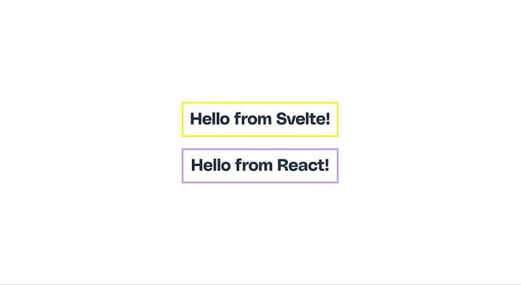
In the code above, we imported the Hello Svelte component we created earlier with an additional in-React query parameter. We also defined another heading with the message “Hello from React!” to distinguish the Svelte component from React.
When we run our application using the npm run dev command, we should see an output similar to the one below:
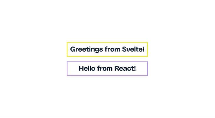
Sveltris also accepts props and performs a re-render whenever a prop value changes.
For instance, suppose we modify our Hello.svelte component to accept a custom message prop:
<script>
    export let message;
</script>
<div>
    <h1>{message} from Svelte!</h1>
</div>
We can pass the message as we normally would in our React application:
import Hello from "./Hello.svelte?in-react";

function App() {
  return (
    <>
      <Hello message="Greetings" />
      <h1 style={{ padding: "20px", border: "5px solid #bc9aed" }}>
        Hello from React!
      </h1>
    </>
  );
}

export default App;
And we should get something like the output below:
Furthermore, events are interoperable in the sense that all Svelte events, such as on:click, are mapped to camelCase events, such as onClick:
import Input from './Input.svelte?in-react';
import { useState } from 'react'

const [value, setValue] = useState("")

<Input value={value} onChange={v => setValue(v)} />;
To start using React in a Svelte application, we’d need to go through the same steps as in the previous section. First, use the command below to create a new Svelte app:
npm create vite@latest sveltris-svelte -- --template svelte
cd sveltris-svelte && npm install
Next, run the command below to install Sveltris and the React Vite plugin as a dev dependency:
npm install sveltris
npm install --save-dev @vitejs/plugin-react
Update your vite.config.js file to import the React and Sveltris plugins, as shown below:
import { defineConfig } from "vite";
import react from "@vitejs/plugin-react";
import { sveltrisVitePlugins } from "sveltris";
import { svelte } from "@sveltejs/vite-plugin-svelte";

export default defineConfig({
  plugins: [svelte(), react(), ...sveltrisVitePlugins()],
});
To try things out, create a new Card.jsx file in the default /src folder and paste the code below into it:
export default function Card() {
  return (
    <div style={{ border: "3px solid #bc9aed", borderRadius: "5px", padding: "10px" }}>
      <h1>{title}</h1>
      <p>{content}</p>
    </div>
  );
}
In this example, we created a React component that accepts title and content props and renders a styled card based on the data in the props.
Next, open the default src/App.svelte file and also replace its content with the code below:
<script>
  import Card from './Card.jsx?in-svelte';
</script>

<main style="border: 3px solid #FFC107;padding: 25px;">
  <h1>Svelte App</h1>
  <Card title="React Card" content="Card component created with React and imported to a Svelte app." />
</main>
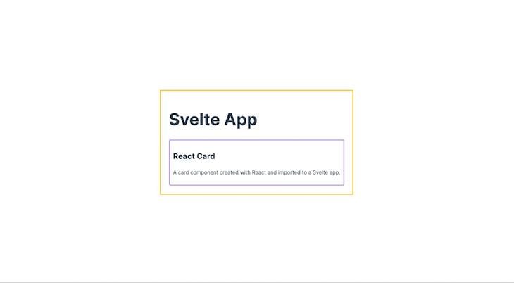
We basically imported the component we made earlier and rendered it in our Svelte app. When you run your application, you should see something like this:
Sveltris also allows you to use React Hooks within your Svelte component by enclosing the call in a use() function, which returns a read-only Svelte store that your component can subscribe to.
This feature proves valuable in various scenarios, particularly for enhancing functionality and promoting reusability. It also becomes beneficial when you are already familiar with React Hooks and prefer using them for specific functionalities.
The following is an example of using React’s useState Hook within a Svelte application to create a counter application:
<script>
import { useState } from 'react'
import { use } from 'sveltris/svelte'

const counter = use(() => useState(0))
</script>

{#if $counter}
  {@const [count, setCount] = $counter}
  <button on:click={() => setCount(c => c - 1)}>-</button>
    {count}
  <button on:click={() => setCount(c => c + 1)}>+</button>
{/if}
The code above should output the following:

It’s also worth noting that the value of the store created with the use() function is undefined during the initial render, so it must be accessed within a #if block, as shown in the previous example.
We’re building an interoperable social media dashboard using Sveltris, incorporating components created with Svelte and React. We’ll also utilize third-party packages from these libraries.
Here’s how our app will work:
To display the bar chart, we’ll utilize the react-apexcharts package. Additionally, when a new post is added, we’ll show a success toast using the svelte-svoast package.
Let’s build on the Svelte-in-React app from the previous section and install the required packages using the following code:
yarn add react-apexcharts apexcharts svoast
This command will install the react-apexcharts and svelte-svoast libraries.
Next, copy and paste the code below into the default src/index.css file to apply the required styling for our application:
* {
  margin: 0;
  padding: 0;
  box-sizing: border-box;
  font-family: Polysans, sans-serif;
}

main .header {
  text-align: center;
  margin: 10px 0;
}

.container {
  display: flex;
  justify-content: space-between;
  padding: 40px;
  height: 87vh;
}

.first-row {
  border: 3px solid #1a50e6;
  padding: 40px;
  width: 45%;
  height: 100%;
  overflow: auto;
}

.add-btn {
  cursor: pointer;
  font-size: 12px;
  padding: 10px 10px;
  margin-top: 10px;
  background-color: #1a50e6;
  color: #fff;
  border: none;
  border-radius: 5px;
}

.posts-wrapper {
  margin-top: 40px;
}

.post-card {
  padding: 20px;
  border-radius: 5px;
  border: 1px solid #393e43;
  margin-bottom: 20px;
}

.post-card p {
  margin: 20px 0;
  color: #393e43;
}

.post-card img {
  max-width: 100%;
  border-radius: 5px;
}

.sec-row {
  border: 3px solid #fff000;
  padding: 40px;
  width: 50%;
}
With our app all set up, we can start adding React and Svelte features and functionalities.
Let’s proceed by creating a new post card and toast component in Svelte. First, create a file named PostCard.svelte inside the src/ folder and paste the code below:
<script>
  export let id, author, content;
</script>

<div class="post-card">
  <h4>{author}</h4>
  <p>{content}</p>
  <img src={"https://source.unsplash.com/random/?beach," + id} alt="" />
</div>
The code above generates a basic Svelte post-card component, along with a random image from Unsplash, accepting id, author, and content as props.
Next, create a file named Toast.svelte and paste the following code:
<script>
  export let showToast, toastMessage;
  import { Toasts, toast } from "svoast";

  $: if (showToast) {
    launchToast();
  }

  async function launchToast() {
    toast.success(toastMessage);
  }
</script>

<Toasts position="top-left" />
The code above creates a new toast component using the svoast package. It accepts a showToast prop to trigger the visibility of the toast and a toastMessage prop for the message to be displayed.
Let’s replace the content of the default src/App.jsx file with the following code:
import React, { useState } from "react";
import Chart from "react-apexcharts";
import Toast from "./Toast.svelte?in-react";
import PostCard from "./PostCard.svelte?in-react";

const initialPosts = [
  {
    author: "John Doe",
    content: "Hi! Setting up my Otter account!",
  },
  {
    author: "Jane Doe",
    content: "Lorem ipsum dolor sit amet consectetur adipisicing elit. Ad, iure!",
  },
];

const getPostCount = (posts, author) => {
  return posts.filter((post) => post.author === author).length;
};

const App = () => {
  const [posts, setPosts] = useState(initialPosts);
  const [showToast, setShowToast] = useState(false);

  const addRandPost = () => {
    const randPost = posts[Math.floor(Math.random() * posts.length)];
    const updatedPosts = [...posts, randPost];
    setPosts(updatedPosts);
    setShowToast(true);
  };

  return (
    <>
      <Toast showToast={showToast} toastMessage="New post added successfully!" />
      <main>
        <div className="header">
          <h1>Otter 🦦</h1>
          <button className="add-btn" onClick={addRandPost}>
            Add Random Post
          </button>
        </div>
        <div className="container">
          <div className="first-row">
            <div className="posts-wrapper">
              {posts.map((post, id) => (
                <React.Fragment key={id}>
                  <PostCard id={id} author={post.author} content={post.content} />
                </React.Fragment>
              ))}
            </div>
          </div>
        </div>
      </main>
    </>
  );
};

export default App;
In the code above, we define an array of initial posts and iterate through it in the markup, rendering the Svelte PostCard component we created earlier for each post.
We also create an Add Random Post button that adds a new random post when clicked and displays the SVoast toast notification after a post is added. Additionally, we define a getPostCount() function that we will utilize later to display the chart library.
At this point, previewing our application would result in an output similar to the one shown below:
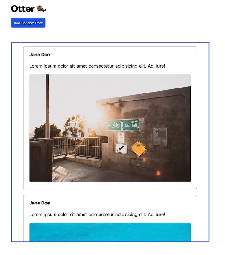
To add a bar chart displaying the number of posts for each user, we’re going to add some code to the App.jsx file.
First, define a new state called chartData with the following default data:
const [chartData, setChartData] = useState(() => {
  const johnPostsCount = getPostCount(posts, "John Doe");
  const janePostsCount = getPostCount(posts, "Jane Doe");

  return {
    options: {
      chart: {
        id: "basic-bar",
      },
      xaxis: {
        categories: ["no of posts"],
      },
    },
    series: [
      { name: "John", data: [johnPostsCount] },
      { name: "Jane", data: [janePostsCount] },
    ],
  };
});
In the code above, we utilize the getPostCount() function we defined earlier to get the post count for each user.
Next, update the addRandPost() function to automatically update the chart data when a new post is added:
const addRandPost = () => {
  const randPost = posts[Math.floor(Math.random() * posts.length)];
  const updatedPosts = [...posts, randPost];
  setPosts(updatedPosts);

  setChartData((prevChartData) => {
    const johnPostsCount = getPostCount(updatedPosts, "John Doe");
    const janePostsCount = getPostCount(updatedPosts, "Jane Doe");

    return {
      ...prevChartData,
      series: [
        { name: "John", data: [johnPostsCount] },
        { name: "Jane", data: [janePostsCount] },
      ],
    };
  });

  setShowToast(true);
};
Finally, update the JSX code to render the bar chart with the chartData:
<div className="container">
  <div className="first-row">
    {/* ... */}
  </div>
  <div className="sec-row">
    <h3>Post Trends</h3>
    <Chart
      options={chartData.options}
      series={chartData.series}
      type="bar"
      width="500"
    />
  </div>
</div>
After making these updates, our Otter social application is now complete, and we should have an output similar to the one shown below:

This application demonstrates the strength of Sveltris in combining React and Svelte to build powerful applications.
We created the Toast and PostCard components using Svelte, with the Toast component utilizing a third-party Svelte component. Additionally, we showcased the ability to share reactive data between Svelte and React in our App.jsx file, highlighting the power of Svelte’s interoperability.
You can find the complete code for this sample application on GitHub. Additionally, you can view the live output of the application for your convenience.
Throughout this tutorial, we explored Sveltris, a powerful framework for building interoperable React and Svelte applications. Sveltris opens up exciting opportunities for developers to harness the power of React and Svelte together.
While Sveltris currently only supports React, there are other frameworks like Astro that can integrate multiple frameworks. Check out this article on building a multi-framework dashboard with Astro to see how it works.
Install LogRocket via npm or script tag. LogRocket.init() must be called client-side, not
server-side
$ npm i --save logrocket

// Code:

import LogRocket from 'logrocket';
LogRocket.init('app/id');
// Add to your HTML:

<script src="https://cdn.lr-ingest.com/LogRocket.min.js"></script>
<script>window.LogRocket && window.LogRocket.init('app/id');</script>
Would you be interested in joining LogRocket's developer community?
Join LogRocket’s Content Advisory Board. You’ll help inform the type of content we create and get access to exclusive meetups, social accreditation, and swag.
Sign up now
Discover how to use Gemini CLI, Google’s new open-source AI agent that brings Gemini directly to your terminal.

This article explores several proven patterns for writing safer, cleaner, and more readable code in React and TypeScript.

A breakdown of the wrapper and container CSS classes, how they’re used in real-world code, and when it makes sense to use one over the other.

This guide walks you through creating a web UI for an AI agent that browses, clicks, and extracts info from websites powered by Stagehand and Gemini.