Writing quality CSS is tricky. People seem to get exasperated with CSS more so than with other technologies, and that’s why I’m surprised that using a linter like Stylelint for CSS is not discussed more often. Catching and fixing errors as you go, as well as enforcing best practices while coding, can significantly improve code quality.

And, while many modern dev tools like Vue CLI and Create React App include ESLint as part of their configuration so that you can easily lint JavaScript, you are on your own when it comes to linting CSS.
This article is not meant to be a stand-in for Stylelint’s official user guide, which is well written and will cover most of your needs. This article aims to give you an up-to-date look at some of the advanced things Stylelint can do for you (which may surprise you!) and shows how you can integrate Stylelint into your workflow.
First, here’s a quick overview of Stylelint.
The Replay is a weekly newsletter for dev and engineering leaders.
Delivered once a week, it's your curated guide to the most important conversations around frontend dev, emerging AI tools, and the state of modern software.
If you are new to linters, you can read a tutorial on linting CSS, written by the author of Stylelint to get a complete background.
Stylelint understands the latest CSS syntax and parses CSS-like syntaxes such as SCSS, Sass, and Less.
Stylelint can extract embedded styles from:
Essentially, Stylelint should be able to parse your CSS in any form, anywhere. Similar to ESLint, it has built-in rules to catch errors and can automatically fix some of them. It supports shareable configs and has plugins that extend the functionality. It has integrations for code editors, task runners, and some bundlers.
Stylelint follows similar conventions to ESLint.
First, use npm to install Stylelint, along with the stylelint-config-standard to enable a core set of rules. Stylelint-config-standard is based on the common stylistic conventions common in a handful of CSS style guides, such as idiomatic CSS principles and Airbnb’s style guide.
npm install --save-dev stylelint stylelint-config-standard
Create a configuration file in the root of your project. It can be named .stylelintrc or .stylelintrc.json:
{
  "extends": "stylelint-config-standard"
}
Now you can run Stylelint on the command line. For example, to target only the CSS files in your project, run stylelint "**/*.css". To automatically fix errors, you can add the --fix flag.

It is a good idea to read through the standard rules to gain more familiarity with Stylelint. Some people advocate starting with a blank config and only adding the rules you need, while others use the standard config as the base and modify it as they gain more experience.
The latter is certainly the fastest way to get going. I think it’s a good idea to leave auto-fix off initially so that you can see the common errors occurring and understand them. Once you’ve reached a good understanding, turn on auto-fix. Of course, it’s up to you!
Check out the official user guide if you want to learn more about Stylelint’s configuration and general usage. I will now talk about the bits I haven’t seen covered well elsewhere.
Beyond the basics, Stylelint can do some things that you may not expect but will appreciate. If you would like an example config that uses most of what I am about to discuss, you can install my config from my npm.
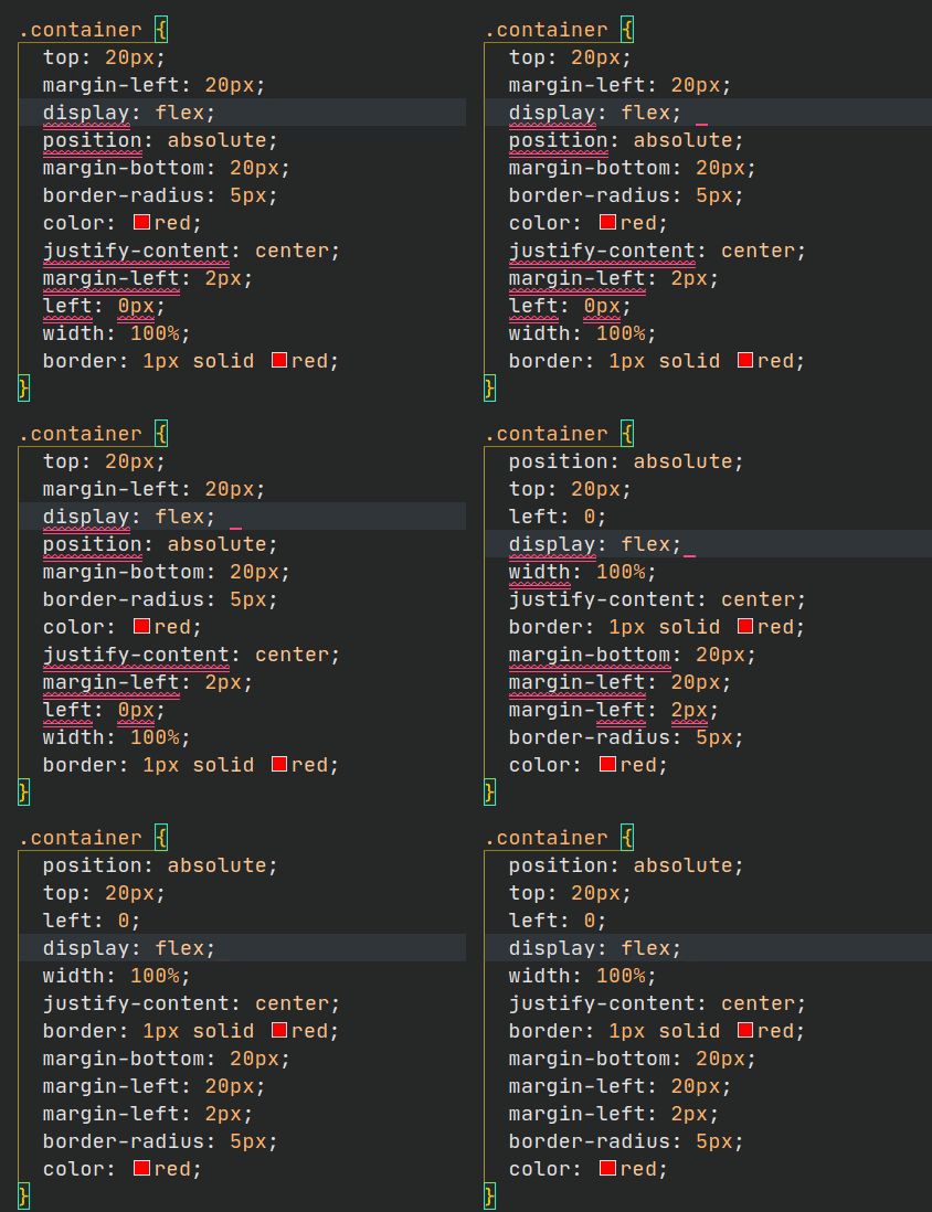
The stylelint-order plugin can automatically sort properties in an order of your choosing. This can help make your CSS code easier to scan and comprehend. It is handy to have properties sorted every time you save, as below.

I would issue a word of caution with automating this on projects, as it might break stuff if it is done blindly. This is why Prettier opted not to include it as a feature. Using @mixin and @include in Sass is one area that you’d want to be careful. Because properties are included from outside the current block, changing the order of existing declarations may change the computed style for that rule.
Alphabetic ordering is not the only ordering pattern that people follow. Two additional examples are:
The idiomatic CSS style guide has some advice on which to use and when.
If declarations are to be consistently ordered, they should be in accordance with a single, simple principle.
Smaller teams may prefer to cluster related properties (e.g., positioning and box-model) together.
Larger teams may prefer the simplicity and easier maintenance that comes with alphabetical ordering.
Examples of groups are: positioning properties (position, top, bottom, left, right, float, display) and box-model properties (width, height, margin, padding).
I recommend reading the articles: “Harry Potter and the Order of CSS” by Anton Korzunov and “Organize your CSS declarations alphabetically” by Eric Bailey if you want to learn more on this topic. The authors have contrasting views!
I started to use the stylelint-config-idiomatic-order config for some of my personal projects. It organizes properties into several different groups, with the main groups being: layout, display, and box model.
The organization roughly equates to something like this:
.wrapper{
  /* position */
  position: absolute;
  top: 20px;
  left: 0;

  /* display */
  display: flex;
  justify-content: center;

  /* box-model */
  width: 100%;
  height: 100%;
  margin-bottom: 20px;
  margin-left: 20px;
  margin-left: 2px;

  color: red;

  /* groups family of props together */
  border: 1px solid red;
  border-radius: 5px;
}
If you want blank lines between the groups, you need to tweak the built-in rules related to empty lines with declaration-empty-line-before. Adding the rule below did the trick for me. It effectively disables reporting empty lines between declarations as an error.
 "declaration-empty-line-before": [
      "always",
      {
        "ignore": [
          "after-comment",
          "after-declaration",
          "first-nested",
          "inside-single-line-block"
        ]
      }
    ]
The stylelint-a11y plugin can help make accessibility a more significant part of your dev process. I think this is great. Accessibility should be a key concern and not be left until later.
The plugin adds these rules:
| Recommended/Fixable Rule | Rule ID | Description |
|---|---|---|
| content-property-no-static-value | Disallow unaccessible CSS generated content in pseudo-elements | |
| font-size-is-readable | Disallow font sizes less than 15px |
|
| line-height-is-vertical-rhythmed | Disallow not vertical rhythmed line-height |
|
| ⭐️✒️ | media-prefers-reduced-motion | Require certain styles if the animation or transition in media features |
| media-prefers-color-scheme | Require implementation of certain styles for selectors with colors. | |
| no-display-none | Disallow content hiding with display: none property |
|
| no-obsolete-attribute | Disallow obsolete attribute using | |
| no-obsolete-element | Disallow obsolete selectors using | |
| no-spread-text | Require width of text in a comfortable range | |
| ⭐️ | no-outline-none | Disallow outline clearing |
| no-text-align-justify | Disallow content with text-align: justify |
|
| ⭐️✒️ | selector-pseudo-class-focus | Require or disallow a pseudo-element to the selectors with :hover |
⭐️: the mark of recommended rules ✒️: the mark of fixable rules.
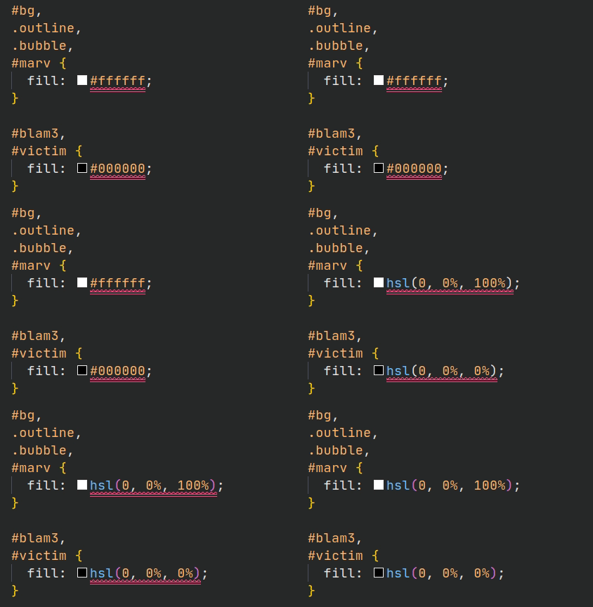
The stylelint-color-format plugin can normalize all colors to RGB(A) or HSL(A). I like to use HSL everywhere. HSL is a more intuitive format to use and has some unique applications that are not possible with other formats.

The only limitation is that if you have a color with a name, e.g., color: blue;, it won’t convert this for you.
It’s challenging for developers to continue to learn and adapt to evolving best practices, so adding new rule sets that make new recommendations an active part of your development process is enormously helpful.
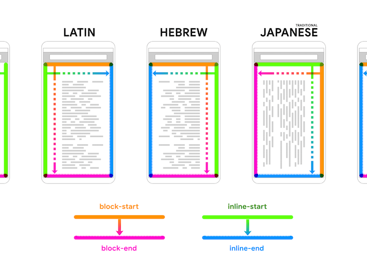
One recent example is using logical properties. Logical properties are writing mode equivalents of physical properties. They offer a way to describe the layout of web pages in a universal vocabulary that is unambiguous across different languages.
For example, you can have a single set of CSS declarations that apply to right-to-left languages (e.g., Arabic) and left-to-right languages, such as English. You can learn more about these properties in this article, CSS Logical Properties and Values.

Logical properties have been around for quite some time, but it has only been in the last couple of years that adoption has significantly improved across all the major browsers. You can use the stylelint-use-logical-spec plugin to transition to logical properties and break your old habits!
Did you know that some properties are ignored when used in conjunction with other property-value combinations?
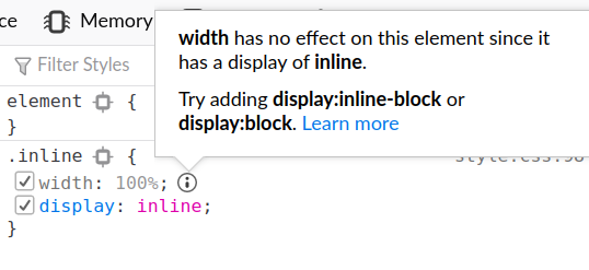
For example, when you use display: inline, size properties such as width are ignored. This may be an obvious example to you, but others are less obvious. Obvious or not, these can be forgotten or missed in the midst of a busy project! Why don’t you let the linter catch these for you?
You can use the stylelint-declaration-block-no-ignored-properties plugin to lint these.
As a side note, some browsers have started to highlight these ignored values in their dev tools. This is how it looks in Firefox:

Chrome does not show this information.
I typically:
These are a few of the common ways Stylelint is used. I will show you how to set these situations up.
Prettier is very popular for taking care of code formatting. Because Stylelint reports some formatting conventions as errors, it will clash with Prettier. Prettier will format something in a particular way, and Stylelint won’t like it.
You can include the stylelint-config-prettier in your config to disable any conflicting rules. This should always be the last referenced config in extends so that its rules are not overwritten.
{
  "extends": [
    "stylelint-config-standard",
    "stylelint-config-prettier",
  ]
};
There is a Stylelint extension you can use. Once you have installed Stylelint (globally or locally) and have added a Stylelint config to your workspace, the extension will lint open files automatically. It covers most languages that may contain CSS by default e.g., Svelte.
You probably want to add some scripts to your package.json to run it from the command line regularly.
{
     "scripts": {
       "lint": "stylelint src",
       "lint:fix": "npm run lint -- --fix",
     }
}
If you want to use Stylelint with Prettier in VS Code, I recommend installing these two extensions: Prettier and Format Code Action, which enables Prettier to be run as a code action. To format and lint CSS code when you save, you can update your user settings with the following:
{
  "editor.defaultFormatter": "esbenp.prettier-vscode",
  "editor.formatOnSave": false,
  "editor.codeActionsOnSave": [
    "source.formatDocument",
    "source.fixAll"
  ],
}
If you are using webpack, you might prefer to have Stylelint run as part of the build process. You need to install the stylelint-webpack-plugin to accomplish this.
If you are using webpack through a dev tool like Create React App or Vue CLI, you need to do things differently. In the next section, I describe how to do this for Vue CLI.
To set it up in webpack yourself:
npm i --save-dev stylelint stylelint-webpack-pluginwebpack.config.js// webpack.config.js// webpack.config.js
const StyleLintPlugin = require('stylelint-webpack-plugin');
module.exports = {
// ... other options
plugins: [
new StyleLintPlugin({
files: ['**/*.{htm,html,css,sss,less,scss,sass}'],
})
]
}
.stylelintrc config to the root directory, and you’re all set!For Vue CLI, you can install the npm package @steveworkman/vue-cli-plugin-stylelint to integrate Stylelint for you. To add it to an existing project, run the command vue add @steveworkman/vue-cli-plugin-stylelint and it will walk you through the setup.

It will populate vue.config.js with your chosen plugin options and add a Stylelint config (.stylelintrc.js) for you.
It also adds the following script to your package.json:
"lint:style": "vue-cli-service lint:style"
I hope that after reading this you can see how much value there is in linting CSS. Even though many frontend dev tools don’t highlight its usage or include it in their quick setup, I think using Stylelint is critical. It will save you some headaches along the way and assist you in maintaining a high level of code quality. Happy linting!
As web frontends get increasingly complex, resource-greedy features demand more and more from the browser. If you’re interested in monitoring and tracking client-side CPU usage, memory usage, and more for all of your users in production, try LogRocket.

LogRocket lets you replay user sessions, eliminating guesswork around why bugs happen by showing exactly what users experienced. It captures console logs, errors, network requests, and pixel-perfect DOM recordings — compatible with all frameworks.
LogRocket's Galileo AI watches sessions for you, instantly identifying and explaining user struggles with automated monitoring of your entire product experience.
Modernize how you debug web and mobile apps — start monitoring for free.

A step-by-step guide to building your first MCP server using Node.js, covering core concepts, tool design, and upgrading from file storage to MySQL.

Using security headers in your Next.js apps is a highly effective way to secure websites from common security threats.

A deep dive into April 2026’s AI model and tool rankings. We break down performance, usability, pricing, and real-world capabilities across 50+ features to help you pick the right tools for your development workflow.

A practical guide to Agent Browser CLI. Learn how AI agents navigate, snapshot, and interact with web pages using stable references, enabling efficient automation and exploratory testing.
Hey there, want to help make our blog better?
Join LogRocket’s Content Advisory Board. You’ll help inform the type of content we create and get access to exclusive meetups, social accreditation, and swag.
Sign up now