Being able to upload files is an essential requirement while creating application. Uploading files means a user from a client side should be able to upload files to the server. There are many ways to achieve this, as each file system has its own implementation.

In this article, we’ll look at file uploads in React with React Uploady by building a file uploads system.
According to its official documentation, React-Uploady is a lightweight library that enables developers to build client-side, file-upload features with just a few lines of code.
Essentially, it’s a library that focuses on modern file upload components and hooks for React applications. It’s also an all-in-one shop for all things file uploads, such as file upload progress, upload buttons, and enhancers for uploads.
For this article, you’ll need:
First, install the official React application scaffold tool, create-react-app:
npm install -g create-react-app
You can verify the installation by running create-react-app. This should ask you to specify the directory name.
The idea behind React uploady is that it should be easy to use and also customizable. To achieve this, React Uploady provides components and hooks for events and features. Leveraging this, we will build a simple upload system.
We’ll use create-react-app to bootstrap our project. create-react-app is an open-source tool that is maintained by Facebook and the community to help developers start a react project in a very short time.
To create a new project using the create-react-app boilerplate, run this command in your preferred terminal:
create-react-app react-uploady
The name react-uploady is used as the project name for this project, but it can be replaced with whatever name you choose to use.
Next, switch to your project directory and start your development server by running:
cd react-uploady && npm start
The command opens a browser tab rendering the default boilerplate application.
React Uploady contains hooks and components like UploadButton, which handles the upload button, and even an Upload Preview to preview our file uploads.
To get started with our system, let’s first install the following packages using our terminal:
npm i @rpldy/upload-button @rpldy/uploady rc-progress
In the above code, we installed:
@rpldy/upload-button: This is a component from React Uploady for our upload buttons@rpldy/uploady: This is a main package for React Uploady libraryrc-progress: This is a package to show file upload progressNext, let’s create a Header component for our system. To do this, create a new file called Header.js inside our src folder. Note that the filename can be whatever you want.
Next, we create a functional component like the one below.
import React from "react";

export default function App() {
  return (
    <div>
      <h1>File upload with React Uploady</h1>
    </div>
  );
}
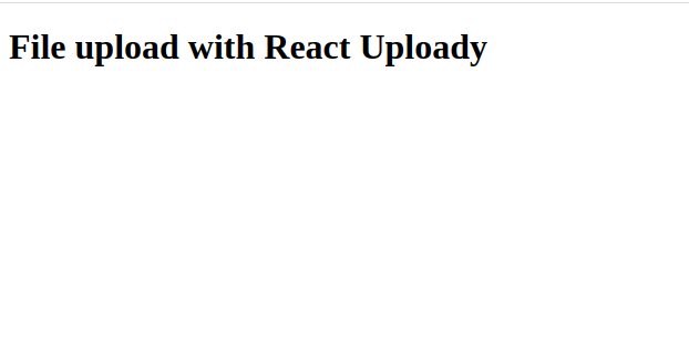
Here, we created a functional component with an h1 tag that says “File upload with React Uploady.”
Next, let’s render our Header component in our App component below.
import React from "react";

export default function App() {
  return (
      <div className="App">
        <Header />
      </div>
      );
  }
We rendered our Header component in our App component, and we should see the results in our browser similar to the image below.

Next, let’s build our upload system in our App.js component and build a simple upload similar. To do that, we’d need to import our packages, render our upload button from the upload-button package, and wrap our app with the Uploady component:
import React, { useState } from "react";
import Header from "./Header";
import "./App.css";

import { Line } from "rc-progress";
import Uploady, { useItemProgressListener } from "@rpldy/uploady";
import UploadButton from "@rpldy/upload-button";
import { createMockSender } from "@rpldy/sender";
In the code above, we imported the Line style of file upload from rc-progress package. Next, we imported the uploady and progress listener from @rpldy/uploady, then imported Upload Button from @rpldy/upload-button.
We also imported a mock sender from @rpldy/sender, which is used to replace a real sender for testing purposes.
Next, let’s build our file upload progress by first building a state for it and rendering it as a component in our App.
const UploadProgress = () => {
  const [progress, setProgess] = useState(0);

  const progressData = useItemProgressListener();

  if (progressData && progressData.completed > progress) {
    setProgess(() => progressData.completed);
  }
In the code above, we created a function called UploadProgress. Then we initialized progress as the initial state using the setState hook and set it to a initial state of 0.
After that, we set the progressData variable to useItemProgressListener, which we got from React Uploady. In the sixth line, using an if statement, we said if the progressData is greater than the progress, then set progress as “progress data completed.”
To complete our progress bar for file uploads, let’s return the line for the progress bar and style it:
 return (
    progressData && (
      <Line
        style={{ height: "10px", marginTop: "20px" }}
        strokeWidth={2}
        strokeColor={progress === 100 ? "#00a626" : "#2db7f5"}
        percent={progress}
      />
    )
  );
};
Here, we are using the Line component we imported from rc-progress. Notice we added a height and margin top, and we also added 2 as the width of the stroke.
Using a switch operator, we added a color for when progress bar is loading and when it’s completed. Lastly, we set the percentage of the progress bar to progress.
To complete our app, let’s render all of this on our app and see what it looks like on our browser.
export default function App() {
  return (
    <Uploady
      destination={{ url: "http://server.com" }}
      enhancer={mockEnhancer}
    >
      <div className="App">
        <Header />
        <UploadButton />
        <UploadProgress />
      </div>
    </Uploady>
  );
}
In the code above, we wrapped our App component using the Uploady component and set a destination for our file upload. Because this is for testing, we can set a dummy server as our destination.
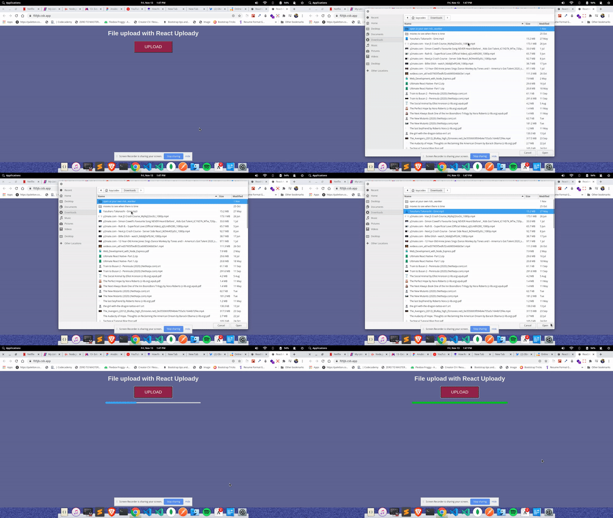
We then rendered the Header component, the UploadButton, and the UploadProgress, which we initialized as a function previously. Our application should look like the image below.

Our application is almost complete.
To complete it, let’s add styles and an enhancer for our upload system. An enhancer is a function that can enhance an uploader instance. Using them, we can add custom functionalities to our file uploads. Let’s do that now:
const mockEnhancer = (uploader) => {
  const mockSender = createMockSender({ delay: 1500 });
  uploader.update({ send: mockSender.send });
  return uploader;
};
In the code above, we created a function mockEnhancer that takes in uploader as a method. Inside it, we initialized the mocksender method, which we imported from @rpldy/sender. Then, we added a delay of 1.5 seconds and returned the uploader. This was done to imitate an actual send and upload.
Let’s add styles below and then see the final face of our application.
.App {
  font-family: arial, sans-serif;
  text-align: center;
  margin-top: 20px;
}
body {
  background: #5c6e91;
  color: #eeeded;
}
button {
  height: 60px;
  width: 200px;
  font-size: 22px;
  background-color: #8f384d;
  color: #eeeded;
  text-transform: uppercase;
  cursor: pointer;
}
Below is a video of our final application, a file upload system with React Uploady:

In this post, we’ve learned about React Uploady and how to use it to build a simple file upload system. We’ve also seen how to use ES6 JavaScript to write logic for our file uploads.
You can read more React articles here on LogRocket and check out the official documentation for React Uploady here. The code and a working version of the app can be found here.
Install LogRocket via npm or script tag. LogRocket.init() must be called client-side, not
server-side
$ npm i --save logrocket

// Code:

import LogRocket from 'logrocket';
LogRocket.init('app/id');
// Add to your HTML:

<script src="https://cdn.lr-ingest.com/LogRocket.min.js"></script>
<script>window.LogRocket && window.LogRocket.init('app/id');</script>
Hey there, want to help make our blog better?
Join LogRocket’s Content Advisory Board. You’ll help inform the type of content we create and get access to exclusive meetups, social accreditation, and swag.
Sign up now
A breakdown of the wrapper and container CSS classes, how they’re used in real-world code, and when it makes sense to use one over the other.

This guide walks you through creating a web UI for an AI agent that browses, clicks, and extracts info from websites powered by Stagehand and Gemini.

This guide explores how to use Anthropic’s Claude 4 models, including Opus 4 and Sonnet 4, to build AI-powered applications.

Which AI frontend dev tool reigns supreme in July 2025? Check out our power rankings and use our interactive comparison tool to find out.