Component-driven development has become a cornerstone of modern web development. It allows for modular, reusable code that can make a project more maintainable and scalable. One tool that stands out for facilitating this approach is React Styleguidist.

In this article, we’ll explore React Styleguidist, a component-driven development library that’s also useful for creating quick documentation. We’ll delve into:
You can also interact with the examples used in this article in this CodeSandbox environment.
React Styleguidist serves as both a playground and a comprehensive documentation tool for your React components. It takes the Markdown files you’ve created and transforms them into interactive, visually appealing documentation.
One of React Styleguidist’s standout features is the ability to test your components live. You can modify props in real-time to observe how your components behave under different conditions.
Under the hood, Styleguidist utilizes react-docgen to parse your component files and extract prop types, default values, and other component metadata. This enables Styleguidist to automatically generate detailed prop tables, offering a more in-depth understanding of how each component should be used.
When you initiate the Styleguidist server, it scans your project for React components based on the configuration specified in the styleguidist.config.js file. It then pairs these components with their corresponding Markdown files to generate a fully-fledged documentation site.
These Markdown files can even include JSX code, which Styleguidist renders as live, editable examples.
React Styleguidist comes loaded with features that make it a reliable go-to tool for React developers:
These features also support collaboration efforts between developers as well as with non-developer teams and team members through version control mechanisms.
While Styleguidist is a powerful tool, it’s not without its limitations. The most notable one is its dependency on webpack.
This is not as much of a drawback if you already use webpack with React. However, if your project uses a different build tool, integrating Styleguidist could be challenging.
To get started with React Styleguidist, you’ll need to have Node.js and npm installed on your machine. If you haven’t already set up a React project, you can do so by running the following command:
npx create-react-app my-styleguidist-app
Navigate into your project directory and install React Styleguidist as a development dependency:
cd my-styleguidist-app
npm install --save-dev react-styleguidist
Although Styleguidist works out of the box for most projects, you might want to tailor it to your needs. To do so, simply create a styleguidist.config.js file at the root of your project and add any custom configurations.
For example, to specify the path to the components you want to document, you can do the following:
module.exports = {
  components: 'src/components/**/*.js'
};
This configuration will create documentation for components in the src/components directory.
Finally, you can run the Styleguidist server:
npx styleguidist server
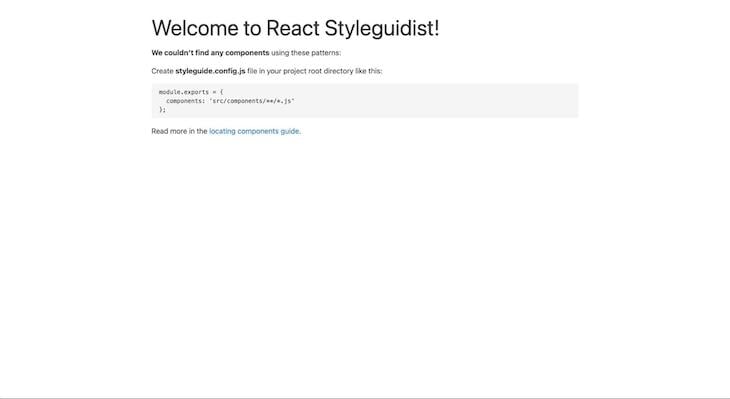
Your component documentation will be available at http://localhost:6060 as shown in the image below:

Documentation in Styleguidist is written in Markdown and lives alongside your components. To try things out, let’s create an Alert component and document it.
First, create a new directory called components inside the src directory if it doesn’t already exist. Inside components, create a new file called Alert.js and paste the code below into it:
// src/components/Alert.js

import React from 'react';
import PropTypes from 'prop-types';

const Alert = ({ message, type }) => {
  const alertStyles = {
    color: type === 'error' ? 'red' : 'green',
    border: '1px solid',
    padding: '10px',
    borderRadius: '5px'
  };

  return <div style={alertStyles}>{message}</div>;
};

Alert.propTypes = {
  message: PropTypes.string.isRequired,
  type: PropTypes.oneOf(['error', 'success'])
};

export default Alert;
Create a Markdown file with the same name as your component, like Alert.md, and place it in the same directory as your component:
// src/components/Alert.md

Alert is a simple component for displaying messages. It takes in a message and a type prop.

Props:

- message: The message to display (required)
- type: The type of alert, either 'error' or 'success'

Error Alert

```jsx
<Alert message="This is an error message" type="error" />
```

Success Alert

```jsx
<Alert message="This is a success message" type="success" />
```
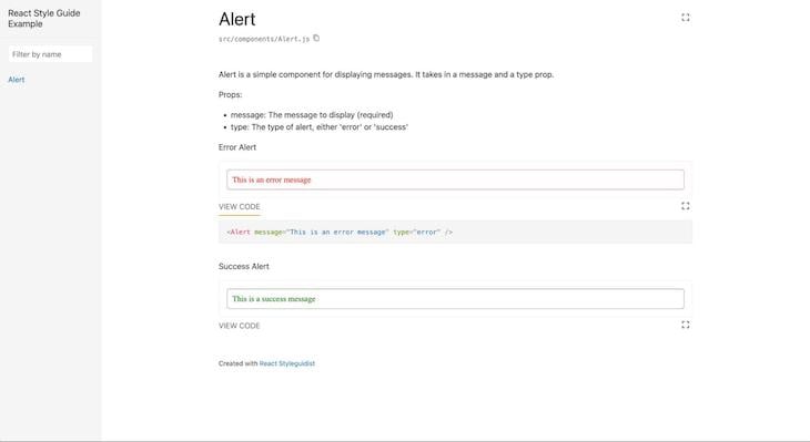
Now, when you run your Styleguidist server, you’ll see the Alert component documented with live examples:

React Styleguidist is not just limited to vanilla React components. You can extend it to work with other libraries, like Redux and styled-components. Let’s go over the steps to integrate these libraries into your Styleguidist setup.
Redux is a popular state management library frequently used with React. We can integrate Redux and React Styleguidist to document how to manage components in an application.
Say we have a Bookstore.js file with the following code, and we want to use Redux to manage the state of the list of books available in the store in the component documentation:
// src/components/Bookstore.js
import React from 'react';
import PropTypes from 'prop-types';

const Bookstore = ({ greeting, books }) => {
  return (
    <div>
      <h1>{greeting}</h1>
      <ul>
        {books.map((book, index) => (
          <li key={index}>{book.title}</li>
        ))}
      </ul>
    </div>
  );
};

Bookstore.propTypes = {
  greeting: PropTypes.string.isRequired,
  books: PropTypes.arrayOf(
    PropTypes.shape({
      title: PropTypes.string.isRequired
    })
  ).isRequired
};

export default Bookstore;
In this component, we’re displaying a greeting and a list of books. The list of books is passed as a prop, which we’d like to manage using Redux.
To document how to use this Bookstore component with Redux, you can create an accompanying Markdown file, Bookstore.md, and include the following example:
// src/components/Bookstore.md

Here's how to use the `Bookstore` component with a Redux store:

```jsx
import { Provider } from 'react-redux';
import configureStore from '../utils/configureStore';
import Bookstore from './Bookstore';

const initialState = {
  app: {
    name: 'Book Haven',
    books: [
      { title: 'To Kill a Mockingbird' },
      { title: '1984' },
      { title: 'The Great Gatsby' }
    ]
  }
};

const store = configureStore({ initialState });

<Provider store={store}>
  <Bookstore greeting="Find your next favorite book!" books={store.getState().app.books} />
</Provider>
In this example, we’re setting up a Redux store with an initial state that includes the name of the app and a list of books. We then use the Redux Provider component to make this store available to the Bookstore component. The books prop is populated from the Redux store’s state.
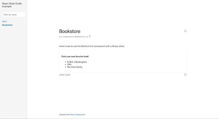
After previewing this in our browser, we should have an output similar to the one below:

It’s also possible to make a Redux store available globally to all components in your Styleguidist instance. This is particularly useful when you have multiple components that rely on the same Redux store.
To proceed, we have to redefine the Wrapper component in our styleguide.config.js file. First, let’s create a Wrapper.js file that includes the Redux Provider:
// src/styleguide/Wrapper.js
import React, { Component } from 'react';
import { Provider } from 'react-redux';
import configureStore from '../utils/configureStore';

const initialState = {
  app: {
    name: 'Book Haven',
    books: [
      { title: 'To Kill a Mockingbird' },
      { title: '1984' },
      { title: 'The Great Gatsby' }
    ]
  }
};

const store = configureStore({ initialState });

export default class Wrapper extends Component {
  render() {
    return <Provider store={store}>{this.props.children}</Provider>;
  }
}
In this Wrapper component, we’re setting up a Redux store with an initial state that includes the name of the app and a list of books. We then use the Redux Provider to make this store available to all components.
Next, update your styleguide.config.js file to use this custom Wrapper:
// styleguide.config.js
const path = require('path');

module.exports = {
  styleguideComponents: {
    Wrapper: path.join(__dirname, 'src/styleguide/Wrapper')
  }
};
Specifying the Wrapper in the styleguide.config.js file tells Styleguidist to use this custom wrapper component for all your documented components. Now you can use this component in your Bookstore.md or any other component’s Markdown file without needing to wrap it with a Provider:
// src/components/Bookstore.md

Since we've globally configured a Redux store, you can use the `Bookstore` component like this:

```jsx
import Bookstore from './Bookstore';

<Bookstore greeting="Find your next favorite book!" books={store.getState().app.books} />
```
After running this code, we should get an output similar to the one before.
The styled-components library is a popular choice for styling React applications.
To document components styled with styled-components, you need to add the @component JSDoc annotation to the component export. This tells Styleguidist that the exported object is a React component and should be documented as such.
Here’s an example of a React component styled using styled-components:
// src/components/ThemedButton.js
import React from 'react';
import PropTypes from 'prop-types';
import styled from 'styled-components';

const Button = styled.button`
  background-color: coral;
  border: 1px solid darkorange;
  color: white;
`;

const ThemedButton = ({ children, onClick }) => {
  return <Button onClick={onClick}>{children}</Button>;
};

ThemedButton.propTypes = {
  children: PropTypes.node,
  onClick: PropTypes.func.isRequired
};

/** @component */
export default ThemedButton;
To document this component, you can create an accompanying Markdown file, ThemedButton.md, and include the following code:
// src/components/ThemedButton.md

Here's how to use the `ThemedButton` component:

```jsx
import ThemedButton from './ThemedButton';

const handleClick = () => {
  alert('Button clicked!');
};

<ThemedButton onClick={handleClick}>Click Me!</ThemedButton>
Storybook is another popular tool for developing and documenting React components, and it often comes up as an alternative to Styleguidist. While both are robust and widely used, they serve different needs and offer distinct advantages.
Below is a detailed comparison to help you make an informed decision on which tool best suits your project’s requirements.
React Styleguidist is primarily focused on providing quick and easy-to-write documentation. It’s great for projects where the primary goal is to document components and their props in a straightforward manner.
Storybook, on the other hand, is geared towards creating a full-fledged design system. It allows you to build various “stories” for each component, showing different states and use-cases, making it ideal for UI component development and testing.
In terms of documenting components, Styleguidist allows you to write documentation in Markdown, which is simple and familiar. It automatically generates a props table for each component based on PropTypes or TypeScript definitions.
Storybook uses JavaScript or TypeScript files to create stories. While it offers robust documentation capabilities through add-ons, the syntax can be less straightforward than Markdown.
Styleguidist offers basic customization through its configuration file and allows you to override its components to create a custom style guide.
Storybook is highly extensible, with a rich ecosystem of add-ons for functionalities like accessibility checks, viewport adjustments, and even GraphQL mocking.
Styleguidist can be configured to work with Redux and styled-components, among other libraries, but may require additional setup.
Meanwhile, Storybook provides out-of-the-box support for various libraries and frameworks, including Redux, styled-components, Angular, and Vue, making it more versatile in multi-framework projects.
For a deeper dive into Storybook, check out my article on Building a Next.js App with Tailwind and Storybook.
The table below summarizes the main differences between React Styleguidist and Storybook:
| React Styleguidist | Storybook | |
|---|---|---|
| Purpose and focus | Writing documentation quickly and easily. Best for projects that prioritize clearly documenting components and props | Creating complete design systems. Ideal for UI component development and testing |
| Documentation capabilities | Uses Markdown files | Uses JavaScript or TypeScript files with documentation capabilities available through add-ons |
| Customization and extensibility | Offers basic customization with the ability to override its components to create a custom style guide | Highly extensible through add-ons |
| Integration with other libraries | Requires additional setup to work with Redux, styled-components, and other libraries | Provides out-of-the-box support for many libraries and frameworks |
You can use this table to determine which option is best for your project’s requirements.
In this article, we explored various examples to demonstrate key features of React Styleguidist. You can check out these examples on CodeSandbox to see React Styleguidist in action.
React Styleguidist is a quick and easy solution for documenting your React components. Its Markdown support and live playground capabilities make it an appealing solution for teams interested in pursuing a collaborative, component-driven development approach.
While React Styleguidist has limits, such as its reliance on webpack, its advantages tend to outweigh the disadvantages. It’s a great option to consider if you want a straightforward way to create automated, up-to-date style guides and collaborate between designers and developers.
Install LogRocket via npm or script tag. LogRocket.init() must be called client-side, not
server-side
$ npm i --save logrocket

// Code:

import LogRocket from 'logrocket';
LogRocket.init('app/id');
// Add to your HTML:

<script src="https://cdn.lr-ingest.com/LogRocket.min.js"></script>
<script>window.LogRocket && window.LogRocket.init('app/id');</script>
Hey there, want to help make our blog better?
Join LogRocket’s Content Advisory Board. You’ll help inform the type of content we create and get access to exclusive meetups, social accreditation, and swag.
Sign up now
Not sure if low-code is right for your next project? This guide breaks down when to use it, when to avoid it, and how to make the right call.

Compare Firebase Studio, Lovable, and Replit for AI-powered app building. Find the best tool for your project needs.

Discover how to use Gemini CLI, Google’s new open-source AI agent that brings Gemini directly to your terminal.

This article explores several proven patterns for writing safer, cleaner, and more readable code in React and TypeScript.