When working with apps wherein the power lies in the data, it’s important that we present it in a nice way to the user. That’s where charting libraries come into play. They allow you to present the data to the user in a way that’s engaging and in turn makes them use your app more.

In this tutorial, we’ll be taking a look at React Native Chart Kit, a charting library for React Native. We’re going to build an app that uses it so you can have a practical example to work with.
The Replay is a weekly newsletter for dev and engineering leaders.
Delivered once a week, it's your curated guide to the most important conversations around frontend dev, emerging AI tools, and the state of modern software.
The app that we will be going over is a finance tracking app.
The app has four screens. Three of them are for user input, while the last one is for the charts. We will mainly focus on the screen that has charts, but we’ll also go through the other screens briefly.
These are the three input screens:
![]()
![]()
The final screen is the report screen where the charts are presented to the user:
![]()
The easiest way to set up the project is by spinning up a new React Native project:
npx react-native init RNChartKitFinanceApp
Once that’s done, copy the files from the GitHub repo. The React Native version I used for this app is 0.65.1. If by the time you’re reading this there’s a more recent version, be sure to use that instead. You can do that by replacing the corresponding version in your package.json file.
The app uses the following packages. If you want to follow along and build a finance tracking app to play with React Native Chart Kit, be sure to follow their corresponding installation steps on their website:
Only the packages that have native dependencies are mentioned above. Check out the package.json file in the repo for a full list of dependencies.
This won’t be your usual build-from-scratch tutorial so that we can focus on the main topic: React Native Chart Kit.
We will no longer go through the screens for creating categories, funds, and transactions. We also won’t be going through the setup for React Navigation and React Native Paper. You can simply check out the repo for that.
Instead, we will only focus on the Reports screen and what the queries for getting the data look like.
Let’s first take a look at how we work with the database. As mentioned earlier, we’re using the React Native SQLite storage library to manage our own SQLite database locally.
We only need three methods from the library: enablePromise() and openDatabase():
// data/db-service.js
import {
  enablePromise,
  openDatabase,
} from 'react-native-sqlite-storage';
enablePromise() is to enable handling of promises when executing the different methods:
enablePromise(true);
openDatabase() is for creating and opening the database file on the app’s allotted local storage by the operating system. If the file already exists, then it will simply open the file:
export const getDBConnection = async () => {
  return openDatabase({name: 'finance-data.db', location: 'default'});
};
Creating a table is just a matter of knowing the query to execute and then calling the executeSql() method on the db object, supplying your query as an argument. Here’s the code for creating the transactions table.
We’re using an integer data type to store the transactionDate because it will be stored as a Unix timestamp.
category_id is the rowId from the categories table. We can also add a foreign key to it but for simplicity’s sake we won’t:
export const createTransactionsTable = async db => {
  const query = `CREATE TABLE IF NOT EXISTS transactions (transactionDate INTEGER, summary TEXT, category_id INTEGER NOT NULL, transactionType TEXT, amount FLOAT)`;
  await db.executeSql(query);
};
Below is the code for creating a new transaction record. All the transaction fields can just be saved directly except for the transactionDate.
The datepicker library returns a Date object, so we have to get the timestamp from that by calling getTime() then dividing by 1000 to get the Unix timestamp. This is very important because we cannot call date manipulation methods in SQLite if it’s not saved in the correct format:
export const createTransaction = async (db, transaction) => {
  const {transactionDate, summary, category, transactionType, amount} =
          transaction;
  const timestamp = parseInt((transactionDate.getTime() / 1000).toFixed(0));
  const insertQuery = `INSERT INTO transactions(transactionDate, summary, category_id, transactionType, amount) VALUES("${timestamp}", "${summary}", "${category}", "${transactionType}", "${amount}")`;
  return db.executeSql(insertQuery);
};
Be sure to check out the repo for the codes for dealing with categories and funds as we will no longer be going through those in this tutorial.
It’s time to proceed with the main topic of this tutorial: creating charts with React Native Chart Kit.
Start by importing the modules we need:
// src/screens/ReportsScreen.js
import React, {useState, useEffect, useCallback} from 'react';
import {ScrollView, StyleSheet} from 'react-native';

import {withTheme} from 'react-native-paper';
import {SafeAreaView} from 'react-native-safe-area-context';
Also import the custom components for each type of chart. We will be creating these later:
import FinancePieChart from '../components/FinancePieChart';
import FinanceLineChart from '../components/FinanceLineChart';
import FinanceBarChart from '../components/FinanceBarChart';
Next, extract the methods for getting the reports data we need from the database. Each of these methods (except the first two) corresponds to the type of report we will be showing to the user.
If you’ve seen the screenshots from earlier, each of these methods corresponds to each chart (except for the last chart that depends on the last three methods below). We will also be adding these later:
import {
  getDBConnection,
  createTransactionsTable,

  // pie charts
  getTransactionsGroupedByTransactionType,
  getExpenseTransactionsGroupedByCategory,
  getIncomeTransactionsGroupedByCategory,
  getSavingsTransactionsGroupedByCategory,
  getInvestmentTransactionsGroupedByCategory,

  // bar charts
  getExpenseGroupedByMonth,

  // for bar chart and line chart
  getSavingsGroupedByMonth,
  getIncomeGroupedByMonth,

  getInvestmentsGroupedByMonth, // for line chart
} from '../../data/db-service';
Next, create the component and initialize the state values we will be using to store the data coming from the database:
const ReportsScreen = ({theme}) => {
  const {colors, fonts} = theme;

  const [byExpenseCategories, setByExpenseCategories] = useState([]);
  const [byIncomeCategories, setByIncomeCategories] = useState([]);
  const [bySavingsCategories, setBySavingsCategories] = useState([]);
  const [byInvestmentCategories, setByInvestmentCategories] = useState([]);
  const [byTransactionTypes, setByTransactionTypes] = useState([]);

  const [monthlyIncome, setMonthlyIncome] = useState([]);
  const [monthlyExpense, setMonthlyExpense] = useState([]);

  const [monthlySavings, setMonthlySavings] = useState([]);
  const [monthlyInvestments, setMonthlyInvestments] = useState([]);
}
Next, we now call the methods and update the state with the values they return:
const loadDataCallback = useCallback(async () => {
  try {
    const db = await getDBConnection();
    await createTransactionsTable(db);

    const groupedByTransactionTypes =
      await getTransactionsGroupedByTransactionType(db);
    if (groupedByTransactionTypes.length) {
      setByTransactionTypes(groupedByTransactionTypes);
    }

    const groupedByExpenseCategories =
      await getExpenseTransactionsGroupedByCategory(db);
    if (groupedByExpenseCategories.length) {
      setByExpenseCategories(groupedByExpenseCategories);
    }

    const groupedByIncomeCategories =
      await getIncomeTransactionsGroupedByCategory(db);
    if (groupedByIncomeCategories.length) {
      setByIncomeCategories(groupedByIncomeCategories);
    }

    const groupedBySavingsCategories =
      await getSavingsTransactionsGroupedByCategory(db);
    if (groupedBySavingsCategories.length) {
      setBySavingsCategories(groupedBySavingsCategories);
    }

    const groupedByInvestmentCategories =
      await getInvestmentTransactionsGroupedByCategory(db);
    if (groupedByInvestmentCategories.length) {
      setByInvestmentCategories(groupedByInvestmentCategories);
    }

    const incomeMonth = await getIncomeGroupedByMonth(db);
    if (incomeMonth) {
      setMonthlyIncome(incomeMonth);
    }

    const expenseMonth = await getExpenseGroupedByMonth(db);
    if (expenseMonth) {
      setMonthlyExpense(expenseMonth);
    }

    const savingsMonth = await getSavingsGroupedByMonth(db);
    if (savingsMonth) {
      setMonthlySavings(savingsMonth);
    }

    const investmentMonth = await getInvestmentsGroupedByMonth(db);
    if (investmentMonth) {
      setMonthlyInvestments(investmentMonth);
    }
  } catch (error) {
    console.error('transaction list err: ', error);
  }
}, []);

useEffect(() => {
  loadDataCallback();
}, [loadDataCallback]);
Just so we’re on the same page on what each method does, here’s a quick breakdown:
getTransactionsGroupedByTransactionType() — groups the transactions in the current month by its transaction type (e.g., expense, income, savings, investment) and gets the sum for eachgetExpenseTransactionsGroupedByCategory() — groups the transactions in the current month by all categories under expense (e.g., water bill, electric bill, eating out) and returns the sum for eachgetIncomeTransactionsGroupedByCategory() — similar to the previous one but for categories under income (e.g., main income, side income)getSavingsTransactionsGroupedByCategory() — similar to the previous one but the transaction type is limited to savings (e.g., bank A savings, bank B savings)getInvestmentTransactionsGroupedByCategory() — similar to the previous one, but the transaction type is limited to investments (e.g., stocks, crypto, real estate)getIncomeGroupedByMonth() — returns the total income for each monthgetExpenseGroupedByMonth() — returns the total expense for each monthgetSavingsGroupedByMonth() — returns the total savings for each monthgetInvestmentsGroupedByMonth() — returns the total investments for each monthGoing back to the code, we now add the conditions for showing each chart:
const hasByTransactionTypes = byTransactionTypes.length > 0;
const hasByExpenseCategories = byExpenseCategories.length > 0;
const hasByIncomeCategories = byIncomeCategories.length > 0;
const hasBySavingsCategories = bySavingsCategories.length > 0;
const hasByInvestmentCategories = byInvestmentCategories.length > 0;
const hasMonthlyIncome = monthlyIncome.length > 0;
const hasMonthlyExpense = monthlyExpense.length > 0;

const hasIncomeSavingsInvestment =
        monthlyIncome.length > 0 ||
        monthlySavings.length > 0 ||
        monthlyInvestments.length > 0;
Next, we need to declare the settings for the final chart (the one that shows a line chart of the income, savings, and investments in one chart).
We can’t really construct the data for that within the component itself; that’s why we’re constructing it here. These are mainly used by the React Native Chart Kit library:
const lineChartLegends = [
  {
    name: 'Income',
    color: '#003049',
  },
  {
    name: 'Savings',
    color: '#d62828',
  },
  {
    name: 'Investment',
    color: '#f77f00',
  },
];

// dataset for the line chart
const datasets = [];
if (monthlyIncome.length > 0) {
  datasets.push({
    data: monthlyIncome.map(item => item.value),
    color: (opacity = 1) => '#003049',
    strokeWidth: 2,
  });
}

if (monthlySavings.length > 0) {
  datasets.push({
    data: monthlySavings.map(item => item.value),
    color: (opacity = 1) => '#d62828',
    strokeWidth: 2,
  });
}

if (monthlyInvestments.length > 0) {
  datasets.push({
    data: monthlyInvestments.map(item => item.value),
    color: (opacity = 1) => '#f77f00',
    strokeWidth: 2,
  });
}

const chartData = {
  labels: monthlyIncome.map(item => item.label),
  datasets,
};
Lastly, return the UI:
return (
  <SafeAreaView
    style={[styles.container, {backgroundColor: colors.background}]}
  >
    <ScrollView
      style={{
        flex: 1,
      }}
    >
      {hasByTransactionTypes && (
        <FinancePieChart
          title="Transaction Types"
          data={byTransactionTypes}
        />
      )}

      {hasByExpenseCategories && (
        <FinancePieChart title="Expenses" data={byExpenseCategories} />
      )}

      {hasByIncomeCategories && (
        <FinancePieChart title="Income" data={byIncomeCategories} />
      )}

      {hasBySavingsCategories && (
        <FinancePieChart title="Savings" data={bySavingsCategories} />
      )}

      {hasByInvestmentCategories && (
        <FinancePieChart title="Investment" data={byInvestmentCategories} />
      )}

      {hasMonthlyIncome && (
        <FinanceBarChart
          title="Monthly Income"
          data={monthlyIncome}
          fillShadowGradient="#DF5353"
          color="#d62828"
        />
      )}

      {hasMonthlyExpense && (
        <FinanceBarChart
          title="Monthly Expense"
          data={monthlyExpense}
          fillShadowGradient="#00b4d8"
          color="#0077b6"
        />
      )}

      {hasIncomeSavingsInvestment && (
        <FinanceLineChart
          title="Income to savings to investment"
          chartData={chartData}
          fillShadowGradient="#ccc"
          legend={lineChartLegends}
        />
      )}
    </ScrollView>
  </SafeAreaView>
);

const styles = StyleSheet.create({
  container: {
    flex: 1,
    flexDirection: 'column',
  },
});

export default withTheme(ReportsScreen);
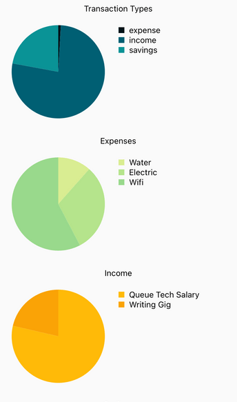
Now let’s move on to the code for the chart components. First, let’s take a look at the FinancePieChart component. This uses the PieChart component from React Native Chart Kit. We’re using it to generate the pie chart for the transaction types, expense types, income types, savings types, and investment types.
We start by importing the modules we need. We’re also importing a Legend component for showing a legend for each data point.
Note that the PieChart component already has its own legend, but we won’t use it. That’s why we’re setting hasLegend={false} as a prop. This is because it’s not very customizable. It’s really hard to modify its position. Using a custom Legend component allows for more flexibility.
We’re using the Dimensions module to get the screen width of the current device. We then supply that width to the component to make it adapt to the screen width. Note that it won’t actually consume the entire available width of the device. Instead, it will only use half of it:
// src/components/FinancePieChart.js

import React from 'react';
import {View, Text, Dimensions, StyleSheet} from 'react-native';

import {PieChart} from 'react-native-chart-kit';

import Legend from './Legend';

const screenWidth = Dimensions.get('window').width;
Next, initialize the chart config. This is the configuration object for the chart. It’s mostly used for configuring the general chart settings such as the strokeWidth (the base stroke width of the chart) and the color (a function for calculating the base color used for the labels and sectors in the chart). Note that not all properties are applicable to all chart types.
There will be some that are only applicable to specific types. But the good thing is that all of these properties have default values assigned to them, so you can probably get away with using a property that’s not applicable to the specific chart you’re using:
const chartConfig = {
  backgroundGradientFrom: '#1E2923',
  backgroundGradientFromOpacity: 0,
  backgroundGradientTo: '#08130D',
  backgroundGradientToOpacity: 0.5,
  color: (opacity = 1) => `rgba(26, 255, 146, ${opacity})`,
  strokeWidth: 2,
  useShadowColorFromDataset: false,
};
Next, render the PieChart component. This accepts the following props:
data — the data you want to present. We’ll see this later once we go through the queries and data returned in the src/data/db-service.js file. But the general rule of thumb is that you need an array of objects with a label and a value. The label is the legend while the value is the data pointwidth and height — the dimensions of the chartchartConfig — the general configuration object for the chartaccessor — the property from the data object from which the number values are takenbackgroundColor — the background color to apply to the chart. This can be transparent or none if you don’t want any background color appliedcenter — the offset x and y coordinates to position the chart. [0, 0] means we’re positioning it at the very start of its allotted spot. Note that this is not a fixed position, it’s a relative one, so it will always adhere to the elements before ithasLegend — whether to show the legend or notYou can check out the repo to learn more about the props you can specify.
Right below the chart, we render the legend:
function FinancePieChart({title, data}) {
  return (
    <View style={styles.container}>
      <View style={styles.titleContainer}>
        <Text>{title}</Text>
      </View>

      <View style={styles.bodyContainer}>
        <View style={styles.chartContainer}>
          <PieChart
            data={data}
            width={screenWidth}
            height={200}
            chartConfig={chartConfig}
            accessor={'total'}
            backgroundColor={'transparent'}
            center={[0, 0]}
            hasLegend={false}
          />
        </View>

        <View style={styles.legendContainer}>
          {data.map(({name, color}) => {
            return <Legend key={name} name={name} color={color} />;
          })}
        </View>
      </View>
    </View>
  );
}

const styles = StyleSheet.create({
  container: {
    marginTop: 10,
  },
  titleContainer: {
    flex: 1,
    alignItems: 'center',
  },
  bodyContainer: {
    flexDirection: 'row',
  },
  chartContainer: {
    flex: 1,
  },
  legendContainer: {
    flex: 1,
    marginTop: 20,
  },
});

export default FinancePieChart;
Before we proceed to the next chart, let’s first take a look at how we get the data we supply to the FinancePieChart component.
Here’s the code for getting the data for the first pie chart. We’re using the aggregate function SUM() to sum up the amount in each row and then group it by the transactionType. The transaction types can be found in the config/app.js file.
To get the data we need, we loop through the results a couple of times: one forEach and one for loop. Note that the outer loop is only executed once, it’s just so we can get to the object which contains the actual results.
The row data isn’t available as a plain object, so we have to call the item() method on result.rows and supply the current index to get to the data we need. From there, we extract the name and the total columns.
We’re also putting an additional property color for specifiying the color for the data point. The colors are all hardcoded in the src/helpers/palette.js file. Credit goes to coolors for the nice color palette:
export const getTransactionsGroupedByTransactionType = async db => {
  try {
    const transactions = [];
    const results = await db.executeSql(
      `SELECT SUM(amount) AS total, transactionType AS name FROM transactions
      WHERE strftime("%m/%Y", datetime(transactionDate, 'unixepoch', 'localtime')) = ?
      GROUP BY transactionType`,
      [monthYear],
    );
    results.forEach(result => {
      for (let index = 0; index < result.rows.length; index++) {
        const {name, total} = result.rows.item(index);
        transactions.push({
          name,
          total,
          color: paletteOne[index],
        });
      }
    });
    return transactions;
  } catch (error) {
    console.error(error);
    throw Error('Failed to getTransactionsGroupedByTransactionType...');
  }
};
Note that monthYear is declared near the top:
enablePromise(true);

const monthYear = new Date().toLocaleDateString(undefined, {
  year: 'numeric',
  month: '2-digit',
});
The other pie charts uses pretty much the same code. Only the query changes, so I’ll just include the query in here. This time, we’re using an INNER JOIN to join the categories table. This is because we need to filter by categoryType:
const results = await db.executeSql(
  `SELECT SUM(amount) AS total, categories.name AS name FROM transactions
  INNER JOIN categories ON categories.rowId = transactions.category_id
  WHERE categoryType = 'expense' AND strftime("%m/%Y", datetime(transactionDate, 'unixepoch', 'localtime')) = ?
  GROUP BY transactions.category_id`,
  [monthYear],
);
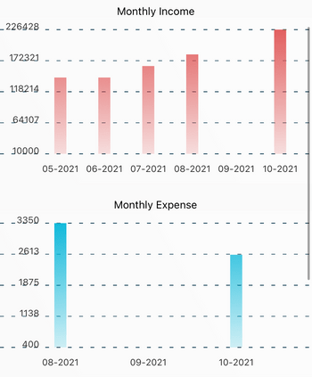
Let’s now move on to the FinanceBarChart component. We’re using it to generate a chart for the monthly income and monthly expense of the user. The code should be pretty similar. For the chartConfig, we added the following properties:
barPercentage — defines the percent of the available width each bar in the chart will take up. This is a value between 0 and 1. In this case, we’ve specified 0.5 to indicate that it will only use half of the available widthfillShadowGradient — defines the color of each bar. Note that a background gradient will be calculated using this value as the basis, so it’s not actually a solid colorfillShadowGradientOpacity — the opacity of fillShadowGradientlabelColor — the color of the text label under each bardecimalPlaces — how many decimal places to display. This defaults to 2, so you have to specify 0 if you don’t want to display any decimalsThe props we supplied to it are pretty much the same as the pie chart. The only difference is the showBarTops. This is a Boolean for specifying whether to show the line on top of each bar. We specified false since we don’t really want to display it.
As for the data you supply, it allows you to add multiple objects under the datasets property, but it wouldn’t actually render multiple bars. So you can’t really use this type of chart for data comparison purposes:
// src/components/FinanceBarChart.js
import React from 'react';
import {View, Text, Dimensions, StyleSheet} from 'react-native';
import {BarChart} from 'react-native-chart-kit';

const screenWidth = Dimensions.get('window').width;

function FinanceBarChart({title, fillShadowGradient, data}) {
  const chartConfig = {
    backgroundGradientFrom: '#fff',
    backgroundGradientFromOpacity: 0,
    backgroundGradientTo: '#fff',
    backgroundGradientToOpacity: 0.5,

    fillShadowGradient,
    fillShadowGradientOpacity: 1,
    color: (opacity = 1) => `#023047`,
    labelColor: (opacity = 1) => `#333`,
    strokeWidth: 2,

    barPercentage: 0.5,
    useShadowColorFromDataset: false,
    decimalPlaces: 0,
  };

  const labels = data.map(item => {
    return item.label;
  });

  const values = data.map(item => {
    return item.value;
  });

  const chartData = {
    labels,
    datasets: [
      {
        data: values,
      },
    ],
  };

  return (
    <View style={styles.container}>
      <View style={styles.titleContainer}>
        <Text>{title}</Text>
      </View>
      <BarChart
        data={chartData}
        width={screenWidth}
        height={220}
        chartConfig={chartConfig}
        showBarTops={false}
      />
    </View>
  );
}

const styles = StyleSheet.create({
  container: {
    marginBottom: 20,
  },
  titleContainer: {
    flex: 1,
    alignItems: 'center',
  },
});

export default FinanceBarChart;
Check out the documentation for more info on the config and props that you can use.
Now let’s take a look at the query that supplies us with the data for that chart. Again, we’re using the strftime function from SQLite to group the transactions by each month, getting the sum and filtering income transactions only:
export const getIncomeGroupedByMonth = async (db) => {
  try {
    const transactions = [];
    const results = await db.executeSql(
      `SELECT strftime("%m-%Y", datetime(transactionDate, 'unixepoch', 'localtime')) AS monthYear,
      SUM(amount) AS total
      FROM transactions
      WHERE transactionType = 'income'
      GROUP BY monthYear`
    );

    results.forEach((result) => {
      for (let index = 0; index < result.rows.length; index++) {
        const item = result.rows.item(index);

        transactions.push({
          value: item.total,
          label: item.monthYear,
        });
      }
    });

    return transactions;
  } catch (error) {
    console.error(error);
    throw Error("Failed to getIncomeGroupedByMonth...");
  }
};
The code for getting the monthly expenses is pretty much the same. You only need to replace the transactionType with expense, so we’ll no longer go through it here.
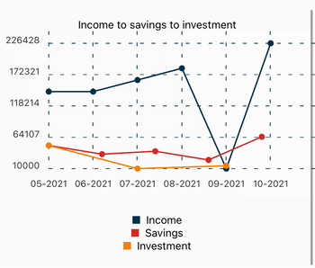
The final type of chart we’re going to go through is the line chart. We’re using this to show the comparison between income, savings, and investments through the months.
As you have seen in the code for the reports screen earlier, this accepts multiple objects for the datasets property, so it’s best used for comparison purposes. This uses the LineChart component from the React Native Chart Kit library.
As far as the chartConfig is concerned, there’s really nothing different we’ve supplied to this one.
The LineChart component doesn’t exactly come with its own legend. That’s why we’re bringing in our homemade Legend component once again. This will serve as the legend for each data point we’re comparing, including income, savings, and investments:
// src/components/FinanceLineChart.js
import React from 'react';
import {View, Text, Dimensions, StyleSheet} from 'react-native';
import {LineChart} from 'react-native-chart-kit';

import Legend from './Legend';

const screenWidth = Dimensions.get('window').width;

function FinanceLineChart({title, chartData, legend, fillShadowGradient}) {
  const chartConfig = {
    backgroundGradientFrom: '#fff',
    backgroundGradientFromOpacity: 0,
    backgroundGradientTo: '#fff',
    backgroundGradientToOpacity: 0.5,

    fillShadowGradient,
    fillShadowGradientOpacity: 0,
    color: (opacity = 1) => `#023047`,
    labelColor: (opacity = 1) => `#333`,
    strokeWidth: 2,

    useShadowColorFromDataset: false,
    decimalPlaces: 0,
  };

  return (
    <View style={styles.container}>
      <View style={styles.titleContainer}>
        <Text>{title}</Text>
      </View>
      <LineChart
        data={chartData}
        width={screenWidth}
        height={220}
        chartConfig={chartConfig}
      />

      <View style={styles.legendContainer}>
        {legend.map(({name, color}) => {
          return <Legend key={name} name={name} color={color} />;
        })}
      </View>
    </View>
  );
}

const styles = StyleSheet.create({
  container: {
    marginBottom: 20,
  },
  titleContainer: {
    flex: 1,
    alignItems: 'center',
  },
  legendContainer: {
    flex: 1,
    marginTop: 20,
    alignItems: 'center',
  },
});

export default FinanceLineChart;
Among the charting components provided by React Native Chart Kit, the LineChart is the one with the most powerful set of features. We haven’t used it here, but if you take a look at the documentation, you’ll see that it has a lot more props available than the other ones. For example, it has an onDataPointClick prop that allows you to perform an action when a data point is clicked on the chart.
As for the data, we’re picking it from three separate queries. One of them is already used by the FinanceBarChart from earlier. It’s the monthlyIncome. So, now all we need is the savings and the investments. Here’s the one for the savings:
export const getSavingsGroupedByMonth = async (db) => {
  try {
    const transactions = [];
    const results = await db.executeSql(
      `SELECT strftime("%m-%Y", datetime(transactionDate, 'unixepoch', 'localtime')) AS monthYear,
      SUM(amount) AS total
      FROM transactions
      WHERE transactionType = 'savings'
      GROUP BY monthYear`
    );

    results.forEach((result) => {
      for (let index = 0; index < result.rows.length; index++) {
        const item = result.rows.item(index);

        transactions.push({
          value: item.total,
          label: item.monthYear,
        });
      }
    });

    return transactions;
  } catch (error) {
    console.error(error);
    throw Error("Failed to getSavingsGroupedByMonth...");
  }
};
I’ll leave the other one for you to check out in the repo.
That’s it! In this tutorial, you learned how to use the React Native Chart Kit library to create different kinds of charts in React Native. Specifically, we worked with pie charts, bar charts, and line charts in this tutorial. You can find the full source code of the app in its GitHub repo.
Check out this article on React Native chart libraries if you want to know more about alternative charting libraries you can use with React Native.
LogRocket's Galileo AI watches sessions for you and and surfaces the technical and usability issues holding back your React Native apps.
LogRocket also helps you increase conversion rates and product usage by showing you exactly how users are interacting with your app. LogRocket's product analytics features surface the reasons why users don't complete a particular flow or don't adopt a new feature.
Start proactively monitoring your React Native apps — try LogRocket for free.

Learn how to test Nuxt apps with Vitest, @nuxt/test-utils, runtime mocks, server route mocks, and Playwright e2e tests.

I had four weeks to build a complete app from scratch using AI tools like OpenCode and Claude Opus: here’s how it went.

Learn how to build a reusable Vue 3 table engine that powers tables, cards, and lists with shared sorting and pagination logic.

Compare the best React chart libraries for 2026, including Recharts, Nivo, visx, Apache ECharts, MUI X Charts, and more.
Would you be interested in joining LogRocket's developer community?
Join LogRocket’s Content Advisory Board. You’ll help inform the type of content we create and get access to exclusive meetups, social accreditation, and swag.
Sign up now