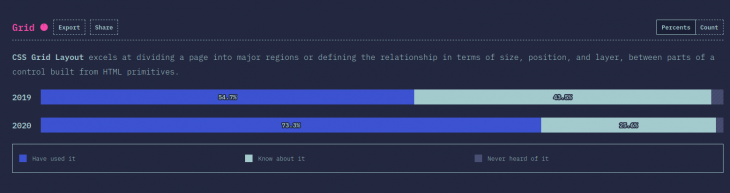
CSS Grid is a powerful layout specification that is growing in popularity year by year. This year’s State of CSS Survey showed that 73.3% of respondents have used Grid, an increase of 18.6% from 2019.

An important part of Grid’s success story is that now most of the major browsers have added Grid support to their DevTools. Visual inspection gives you a more efficient feedback loop when you’re building out an interface.
It can take some of the pain out of debugging layout issues: no more adding red borders (or some similar hack) to see what is going on when you are building out your layouts.
In this article, I’ll focus on Chrome. I will show you how to discover grids in a page and give you tips on how to inspect the page layout and debug layout issues.
First things, first. What makes an HTML element a grid?
If an HTML element on your page has display: grid or display: inline-grid applied to it, it’s a grid.
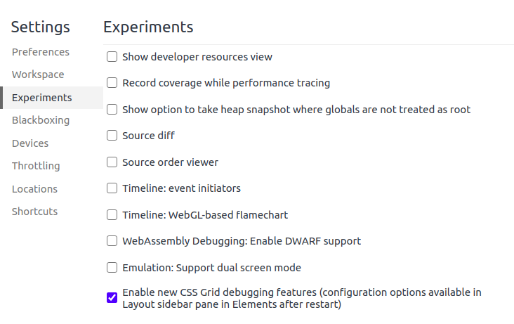
You may need to enable Grid debugging in the DevTools settings, as it is still considered an experimental setting:
You can quickly discover if a page has grid elements in the following ways.
In the Elements pane, you will see a grey grid badge next to a grid element:
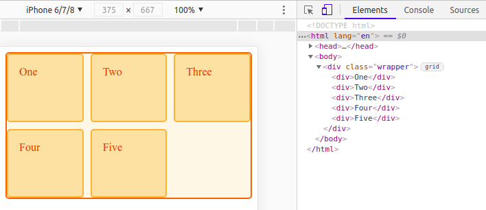
In this simple example, the div with the “wrapper” class is a grid.
Clicking this badge will toggle the display of an overlay for the element, like so:
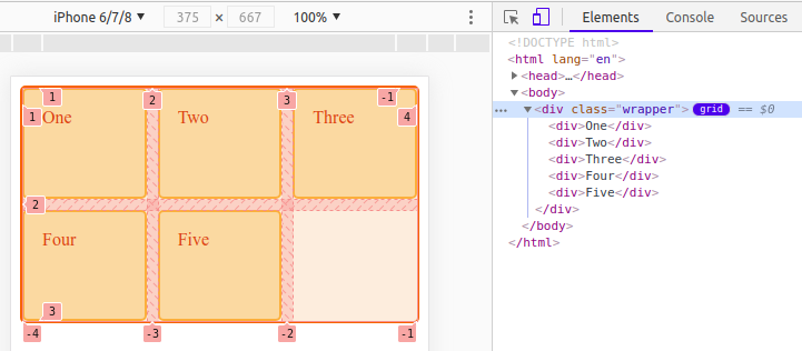
You will see the badge has changed color to indicate that is now active.
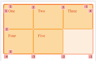
The overlay shows:
In a more complex web page, there may be many grids, and they may not be a child of body like our previous example. It is more work to find them by inspection if you want to understand the layout of a page.
The Layout pane has a Grid section, which lists all of the grids out for us.
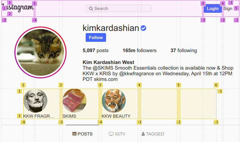
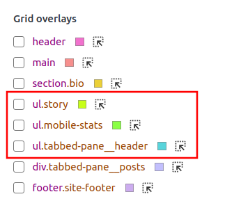
Let’s take another example, recreating Instagram’s profile page using Grid. Notice it has eight grids. You can see them listed under the subheading “Grid overlays” (see red box below).
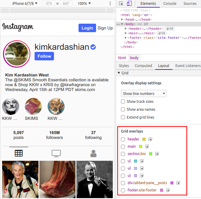
The grids are listed in order of occurrence. The label comprises the element name, ID selector (if any), and class selectors (if any).
You can show the overlay by checking the adjacent checkbox:

As you can see, there are some other settings in the Layout pane, which we will cover next.
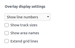
There are some options for customizing the overlay in the Layout pane. Let’s cover the Grid overlays section first.
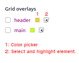
Chrome selects different colors for the overlays by default to make it easy to distinguish between them. There is an adjacent color picker if you want to choose your own. This is especially useful if there is a clash between the grid overlay color and the background.
The second option in this section will highlight the overlay for the element in the webpage, and select the element in the Elements pane (as below). This doesn’t customize the overlay; rather, it helps orientate you and explores the associated styles.

It should be fairly clear what these display settings are, but let’s go through each one to discuss the finer points.
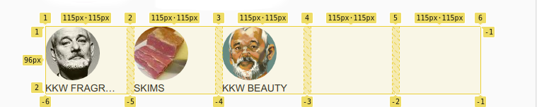
The show track sizes setting is useful for understanding why a grid item ends up as particular size.
To get the terminology straight, let’s define a track.
According to CSS Grid Layout Module Level 1 by W3C, a grid track is a generic term for a grid column or grid row — in other words, it is the space between two adjacent grid lines. Each grid track is assigned a sizing function, which controls how wide or tall the column or row may grow, and thus how far apart its bounding grid lines are.
In this context, it is just telling you the width and height of a grid item, which may span multiple rows or columns.
The track size label has the following format: [authored size] - [computed size]. The authored size is the size declared in the stylesheet (it is omitted if nothing is defined). The computed size is the actual size on the screen.
Let’s return to our Instagram example to illustrate this.
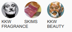
You can see that the story section has a fixed width of 115px.

.story {
    display: grid;
    grid-template-columns: repeat(auto-fill, 115px);
}
Because the size is fixed, the column’s authored size and the actual size are the same.
The row label only shows the actual size because we have nothing declared for that track.
For the posts section, the column width is a range.
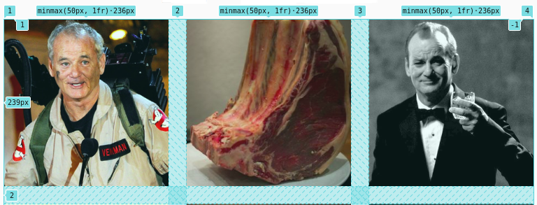
.tabbed-pane__posts {
   display: grid;
   grid-template-columns: repeat(3, minmax(50px, 1fr));
   grid-gap: 25px;
}
The authored size is minmax(50px, 1fr) and the actual size is 236px for this viewport size. The actual size will vary depending on the viewport width.
Again, the row label only shows the actual size because there is nothing defined for it.
If you have named areas on your grid, this setting will show them as inset label in the top-left corner of each item.
In this example, we name three areas: header, sidebar, and content. We assign areas to tracks using grid-template-areas.
We have left the first grid item empty, so it does not have a label.
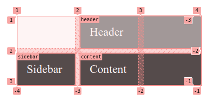
<div class="wrapper">
  <div class="box header">Header</div>
  <div class="box sidebar">Sidebar</div>
  <div class="box content">Content</div>
</div>
.sidebar {
 grid-area: sidebar;
}

.content {
 grid-area: content;
}

.header {
 grid-area: header;
}

.wrapper {
 display: grid;
 grid-gap: 10px;
 grid-template-columns: 120px  120px  120px;
 grid-template-areas:
   "....... header  header"
   "sidebar content content";
}
The extend grid lines setting is useful if you want to align independent elements. It creates dashed lines that extend beyond the boundaries of the grid.
In our Instagram example, if we wanted to align the header and the story sections in some way, the extended grid lines can act as guidelines.
You can make your grids easier to identify by adding an ID or class to the element, or by using area names.
In our Instagram example, initially we had three ul elements that are grids but no IDs or classes (see red box). So, we can’t distinguish between them.
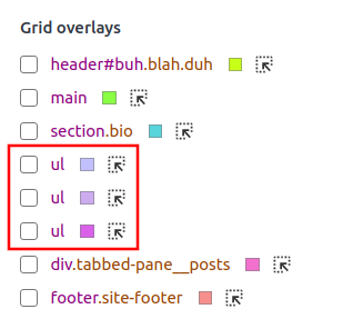
Adding the classes to the ul makes them more identifiable!
This may sound trite, but prevention is better than cure. Some issues can be avoided by planning a layout out first. The power of a grid is that it is easier to impose order, so why not decide on what you’re doing before you do it?
Your design doesn’t have to be very detailed, something like the design below is usually enough:
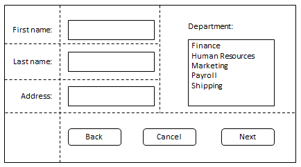
The important part is that you consider element sizes, alignment, and spacing of your layout in advance. You need to design for different device sizes and decide how you present the content within the available space. You may need to wrap items or change the grid layout for different device sizes.
I don’t want to prescriptively itemize how to debug layouts — there are far too many permutations. Instead, I will discuss a couple of design decisions from our Instagram example. This will give you some ideas about how you can review and resolve issues.
The sizing of tracks and content is probably the most common cause of issues.
If you set a fixed size for a track, you should ensure that the content does not overflow (unless you decide you want it to, of course). To deal with overflow, you can: set a fixed size for the content; use the overflow property; or the object-fit property for images and videos.
For example, the story section in our Instagram example has a fixed column size of 115px on mobile devices.
We fix the size of the image to 56px. For the heading (h2) below the image, we hide content that overflows and prohibit text wrapping (so it is always a single line of text). Adding text-overflow:ellipsis; appends ellipses to the end of the text to indicate that the text is truncated.
Now, we can guarantee that every “story” is uniform in size. When you are dealing with dynamic content, you need to anticipate this happening:
.story img {
    border-radius: 50%;
    width: 56px;
    height: 56px;
}

.story h2 {
    overflow: hidden;
    text-overflow: ellipsis;
    white-space: nowrap;
}
If we didn’t manage the overflow of the heading, it would look like this:
The other part of sizing is the units you use. You should only choose fr or minmax() when you are happy for the size of an item to be dynamic. Use other values if you want to freeze their size.
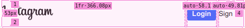
Take the header section for example. The first column (track) has a width of one fractional unit (1fr). This will grow when there is more available space. It doesn’t cause any shifting or resizing of the logo image (.header__logo) because its size is absolute, and it’s positioned at the start of the item.
Keep in mind that if you have content with a min-width or min-height declared, you can have unexpected results with the fractional unit.
The fr unit fills up the available space but it is never smaller than the minimum size of the grid container or the content of the row or column:
header {
    display: grid;
    grid-template-columns: 1fr auto auto;
    align-items: center;
    width: 100%;
}

.header__logo {
    justify-self: start;
}
The other two grid items (the Login and Sign Up buttons) will always remain the same size.
When troubleshooting, it can be useful to resize the viewport to see how the size of grid items vary. In our example, you can clearly see that it is only the first item that changes size.

With the addition of Grid support to Chrome DevTools, you can now easily visualize and debug your layout. Getting better feedback while you build layout is a big boost for productivity. I hope this article was able to show you how you can benefit from using the Chrome DevTools when working with CSS Grid.
As web frontends get increasingly complex, resource-greedy features demand more and more from the browser. If you’re interested in monitoring and tracking client-side CPU usage, memory usage, and more for all of your users in production, try LogRocket.

LogRocket lets you replay user sessions, eliminating guesswork around why bugs happen by showing exactly what users experienced. It captures console logs, errors, network requests, and pixel-perfect DOM recordings — compatible with all frameworks.
LogRocket's Galileo AI watches sessions for you, instantly identifying and explaining user struggles with automated monitoring of your entire product experience.
Modernize how you debug web and mobile apps — start monitoring for free.
Would you be interested in joining LogRocket's developer community?
Join LogRocket’s Content Advisory Board. You’ll help inform the type of content we create and get access to exclusive meetups, social accreditation, and swag.
Sign up now
A breakdown of the wrapper and container CSS classes, how they’re used in real-world code, and when it makes sense to use one over the other.

This guide walks you through creating a web UI for an AI agent that browses, clicks, and extracts info from websites powered by Stagehand and Gemini.

This guide explores how to use Anthropic’s Claude 4 models, including Opus 4 and Sonnet 4, to build AI-powered applications.

Which AI frontend dev tool reigns supreme in July 2025? Check out our power rankings and use our interactive comparison tool to find out.

 Learn more →
