
Before they were introduced during Apple’s 2020 Worldwide Developer’s Conference, grids were among the most-desired features to be included in SwiftUI. Up to that point, many developers came up with their implementation to approximate UICollectionView in SwiftUI. Then the Swift team officially introduced the LazyVGrid and LazyHGrid layouts at WWDC 2020.

In this tutorial, we’ll go over the basics of the SwiftUI grid layout. We’ll demonstrate how to create grids with SwiftUI by developing a reminder app that helps you categorize your reminders with a due date and mark them complete.
We’ll focus on the following:
To follow along, you should have basic knowledge of:
The Replay is a weekly newsletter for dev and engineering leaders.
Delivered once a week, it's your curated guide to the most important conversations around frontend dev, emerging AI tools, and the state of modern software.
A grid layout can be seen in almost all Apple applications. You may have noticed it in the Photos app or the Calendar app. It helps to accommodate more vital data into the same space by splitting the views into rows and columns.
Take a look at the examples below:
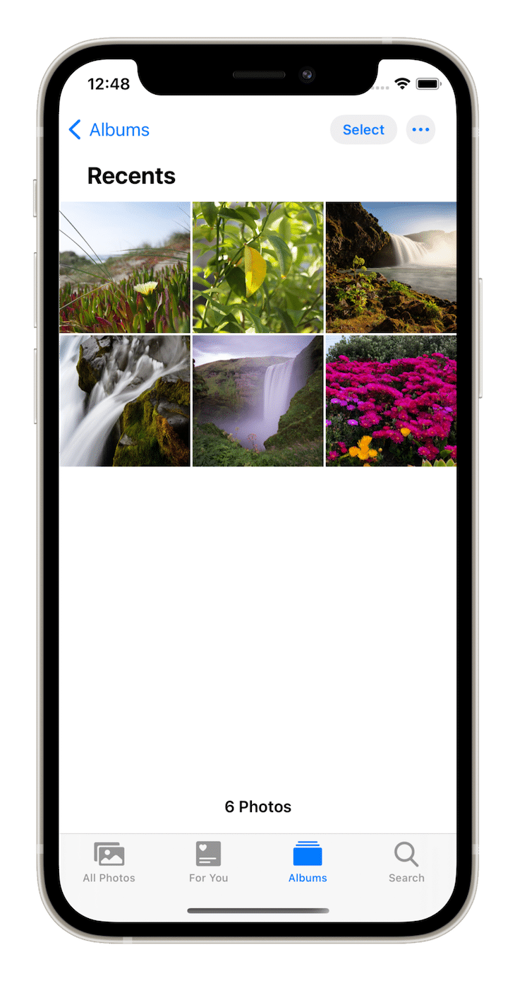
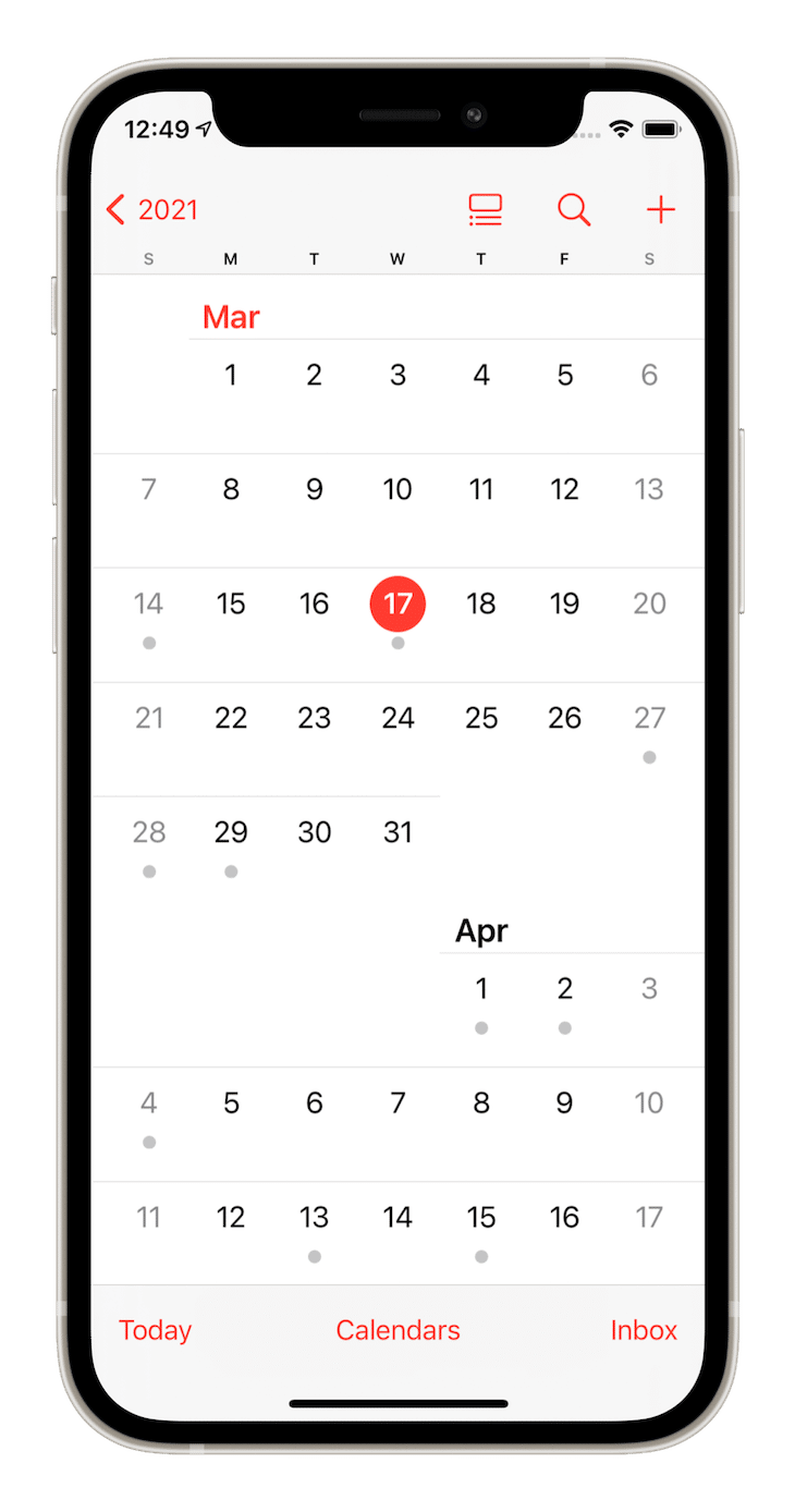
To demonstrate how the SwiftUI grid layout works, we’ll build a reminder app. We’ll start with a project with all the boiler code already written.
The app contains a main screen on which to implement grids. To add new reminders or categories, you can click the Add button in the top-right. The top-left button will switch between a vertical and horizontal layout to give users some control over the display.
The app already contains a model for the categories and the reminder with the name, due date, and a boolean value to mark them as completed. The view model has methods to add more reminders or update the status of the reminder. The app uses test data for convenience.
With all that in mind, let’s jump into the theory of how grids work in Swift and how they are different from standard lists.
GridItemIn a grid layout in SwiftUI, each element is called GridItem. We can customize it by changing its size, spacing between, and aligning it to the parent view.
There are three types of GridItem:
These types differ according to how they are used, either in a vertical grid or a horizontal grid.
We start with a simple array of fixed grid items with two columns and rows. Now let’s add the following code under style in ReminderView:
var items: [GridItem] = Array(repeating: .init(.fixed(120)), count: 2)
This creates two grid items of a fixed size of 120 in a row or a column depending upon what we use.
You can similarly create flexible items. These items take the space available to fill two columns or rows:
var items: [GridItem] = Array(repeating: .init(.flexible()), count: 2)
Likewise, you can create adaptive items:
var items: [GridItem] = Array(repeating: .init(.adaptive(minimum: 120)), count: 2)
If the space available with a minimum size of 120 is enough for three or four rows/columns, the items adjust automatically.
With the basics done, it’s time to fill these items in a grid!
LazyVGridLazyVGrid is a container view that arranges its child views in a grid that grows vertically, creating items only as needed.
The vertical grid can be divided into multiple columns as per your requirement. The API gives the flexibility to fix the element’s size or make it either flexible or adaptive.
LazyVGrid contains the following parameters for customization: the column to position each item, alignment in the view, the spacing between grid and next item in the view, and pinned views to bound to the scroll view.
init(columns: [GridItem], alignment: HorizontalAlignment = .center, spacing: CGFloat? = nil, pinnedViews: PinnedScrollableViews = .init(), @ViewBuilder content: () -> Content)
We’ll start by adding a vertical scroll view that will house the grid. Then, we’ll add LazyVGrid with the columns as the first parameter.
Replace the content below style in ReminderView with the following:
var items: [GridItem] {
  Array(repeating: .init(.adaptive(minimum: 120)), count: 2)
}

var body: some View {
  ScrollView(.vertical, showsIndicators: false) {
    ForEach(viewModel.reminderCategories, id: \.id) { category in
      LazyVGrid(columns: items, spacing: 10) {
        ReminderListView(category: category)
      }
      .padding(.horizontal)
    }
  }
}
This produces a simple grid with just few lines of code:
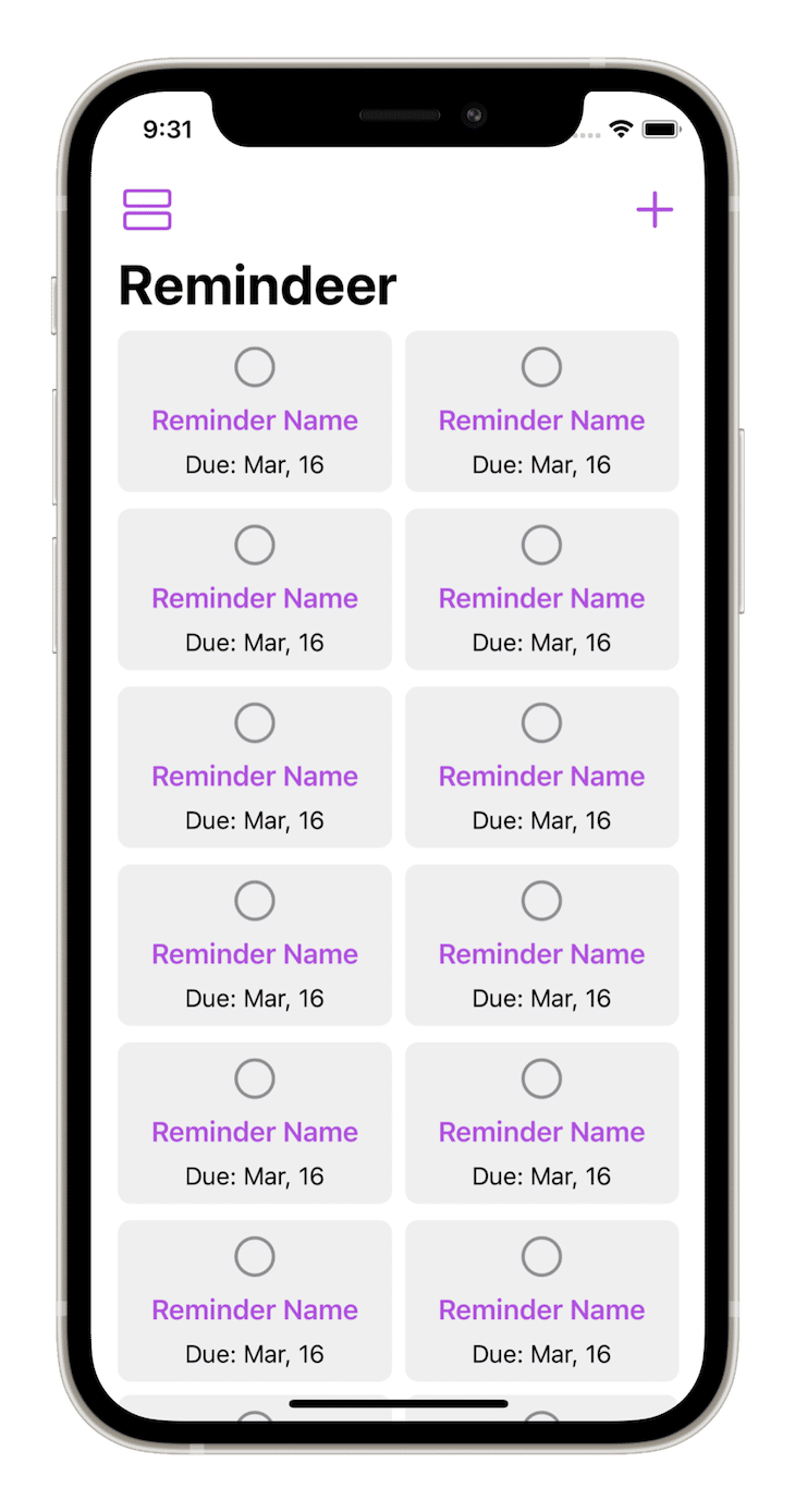
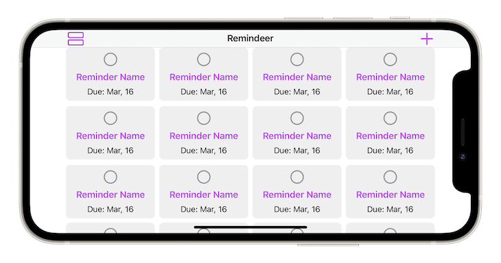
Turn over to landscape orientation, and the grid automatically adapts to more than two columns:
Now that we have a pretty vertical grid, it’s time to modify it to create a nice horizontal one.
LazyHGridThe horizontal grid can be divided into multiple rows. The view performs similar functionality to LazyVGrid.
LazyHGrid contains similar parameters for customization: the row to position each item, alignment in the view, the spacing between grid and next item in the view, and pinned views to bound to the scroll view.
Add a switch case on style below ForEach() to distinguish between the vertical and horizontal layout:
ScrollView(.vertical, showsIndicators: false) {
  ForEach(viewModel.reminderCategories, id: \.id) { category in
    switch style {
    case .horizontal:
      Text("LazyHGrid content goes here")
    case .vertical:
      LazyVGrid(columns: items, spacing: 10) {
        ReminderListView(category: category)
      }
      .padding(.horizontal)
    }
  }
}
We created fixed-size items for the horizontal layout. Replace the old implementation of items with:
var items: [GridItem] {
  switch style {
  case .vertical:
    return Array(repeating: .init(.adaptive(minimum: 120)), count: 2)
  case .horizontal:
    return Array(repeating: .init(.fixed(120)), count: 2)
  }
}
Now let’s add a horizontal scroll view that will house the grid. Then, add LazyHGrid with the rows as the first parameter.
Replace the content below case .horizontal in the switch case with the folllowing:
ScrollView(.horizontal, showsIndicators: false) {
  LazyHGrid(rows: items) {
    ReminderListView(category: category)
  }
  .padding(.vertical)
}
Running the application shows a list of grids that can be scrolled horizontally:
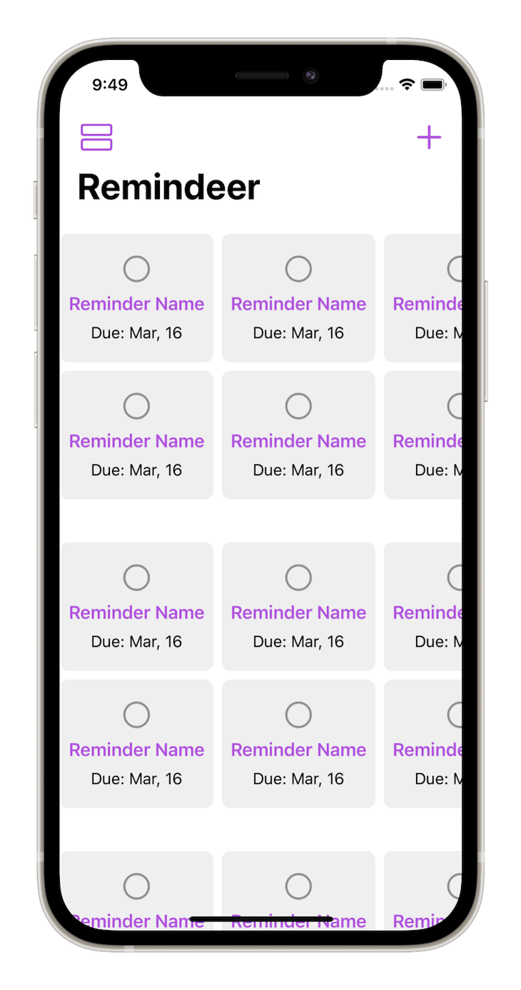
Try adding new reminders under different categories of urgent, important, and casual. We find that all of them are added under a simple grid with no header to distinguish them. Now we need need headings for the categories.
PinnedScrollableViewsPinnedScrollableViews are lists of headers that “pin” below the navigation title while scrolling. It can be used to create a sticky effect for the header.
As a practical example, if you have many reminders in a particular category, it would be cool to have the reminder category pinned at the top while scrolling so the user knows under which type they’re looking at the reminders.
Similarly, you can pin the footers of the view that stick to the bottom while scrolling.
Let’s implement pinning of headers in our app.
Add the pinnedViews parameter to both LazyVGrid and LazyHGrid, which provides the array of pinned scrollable views. In this case, it would be [.sectionHeaders].
Now, we wrap remindersView(category:) inside a Section and create a headerView for it. The headerView takes the reminder category name as the parameter.
private func categoryVHeader(with header: String) -> some View {
  Text(header)
    .font(.title2)
    .bold()
    .padding()
    .frame(maxWidth: .infinity, maxHeight: .infinity, alignment: .leading)
    .background(RoundedRectangle(cornerRadius: 0)
      .fill(Color.headerBackground))
}
The complete code for our LazyVGrid implementation looks like this:
LazyVGrid(columns: items, spacing: 10, pinnedViews: [.sectionHeaders]) {
  Section(header: categoryVHeader(with: category.header.name)) {
    RemindersView(category: category)
  }
}
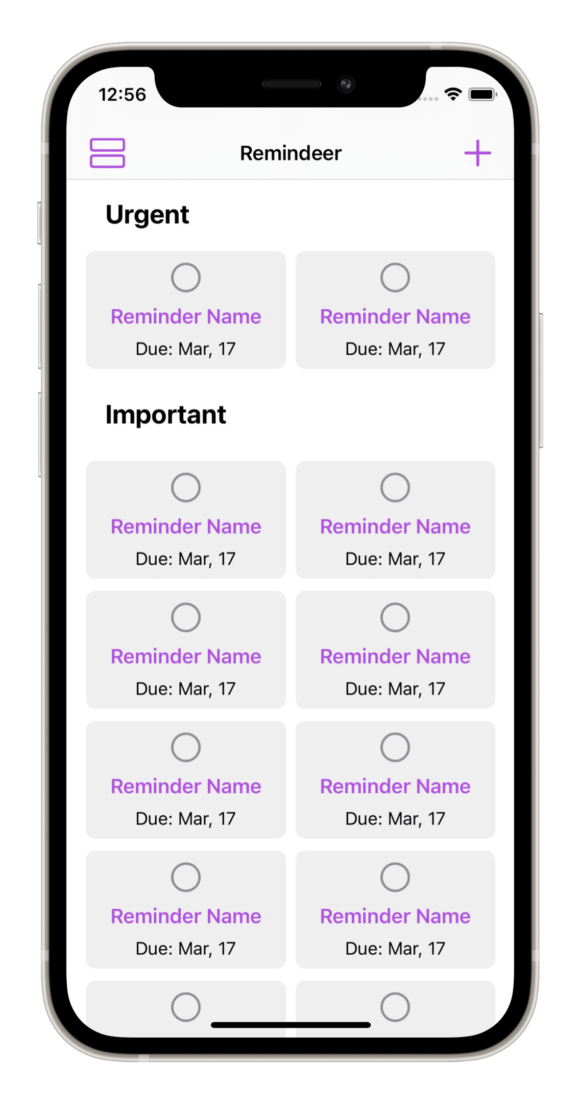
Now let’s say want something more remarkable for the horizontal grid with the header flipped 90 degrees and sticking to the leading side of the screen.
private func categoryHHeader(with header: String) -> some View {
  Text(header)
    .bold()
    .frame(minWidth: 70)
    .rotationEffect(Angle(degrees: -90))
    .frame(maxWidth: .infinity, maxHeight: .infinity)
    .background(RoundedRectangle(cornerRadius: 0)
      .fill(Color.headerBackground))
}
Now the code for our LazyHGrid implementation looks like this:
ScrollView(.horizontal, showsIndicators: false) {
  LazyHGrid(rows: items, pinnedViews: [.sectionHeaders]) {
    Section(header: categoryHHeader(with: category.header.name)) {
      RemindersView(category: category)
    }
  }
  .padding(.vertical)
}
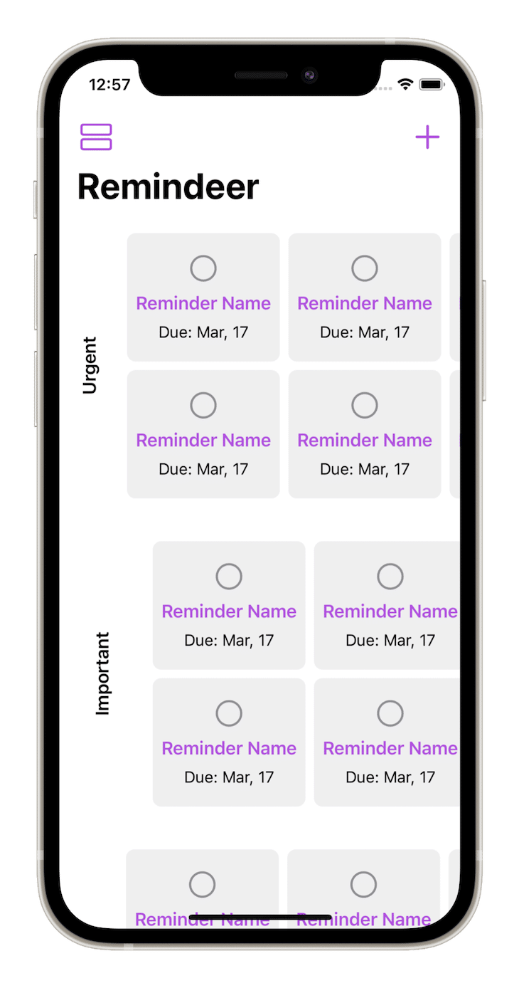
Try tapping the layout button on the top left of the screen to see your upcoming reminders in different grid layouts.
The app uses test data for our convenience. To use it for your own work, initialize an empty array of reminderCategories in RemindersViewModel:
@Published var reminderCategories: [ReminderCategory] = []
Grids are appropriate for showing more essential data, such as photos or album art, in less space. SwiftUI 2.0 makes it easier to create simple grid layouts. I’m hoping for more complex functionality in the future.
As a next step, you could try to recreate the photos app grid layout or create something similar to the reminders app for fun.
Install LogRocket via npm or script tag. LogRocket.init() must be called client-side, not
server-side
$ npm i --save logrocket

// Code:

import LogRocket from 'logrocket';
LogRocket.init('app/id');
// Add to your HTML:

<script src="https://cdn.lr-ingest.com/LogRocket.min.js"></script>
<script>window.LogRocket && window.LogRocket.init('app/id');</script>

useEffect breaks AI streaming responses in ReactSee why useEffect breaks AI streaming in React, and how moving stream state outside React fixes flicker and stale updates.

A real-world debugging session using Claude to solve a tricky Next.js UI bug, exploring how AI helps, where it struggles, and what actually fixed the issue.

CSS wasn’t built for dynamic UIs. Pretext flips the model by measuring text before rendering, enabling accurate layouts, faster performance, and better control in React apps.

Why do real-time frontends break at scale? Learn how event-driven patterns reduce drift, race conditions, and inconsistent UI state.
Hey there, want to help make our blog better?
Join LogRocket’s Content Advisory Board. You’ll help inform the type of content we create and get access to exclusive meetups, social accreditation, and swag.
Sign up now