Understanding the CSS sizing properties is necessary for developers who want the flexibility to present webpage content appropriately.

In CSS, we define an element size using the length (px, em), percentage, and keyword values. While the length and percentage value types are often used for webpage layouts, they are not always a perfect fit.
In some context, we use the keyword value types, including fit-content, min-content, and max-content.
In this guide, we cover what these keyword values are, their differences, and how they can apply to a real-world project.
Before we proceed, ensure you have a basic understanding of CSS.
Consider a div element containing content that has a fixed width and height of 200px:
<div class="s_1">
  nemo suscipitarchitectodeserunt vero, eveniet soluta deleniti alias dolor
  illum praesentium ipsa minus
</div>
Here we gave the div a border to see the extent of the size.
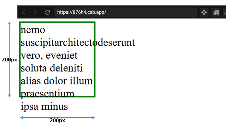
When we alter the natural size of an element by applying a specific value to it, as seen in the image above, we refer to that sizing as extrinsic.
On the other hand, when the content’s size defines the element’s size, we refer to that as intrinsic or natural size.
By restricting the block’s dimension to a specific size, we experience a content overflow, a downside of extrinsic sizing.
However, we can remedy the undesired behavior to produce a better layout by determining the element’s intrinsic size from the content using keyword values.
min-content keyword valueAccording to the W3C specifications, the min-content is the smallest size a box can take without overflowing its content.
For horizontal content, the min-content uses the length of the widest bit of content in the element box and automatically sets that length value as the box width.
The content in this case includes the text and assets like images and videos.
If we revisit the box example above, we can apply the min-content to the box element like so:
.s_2 {
  /* ... */
  width: min-content;
  /* ... */
}
And we should get this layout:
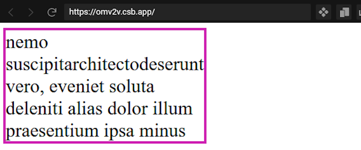
Here, with min-content, the longest word within the content defines the size of the box; this is the intrinsic minimum width of the box.
min-content keyword valueTo implement the min-content keyword in a real-world project, let’s consider the following use cases.
In a case where we want to mark up an image with a caption that follows the width of the image, we can use min-content to achieve the desired result seamlessly.
Let’s take a look at the following code:
<figure>
  <img
    src="https://upload.wikimedia.org/wikipedia/commons/1/1b/Square_200x200.png"
    alt="sample"
  />
  <figcaption>
    Lorem ipsum dolor sit amet consectetur adipisicing elit
  </figcaption>
</figure>
This gives the figure element a border to see the extent of the size.
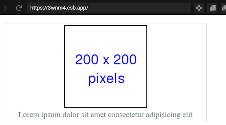
Since the figure is a block element, its width naturally occupies its container element.
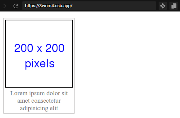
By assigning a width of min-content to the figure element, its size is defined by the widest bit of content. In this case, the widest bit is the image:
figure {
  /* ... */
  width: min-content;
}
This renders the following output with the image defining the width:
The min-content is also a valid value for a grid and flex sizing properties. In CSS, the flex-basis property of a flexbox system sets the size of the content box. This makes the min-content keyword an ideal value to automatically get the intrinsic minimum size of the box.
In this case, we use flex-basis: min-content.
Likewise, in a grid system, we can assign the min-content keyword to the grid-template-rows or grid-template-columns properties to get the intrinsic minimum box size.
Let’s consider the following code:
<div class="grid">
  <header class="header">
    <!-- ... -->
  </header>
  <div class="content">
    <!-- ... -->
  </div>
  <div class="footer">
    <!-- ... -->
  </div>
</div>
Note that we removed the element’s content for brevity.
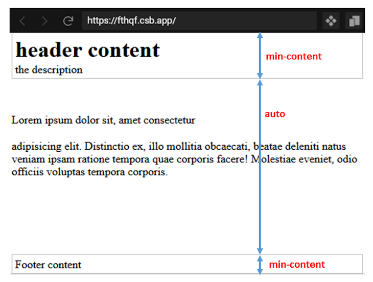
Let’s transform the structure to a grid layout and apply a min-content keyword:
.grid {
  display: grid;
  grid-template-rows: min-content auto min-content;
  height: 100vh;
}
With this, we get the intrinsic minimum value for the content height without causing an overflow.
If we do not apply min-content, we get different behavior. To visualize this behavior, we can temporarily remove the grid-template-rows and apply a fixed height to the header:
.grid {
  ...
  /* grid-template-rows: min-content auto min-content; */
  ...
}
.header {
  ...
  height: 40px;
}
With this, we no longer get the natural content size. In this case, the element boxes may be too big for their content, causing the content to overflow the boxes.
max-content keyword valueAccording to W3C specifications, max-content represents a box’s ideal size in a given axis when given infinite available space.
In other words, max-content represents the size a box needs to contain all of its content without being wrapped or it overflows the box.
With this, let’s apply a max-content to an element size:
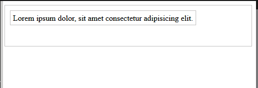
<div id="container">
  <div class="item1">Lorem ipsum dolor, sit amet consectetur adipisicing elit.</div>
  <div class="item2">Lorem ipsum dolor, sit amet consectetur adipisicing elit.</div>
</div>
As this renders, we receive this output:
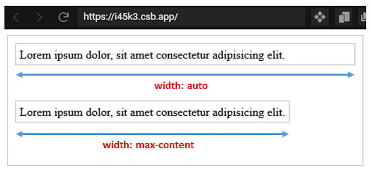
Here, the first box element takes the auto default width value, thus accommodating as much space as the container allows. But, when applying the max-content value to the same box, we get the exact content size of the box.
The max-content keyword value is ideal in situations where we need the maximum width of the content to decide the size of the box.
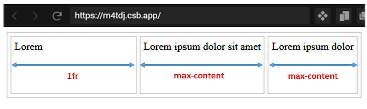
max-content value keywordConsider a grid layout structure where we apply a max-content to the grid columns:
The HTML includes the following:
<div class="container">
  <div>Lorem</div>
  <div>
    Lorem ipsum dolor sit amet
  </div>
  <div>Lorem ipsum dolor</div>
</div>
Then, add the CSS:
.container {
  display: grid;
  grid-template-columns: 1fr max-content max-content;
  /* ... */
}
This renders the column with the max-content value taking the content size while the column with the fr unit takes the remaining available space.
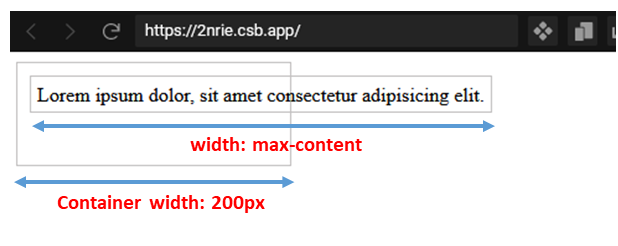
max-contentmax-content, as we’ve learned, works pretty well for an infinite available space where the box element can contain all of its content without being wrapped and overflowing its parent container.
However, in a case where the parent or ancestral element cannot accommodate the size of the box, the box tends to overflow:
<div id="container">
  <div class="item1">Lorem ipsum dolor, sit amet consectetur adipisicing elit.</div>
</div>
Adding the CSS sets the width:
#container {
  /* ... */
  width: 200px;
}

.item1 {
  width: max-content;
  /* ... */
}
With this code, the intrinsic maximum width of the box is longer than the container, causing overflow.
In this situation, we must adjust the box content to fit the container’s available space. This is where the fit-content keyword comes in.
fit-content keyword valueDepending on the size of a container element, when applying fit-content to a box element within the container, the box either uses the max-content size, the min-content size, or the available container as its ideal size.
When given infinite available space, the max-content defines the box’s ideal size. However, when the viewport is narrower, the available space becomes the box’s size to prevent overflow until the box uses min-content.
If we revisit our last example, by applying a fit-content to the box element, we have the following:
.item1 {
  width: -moz-fit-content;
  width: fit-content;
  /* ... */
}
Note that we must use a -moz- vendor prefix to use this keyword value on Mozilla Firefox.
As seen in the GIF below, the box uses the available space but never expands beyond the max-content, and when the viewport is narrower, the box never shrinks beyond the min-content.
fit-content() functionThe W3C specifications also note the fit-content() function allows developers to define a maximum allowable width for an element’s size. This CSS function often sizes grid columns and rows using the grid-template-columns and grid-template-rows, respectively.
Using fit-content() accepts a percentage or length unit as an argument:
fit-content(percentage | length)
Similar to the fit-content keyword, when assigning this function value to determine the sizing in a grid layout, it uses the specified argument as the maximum allowable box size while ensuring the box never goes beyond the max-content.
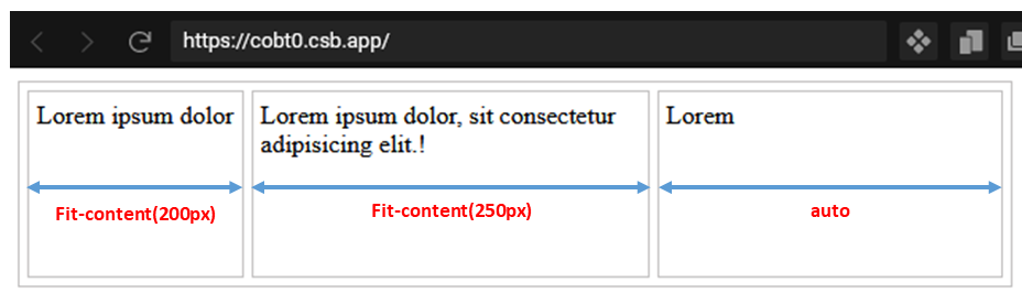
Let’s consider a grid layout structure and apply a fit-content() to the grid column:
<div class="container">
  <div>Lorem ipsum dolor</div>
  <div>
    Lorem ipsum dolor, sit consectetur adipisicing elit.!
  </div>
  <div>Lorem</div>
</div>
In the CSS, we add fit-content():
.container {
  display: grid;
  grid-template-columns: fit-content(200px) fit-content(250px) auto;
  /* ... */
}
The argument passed to the fit-content()differentiates the two functions.
In the first column of the grid layout, we passed 200px as an argument, hence, the column has a maximum allowable width of 200px and the second column has a maximum allowable width of 250px. The third column takes the remaining container space since it is assigned a value of auto.
The boxes whose sizes are defined by fit-content() never expand beyond the specified width while also never going beyond the max-content. But, when the viewport is narrower, the box can shrink to fit the content.
With intrinsic keyword values, we have the flexibility to present page content in the most appropriate ways. In this tutorial, we covered how to use the min-content, max-content, and fit-content keyword values with practical examples so you can start using them in your projects.
If you like this tutorial, ensure you share this content around the web. And, if you have questions or contributions, please share your thoughts via the comment section.
As web frontends get increasingly complex, resource-greedy features demand more and more from the browser. If you’re interested in monitoring and tracking client-side CPU usage, memory usage, and more for all of your users in production, try LogRocket.

LogRocket lets you replay user sessions, eliminating guesswork around why bugs happen by showing exactly what users experienced. It captures console logs, errors, network requests, and pixel-perfect DOM recordings — compatible with all frameworks.
LogRocket's Galileo AI watches sessions for you, instantly identifying and explaining user struggles with automated monitoring of your entire product experience.
Modernize how you debug web and mobile apps — start monitoring for free.

We built the same app in TanStack Start RSC and Next.js RSC. TanStack shipped 40% less JS and built 4x faster — but Next.js is still the safer production bet.

From RSC vulnerabilities and the Vercel breach to TypeScript 7.0 Beta and AI agents — the nine frontend storylines that defined H1 2026, ranked.

AI tools generate working React code fast, but miss race conditions, empty states, debouncing, and accessibility. Here’s how to catch bugs before production.

Learn how to use Gemini CLI subagents to delegate frontend, backend, testing, and docs tasks to specialized agents with guardrails and clear ownership.
Would you be interested in joining LogRocket's developer community?
Join LogRocket’s Content Advisory Board. You’ll help inform the type of content we create and get access to exclusive meetups, social accreditation, and swag.
Sign up now

 Learn more →
