To create a slideshow, we’ve got to create display images dynamically and add navigation buttons to navigate between them. We may need autoplay capabilities, too.

These all take time to build, and it’s exceedingly likely we could be better using that time doing something else. In this article, we’ll look at some carousel libraries for Vue.js to make our lives easier and give us back some of that precious time.
vue-easy-slider is a simple Vue slider component that can be used with both mice and touch screens. It’s customizable and comes with animation effects.
To use it, we install it by running:
npm i -S vue-easy-slider
Then we can use it by writing:
//main.js

import Vue from "vue";
import App from "./App.vue";
import EasySlider from "vue-easy-slider";

Vue.use(EasySlider);
Vue.config.productionTip = false;

new Vue({
  render: h => h(App)
}).$mount("#app");
//App.vue

<template>
  <div id="app">
    <slider animation="fade">
      <slider-item v-for="(i, index) in list" :key="index">
        <img :src="i">
      </slider-item>
    </slider>
  </div>
</template>

<script>
export default {
  name: "App",
  data() {
    return {
      index: 0,
      list: Array(5)
        .fill()
        .map((_, i) => `http://lorempixel.com/400/200/sports/${i}/`)
    };
  }
};
</script>
We use the slider component to add the carousel, and the animation prop sets the animation effect. As its name implies, slider-item holds the slider item.
We can also change the styles. For instance, we can change the width and height by writing:
<template>
  <div id="app">
    <slider animation="fade" width="400px" height="250px">
      <slider-item v-for="(i, index) in list" :key="index">
        <img :src="i">
      </slider-item>
    </slider>
  </div>
</template>

<script>
export default {
  name: "App",
  data() {
    return {
      index: 0,
      list: Array(5)
        .fill()
        .map((_, i) => `http://lorempixel.com/400/200/sports/${i}/`)
    };
  }
};
</script>
We can also enable or disable touch control and change the speed of the slide changes. It also emits a few events, like change, which fires when changing slides. next and previous fire when the next or previous slide is displayed.
It also has slots for the item placeholder to display something if a slide is loading.
vue-awesome-swiper is another easy-to-use carousel component for Vue apps. It’s based on Swiper, so we’ve got to install that alongside the package:
npm install swiper vue-awesome-swiper --save
Then we can use it by writing:
//app.js

import Vue from "vue";
import App from "./App.vue";
import VueAwesomeSwiper from "vue-awesome-swiper";
import "swiper/css/swiper.css";

Vue.use(VueAwesomeSwiper);
Vue.config.productionTip = false;

new Vue({
  render: h => h(App)
}).$mount("#app");
//App.vue

<template>
  <div id="app">
    <swiper ref="mySwiper" :options="swiperOptions">
      <swiper-slide v-for="(i, index) in list" :key="index">
        <img :src="i">
      </swiper-slide>
      <div class="swiper-pagination" slot="pagination"></div>
    </swiper>
  </div>
</template>

<script>
export default {
  data() {
    return {
      list: Array(5)
        .fill()
        .map((_, i) => `http://lorempixel.com/400/200/sports/${i}/`),
      swiperOptions: {
        pagination: {
          el: ".swiper-pagination"
        }
      }
    };
  }
};
</script>
Here, we use the swiper component with some options. The swiper-slide component holds the slides, so we put our images inside it. We also pass the swiperOptions into the options prop.
We populate our content with the pagination slot, and we set a class for the pagination so that we can style it.
We can also go to a slide programmatically. This is one reason why we assigned a ref to the slider — to shift to the slide we want. For instance, we can write:
//App.js

<template>
  <div id="app">
    <swiper ref="mySwiper" :options="swiperOptions">
      <swiper-slide v-for="(i, index) in list" :key="index">
        <img :src="i">
      </swiper-slide>
      <div class="swiper-pagination" slot="pagination"></div>
    </swiper>
  </div>
</template>

<script>
export default {
  data() {
    return {
      list: Array(5)
        .fill()
        .map((_, i) => `http://lorempixel.com/400/200/sports/${i}/`),
      swiperOptions: {
        pagination: {
          el: ".swiper-pagination"
        }
      }
    };
  },
  computed: {
    swiper() {
      return this.$refs.mySwiper.$swiper;
    }
  },
  mounted() {
    this.swiper.slideTo(2, 1000, false);
  }
};
</script>
We created a computed property with the mySwiper ref we assigned to our slider, then we call the slideTo method to change to the slide with the given index. The index is in the first argument, the second argument is the delay, and the third argument indicates whether we want to run callbacks. If we set it to true, it’ll emit events during transitions.
Like vue-easy-slider, this carousel library also has animation effects.
The Slick for Vue.js library provides us with another slider. jQuery is a dependency, so we’ve got to install that as well. To install the dependencies, run:
npm install jquery vue-slick --save
Next, we can use it by writing:
//main.js

import Vue from "vue";
import App from "./App.vue";
import "slick-carousel/slick/slick.css";

Vue.config.productionTip = false;

new Vue({
  render: h => h(App)
}).$mount("#app");
//App.vue

<template>
  <slick ref="slick" :options="slickOptions">
    <div v-for="(i, index) in list" :key="index">
      <img :src="i">
    </div>
  </slick>
</template>

<script>
import Slick from "vue-slick";

export default {
  components: { Slick },
  data() {
    return {
      slickOptions: {
        slidesToShow: 1
      },
      list: Array(5)
        .fill()
        .map((_, i) => `http://lorempixel.com/400/200/sports/${i}/`)
    };
  },
  methods: {}
};
</script>
We register the plugin main.js and imported the CSS, then we use the slick component to create our carousel. We pass in our slickOptions object with the slidesToShow property set to 1 to show only one slide. The slides are created by using v-for to render the images.
It emits many events:
afterChange event, which is emitted when the slides have changedbeforeChange is emitted before a slide changesdestroy is emitted when the slider is being unloadedswipe is fired when a swipe action is being performedWe can also call this.$refs.slick.reSlick(); to update our slides with the latest images if we change the image list.
Next up is vue-flickity, which provides us with many customization options. To install it, we can run:
npm install vue-flickity --save
Let’s take a look at how to use it:
//App.vue

<template>
  <div>
    <flickity ref="flickity" :options="flickityOptions">
     <div class="carousel-cell" v-for="(i, index) in list" :key="index">
      <img :src="i">
    </div>
    </flickity>

    <button @click="previous()">Previous</button>
    <button @click="next()">Next</button>
  </div>
</template>

<script>
import Flickity from "vue-flickity";

export default {
  components: {
    Flickity
  },

  data() {
    return {
      flickityOptions: {
        initialIndex: 3,
        prevNextButtons: false,
        pageDots: false,
        wrapAround: true
      },
      list: Array(5)
        .fill()
        .map((_, i) => `http://lorempixel.com/400/200/sports/${i}/`)
    };
  },

  methods: {
    next() {
      this.$refs.flickity.next();
    },

    previous() {
      this.$refs.flickity.previous();
    }
  }
};
</script>
We use the flickity component to add our slider, and it’s customizable via the options prop. We use it to set the initial slide via the initialIndex property.
prevNextButton lets us show or hide the built-in navigation buttons, and we can choose whether we want to show the navigation dots with pageDots. wrapAround indicates that we go back to the first or last slide when we reach the end or start of the carousel, respectively.
We’ve also added some custom buttons for navigation. We created one for navigating to the previous slide and one for navigating to the next slide. ref gets the ref and lets us call the next or previous method to move to the next or previous slide, respectively.
We can style the carousel and slides with CSS. It adds the carousel to the carousel-cell class so we can style it. The built-in navigation buttons and dots also have their classes, which means we can style them without much trouble.
Vue Carousel 3D is an interesting slider. It shows the slides in a 3D slideshow instead of in 2D. When we navigate through the slides, the slide being shown is created in front of the others, and it shows a rotating effect as we flip through the slides.
To install it, we run:
npm install -S vue-carousel-3d
To use it, we write:
//main.js

import Vue from "vue";
import App from "./App.vue";
import Carousel3d from "vue-carousel-3d";

Vue.use(Carousel3d);
Vue.config.productionTip = false;

new Vue({
  render: h => h(App)
}).$mount("#app");
//App.vue

<template>
  <div>
    <carousel-3d>
      <slide v-for="(i, index) in list" :key="index" :index="index">
        <img :src="i">
      </slide>
    </carousel-3d>
  </div>
</template>

<script>
export default {
  data() {
    return {
      list: Array(5)
        .fill()
        .map((_, i) => `http://lorempixel.com/400/200/sports/${i}/`)
    };
  }
};
</script>
We use the carousel-3d component to add the carousel, then we use the slide component to add the slides. We pass in the index so that the slides are positioned properly. The 3D styles are built in.
Other than that, it also has a few options for customization. We can:
autoplay propMost of the libraries are quite similar, and Vue Carousel 3D is easily the most unique. The others are all 2D with similar customization options.
Their performance is similar, and they’re all fairly easy to use. All of them can be used on touch screens, and they all have animation effects.
Slick for Vue.js emits lots of events, so if we need to do things when slides change or anything like that, that’s likely the library we should choose. Slick for Vue.js is also useful if we want to display multiple slides per page.
Debugging Vue.js applications can be difficult, especially when users experience issues that are difficult to reproduce. If you’re interested in monitoring and tracking Vue mutations and actions for all of your users in production, try LogRocket.
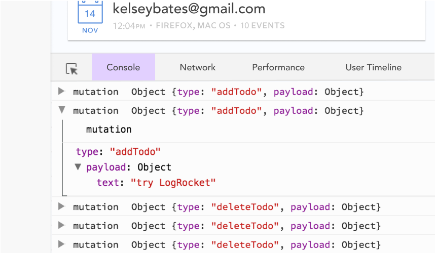
LogRocket lets you replay user sessions, eliminating guesswork by showing exactly what users experienced. It captures console logs, errors, network requests, and pixel-perfect DOM recordings — compatible with all frameworks.
With Galileo AI, you can instantly identify and explain user struggles with automated monitoring of your entire product experience.
Modernize how you debug your Vue apps — start monitoring for free.
Hey there, want to help make our blog better?
Join LogRocket’s Content Advisory Board. You’ll help inform the type of content we create and get access to exclusive meetups, social accreditation, and swag.
Sign up now
This guide walks you through creating a web UI for an AI agent that browses, clicks, and extracts info from websites powered by Stagehand and Gemini.

This guide explores how to use Anthropic’s Claude 4 models, including Opus 4 and Sonnet 4, to build AI-powered applications.

Which AI frontend dev tool reigns supreme in July 2025? Check out our power rankings and use our interactive comparison tool to find out.

Learn how OpenAPI can automate API client generation to save time, reduce bugs, and streamline how your frontend app talks to backend APIs.

 Learn more →
