The React Native system is gradually progressing towards solutions for sharing code between React Native and React Native web applications.

One recent addition to the React Native ecosystem is Tamagui, a UI kit that includes a series of themes, media queries, and typed inline styles, as well as an optimizing compiler. Tamagui aims to close the gap between React Native and React Native web applications by covering the foundational elements of an app, like styling, theming, and providing cross-platform components, all while keeping the app’s performance in mind.
In this article, we’ll learn how to configure Tamagui in a React Native app and a React Native Web app, exploring the components it offers in its current state at the time of writing. Let’s get started!
We’ll start by creating a new React Native project using Expo CLI, which enhances the developer experience with tools in the React Native ecosystem, for example, a variety of templates. Choosing one of these templates is a great starting point for the demo app we’ll build in this tutorial. Open up a terminal window and execute the following command:
npx expo init tamagui-app
# after the project directory is created, navigate inside it
cd tamagui-app
On running the command, you’ll be prompted to choose a template. Choose blank (TypeScript), which will create a project with minimal TypeScript configuration.
After navigating inside the project directory, we’ll install the libraries required to configure Tamagui inside a React Native project First, run the following command from the terminal:
yarn add [email protected] @tamagui/[email protected]
Since Tamagui is still in its alpha release, I’m using specific package versions. However, when a more stable version is released in the future, you might not have to. Be sure to refer to the official documentation for the most up-to-date information on installing dependencies.
tamagui is the UI kit, and @tamagui/babel-plugin is the Babel plugin that loads the design system properties defined inside another file called tamagui.config.ts. You’ll need to create this file in the root of your project, but you can leave it blank for now. We’ll return to it later.
The @unimodules/core dependency is required by the Tamagui UI kit to work with an Expo project. Open the terminal window and execute the following command:
expo install @unimodules/core
Next, we need to install dev dependencies to use Tamagui with Expo for web. Open the terminal window and execute the command below:
yarn add -D @expo/[email protected] [email protected] [email protected] [email protected]
As before, we’ve installed packages with specific versions. In the package.json file, you’ll find the following summary of dependencies and dev dependencies that we installed:
{
  "dependencies": {
   "@tamagui/babel-plugin": "^1.0.0-alpha.37",
    "@unimodules/core": "~7.2.0",
    "expo": "~43.0.2",
    "expo-status-bar": "~1.1.0",
    "react": "17.0.2",
    "react-dom": "17.0.2",
    "react-native": "0.64.3",
    "react-native-web": "0.17.5",
    "tamagui": "^1.0.0-alpha.37"
  },
  "devDependencies": {
    "@babel/core": "^7.12.9",
    "@types/react": "~17.0.21",
    "@types/react-native": "~0.66.6",
    "typescript": "~4.5.2",
    "@expo/webpack-config": "^0.16.14",
    "esbuild-loader": "^2.17.0",
    "tamagui-loader": "^1.0.0-alpha.37",
    "thread-loader": "^3.0.4"
  }
}
Now that our dependencies are installed, add @tamagui/babel-plugin to the babel.config.js file:
module.exports = function (api) {
  api.cache(true);
  return {
    presets: ['babel-preset-expo'],
    plugins: [
      [
        '@tamagui/babel-plugin',
        {
          components: ['tamagui'],
          config: './tamagui.config.ts'
        }
    ]
    ]
  };
};
In the code snippet above, ensure that the path defined for config is the relative path to the Tamagui config file. components contains an array of npm modules containing Tamagui components. For this example app, we’re using Tamagui base components; therefore, we don’t need to add any further configuration.
Tamagui lets you create themes, define tokens, add shorthands, and more. However, it requires you to describe all the properties and set up the foundation of a design system before you can dive into building the components for your React Native app.
To set up the required Tamagui configuration, we’ll use the createTamagui function. We’ll need to define the following:
tokens: Generates variables in theme and appmedia: Defines reusable responsive media queriesthemes: Defines your design themeshorthands: Allows you to define keys that expand the style value props. For example, you can define f for flex, ai for alignItems, jc for justifyContent, etc.You can start setting up the configuration with the size and space properties. We’ll also need to set the defaultFont using the createFont function with a configuration object that contains values for font family, size, lineHeight, fontWeight, and letter spacing.
All of the values above are used inside of the createTokens function, which allows you to create tokens, or the variables mapped to CSS variables at build time. The createTokens function requires the size, space, font, color, radius, and zIndex properties in its configuration object.
The code block below contains a minimal configuration that I’ve created for the demo app with all of the required properties:
import { createFont, createTokens, createTamagui } from 'tamagui';
const size = {
  0: 0,
  1: 4,
  2: 8
};
const space = {
  ...size,
  '-0': -0,
  '-1': -5
};
const defaultFont = createFont({
  family: 'Arial',
  size: {
    1: 14,
    2: 18,
    3: 22
  },
  lineHeight: {
    1: 15,
    2: 20
  },
  weight: {
    4: '300',
    7: '600'
  },
  letterSpacing: {
    4: 0,
    7: -1
  }
});
const tokens = createTokens({
  size,
  space,
  font: {
    title: defaultFont,
    body: defaultFont
  },
  color: {
    lightPurple: '#EDD2F3',
    darkPurple: '#544179'
  },
  radius: {
    0: 0,
    1: 3,
    2: 5,
    3: 10,
    4: 15,
    5: 20
  },
  zIndex: {
    0: 0,
    1: 100,
    2: 200,
    3: 300,
    4: 400,
    5: 500
  }
});
const shorthands = {
  ai: 'alignItems',
  bg: 'backgroundColor',
  br: 'borderRadius',
  f: 'flex',
  h: 'height',
  jc: 'justifyContent',
  m: 'margin',
  p: 'padding',
  w: 'width',
 lh: 'lineHeight',
  ta: 'textAlign'
} as const;
const media = {
  xs: { maxWidth: 660 },
  gtXs: { minWidth: 660 + 1 },
  sm: { maxWidth: 860 },
  gtSm: { minWidth: 860 + 1 },
  md: { minWidth: 980 },
  gtMd: { minWidth: 980 + 1 },
  lg: { minWidth: 1120 },
  gtLg: { minWidth: 1120 + 1 },
  xl: { minWidth: 1280 },
  xxl: { minWidth: 1420 },
  short: { maxHeight: 820 },
  tall: { minHeight: 820 },
  hoverNone: { hover: 'none' },
  pointerCoarse: { pointer: 'coarse' }
};
const config = createTamagui({
  defaultTheme: 'light',
  shorthands,
  media,
  tokens,
  themes: {
    light: {
      bg: tokens.color.lightPurple
    }
  }
});
type Conf = typeof config;
declare module 'tamagui' {
  interface TamaguiCustomConfig extends Conf {}
}
export default config;
Tamagui.ProviderTamagui configuration provides a Tamagui.Provider component that wraps all the other components inside your app:
import React from 'react';
import Tamagui from './tamagui.config';
export default function App() {
  return <Tamagui.Provider>{/* The rest of your app here */}</Tamagui.Provider>;
}
In Tamagui, stacks are the core view elements for creating flex-based layouts. There are three different types of stacks available, XStack, YStack, and ZStack, and each implies a different axis.
In the example below, the defaultTheme takes the value of the theme you’ve defined in the config file. The XStack uses several shorthands, for example, f stands for flex, ai for alignItems, jc for justifyContent, and bg for backgroundColor.
The value of the $bg prop is also coming from the config file, where we’ve explicitly defined that the bg property for the light theme should have a particular color value. The value of space on the YStack is set to $2 from the config file itself:
import { StatusBar } from 'expo-status-bar';
import React from 'react';
import { YStack, Text, XStack } from 'tamagui';
import Tamagui from './tamagui.config';
export default function App() {
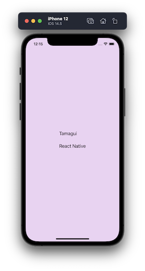
return (
<Tamagui.Provider defaultTheme='light'>
<StatusBar style='dark' />
<XStack f={1} ai='center' jc='center' bg='$bg'>
<YStack space='$2'>
<Text fontSize={20} marginBottom={20}>
Tamagui
</Text>
<Text fontSize={20}>Tamagui</Text>
</YStack>
</XStack>
</Tamagui.Provider>
);
}
You can further define shorthands for properties like margin, marginBottom, and padding and use them as utility props in components, giving you more control over your styles and themes, as seen in the following example:
Now, we’ll take advantage of the @expo/webpack-config package that we installed earlier, which is used to create a custom webpack configuration. When running the expo start --web command, the Expo CLI checks whether the project has a custom webpack configuration in the root directory. If the project does not have a custom webpack configuration, Expo uses the default configuration.
To create our custom webpack configuration, we’ll first run the following command from a terminal window, which will create a config file for you to customize the webpack configuration. When you run this command, you’ll be prompted to choose from several options. Select the webpack.config.js option:
expo customize:web
Next, add the custom configuration to the webpack.config.js file, as recommend by the Tamagui documentation. The configuration will allow us to run tamagui-loader on the web:
const createExpoWebpackConfigAsync = require('@expo/webpack-config');
module.exports = async function (env, argv) {
  const config = await createExpoWebpackConfigAsync(env, argv);
  // Customize the config before returning it.
  // add TAMAGUI_TARGET = web to defines
  const DefinePlugin = config.plugins.find(
    x => x.constructor.name === 'DefinePlugin'
  );
  DefinePlugin.definitions\['process.env'\]['TAMAGUI_TARGET'] = `"web"`;
  // replace babel-loader with our snackui + esbuild loaders
  const rules = config.module.rules[1].oneOf;
  const ruleIndex = rules.findIndex(x =>
    x.use?.loader?.includes('babel-loader')
  );
  rules[ruleIndex] = {
    test: /\.(mjs|[jt]sx?)$/,
    use: [
      'thread-loader',
      {
        loader: require.resolve('esbuild-loader'),
        options: {
          loader: 'tsx',
          target: 'es2019',
          keepNames: true
        }
      },
      {
        loader: require.resolve('tamagui-loader'),
        options: {
          config: './tamagui.config.ts',
          components: ['tamagui']
        }
      }
    ]
  };
  return config;
};
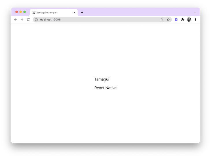
After adding the configuration, execute the command yarn web or expo start --web. You’ll get the following output at http://localhost:19006/:
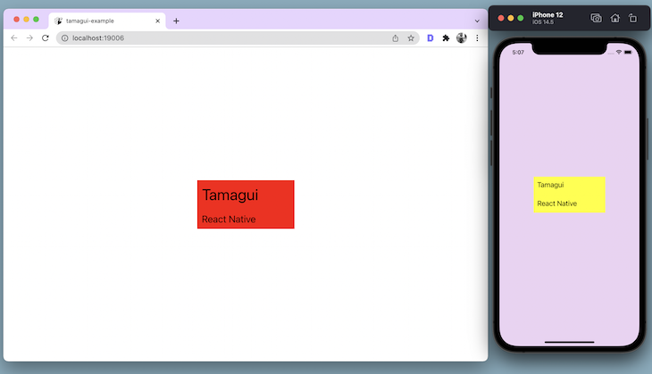
You can incorporate media queries directly in the UI elements of your app. After defining your media queries in the tamagui.config.ts file, you’ll use a Hook called useMedia provided by the library:
import { YStack, Text, XStack, useMedia } from 'tamagui';
Now, let’s add a background color to YStack. Using the media query md: { minWidth: 980 }, the color value will change on the screen’s minimum width. In the code snippet below, the backgroundColor value is set to yellow if the screen width is less than 980, otherwise, it’s set to red:
export default function App() {
  const media = useMedia();
  return (
    <Tamagui.Provider defaultTheme='light'>
      <StatusBar style='dark' />
      <XStack f={1} ai='center' jc='center' bg='$bg'>
        <YStack
          space='$2'
          width={200}
          height={100}
          p={10}
          bg={media.md ? 'red' : 'yellow'}
        >
          <Text fontSize={media.md ? 32 : 18} marginBottom={20}>
            Tamagui
          </Text>
          <Text fontSize={20}>React Native</Text>
     </YStack>
      </XStack>
    </Tamagui.Provider>
  );
}
You can see a visual demonstration of this in the following example:
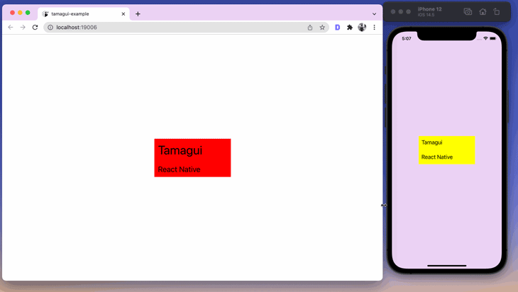
Similarly, the fontSize property also changes based on the media query, as seen in the example:
Although Tamagui is still in its alpha release, it provides benchmarks over other UI kits in the React Native space. In this tutorial, we took a first look at Tamagui, learning the best way to configure it for possible different use cases.
As a developer, I’ll be keeping a close eye on Tamagui’s development and growth. The idea of creating a custom design system from scratch to support both native and web platforms is both fascinating and useful. I hope you enjoyed this tutorial!

LogRocket's Galileo AI watches sessions for you and and surfaces the technical and usability issues holding back your React Native apps.
LogRocket also helps you increase conversion rates and product usage by showing you exactly how users are interacting with your app. LogRocket's product analytics features surface the reasons why users don't complete a particular flow or don't adopt a new feature.
Start proactively monitoring your React Native apps — try LogRocket for free.

Enabled React Compiler v1.0 on a production Next.js app. Here’s every warning, breakage, and silent opt-out I documented — and what actually worked.

We built the same app in TanStack Start RSC and Next.js RSC. TanStack shipped 40% less JS and built 4x faster — but Next.js is still the safer production bet.

From RSC vulnerabilities and the Vercel breach to TypeScript 7.0 Beta and AI agents — the nine frontend storylines that defined H1 2026, ranked.

AI tools generate working React code fast, but miss race conditions, empty states, debouncing, and accessibility. Here’s how to catch bugs before production.
Would you be interested in joining LogRocket's developer community?
Join LogRocket’s Content Advisory Board. You’ll help inform the type of content we create and get access to exclusive meetups, social accreditation, and swag.
Sign up now

 Learn more →
