A practical guide to designing hero sections that are accessible and performant, covering contrast, motion, keyboard navigation, LCP optimization, and collaboration tips for designers and developers.

From pixel art to neon palettes, retro design is resurging across marketing, gaming, fashion, and indie web. Learn how nostalgia, brand differentiation, and anti-minimalism fatigue are shaping modern UX and how to balance style with usability.
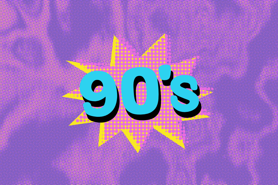
90s website design was a maximalist playground of GIFs, bold colors, quirky fonts, and textured layouts. Learn how this experimental era influenced modern flat design, UX principles, and the nostalgic design trends of today.

Nostalgic design taps into familiar visuals and interactions to trigger happy memories, boost engagement, and foster brand loyalty. Learn how typography, color, sound, and retro patterns can evoke positive emotions while keeping your UX accessible and functional.
You can use 90s-inspired visuals without repeating 90s mistakes. This piece breaks down which retro elements to reuse, which pitfalls to avoid, and a simple framework for balancing nostalgia with modern UX.
Maximalism defined the 90s web with neon colors, dense text, textures, and endless GIFs. This article explains why the style emerged and how its “more-is-more” energy compares to the minimalist UX standards we rely on today.
The 90s web was chaotic, colorful, and full of improvisation and it shaped more of modern UX than we admit. This article traces how tables, GIFs, and bold palettes evolved into today’s grids, micro-animations, and clean hierarchy.
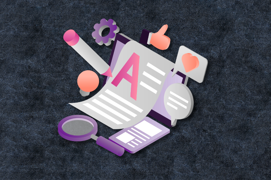
Nostalgia-driven aesthetics is a real thing. In this blog, I talk all about 90s website designs — from grunge-inspired typography to quirky GIFs and clashing colors — and what you can learn from them.
Users don’t interact with your product at random; they follow cognitive patterns. These 14 principles reveal how people think, decide, remember, and get motivated, so you can design experiences that guide them effortlessly.
Great modals respect user intent. Bad ones hijack it. This guide covers when to use modals, how to make them user-friendly, and what to use instead.
AI agents powered by MCP are redefining interfaces, shifting from clicks to intelligent, context-aware conversations.
I redesigned a book library app using Apple’s HIG and AI as my design duo. The experiment taught me how structure and intuition still matter more than machine-generated advice.