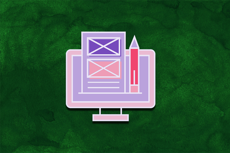
Let’s take a look at several popular community Figma plugins and third-party cloud services that offer Figma to Flutter code generation.

Customer experience is largely dictated by good and bad service. But what are best practices here? And how do they affect CX?

Design is more than just drawing rectangles and putting visual elements together. Here are some best practices for good web design.

Learn the crucial points you must consider to make maintaining the design system easier and avoid mistakes.

The launch of Figma’s Dev Mode sparked some confusion around the new billing payment structure. We’re here to help.
Let’s talk about the design planning process, why projects fail without it, and the necessary elements all designers should include in it.
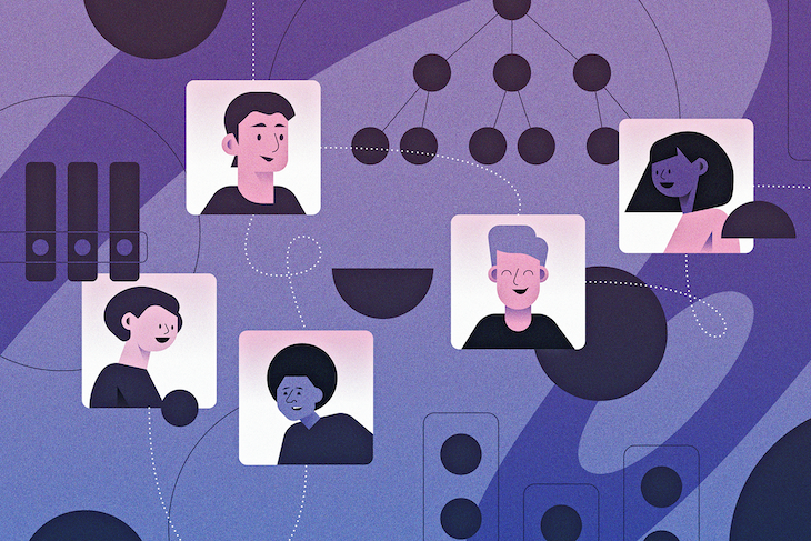
Having a strong design team structure is key to creating the right conditions for your team if you want them to produce their best work.
Color variance across cultures and perceptions can impact the way UX design is interpreted and how effective it is.

Let’s talk about the purpose of a one-on-one meeting, what makes a successful one, and strategies to plan and run one effectively.
Did you know about the vertical trim setting in Figma? Here’s what it does and why it’s awesome but why you shouldn’t use it yet.

Analyzing a similarity matrix can help you identify patterns that tend to be grouped together by participants in card sorting.
A design language is the cohesive system of visual and interaction elements that define a product’s personality. Here’s how to define yours.