In the past few years, the most dominant JavaScript frameworks and libraries have included React, Angular, and Vue; however, since being released in November 2016, Svelte has been growing in popularity.

Renowned for its reactivity, Svelte is a powerful tool for building high-speed web applications that updates the DOM by compiling code and converting it to pure JavaScript.
In this tutorial, we’ll explore Svelte Material UI (SMUI), a helper library for building custom and advanced UI components that is inspired by Google’s Material Design. To follow along with this tutorial, you’ll need:
To follow along, you can access the source code on my GitHub repo. Let’s get started!
To get started with Svelte, first, we’ll need to install a Svelte package called degit, allowing us to clone the latest commit from the Svelte Material UI GitHub repo. We’ll use degit to get a starter template for a new application from the Svelte GitHub repo. Run the following command in your terminal:
npm install -g degit
To create a new app, run the command below in your application directory’s command line. Be sure to add a unique name for your project:
degit sveltejs/template your-project-name
Next, CD into the new file directory and run code ., which will open your app folder in VS Code:
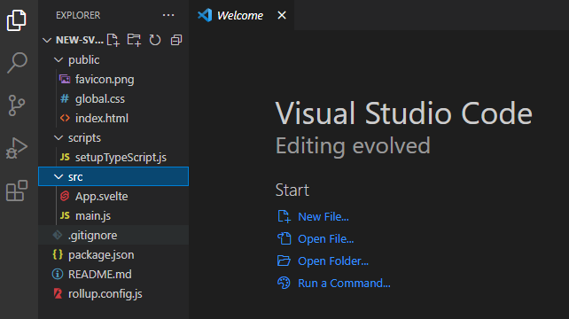
We got the files in the screenshot above from the Sveltejs/template repository. Notice that Svelte apps follow a similar structure to other JavaScript frameworks.
In your app directory’s terminal, run the command below to install the required dependencies:
npm install
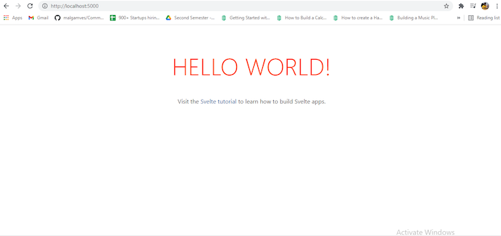
Next, we’ll get the Node modules and the package-lock.json file that controls the dependencies. To open your application locally on the browser, run the following command in your terminal:
npm run dev
Now, your Svelte application should open on a local server in your browser, as seen in the image below:
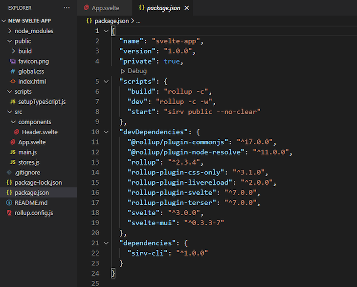
To use SMUI in our Svelte project, first, we have to install it by running the following command in our terminal:
npm install --save-dev svelte-mui
The dependencies will be installed in our package.json file, which will look like the image below:
Svelte Material UI is a collection of lightweight UI components that we can easily import into our Svelte application, including components for UI elements like a checkbox, menu, icon, floating label, form field, and radio buttons.
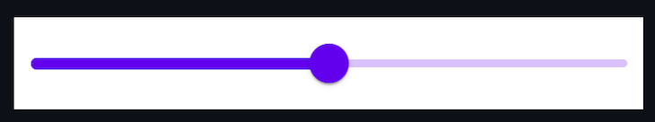
As an example, let’s say we need a slider component in our Svelte application. We can run the command below in our app terminal:
npm install --save-dev @smui/slider
To import the slider component into our application, we’ll copy and paste the code below in our script tag:
import {MDCSlider} from '@material/slider';
Next, we’ll call a continuous slider in our HTML with the code below:
<div class="mdc-slider">
<input class="mdc-slider__input" type="range" min="0" max="100" value="50" name="volume" aria-label="Continuous slider demo">
<div class="mdc-slider__track">
    <div class="mdc-slider__track--inactive"></div>
    div class="mdc-slider__track--active">
      <div class="mdc-slider__track--active_fill"></div>
    </div>
  </div>
  <div class="mdc-slider__thumb">
    <div class="mdc-slider__thumb-knob"></div>
  </div>
</div>
The slider will appear in our app like the image below:
Let’s build a simple to-do list application using pre-built components from Svelte Material UI.
Our application will have a button for adding new tasks, which the user can define using a text field. We’ll also add a delete button for removing events once they are completed. To do so, we’ll import the Add button, Text field, and Delete button components from SMUI.
First, let’s create a new file in our src/components folder called Header.svelte, which will contain the UI for our application’s header:
<script>

</script>
<style>
    .header {
        display: flex;
        justify-content: space-between;
        align-items: center;
        padding: 15px 20px;
        color: #fff;`
        font-weight: bold;
        font-size: 1.5em;
        background: rgba(0, 0, 0, 0.1);
    }
</style>


<div class="header">
    <span>Onome's Todo list</span>
</div>
In your App.svelte file, run the code below to import the component in your script tag:
import Header from "./components/Header.svelte";
Now, call the header in your HTML as follows:
<Header />
Add buttonNext, we’ll import the Add button from SMUI, which creates a new text field for users to add a new task in the to-do list. To import the button component, first, run the following command in your terminal:
npm install @material/button
Import the button component in your script tag with the code below:
import { Button } from 'svelte-mui/src';
Now, import the code below in your script tag, giving the Add button the ability to add new tasks as text fields:
<script>
import { Button } from 'svelte-mui/src'
    let tasks = [];
    const addTasks = () => {
        tasks = [...tasks, '']
    }
</script>
<div>
<Button on:click={addTasks} raised color="#ff4d14">Add
    </Button>
</div>
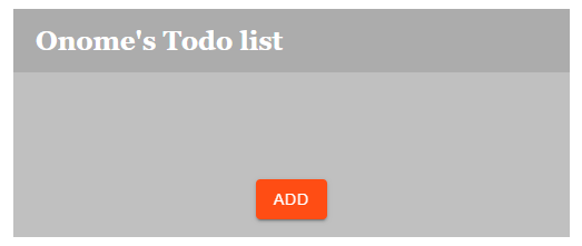
If you run npm run dev in your terminal, your application will look like the image below:
Text fieldTo import the SMUI Text field component, first, run the following command in your app’s terminal:
npm install --save-dev @smui/textfield
Now, you can import the Text field component in your application with the following code:
import {MDCTextField} from '@material/textfield';
To get your Text field, copy and paste the code below in your HTML:
<label class="mdc-text-field mdc-text-field--outlined">
                <span class="mdc-notched-outline">
                  <span class="mdc-notched-outline__leading"></span>
                  <span class="mdc-notched-outline__notch">
                        <span class="mdc-floating-label" id="my-label-id"></span>
                  </span>
                  <span class="mdc-notched-outline__trailing"></span>
                </span>
                <input type="text" class="mdc-text-field__input" aria-labelledby="my-label-id">
          </label>
Delete buttonFinally, we’ll create a Delete button, which uses a trash can icon wrapped with the SMUI button component. When clicked, the button will delete a task from the to-do list using the slice() function.
First, run the command below in your terminal:
npm install @material/icon-button
Now, import the icon and button component into your application with the following code:
import {MDCRipple} from '@material/ripple';
Let’s retrieve the trash can icon from Google Fonts Material Icons; first, we’ll import Material Icons in our application with the code below:
<head>
        <link rel="stylesheet" href="https://fonts.googleapis.com/icon?family=Material+Icons">
 </head>
To import the icon of your choice, simply add its HTML code in your app. In this case, we used the delete icon. Next, we’ll write the script for the delete button, causing it to remove the task when a click event is triggered:
<script>
    import { Button } from 'svelte-mui/src'
    let tasks = [];
    const removeTask = (index) => {
        tasks = [...tasks.slice(0, index), ...tasks.slice(index+1)];
     }
</script>
<div>
{#each tasks as task, index }
<Button on:click={()=>removeTask(index)} > <span class="material-icons" >
        delete
        </span> </Button>
{/each}
</div>
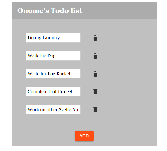
You can deploy your Svelte app as you would any other web app. However, you must run npm run build in your terminal before deploying on Netlify or any other site of your choice. Our final app looks like the image below:
You can also see the deployed app here.
As a relatively new JavaScript frontend compiler, Svelte is still a work in progress. However, it has already proven itself to be effective and easily understandable, thanks in part to third-party packages and component libraries. This article demonstrated how Svelte Material UI utilizes Material UI components, providing utilities for creating faster applications that have a more attractive and understandable UI.
If you have any questions, feel free to comment below!
Hey there, want to help make our blog better?
Join LogRocket’s Content Advisory Board. You’ll help inform the type of content we create and get access to exclusive meetups, social accreditation, and swag.
Sign up now
Learn how OpenAPI can automate API client generation to save time, reduce bugs, and streamline how your frontend app talks to backend APIs.

Discover how the Interface Segregation Principle (ISP) keeps your code lean, modular, and maintainable using real-world analogies and practical examples.

<selectedcontent> element improves dropdowns
Learn how to implement an advanced caching layer in a Node.js app using Valkey, a high-performance, Redis-compatible in-memory datastore.


One Reply to "Svelte Material UI: Advanced Material Design components"
I’m new to Svelte and want to learn a front end framework to go along with it. Has anyone gone through this tutorial and gotten it to work. Seems like the only styled component is the orange button at the end. Very confused because I can’t get the official site https://sveltematerialui.com/INSTALL.md working either