accent-color
Modern web development technology has two form control types: native, standard HTML form controls and custom form controls. Every popular browser can render native form controls, such as buttons, text boxes, radio buttons, checkboxes, etc. But custom form controls are built by assembling multiple div elements or hiding native elements with a CSS appearance: none setup.

Native form controls don’t require installing external UI libraries. They are easy to use and available in every modern browser, but they create several issues for developers.
Each browser rendered them using its own, specific theme color, so these controls looked different on various browsers. The CSS standard allowed web developers to customize some form controls, like text boxes, but didn’t offer an easy, consistent way to customize the look and feel of all available form controls to match the web app theme.
The inability to customize the default theme colors of checkboxes, radio buttons, range sliders, and progress bars was a critical problem, so developers used custom form controls built with CSS-styled elements as a solution.
The basic UI module level 4 CSS specification introduced the accent-color property to change form controls theme colors that were not previously customizable.
In this tutorial, I’ll explain how to use the accent-color property to simplify form control styling with practical examples. Also, I’ll explain how to enhance the accent-color-based styling with other popular CSS techniques.
Jump ahead:
accent-color?
accent-color in HTML form controls
accent-color with dark/light modesaccent-coloraccent-colorThe Replay is a weekly newsletter for dev and engineering leaders.
Delivered once a week, it's your curated guide to the most important conversations around frontend dev, emerging AI tools, and the state of modern software.
accent-color?Native HTML form controls use a pre-defined, browser-specific color (or colors) to build a theme for form controls. For example, Google Chrome uses a default light blue color as a foundation for a color scheme for most form controls, as shown below:
The accent-color CSS property helps you set a different color for this form control theme, also known as the accent color. If you use red as the accent color, the browser generates a red-based color theme for form controls:
You can use this property to customize the form control appearance to match your app’s theme colors without using popular customization workarounds, such as the old native control hiding approach, which you can read a detailed explanation of on this blog.
The accent-color property accepts three types of values:
auto: Uses the accent color defined by the web browserhotpink), a HEX value, or a color function (rgb and hsl)inherit, initial, etc. You can see all accepted global values on MDNIn most scenarios, you can use a specific color to customize form controls to match your app theme colors. Look at the following CSS snippet:
.selector-1 {
  accent-color: hotpink;
}

.selector-2 {
  accent-color: #00ff00;
}

.selector-3 {
  accent-color: rgb(20, 25, 100);
}

.selector-4 {
  accent-color: hsl(35%, 100%, 50%);
}
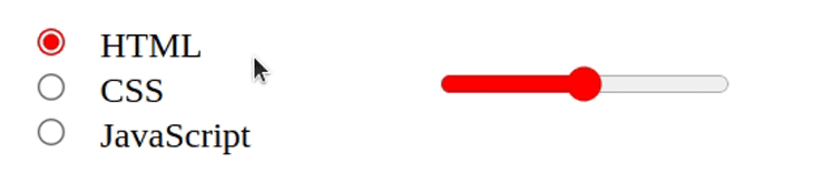
We can currently use this CSS property to customize the accent colors of radio buttons, checkboxes, range sliders, and progress bars. Let’s change the colors of a range slider to understand how this CSS property works!
You can run the upcoming example in a local HTML file or edit it live in this CodePen. First, create a range slider with the following HTML snippet:
<input type="range" style="width: 300px"/>
Check the preview. You will see a range slider with default colors; I got the following one on Google Chrome:

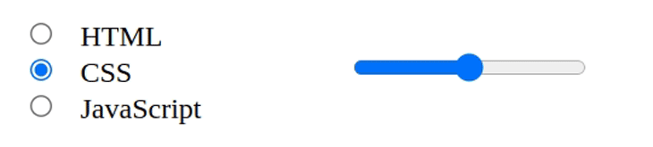
Assume that your app’s primary theme color is green. So, change the accent color as follows:
<input type="range" style="width: 300px; accent-color: green"/>
Look at the range slider — it’s now green:

Experiment further by using different colors and see how it affects the color scheme. The #af32fc HEX color displays the following:

accent-color in HTML form controlsLet’s create a practical HTML form for a food ordering app and learn further about accent color configuration.
Create the structure of our form with the following HTML snippet:
<div class="form">
  <h2><span>Modern</span>Food Restaurant</h2>
  <div class="note">TODO: Add form controls</div>
</div>
Next, add the required CSS styling definitions:
.form {
  background-color: #eee;
  padding: 24px;
  border-top: solid 10px #bb0000;
}

.spacer {
  height: 24px;
}

.inline-item {
  display: flex;
  align-items: center;
}

h2 span {
  color: red;
}

.note {
  padding-bottom: 12px;
}

label {
  padding-left: 6px;
}
The form structure is ready. Let’s add form controls and learn how to use accent-color for color scheme customization.
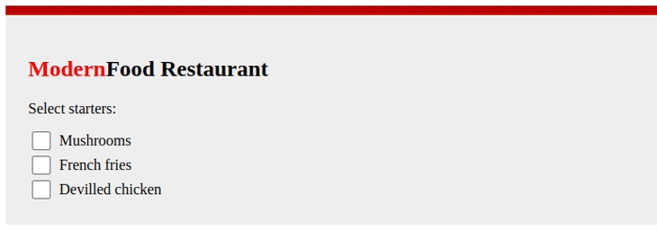
The browser will change the checkbox’s hover, press, check status, and tick icon colors based on the accent color. Take a look at the following HTML and CSS files before viewing the preview:
<div class="note">Select starters:</div>
<div class="inline-item">
  <input type="checkbox" id="opt1"/>
  <label for="opt1">Mushrooms</label>
</div>
<div class="inline-item">
  <input type="checkbox" id="opt2"/>
  <label for="opt2">French fries</label>
</div>
<div class="inline-item">
  <input type="checkbox" id="opt3"/>
  <label for="opt3">Devilled chicken</label>
</div>
input[type="checkbox"] {
  accent-color: red;
  width: 20px;
  height: 20px;
}
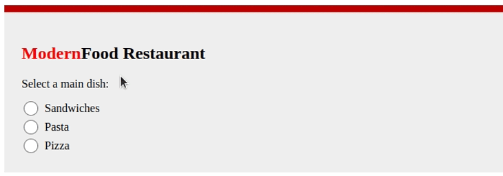
The browser will change the radio’s hover, press, select status, and the selected icon colors based on the accent color, similar to the checkbox form control:
<div class="note">Select a main dish:</div>
<div class="inline-item">
  <input type="radio" id="opt1" name="maindish"/>
  <label for="opt1">Sandwiches</label>
</div>
<div class="inline-item">
  <input type="radio" id="opt2" name="maindish"/>
  <label for="opt2">Pasta</label>
</div>
<div class="inline-item">
  <input type="radio" id="opt3" name="maindish"/>
  <label for="opt3">Pizza</label>
</div>
input[type="radio"] {
  accent-color: red;
  width: 20px;
  height: 20px;
  margin: 3px;
}
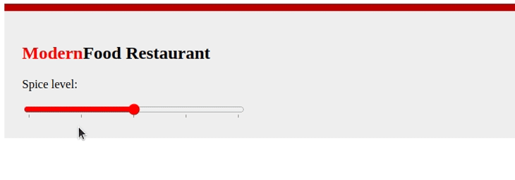
A range slider control consists of several building blocks: the sliding rail, the knob, and the filled region. The colors of these parts change when the user presses and hovers over the range slider.
When you change the range slider accent color, it affects these atomic parts and both the hover and press effect colors. Take a look:
<div class="note">Spice level:</div>
<input type="range" min="1" max="5" list="markers"/>
<datalist id="markers">
  <option value="1"></option>
  <option value="2"></option>
  <option value="3"></option>
  <option value="4"></option>
  <option value="5"></option>
</datalist>
input[type="range"] {
  accent-color: red;
  width: 300px;
}
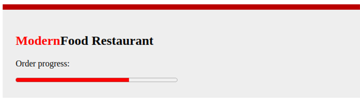
Most HTML UI libraries offer divs-based animated progress indicators (i.e., Bootstrap’s Progress component), but there is also a native, inbuilt HTML progress bar that works on all popular web browsers.
The accent-color property changes its filled and empty region colors like so:
<div class="note">Order progress:</div>
<progress max="100" value="70"> 70% </progress>
progress {
  accent-color: red;
  width: 300px;
}
We checked each form control’s accent color configuration separately for demonstration simplicity. You can check this CodePen to see the complete food ordering app form live with the source code.
accent-color with dark/light modesThe browser carefully creates a UX-friendly color scheme for form controls based on the accent color setup — it never uses background and foreground colors that could blend with each other cause accessibility-related problems (i.e., create an invisible checkbox tick).
For example, when you use a light accent color for a checkbox, the tick icon becomes darker to improve the accessibility factors. A good tool to use to check how accent-color changes form control color themes is this web app.
Nowadays, most apps let users apply a dark color theme, or “dark mode,” apart from the traditional light color theme. Web developers typically switch their apps’ color theme automatically based on the operating system or browser’s theme settings via the prefers-color-scheme CSS media query.
As with other CSS properties, you can use a different accent color for dark mode by wrapping accent-color definition with prefers-color-scheme. Also, it’s possible to apply a dark background for form controls using the color-scheme CSS property.
Let’s implement a dark theme for our food ordering form! Add the following CSS to the previous HTML form implementation:
@media (prefers-color-scheme: dark) {
  .form {
    background-color: black;
    color: white;
  }

  input[type="checkbox"],
  input[type="radio"],
  input[type="range"],
  progress {
    accent-color: white;
    color-scheme: dark;
  }
}
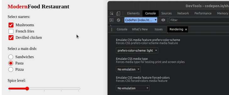
The above media query definition does two key things for users who use dark themes:
color-scheme and changes the accent color via accent-colorAfter you run the above CSS snippet, you can toggle and test the dark theme via Chrome DevTools rendering tab as follows:
You can check the complete source code of this dark-theme-enabled form in this CodePen.
accent-colorThe accent color is just a color value, but the browser will generate a color scheme to go with it in various situations. For example, the checkbox’s hover color also gets changed based on the accent color you’ve used.
This makes customizing form controls so simple, but this approach limits you from using various custom accent colors for different form control states (i.e., hovered, pressed, etc.).
There is a way to use custom accent colors based on form control states: switch your accent colors with CSS pseudo-classes and use transition effects. Let’s enhance the default accent color setup with CSS transitions in the following snippet:
input[type="checkbox"] {
  width: 80px;
  height: 80px;
  accent-color: rgb(224, 2, 2);
  transition: accent-color 0.5s 0.2s ease;
}

input[type="checkbox"]:hover {
  accent-color: rgb(191, 0, 147);
}

input[type="checkbox"]:active {
  accent-color: rgb(138, 9, 0);
}
The above CSS snippet will customize the auto-generated color scheme for hovered and pressed checkbox states, as shown below (or, see a live preview with code in this CodePen):

As another styling enhancement, you can use dynamic accent colors for each checkbox with the following CSS:
input[type="checkbox"] {
  width: 80px;
  height: 80px;
  --red: calc(var(--i) * 50 + 100);
  accent-color: hsl(var(--red), 50%, 50%);
}
The above CSS generates dynamic accent colors for each checkbox once you increment the --i custom property, as shown in the following HTML snippet:
<input type="checkbox" checked style="--i: 0"/>
<input type="checkbox" checked style="--i: 1"/>
<input type="checkbox" checked style="--i: 2"/>
<input type="checkbox" checked style="--i: 3"/>
Look at the following preview (or see a live preview with code from this CodePen):

accent-colorEvery modern web browser implements the accent-color property according to the standard CSS specification, and allows customizing the accent colors of checkboxes, radio buttons, range sliders, and progress bars in a simplified way.
Check the browser support details from the following table:
| Browser name | Version (where accent-color was added) |
|---|---|
| Google Chrome | 93 |
| Microsoft Edge | 93 |
| Mozilla Firefox | 92 |
| Opera | 79 |
| Apple Safari | 15.4 |
| Google Chrome Android | 93 |
| Mozilla Firefox Android | 92 |
| Opera Android | 66 |
| Apple Safari iOS | 15.4 |
| Samsung Internet | 17 |
| WebView Android | 93 |
In this tutorial, we discussed how to simplify the form control styling process by using the accent-color CSS property. accent-color currently works with the checkbox, radio button, range slider, and progress elements. Now, you don’t need to spend so much time customizing form control colors by hiding natively rendered elements and replacing them with CSS-styled elements. Instead, you can use one modern CSS property, accent-color to style native form controls instantly!
Other form controls, such as text boxes, buttons, dropdowns, etc. don’t respond to this property at the moment, but we can customize them with other CSS properties (i.e., using background-color and border). Perhaps, accent-color may become a CSS specification standard and support these controls soon.
HTML video and audio elements are also good candidates to receive accent-color support in the future. You can discuss the future of the accent-color CSS feature by suggesting your ideas in this GitHub repository issue tracker.
As web frontends get increasingly complex, resource-greedy features demand more and more from the browser. If you’re interested in monitoring and tracking client-side CPU usage, memory usage, and more for all of your users in production, try LogRocket.

LogRocket lets you replay user sessions, eliminating guesswork around why bugs happen by showing exactly what users experienced. It captures console logs, errors, network requests, and pixel-perfect DOM recordings — compatible with all frameworks.
LogRocket's Galileo AI watches sessions for you, instantly identifying and explaining user struggles with automated monitoring of your entire product experience.
Modernize how you debug web and mobile apps — start monitoring for free.

Learn how next-browser gives AI agents runtime context for debugging Next.js apps, including React props, hydration, PPR, forms, and performance.

Build dynamic LLM routing in Next.js with OpenRouter, TanStack AI, task classification, model fallbacks, and cost-aware routing.

TSRX adds first-class control flow, conditional hooks, and scoped styles to React via a TypeScript compiler extension — no new framework required.

Learn how to build a full React Native auth system using Better Auth and Expo — with email/password login, Google OAuth, session persistence, and protected routes.
Hey there, want to help make our blog better?
Join LogRocket’s Content Advisory Board. You’ll help inform the type of content we create and get access to exclusive meetups, social accreditation, and swag.
Sign up now

 Learn more →
