As a style language, CSS provides many options for rotating headers, paragraphs, or other text on a webpage. Rotating text is often necessary when representing languages like Chinese, Japanese, and Mongolian. It can also come in handy when adding text to graphics like maps or charts.

In this article, we’ll review the text-orientation, writing-mode, transform, and rotate CSS properties. You can use these properties to rotate text to a particular degree either vertically, sideways towards the right, sideways towards the left, right to left, or left to right. We’ll explore these properties and their syntaxes by building a rotated side header with CSS. To follow along with this article, you should have some experience with CSS. Let’s get started!
Jump ahead:
transform propertyrotate propertywriting-mode propertytext-orientation propertyFor demonstration purposes, first, we’ll generate some paragraph text and a heading. Create an index.html file and add the following code to it:
//index.html
<!DOCTYPE html>
<html lang="en">
<head>
<meta charset="UTF-8">
<meta http-equiv="X-UA-Compatible" content="IE=edge">
<meta name="viewport" content="width=device-width, initial-scale=1.0">
<title>Css rotate texts</title>
<link rel="stylesheet" href="style.css">
</head>
<body>
<section>
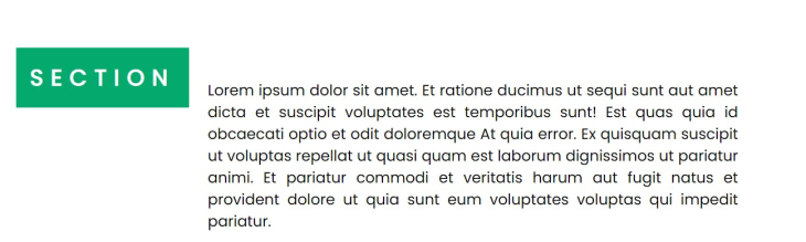
<div class = "container">
<div class = "box">
<h2 class="heading--text">SECTION</h2>
<p class="paragraph--texts">Lorem ipsum dolor sit amet. Et ratione ducimus ut sequi sunt aut amet dicta et suscipit voluptates est temporibus sunt! Est quas quia id obcaecati optio et odit doloremque At quia error. Ex quisquam suscipit ut voluptas repellat ut quasi quam est laborum dignissimos ut pariatur animi. Et pariatur commodi et veritatis harum aut fugit natus et provident dolore ut quia sunt eum voluptates voluptas qui impedit pariatur.
</p>
</div>
</div>
</section>
</body>
</html>
Next, create a style.css file and add the following basic styles:
section{
    display: flex;
    align-items:center;
    justify-content: center;
    min-height: 100vh;
    padding: 10px;
}
.box{
    display: flex;
    width: 70%;
}
.heading--text{
  display:inline;
  letter-spacing: 10px;
  height: 60px;
  padding: 15px;
  background-color: #04AA6D;
  color:white;
  margin-right: 20px;
}
.paragraph--texts{
 align-self: center;
}
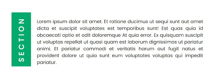
With the code above, we’ll have the following output:

transform propertyThe transform property applies a 2D or 3D transformation to an element. It can either rotate an element using rotate(), resize that element using scale(), or cause an element to move from one position to another using translate().
rotate() rotates an element around a fixed position. For a 2D rotation, the syntax is transform: rotate(angle). For 3D rotations along the x-axis, y-axis, z-axis, respectively, the syntax is rotateX(angle), rotateY(angle), or rotateZ(angle). The angle is the degree to which the text should be rotated. A negative angle value can also be used to indicate the direction of the rotation to the left.
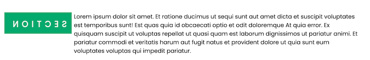
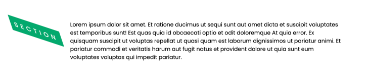
Let’s rotate the example header text by negative 90 degrees. Add the following style to the heading--text class in style.css:
transform: rotate(-90deg);
transform: rotateY(160deg) will look like the preview below:
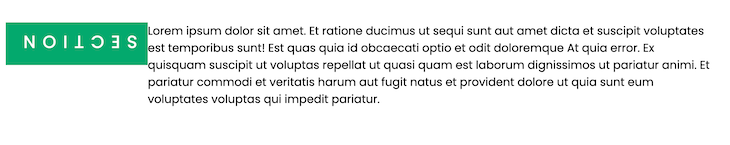
rotate propertyThe rotate property defines how much an element will be rotated clockwise around the z-axis.To rotate an element around the x-axis, y-axis, or in another direction, you need to define the syntax as follows:
rotate: axis angle|initial|inherit;
For example, rotate: 180deg rotates an element at an angle of 180 degrees along the z-axis. Applying this style to our header will look like the following:
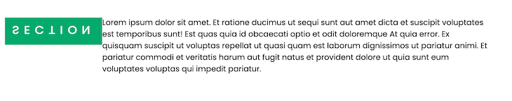
If an axis and angle are specified, like in rotate: x 160deg, the element is rotated clockwise around the given axis. This rotates the element 160 degrees around the x-axis as follows:
If three values are given in addition to the angle, the three values define a vector that the element is rotated around, for example, rotate: 1 1 0 60deg;:
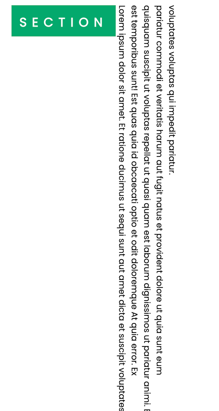
writing-mode propertyThe CSS writing-mode method is best used when setting a text vertically or horizontally. It sets the direction a block of text should progress as well as the direction an inline element should flow within a block container.
The writing-mode property can be used alongside the rotate function to set the direction of the block text either vertically or horizontally before rotating the text along that fixed position. The syntax is as follows:
writing-mode: horizontal-tb|vertical-rl|vertical-lr;
For example, writing-mode: horizontal-tb means that elements are positioned horizontally from top to bottom, as follows:
Applying writing-mode: vertical-lr; to the paragraph--texts class in the CSS file above gives us the result below. You’ll notice that the texts are vertically positioned and moving from left to right:
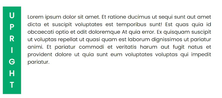
text-orientation propertyThe text-orientation property sets the orientation of the characters in a vertical text or header. The syntax is below:
text-orientation: mixed|upright|sideways|sideways-right|use-glyph-orientation|initial|inherit;
Applying the text-orientation: upright style to the header looks like the following:
In this article, we explored four different methods to rotate text in CSS. This is especially useful when you want to control the display of languages that use vertical scripts. Although you can use any of these methods individually, more often, they are used in combination to achieve the desired orientation, direction, or appearance of any element.
For example, the vertical rl writing mode, the rotate(180deg) transform function, and the upright orientation always go well together to achieve the best side header. However, the choice remains yours. I hope you found this article helpful, and be sure to leave a comment if you have any questions. Happy coding!
As web frontends get increasingly complex, resource-greedy features demand more and more from the browser. If you’re interested in monitoring and tracking client-side CPU usage, memory usage, and more for all of your users in production, try LogRocket.

LogRocket lets you replay user sessions, eliminating guesswork around why bugs happen by showing exactly what users experienced. It captures console logs, errors, network requests, and pixel-perfect DOM recordings — compatible with all frameworks.
LogRocket's Galileo AI watches sessions for you, instantly identifying and explaining user struggles with automated monitoring of your entire product experience.
Modernize how you debug web and mobile apps — start monitoring for free.

Learn how to use Fallow to analyze AI-generated code, detect dead code, duplicate logic, and complexity issues, and integrate automated code quality checks into your AI-assisted development workflow.

Learn how to protect full-stack projects from NPM supply chain attacks with a practical security checklist.

Explore 15 essential MCP servers for web developers to enhance AI workflows with tools, data, and automation.

Learn how contrast-color() automatically picks accessible text colors using native CSS, without JavaScript.
Would you be interested in joining LogRocket's developer community?
Join LogRocket’s Content Advisory Board. You’ll help inform the type of content we create and get access to exclusive meetups, social accreditation, and swag.
Sign up now

