Most real-world applications include a way to manage and manipulate dates. In such use cases, having a calendar is often the most effective solution.

In this tutorial, we’ll show you how to create a simple calendar in React using React-Calendar. We’ll cover the following with practical examples:
The Replay is a weekly newsletter for dev and engineering leaders.
Delivered once a week, it's your curated guide to the most important conversations around frontend dev, emerging AI tools, and the state of modern software.
React-Calendar is a simple calendar library that provides the ability to pick days, months, years, or even decades. It also supports date range selection and a variety of languages for more complex use cases.
Because React-Calendar is not dependent on moment.js, it’s a very flexible and versatile library that you can use in virtually any application.
Let’s create a fresh new react project for this tutorial using Create React App. Make sure you have Node.js ≥v10.16 and npm ≥v5.6 installed on your machine.
To create a new project, run the following command:
npx create-react-app calendar-example
Now, add the React-Calendar library to our project using npm:
npm install react-calendar
Now we have a bare-minimum setup. Remove the basic boilerplate code added by Create React App and let’s get started.
The first step is to add the calendar to our React app. Import the Calendar component from react-calendar and add it to app.js file. The file will look something like this:
// App.js

import { useState } from 'react';
import Calendar from 'react-calendar';
import './App.css';

function App() {
  const [date, setDate] = useState(new Date());

  return (
    <div className='app'>
      <h1 className='text-center'>React Calendar</h1>
      <div className='calendar-container'>
        <Calendar onChange={setDate} value={date} />
      </div>
      <p className='text-center'>
        <span className='bold'>Selected Date:</span>{' '}
        {date.toDateString()}
      </p>
    </div>
  );
}

export default App;
Here, we added a Calendar component to our app.js file and added two properties to it. We created a state to store a date and passed the current date as its initial value using JavaScript’s Date object.
With this basic structure ready, our initial calendar will look similar to this:
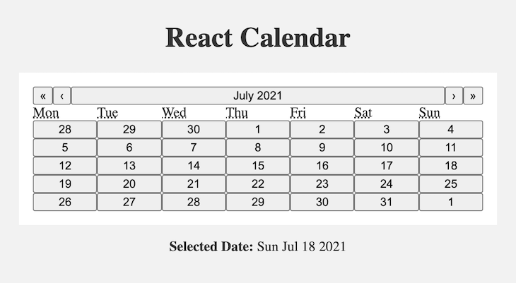
If you check the code of the app.js file, we created a state named date and passed it as a value to the Calendar component. Another prop, onChange, is passed to Calendar, which sets the date state to the value clicked by the user.
The initial value passed to the calendar is the present date. When a user clicks the calendar, its value will be set to the user’s selection. For this application, we are printing the date value below our calendar.
We’re done with the very basic calendar implementation. But as you can see, the styling is not yet applied to the calendar, so it looks pretty boring.
React-Calendar provides some default styling, which you can apply by importing its stylesheet. To do this, add the following line to your app.js file:
import 'react-calendar/dist/Calendar.css';
If you want to add your own styling, you can override these classes and add your custom CSS properties.
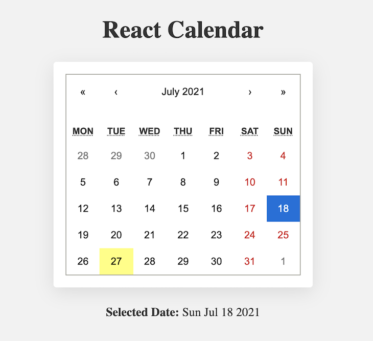
The custom styles of React-Calendar look pretty good. But we always want our components to be consistent with the overall style of a product. The elements of React-Calendar have some classes already applied, which we can use to add our styles.
The best way to apply your styling is by overriding Calendar.css. You can copy the entire calendar CSS in a local file from node_modules/react-calendar/dist and import the same file into App.js instead of into the default calendar CSS.
I changed some default font color and background color of the calendar and added some border-radius to the range selection. Here, I overrode some classes and added my custom styles to get the result similar to this:
.react-calendar {
 width: 400px;
 max-width: 100%;
 background-color: #fff;
 color: #222;
 border-radius: 8px;
 box-shadow: 0 12px 24px rgba(0, 0, 0, 0.2);
 font-family: Arial, Helvetica, sans-serif;
 line-height: 1.125em;
}
.react-calendar__navigation button {
 color: #6f48eb;
 min-width: 44px;
 background: none;
 font-size: 16px;
 margin-top: 8px;
}
.react-calendar__navigation button:enabled:hover,
.react-calendar__navigation button:enabled:focus {
 background-color: #f8f8fa;
}
.react-calendar__navigation button[disabled] {
 background-color: #f0f0f0;
}
abbr[title] {
 text-decoration: none;
}
/* .react-calendar__month-view__days__day--weekend {
 color: #d10000;
} */
.react-calendar__tile:enabled:hover,
.react-calendar__tile:enabled:focus {
 background: #f8f8fa;
 color: #6f48eb;
 border-radius: 6px;
}
.react-calendar__tile--now {
 background: #6f48eb33;
 border-radius: 6px;
 font-weight: bold;
 color: #6f48eb;
}
.react-calendar__tile--now:enabled:hover,
.react-calendar__tile--now:enabled:focus {
 background: #6f48eb33;
 border-radius: 6px;
 font-weight: bold;
 color: #6f48eb;
}
.react-calendar__tile--hasActive:enabled:hover,
.react-calendar__tile--hasActive:enabled:focus {
 background: #f8f8fa;
}
.react-calendar__tile--active {
 background: #6f48eb;
 border-radius: 6px;
 font-weight: bold;
 color: white;
}
.react-calendar__tile--active:enabled:hover,
.react-calendar__tile--active:enabled:focus {
 background: #6f48eb;
 color: white;
}
.react-calendar--selectRange .react-calendar__tile--hover {
 background-color: #f8f8fa;
}
.react-calendar__tile--range {
 background: #f8f8fa;
 color: #6f48eb;
 border-radius: 0;
}
.react-calendar__tile--rangeStart {
 border-top-right-radius: 0;
 border-bottom-right-radius: 0;
 border-top-left-radius: 6px;
 border-bottom-left-radius: 6px;
 background: #6f48eb;
 color: white;
}
.react-calendar__tile--rangeEnd {
 border-top-left-radius: 0;
 border-bottom-left-radius: 0;
 border-top-right-radius: 6px;
 border-bottom-right-radius: 6px;
 background: #6f48eb;
 color: white;
}

Consider a use case where you need to provide some data between a custom date range. The user selects their desired date range, which you can take and then do the rest of the operations. React-Calendar supports this feature very effectively.
Let’s take this use case and improve our application to select the date range. We will print the start and end of the range at the bottom of the calendar.
The modified app.js will look like this:
// App.js
import { useState } from 'react';
import Calendar from 'react-calendar';
import 'react-calendar/dist/Calendar.css';
import './App.css';
function App() {
const [date, setDate] = useState(new Date());
return (
<div className='app'>
<h1 className='text-center'>React Calendar with Range</h1>
<div className='calendar-container'>
<Calendar
onChange={setDate}
value={date}
selectRange={true}
/>
</div>
{date.length > 0 ? (
<p className='text-center'>
<span className='bold'>Start:</span>{' '}
{date[0].toDateString()}
|
<span className='bold'>End:</span> {date[1].toDateString()}
</p>
) : (
<p className='text-center'>
<span className='bold'>Default selected date:</span>{' '}
{date.toDateString()}
</p>
)}
</div>
);
}
export default App;
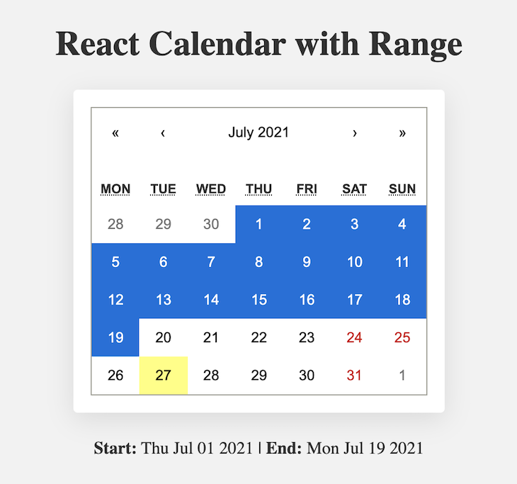
To enable a date range feature, we pass selectRange prop to our Calendar component. The default value of selectRange is false. After enabling this prop, React-Calendar returns an array with two dates: the start date and end date. The selected range is highlighted to make the user understand the selection.
After adding a date range, the calendar component will look like this:
Now that we have a handle on the most useful functionalities of React-Calendar, let’s dive a little deeper and explore the ways you can customize your calendar.
defaultValueThe defaultValue prop enables you to set a default selected value. This prop also supports the default date range selection. If you want to select a single date, you can pass a date object. Otherwise, you can pass an array containing start and end date values.
You can add defaultValue like this:
// App.js

function App() {
  const [date, setDate] = useState([
    new Date(2021, 6, 1),
    new Date(2021, 6, 10),
  ]);

  return (
    <div className='app'>
      <h1 className='text-center'>React Calendar with Range</h1>
      <div className='calendar-container'>
        <Calendar
          onChange={setDate}
          selectRange={true}
          defaultValue={date}
        />
      </div>
    </div>
  );
}
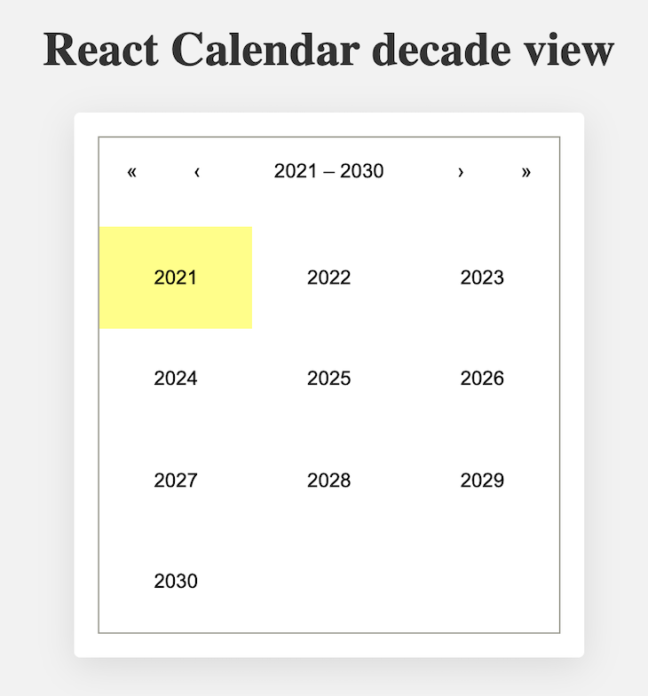
defaultViewThis prop is used to set the date view of the calendar. By default, it is set to month. So if this prop is missing, the calendar shows you a month view.
defaultView provides four options: month, year, decade and century. Even if this prop is set to some value, you can still navigate between different dates/months.
Here’s how to implement defaultView:
// Calendar component
<Calendar
  onChange={setDate}
  selectRange={true}
  defaultView='decade'
/>
This prop will change the initial rendering of the calendar, making it look something like this:
maxDate and minDateIf you don’t want the user to select a date after a certain day, you can prevent this action by adding a maxDate prop to your calendar. As you can probably guess, the minDate prop sets a limit on how early a start date the user is allowed to select.
If the date range is enabled for the app, the user might be able to select the date that is later than the maxDate or earlier than the minDate. React-Calendar prevents this by passing the maxDate or minDate value only and nothing beyond that.
// calendar component

<Calendar
  onChange={setDate}
  value={date}
  maxDate={new Date()} // will not allow date later than today
  minDate={new Date(2015, 6, 1)} // will not allow date before 1st July 2015
/>
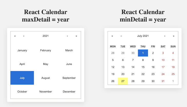
maxDetail and minDetailThe maxDetail and minDetail props are important for restricting the granularity of the calendar. maxDetail defines the maximum amount of details the user can see. If the maxDetail value is set to year, the user can see details of a year in the calendar at a time.
Similarly, if minDetail is set to year, the user will not be able to see details beyond a given year.
// calendar component

<Calendar
  onChange={setDate}
  value={date}
  maxDetail='year'
/>
Below is an example of maxDetail and minDetail:
Next and Prev labelsThe Next and Prev labels enable you to define the names of the buttons used to navigate between views in the calendar. You can also make this accessible using the aria-label attributes.
The props used to change the next values are nextLabel, nextAriaLabel, next2Label, and next2AriaLabel. You can add any string to this or you can set it to null if you want to disable this navigation.
These properties are similar for prev buttons except that prev is a prefix — e.g., prevLabel, prevAriaLabel, prev2Label, prev2AriaLabel, etc.
After adding the Next and Prev labels, the code will look like this:
// calendar component

<Calendar
  onChange={setDate}
  value={date}
  nextLabel='month>>'
  nextAriaLabel='Go to next month'
  next2Label='year>>'
  next2AriaLabel='Go to next year'
  prevLabel='<<month'
  prevAriaLabel='Go to prev month'
  prev2Label='<<year'
  prev2AriaLabel='Go to prev year'
/>
React-Calendar supports triggers on a wide range of click events. When you want to trigger some function calls based on the user’s action, React-Calendar has the most effective props to support that. Here are some of the most widely used events.
onChangeWhen a user clicks on an item of the most detailed view, this function is called. We can receive user selection with the help of this in the following way with alert('Clicked date is: ', value)}/>
onClickDayWhen a user clicks on a particular day, this function is called: alert('Clicked day is: ', value)}/>. Similar to onClickDay, React-Calendar also support events like onClickDecade, onClickMonth, onClickYear, onClickWeekNumber, etc.
onViewChangeWhen the user navigates from one view to another using the drill up button or by clicking a tile, this function is called. This gives us the reason for view change and can be one of the following values: prev, prev2, next, next2, drillUp, drillDown, and onChange. Here’s an example: alert('New view is: ', view)}/>.
React-Calendar is a wonderful library that provides a lot of flexibility in its implementation. It is highly customizable and dependent on the native JavaScript Date object, which makes React-Calendar easy to implement in any application.
Head to the official documentation for some complex examples and use cases for React-Calendar. I hope this tutorial leaves you with the foundational knowledge you need to implement and customize React-Calendar to suit your app and its audience.
If you have any questions about using React-Calendar, feel free to ask them in the comment below.
Install LogRocket via npm or script tag. LogRocket.init() must be called client-side, not
server-side
$ npm i --save logrocket

// Code:

import LogRocket from 'logrocket';
LogRocket.init('app/id');
// Add to your HTML:

<script src="https://cdn.lr-ingest.com/LogRocket.min.js"></script>
<script>window.LogRocket && window.LogRocket.init('app/id');</script>

AI-generated tests can speed up React testing, but they also create hidden risks. Here’s what broke in a real app.re

Why the future of DX might come from the web platform itself, not more tools or frameworks.

A hands-on test of Claude Code Review across real PRs, breaking down what it flagged, what slipped through, and how the pipeline actually performs in practice.

CSS art once made frontend feel playful and accessible. Here’s why it faded as the web became more practical and prestige-driven.
Would you be interested in joining LogRocket's developer community?
Join LogRocket’s Content Advisory Board. You’ll help inform the type of content we create and get access to exclusive meetups, social accreditation, and swag.
Sign up now

 Learn more →
