If you’re a data scientist or analyst, visualizing data can be the most interesting part of your job. Visualizations can help you and your stakeholders gain a better understanding of the data you’re dealing with. If you’re using Python to analyze data, there are several libraries to choose from.

The most common libraries for data visualization in Python are probably Matplotlib and Seaborn, but in this blog post, we’ll cover another great library called Bokeh. In addition, after reading this tutorial, you will know how to use Bokeh in combination with a Jupyter Notebook. For the demonstration we will use a diamond data set, which you can get from here.
Before we dive into these tools, I want to quickly explain what Bokeh and Jupyter Notebooks are and when to use them.
In the introduction, I mentioned that Matplotlib and Seaborn are the most popular data visualization libraries. So the question could arise, why you even should use Bokeh, then?
Well, with tools like Matplotlib, you are pretty much limited to static visualizations. You can’t implement any sort of interaction with the user. And that’s where Bokeh comes in! You cannot only create interactive plots with Bokeh, but also dashboards and data applications.
Jupyter Notebook is an open-source web application which gets hosted on your local machine. It supports many languages, including Python and R, and it’s perfectly suited for data analysis and visualization. In the end, a notebook is a series of input cells, which can be executed separately. Luckily, Bokeh makes it pretty easy to render plots in Jupyter Notebooks!
In order to install Jupyter Notebook on your machine, you must have Python ≥ 3.3 or Python 2.7 installed.
With Python installed, there are actually two ways of installing Juypter Notebook; it’s recommended to use Anaconda to install Jupyter Notebook properly.
Anaconda is a Python distribution that provides everything you need to get started quickly with data science-related tasks. If you install Anaconda, it automatically installs the right Python version, more than 100 Python packages, and also Jupyter.
After downloading and installing Anaconda, you can either open the Anaconda-Navigator and run Jupyter Notebook from there, or just type the following command to your terminal:
jupyter notebook
Alternatively, you can also install Jupyter Notebook with pip/pip3. Please make sure to get the latest version of pip/pip3 by running:
pip3 install --upgrade pip
After that, you’re ready to go ahead and actually install Jupyter Notebook with:
pip3 install jupyter
At this point, we are almost done with the preparation. Now, only Bokeh is left to be installed. With Anaconda installed, run:
conda install bokeh
Otherwise, run:
pip install bokeh
For some basic operations with our data we will also need Pandas and NumPy to be installed. If you’re using Anaconda, install it with:
conda install numpy pandas
And again, if you’re using pip, you need to run the following code:
pip install numpy pandas
In order to get started, let’s import the required libraries and their corresponding aliases:
from bokeh.plotting import figure, show
from bokeh.io import output_notebook
import pandas as pd
import numpy as np
The imports from lines 1 and 2 are most important here. The figure function allows us to create a basic plot object, where we can define things like height, grids, and tools.
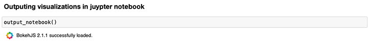
Surprisingly, the show function lets us render the actual plot. In combination with output_notebook, it enables us to output our plots inside the Jupyter Notebook!
All you need to do to output the plots inside the Jupyter Notebook is to call output_notebook before rendering the first plot. If you see the success message from below, you should be ready to go!
This blog post aims at explaining how to use Bokeh in combination with Juypter Notebooks, so the focus will not be on creating a complete exploratory data analysis (EDA). Still, we will take a short look at the data we will be working with before we move forward.
Let’s first load the data and create a smaller sample in order to keep things simple and fast:
data = pd.read_csv("diamonds.csv").drop("Unnamed: 0", axis=1)
data = data.sample(3000, random_state=420)
We’re using pandas’s read_csv function to load the data. The column Unnamed: 0 gets dropped, because there is no relevant information there.
If you want to recreate the exact same result as I got in this post, you also need to set random_state in the second line of the code to 420.
In the next step, let’s try to get a short overview of the data and the data types:
data.info()
This generates following output:
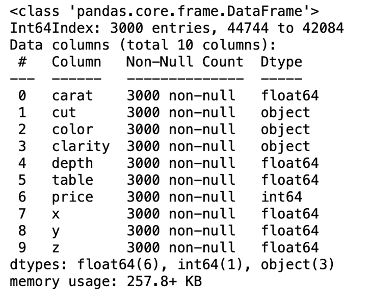
We can see that we have seven numeric and three categorical variables. Below you can find a short explanation of each variable:
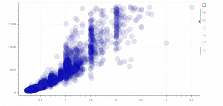
average(X, Y)Finally, this is the point where we define our first, very simple Bokeh plot! So-called glyphs are used in order to create plots in Bokeh. A glyph can be a line, square, wedge, circle and so on.
In the example below, we use the circle method of our figure object, called p. Inside this function, we define the values of the x- (data.carat) and y-axes (data.price), the size and color of the circles, and how transparent the circles should be.
p = figure(width=800, height=400)

# add a circle renderer with a size, color, and alpha
p.circle(data.carat, data.price, size=20, color="navy", alpha=0.2)

# show the results
show(p)
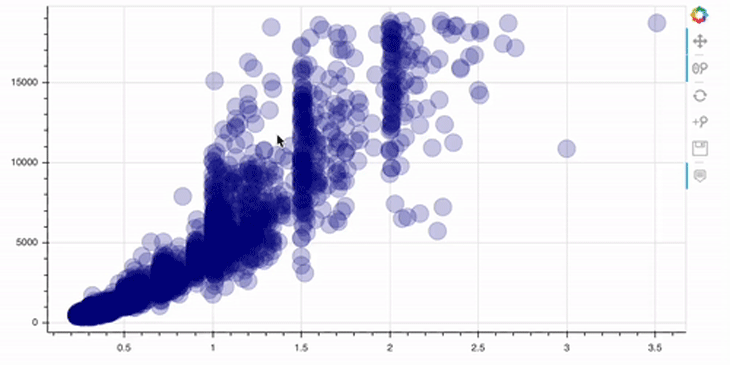
Please note that the toolbar at the right side comes out of the box!
As you can see, this plot is already interactive, to some degree. For example, we can zoom in/out and reset the view. Let’s now go a step further and add some annotations to our plots.
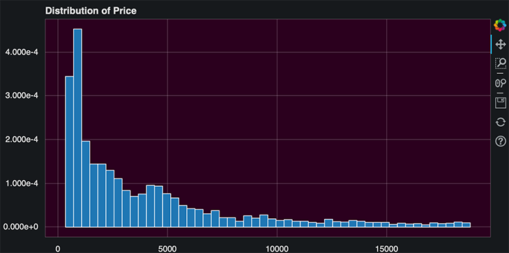
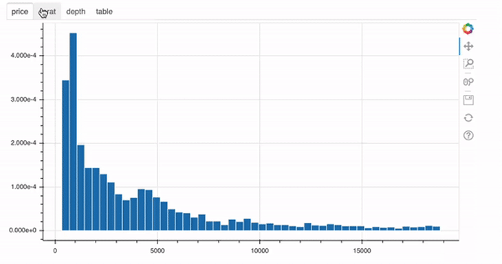
First of all, a plot without a header describing what is being displayed is not the right way of visualizing data.
# add a title with providing the title parameter
p = figure(width=800, height=400, title="Distribution of Price")

# compute the histogram of the price variable
hist, edges = np.histogram(data.price, density=True, bins=50)

# call the quad method on our figure object p
p.quad(top=hist, bottom=0, left=edges[:-1], right=edges[1:], line_color="white")

show(p)
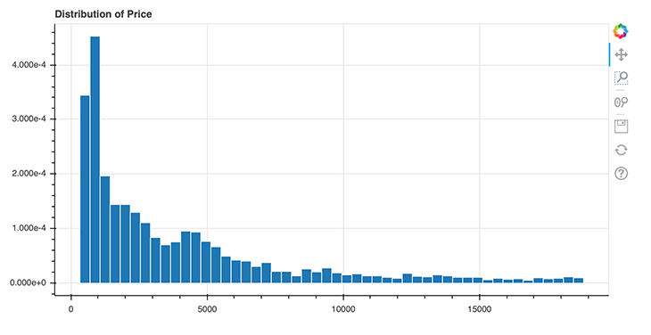
Above, you can see how easy it is to add a title to your Bokeh plots. In line 2, we simply need to specify the title by setting the title parameter. In Bokeh, you firstly need to transform your data in order to create a histogram. In this case, I used the NumPy method histogram() for this. This method returns the actual value of the histogram (hist) and the bin edges (edges), which we then can pass to the quad method of the figure object p in line 8.
But what if we wanted to specify the position of the title, and we wanted a title for each axis? Well, Bokeh also offers a simple solution to this problem:
from bokeh.palettes import Spectral7
from bokeh.models import Title

# prepare the colors and their value counts
colors = sorted(list(data.color.unique()))
counts = [i for i in data.color.value_counts().sort_index()]

p = figure(x_range=colors, width=800, height=400)

p.vbar(x=colors, top=counts, width=0.9, color=Spectral7)

p.y_range.start = 0

p.add_layout(Title(text="Colors", align="center"), "below")
p.add_layout(Title(text="Color counts", align="center"), "left")

show(p)
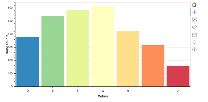
First, let’s take a look at the imports again. In the first line, we import a color palette called Spectral7, which is a list of seven hex RGB strings that we can use as to color in our plot.
Secondly, we import the Title object, which allows us to render titles and specify their positioning. Before we can plot the value counts of each color, we need to prepare the data so that Bokeh can properly understand it. For that, I stored the colors in a list called colors, and the corresponding value counts in a list called counts. These two lists are used in the vbar method, which renders vertical bars.
The interesting part here, though, is in lines 14 and 15, where we call the add_layout method on the figure object p. There, we define the titles and their positions. We defined below and left as the positions here; you can also use top and right as values for positioning.
In this section, we’ll take a look at a more advanced plot with stacked bars and a legend. Consider the below code.
from bokeh.palettes import GnBu5

# data preparation
colors = list(data.color.unique())
cut = list(data.cut.unique())

ideal = [data[(data.cut == "Ideal") & (data.color == colors[i])].shape[0] for i in range(len(colors))]
very_good = [data[(data.cut == "Very Good") & (data.color == colors[i])].shape[0] for i in range(len(colors))]
premium = [data[(data.cut == "Premium") & (data.color == colors[i])].shape[0] for i in range(len(colors))]
good = [data[(data.cut == "Good") & (data.color == colors[i])].shape[0] for i in range(len(colors))]
fair = [data[(data.cut == "Fair") & (data.color == colors[i])].shape[0] for i in range(len(colors))]

data_stacked = {'colors': colors,
                'Ideal': ideal,
                'Very Good': very_good,
                'Premium': premium,
                'Good': good,
                'Fair': fair}

p = figure(x_range=colors, width=800, height=400, title="Colors counts by cut")

p.vbar_stack(cut, x='colors', width=0.9, color=GnBu5, source=data_stacked,
             legend_label=cut)

p.y_range.start = 0
p.y_range.end = 1000
p.legend.location = "top_left"
p.legend.orientation = "horizontal"

show(p)
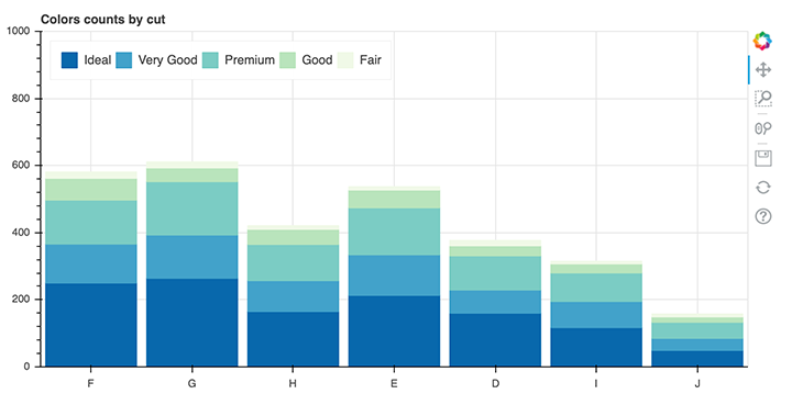
In this example, we use the color palette GnBu5. Then, in lines 4 and 5, we create lists of the unique values of cut and color. The lines 7 to 11 contain six lists, where we store the value counts of each color grouped by the cut.
When applied to the example below, it means that for a cut with the value ideal, we iterate over all colors and store their value counts in the list called ideal. We then repeat this for every cut available in the data set.
ideal = [data[(data.cut == "Ideal") & (data.color == colors[i])].shape[0] for i in range(len(colors))]
These lists get stored in the dictionary called data_stacked, which will be used again in line 22. There, we’ll create a the actual plot by calling the method vbar_stack on the figure object p. In this context, it is important to note that vbar_stack provides an argument called legend_labelthat you can use to define the variables that are relevant for the legend.
Finally, in the lines 27 and 28, we specify the position and orientation of the legend.
The last thing we’re taking a look at in the context of annotations are colored legends:
from bokeh.transform import linear_cmap
from bokeh.models import ColorBar, ColumnDataSource
from bokeh.palettes import Spectral6

y = list(data.price.values)
x = list(data.carat.values)

mapper = linear_cmap(field_name="y", palette=Spectral6 ,low=min(y) ,high=max(y))

source = ColumnDataSource(dict(x=x,y=y))

p = figure(width=800, height=400)

p.circle(x='x', y='y', line_color=mapper, color=mapper, fill_alpha=1, size=12, source=source)

color_bar = ColorBar(color_mapper=mapper['transform'], height=300, width=10)

p.add_layout(color_bar, 'right')

show(p)
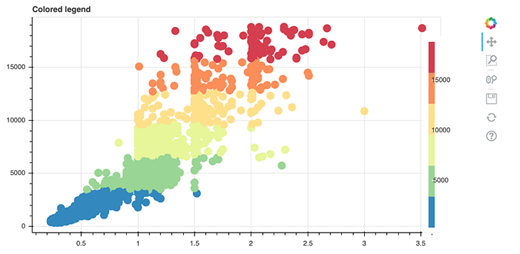
We introduce some new things in this plot. The first new thing is the linear_cmap() function, which we use in line 8 to create a color mapper.
mapper = linear_cmap(field_name="y", palette=Spectral6 ,low=min(y) ,high=max(y))
The attribute field_name specifies the actual data to map colors to, palette the colors being used, low the lowest value mapping a color to and max the highest value.
The second new aspect is the ColumnDataSource object defined in line 10. This is an own-data structure introduced by Bokeh itself. So far, the lists and NumPy arrays have been converted to ColumnDataSource objects implicitly by Bokeh, but here, we’re doing it on our own. It’s pretty simple, we just need to provide our data in a form of a dictionary.
source = ColumnDataSource(dict(x=x,y=y))
And lastly, we create a ColorBar in line 15. There, we use our instance of a ColorMapper called mapper. This is actually a dictionary that contains the keys field and transform; here, we’re only interested in the transform key values. That’s why we have to code it like the following:
color_bar = ColorBar(color_mapper=mapper['transform'], height=300, width=10)
The variable color_bar is then added to the layout in line 18 on the right side of the plot!
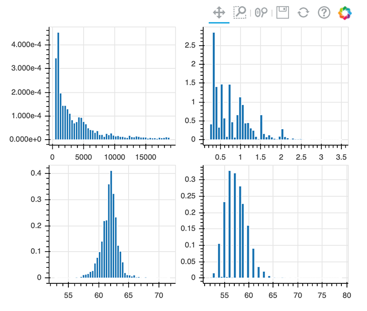
In some cases, you’ll want to render several plots next to each other. That’s where Bokeh’s layout function comes into place. Let’s see what it takes to create a row layout.
from bokeh.layouts import row

p1 = figure(width=250, height=200)
hist1, edges1 = np.histogram(data.price, density=True, bins=50)
p1.quad(top=hist1, bottom=0, left=edges1[:-1], right=edges1[1:], line_color="white")

p2 = figure(width=250, height=200)
hist2, edges2 = np.histogram(data.carat, density=True, bins=50)
p2.quad(top=hist2, bottom=0, left=edges2[:-1], right=edges2[1:], line_color="white")

p3 = figure(width=250, height=200)
hist3, edges3 = np.histogram(data.depth, density=True, bins=50)
p3.quad(top=hist3, bottom=0, left=edges3[:-1], right=edges3[1:], line_color="white")

p4 = figure(width=250, height=200)
hist4, edges4 = np.histogram(data.table, density=True, bins=50)
p4.quad(top=hist4, bottom=0, left=edges4[:-1], right=edges4[1:], line_color="white")


show(row(p1, p2, p3, p4))
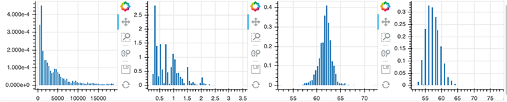
This is pretty straightforward. First, import the row function from Bokeh and the instead of doing show(p), use the following code: show(row(p1, p2, p3, p4)).
If you want to create a grid layout, just replace row with gridplot:
from bokeh.layouts import gridplot

show(gridplot([[p1, p2], [p3, p4]]))
Implementing themes in Bokeh is also a pretty easy task. You can choose from Bokeh’s inbuilt themes or create your own. For the sake of simplicity, we’re using an inbuilt theme called night_sky.
To implement the night_sky theme, just do the following: curdoc().theme = 'night_sky'
from bokeh.io import curdoc

curdoc().theme = 'night_sky'

p = figure(width=800, height=400, title="Distribution of Price")

hist, edges = np.histogram(data.price, density=True, bins=50)

p.quad(top=hist, bottom=0, left=edges[:-1], right=edges[1:], line_color="white")

show(p)
The curdoc function returns the document for the current state. By calling curdoc().theme, you can change the theme for the whole Jupyter Notebook.
If you’re interested in creating your own theme, feel free to check out Bokeh’s docs.
This is probably the most interesting part of Bokeh, since this is what makes Bokeh unique. We will start by configuring the plot tools.
p = figure(width=800, height=400, tools="hover")

p.circle(data.carat, data.price, size=20, color="navy", alpha=0.2)

show(p)

In order to add a tool, you just need to specify the tools argument of the figure object. In this case above, we implement the hover tool. There are tons of possibilities Bokeh offers in this context; I’d recommend checking out their docs to get an overview.
p = figure(width=800, height=400, tools="reset, hover, zoom_in, wheel_zoom, pan, save")

p.circle(data.carat, data.price, size=20, color="navy", alpha=0.2)

show(p)
As you can see in line 1 above, you can simply add tools of your choice as a string. For example, we implemented the wheel zoom and save tools!
Bokeh also allows us to create widgets in order to provide an interactive frontend/UI. In the following code block, we’ll have a look at some of these widgets.
from bokeh.layouts import column
from bokeh.models import Slider

y = list(data.price.values)
x = list(data.carat.values)

mapper = linear_cmap(field_name="y", palette=Spectral6 ,low=min(y) ,high=max(y))

source = ColumnDataSource(dict(x=x,y=y))

p = figure(width=800, height=400,  tools="hover")

r = p.circle(x='x', y='y', line_color=mapper, color=mapper, fill_alpha=1, size=12, source=source)

slider = Slider(start=0.01, end=0.15, step=0.01, value=0.01)
slider.js_link('value', r.glyph, 'radius')

show(column(p, slider))
In the example above, we implemented a slider that allows us to change the size of the circles of our plot. Lines 1-13 are not new; only the last three lines contain new content.
In line 15, we call the Slider object and define start, end, step, and the initial values. In the line after, we then call the js_link method on this just-created Slider object. This method lets us link the circle glyph and the Slider object. This means that the circle glyph/plot is always updated when the value of the slider changes.
slider.js_link('value', r.glyph, 'radius')
We are primarily interested in the value of the slider, so we shall define it as our first argument. Secondly, we pass a Bokeh model, which should be linked to the first argument (value), which should be our glyph object, r. Lastly, we pass radius as the property of r.glyph to be changed and tell Bokeh to render the plot and the slider on top of each other in a column.
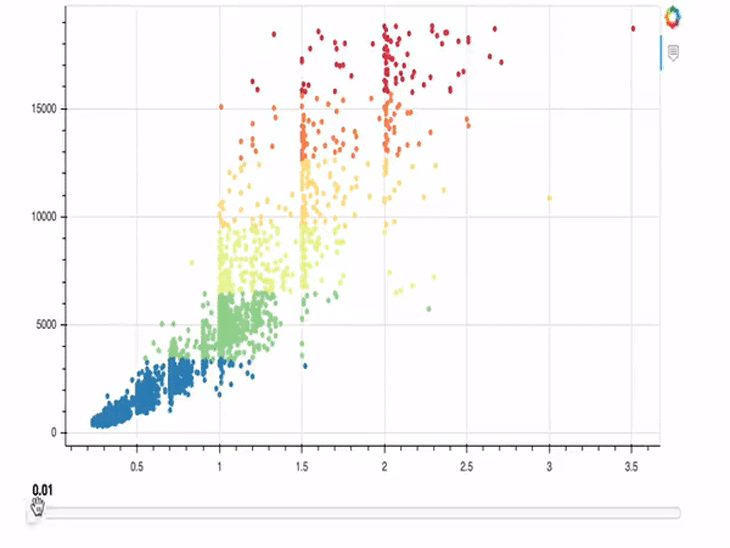
We cannot only link a slider to our plots, but also a color picker!
from bokeh.models import ColorPicker

p = figure(width=800, height=400)

circle = p.circle(data.carat, data.price, size=20, color="black", alpha=0.3)

picker = ColorPicker(title="Circle Color")
picker.js_link('color', circle.glyph, "fill_color")

show(column(p, picker))
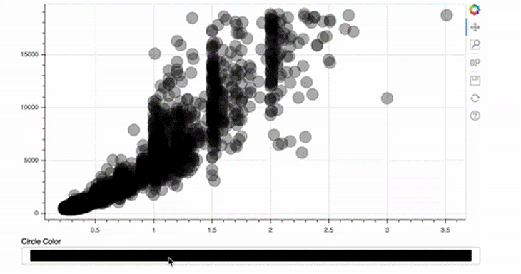
This is even easier than implementing the size slider! For the ColorPicker, we only provide a title — the rest will be done by Bokeh automatically.
picker = ColorPicker(title="Circle Color")
picker.js_link('color', circle.glyph, "fill_color")
In this case, the attribute to be changed is not the value, as in the first example, but the color of the glyph. In addition, the fill_color should be linked and not the radius.
Next, we’re going to implement an interactive legend. Once a legend item is clicked, the corresponding data should hide or show in the plot.
colors = list(data.color.unique())

ideal = [data[(data.cut == "Ideal") & (data.color == colors[i])].shape[0] for i in range(len(colors))]
very_good = [data[(data.cut == "Very Good") & (data.color == colors[i])].shape[0] for i in range(len(colors))]
premium = [data[(data.cut == "Premium") & (data.color == colors[i])].shape[0] for i in range(len(colors))]
good = [data[(data.cut == "Good") & (data.color == colors[i])].shape[0] for i in range(len(colors))]
fair = [data[(data.cut == "Fair") & (data.color == colors[i])].shape[0] for i in range(len(colors))]

cut = list(data.cut.unique())

data_stacked = {'colors': colors,
                'Ideal': ideal,
                'Very Good': very_good,
                'Premium': premium,
                'Good': good,
                'Fair': fair}

p = figure(x_range=colors, width=800, height=400, title="colors counts by cut",
           toolbar_location=None, tools="hover")

p.vbar_stack(cut, x='colors', width=0.9, color=GnBu5, source=data_stacked,
             legend_label=cut)


p.y_range.start = 0
p.y_range.end = 1000
p.legend.location = "top_left"
p.legend.orientation = "horizontal"
p.legend.click_policy="hide"

show(p)
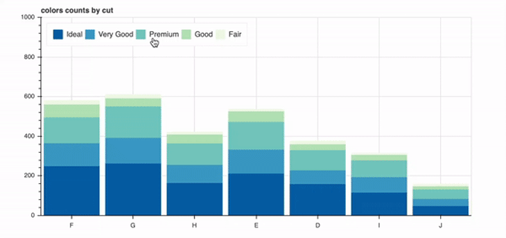
Again, most of the code should look familiar to you. Only the following line is new:
p.legend.click_policy="hide"
That’s easy right? You could alternatively pass mute as a value here; then, the clicked data wouldn’t disappear, but would instead be muted (its opacity would change).
Earlier, I explained to you how to implement layouts in order to render several plots in a row, grid, or column. Bokeh offers another solution to this problem, which provides us with the opportunity to create tabs!
 For each of those four plots, a
 Panel object was created. In the end, these objects are nothing more than containers with a title bar and controls. After defining the panel objects, you can then just go ahead and use them in the Tab object, like in line 23 of the example above.
Finally, we will have a closer look at the most advanced example in this blog post. Until now, we used interaction tools, which come out of the box with Bokeh. But there is also the possibility to add custom JavaScript in order to supply a very custom behavior in response to events or changes.
from bokeh.models import CustomJS

y = list(data.price.values)
x = list(data.carat.values)

s1 = ColumnDataSource(dict(x=x,y=y))
p1 = figure(width=300, height=300,  tools="lasso_select", x_range=(0, 3) , y_range=(0, 20000))
p1.circle(x='x', y='y', fill_alpha=1, source=s1)

s2 = ColumnDataSource(data=dict(x=[], y=[]))
p2 = figure(width=300, height=300, tools="lasso_select", x_range=(0, 3) , y_range=(0, 20000))
p2.circle('x', 'y', fill_alpha=1, source=s2)

s1.selected.js_on_change('indices', CustomJS(args=dict(s1=s1, s2=s2), code="""
        const inds = cb_obj.indices;
        const d1 = s1.data;
        const d2 = s2.data;
        d2['x'] = []
        d2['y'] = []
        for (let i = 0; i < inds.length; i++) {
            d2\['x'].push(d1['x'\][inds[i]])
            d2\['y'].push(d1['y'\][inds[i]])
        }
        s2.change.emit();
    """)
)

show(row(p1, p2))
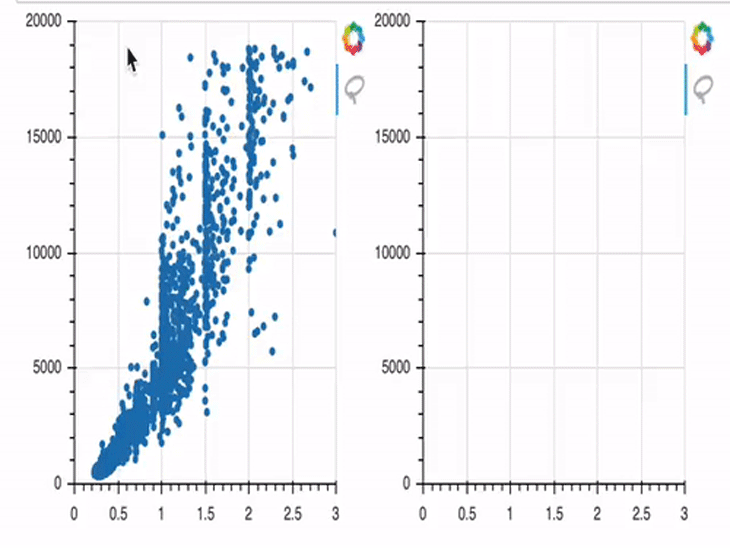
In this example, we first create two plots (p1 and p2). In the beginning, only p1 is provided with data; p2 has no data provided, and is therefore empty by default.
This gets changed from line 14 on. There, we define a js_on_change method, where you can attach a CustomJS callback. This CustomJS model allows us to create a JavaScript snippet which gets executed when some event occurs.
I won’t go too much into the details of the JavaScript code here, but I will try to outline it in a comprehensible way. Our code is listening for an event, which we’ve defined as data points being selected in the first plot. Once those points are selected, their x and y coordinates will be stored in the variable s2, which is the data basis of the second plot. And once these changes are stored successfully in s2, the corresponding points will be rendered in the figure object p2 on the right side.
If you’re interested, you can check out Bokeh’s docs to get an overview of all the opportunities to create and embed custom JS callbacks.
I’m aware that this was quite a lot to process. But this was only a small piece of the cake — Bokeh offers a lot more! So feel free to discover Bokeh’s docs on your own.
In this post we covered the installation and most simple way of plotting graphs with Bokeh and Jupyter Notebook. After that, we had a look at adding annotations and styling visual aspects of our plots. The most interesting part was probably creating interactive plots with both Bokeh’s inbuilt features and our custom JavaScript code.
I hope you enjoyed this introduction to Bokeh and thank you for reading!
Install LogRocket via npm or script tag. LogRocket.init() must be called client-side, not
server-side
$ npm i --save logrocket

// Code:

import LogRocket from 'logrocket';
LogRocket.init('app/id');
// Add to your HTML:

<script src="https://cdn.lr-ingest.com/LogRocket.min.js"></script>
<script>window.LogRocket && window.LogRocket.init('app/id');</script>

Chrome’s Modern Web Guidance embeds modern web platform skills into AI coding agents, helping them choose native HTML, CSS, and browser APIs over legacy patterns.

Learn how to use Fallow to analyze AI-generated code, detect dead code, duplicate logic, and complexity issues, and integrate automated code quality checks into your AI-assisted development workflow.

Learn how to protect full-stack projects from NPM supply chain attacks with a practical security checklist.

Explore 15 essential MCP servers for web developers to enhance AI workflows with tools, data, and automation.
Would you be interested in joining LogRocket's developer community?
Join LogRocket’s Content Advisory Board. You’ll help inform the type of content we create and get access to exclusive meetups, social accreditation, and swag.
Sign up now