Data visualization occupies a special place at the heart of all data-related professions. Nothing is more satisfying for a data scientist than to take a large set of random numbers and turn it into a beautiful visual.

The majority of data visuals created by data scientists are created with Python and its twin visualization libraries: Matplotlib and Seaborn. Matplotlib and Seaborn are widely used to create graphs that enable individuals and companies to make sense of terabytes of data.
So, what are these two libraries, exactly?
Matplotlib is the king of Python data visualization libraries and makes it a breeze to explore tabular data visually.
Seaborn is another Python data visualization library built on top of Matplotlib that introduces some features that weren’t previously available, and, in this tutorial, we’ll use Seaborn.
To follow along with this project, you’ll also need to know about Pandas, a powerful library that manipulates and analyzes tabular data.
In this blog post, we’ll learn how to perform data analysis through visualizations created with Seaborn. You will be introduced to histograms, KDEs, bar charts, and more. By the end, you’ll have a solid understanding of how to visualize data.
We will start by installing the libraries and importing our data. Running the below command will install the Pandas, Matplotlib, and Seaborn libraries for data visualization:
pip install pandas matplotlib seaborn
Now, let’s import the libraries under their standard aliases:
import matplotlib.pyplot as plt
import pandas as pd
import seaborn as sns
Next, load in the data to be analyzed. The dataset contains physical measurements of 54,000 diamonds and their prices. You can download the original dataset as a CSV file from here on Kaggle, but we will be using a shortcut:
diamonds = sns.load_dataset("diamonds")
Because the dataset is already built into Seaborn, we can load it as pandas.DataFrame using the load_dataset function.
>>> type(diamonds)
pandas.core.frame.DataFrame
Before we dive head-first into visuals, let’s ensure we have a high-level understanding of our dataset:
>>> diamonds.head()
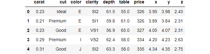
We have used the handy head function of Pandas that prints out the first five rows of the data frame. head should be the first function you use when you load a dataset into your environment for the first time.
Notice the dataset has ten variables — three categorical and seven numeric.
Instead of counting all variables one by one, we can use the shape attribute of the data frame:
>>> diamonds.shape
(53940, 10)
There are 53,940 diamonds recorded, along with their ten different features. Now, let’s print a five-number summary of the dataset:
>>> diamonds.describe()
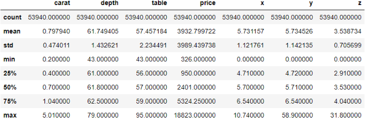
The describe function displays some critical metrics of each numeric variable in a data frame. Here are some observations from the above output:
Now that we are comfortable with the features in our dataset, we can start plotting them to uncover more insights.
In the previous section, we started something called “Exploratory Data Analysis” (EDA), which is the basis for any data-related project.
The goal of EDA is simple — get to know your dataset at the deepest level possible. Becoming intimate with the data and learning its relationships between its variables is an absolute must.
Completing a successful and thorough EDA lays the groundwork for future stages of your data project.
We have already performed the first stage of EDA, which was a simple “get acquainted” step. Now, let’s go deeper, starting with univariate analysis.
As the name suggests, we’ll explore variables one at a time, not the relationships between them just yet. Before we start plotting, we take a small dataset sample because 54,000 is more than we need, and we can learn about the data set pretty well with just 3,000 and to prevent overplotting.
sample = diamonds.sample(3000)
To take a sample, we use the sample function of pandas, passing in the number of random data points to include in a sample.
Now, we create our first plot, which is a histogram:
sns.histplot(x=sample["price"])
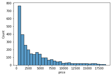
Histograms only work on numeric variables. They divide the data into an arbitrary number of equal-sized bins and display how many diamonds go into each bin. Here, we can approximate that nearly 800 diamonds are priced between 0 and 1000.
Each bin contains the count of diamonds. Instead, we might want to see what percentage of the diamonds falls into each bin. For that, we will set the stat argument of the histplot function to percent:
>>> sns.histplot(sample["price"], stat="percent")
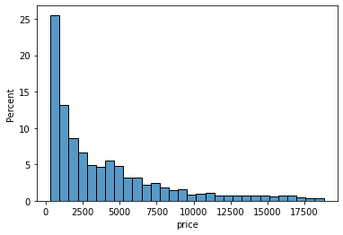
Now, the height of each bar/bin shows the percentage of the diamonds. Let’s do the same for the carat of the diamonds:
sns.histplot(sample["carat"], stat="percent")
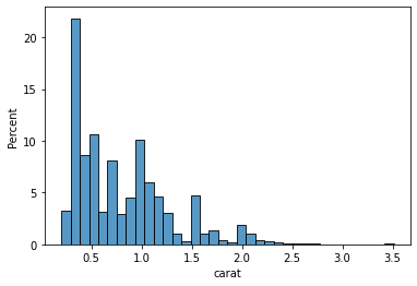
Looking at the first few bars, we can conclude that the majority of the diamonds weigh less than 0.5 carats. Histograms aim to take a numeric variable and show what its shape generally looks like. Statisticians look at the distribution of a variable.
However, histograms aren’t the only plots that do the job. There is also a plot called KDE Plot (Kernel Density Estimate), which uses some fancy math under the hood to draw curves like this:
sns.kdeplot(sample["table"])
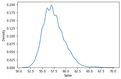
Creating the KDE plot of the table variable shows us that the majority of diamonds measure between 55.0 and 60.0. At this point, I will leave it to you to plot the KDEs and histograms of other numeric variables because we have to move on to categorical features.
The most common plot for categorical features is a countplot. Passing the name of a categorical feature in our dataset to Seaborn’s countplot draws a bar chart, with each bar height representing the number of diamonds in each category. Below is a countplot of diamond cuts:
sns.countplot(sample["cut"])
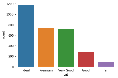
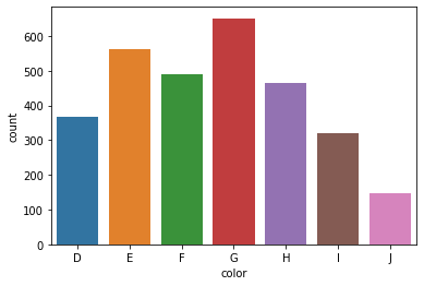
We can see that our dataset consists of much more ideal diamonds than premium or very good diamonds. Here is a countplot of colors for the interested:
sns.countplot(sample["color"])
This concludes the univariate analysis section of the EDA.
Now, let’s look at the relationships between two variables at a time. Let’s start with the connection between diamond carats and price.
We already know that diamonds with higher carats cost more. Let’s see if we can visually capture this trend:
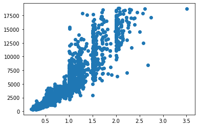
sns.scatterplot(x=sample["carat"], y=sample["price"])
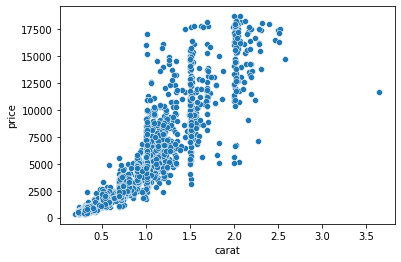
Here, we are using another Seaborn function that plots a scatter plot. Scatterplots are one of the most widely-used charts because they accurately show the relationships between two variables by using a cloud of dots.
Above, each dot represents a single diamond. The dots’ positions are determined by their carat and price measurements, which we passed to X and Y parameters of the scatterplot function.
The plot confirms our assumptions — heavier diamonds tend to be more expensive. We are drawing this conclusion based on the curvy upward trend of the dots.
sns.scatterplot(x=sample["depth"], y=sample["table"])
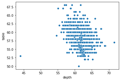
Let’s try plotting depth against the table. Frankly, this scatterplot is disappointing because we can’t draw a tangible conclusion as we did with the previous one.
Another typical bivariate plot is a boxplot, which plots the distribution of a variable against another based on their five-number summary:
sns.boxplot(x=sample["color"], y=sample["price"])
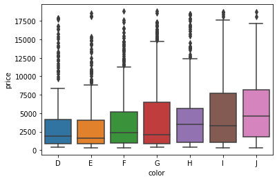
The boxplot above shows the relationship between each color category and their respective prices. The horizontal vertices at the bottom and top of each vertical line of a box represent that category’s minimum and maximum values. The edges of the boxes, specifically the bottom and top edges, represent the 25th and 75th percentiles.
In other words, the bottom edge of the first box tells us that 25% of D-colored diamonds cost less than about $1,250, while the top edge says that 75% of diamonds cost less than about $4,500. The little horizontal line in the middle denotes the median , the 50% mark.
The dark dots above are outliers. Let’s plot a boxplot of diamond clarities and their relationship with carat:
sns.boxplot(diamonds["clarity"], diamonds["carat"])
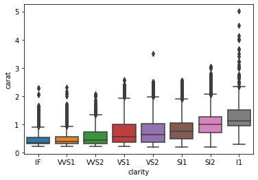
Here we see an interesting trend. The diamond clarities are displayed from best to worst, and we can see that lower clarity diamonds weigh more in the dataset. The last box shows that the lowest clarity (l1) diamonds weigh a carat on average.
Finally, it’s time to look at multiple variables at the same time.
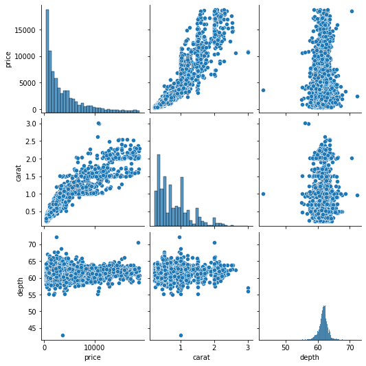
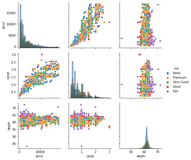
The most common multivariate plot you will encounter is a pair plot of Seaborn. Pair plots take several numeric variables and plot every single combination of them against each other. Below, we are creating a pair plot of price, carat, table, and depth features to keep things manageable:
sns.pairplot(sample[["price", "carat", "table", "depth"]])
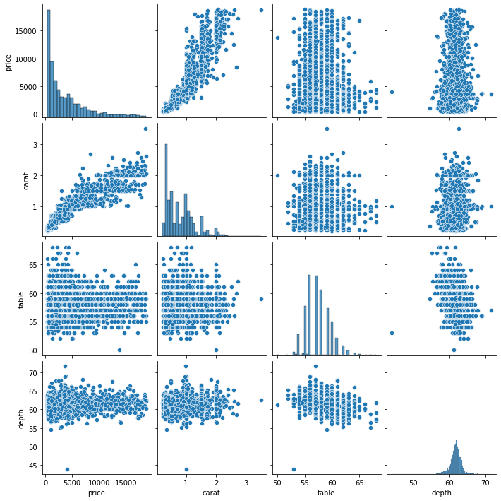
Every variable is plotted against others, resulting in plot doubles across the diagonal. The diagonal itself contains histograms because each one is a variable plotted against itself.
A pair plot is a compact and single-line version of creating multiple scatter plots and histograms simultaneously.
So far, we have solely relied on our visual intuition to decipher the relationships between different features. However, many analysts and statisticians require mathematical or statistical methods that quantify these relationships to back our “eyeball estimates.” One of these statistical methods is computing a correlation coefficient between features.
The correlation coefficient, often denoted as R, measures how strongly a numeric variable is linearly connected to another. It ranges from -1 to 1, and values close to the range limits denote strong relationships.
In other words, if the absolute value of the coefficient is between 0 and 0.3, it is considered a weak (or no) relationship. If it is between 0.3-0.7, the strength of the relationship is considered moderate, while greater than 0.7 correlation represents a strong connection.
Pandas makes it easy to compute the correlation coefficient between every single feature pair. By calling the corr method on our data frame, we get a correlation matrix:
correlation_matrix = diamonds.corr()

>>> correlation_matrix
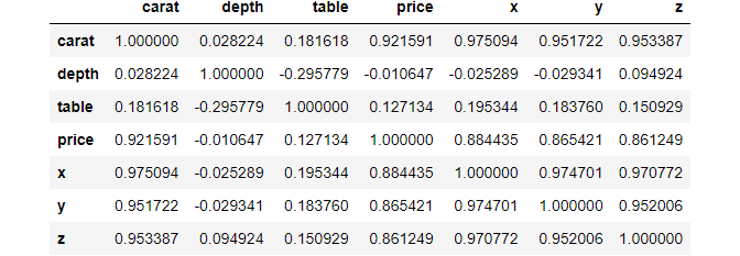
>>> correlation_matrix.shape
(7, 7)
Looking closely, we see a diagonal of 1s. These are perfect relationships because the diagonal contains the correlation between a feature and itself.
However, looking at the raw correlation matrix doesn’t reveal much. Once again, we will use another Seaborn plot called a heatmap to solve this:
>>> sns.heatmap(correlation_matrix)
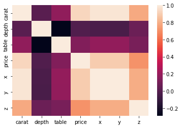
Passing our correlation matrix to the heatmap function displays a plot that colors each cell of the matrix based on its magnitude. The color bar at the right serves as a legend of what shades of color denote which magnitudes.
But we can do much better. Instead of leaving the viewer to guess the numbers, we can annotate the heatmap so that each cell contains its magnitude:
sns.heatmap(correlation_matrix, square=True, annot=True, linewidths=3)
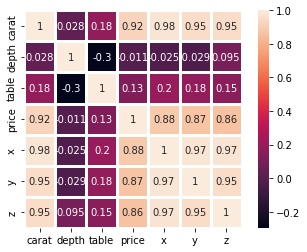
For this, we set the annot parameter to True, which displays the original correlation on the plot. We also set square to True to make the heatmap square-shaped and, thus, more visually appealing. We also increased the line widths so that each cell in the heatmap is more distinct.
Interpreting this heatmap, we can learn that the strongest relations are among the X, Y, and Z features. They all have >0.8 correlation. We also see that the table and depth are negatively correlated but weakly. We can also confirm our assumptions from the scatterplots — the correlation between carat and price is relatively high at 0.92.
Another approach we can use to explore multivariate relationships is to use scatter plots with more variables. Take a look at the one below:
sns.scatterplot(sample["carat"], sample["price"], hue=sample["cut"])
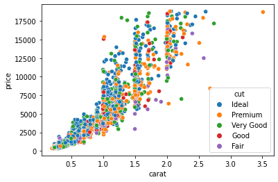
Now, each dot is colored based on its cut category. We achieved this by passing the cut column to the hue parameter of the scatterplot function. We can pass numeric variables to hue as well:
sns.scatterplot(sample["carat"], sample["price"], hue=sample["x"])
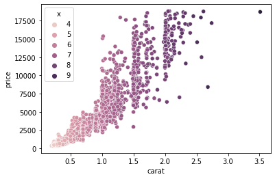
In the above example, we plot carat against price and color each diamond based on its width.
Here we can make two observations:
Instead of encoding the third variable with color, we could have increased the dot size:
sns.scatterplot(sample["carat"], sample["price"], size=sample["y"])
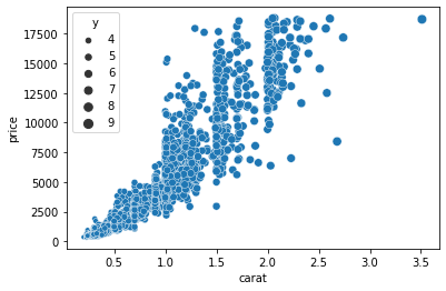
This time, we passed the Y variable to the sizeargument, which scales the size of the dots based on the magnitude of Y for each diamond. Finally, we can plot four variables at the same time by passing separate columns to both hue and size:
sns.scatterplot(sample["carat"], sample["price"], hue=sample["cut"], size=sample["z"])
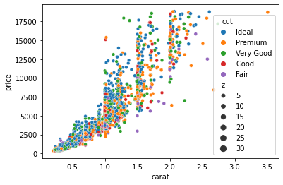
Now the plot encodes the diamond cut categories as color and their depth as the size of the dots.
Let’s see a few more complex visuals you can create with Seaborn, such as a subplot. We have already seen an example of subplots when we used the pairplotfunction:
g = sns.pairplot(sample[["price", "carat", "depth"]])
>>> type(g)
seaborn.axisgrid.PairGrid
The pairplot function is shorthand to create a set of subplots called a PairGrid. Fortunately, we are not just limited to the pairplot function. We can create custom PairGrids:
g = sns.PairGrid(sample[["price", "carat", "depth"]])
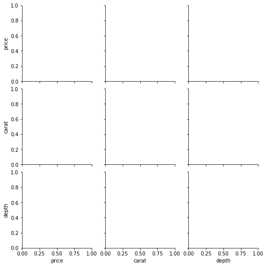
Passing a dataframe to the PairGrid class returns a set of empty subplots like above. Now, we will use the map function to populate each:
g = sns.PairGrid(sample[["price", "carat", "depth"]])
g.map(sns.scatterplot)
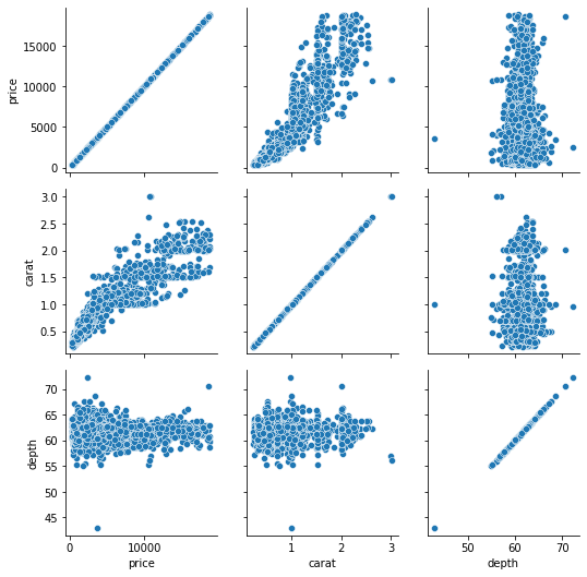
map accepts a name of a Seaborn plotting function and applies it to all subplots. Here, we don’t need scatterplots in the diagonal, so we can populate it with histograms:
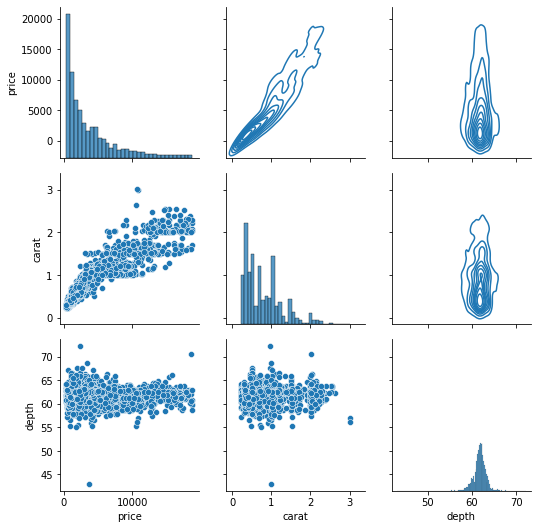
g = sns.PairGrid(sample[["price", "carat", "depth"]])
g.map_offdiag(sns.scatterplot)
g.map_diag(sns.histplot);

Using the map_offdiag and map_diag functions, we ended up with the same result of pairplot. But we can improve the above chart even further. For example, we can plot different charts in the upper and lower triangles using map_lower and map_upper:
g = sns.PairGrid(sample[["price", "carat", "depth"]])
g.map_lower(sns.scatterplot)
g.map_upper(sns.kdeplot)

g.map_diag(sns.histplot);
The upper triangle KDE Plots turn into contours because of their 2D nature.
Finally, we can also use the hue parameter to encode a third variable in every subplot:
g = sns.PairGrid(sample[["price", "carat", "depth", "cut"]], hue="cut")

g.map_diag(sns.histplot)
g.map_offdiag(sns.scatterplot)
g.add_legend();
The hue parameter is specified while calling the PairGrid class. We also call the add_legend function on the grid to make the legend visible.
But, there is a problem with the above subplots. The dots are completely overplotted, so we can’t reasonably distinguish any patterns between each diamond cut.
To solve this, we can use a different set of subplots called FacetGrid. A FacetGrid can be created just like a PairGrid but with different parameters:
g = sns.FacetGrid(sample, col="cut")

Passing the cut column to col parameter creates a FacetGrid with five subplots for each diamond cut category. Let’s populate them with map:
g = sns.FacetGrid(sample, col="cut")

g.map(sns.scatterplot, "price", "carat");
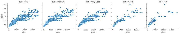
This time, we have separate scatter plots in separate subplots for each diamond cut category. As you can see, FacetGrid is smart enough to put the relevant axis labels as well.
We can also introduce another categorical variable as a row by passing a column name to the row parameter:
g = sns.FacetGrid(sample, col="cut", row="color")

g.map(sns.scatterplot, "price", "carat");
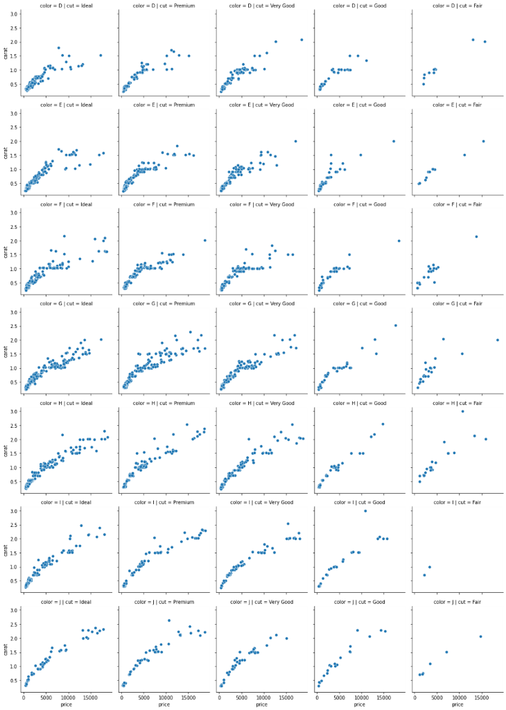
The resulting plot is humongous because there is a subplot for every diamond cut/color combination. There are many other ways you can customize these FacetGrids and PairGrids, so review the docs to learn more.
We have used Seaborn exclusively, but you could consider using Matplotlib.
We used Seaborn because of its simplicity, and, because Seaborn was built on top of Matplotlib, it was designed to complement the weaknesses of Matplotlib, making it more user-friendly.
Another primary reason is the default styles of plots. By default, Seaborn creates more easy-on-the-eye plots. On the other hand, the default styles of Matplotlib plots, well, suck. For example, here is the same histogram of diamond prices:
fig, ax = plt.subplots()

ax.hist(sample["price"])
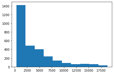
It is vastly different. While Seaborn automatically finds the optimal number of bins, Matplotlib always uses ten bins (although you can change it manually). Another example is the carat vs. price scatterplot:
fig, ax = plt.subplots()

ax.scatter(sample["carat"], sample["price"])
Generally, Seaborn suits developers looking to create beautiful charts using less code.
However, the key to a masterpiece visual is in the customization, and that’s where Matplotlib really shines. Though it has a steeper learning curve, once you master it, you can create jaw-dropping visuals such as these.
This tutorial only served as a glimpse of what a real-world EDA might look like. Even though we learned about many different types of plots, there are still more you can create.
From here, you can learn each introduced plot function in-depth. Each one has many parameters, and reading the documentation and trying out the examples should be enough to satisfy your needs to plot finer charts.
I also recommend reading the Matplotlib documentation to learn about more advanced methods in data visualization. Thank you for reading!
Install LogRocket via npm or script tag. LogRocket.init() must be called client-side, not
server-side
$ npm i --save logrocket

// Code:

import LogRocket from 'logrocket';
LogRocket.init('app/id');
// Add to your HTML:

<script src="https://cdn.lr-ingest.com/LogRocket.min.js"></script>
<script>window.LogRocket && window.LogRocket.init('app/id');</script>

Learn how to use Fallow to analyze AI-generated code, detect dead code, duplicate logic, and complexity issues, and integrate automated code quality checks into your AI-assisted development workflow.

Learn how to protect full-stack projects from NPM supply chain attacks with a practical security checklist.

Explore 15 essential MCP servers for web developers to enhance AI workflows with tools, data, and automation.

Learn how contrast-color() automatically picks accessible text colors using native CSS, without JavaScript.
Would you be interested in joining LogRocket's developer community?
Join LogRocket’s Content Advisory Board. You’ll help inform the type of content we create and get access to exclusive meetups, social accreditation, and swag.
Sign up now