Rangarakesh Kanchamreddy is Vice President of Product Management at Way.com, India, an internet marketplace platform for car owners. He began his career in software engineering at Infosys before joining the product management function at Jio. Rangarakesh later joined Idea Cellular, an Indian telecommunications and digital services company, as a principal product manager focusing on consumer cloud, news, and magazines. Before his current role at Way.com, he served as a senior product manager at MobiTV.
In our conversation, Rangarakesh talks about how he’s helped standardize the product requirements process via templates, context-setting, and early collaboration. He also shares best practices for prioritizing features when developing new versions of a product.
Over my career, I’ve worked on around 25 apps and 25 websites. In total, I’ve touched more than a billion users, and it’s been amazing to create such an impact. With that in mind, I’ve only been able to accomplish this by understanding different segmentations. Segmentation applies not just to users, but to stakeholders, too. For example, certain business partners may not give you pricing control, so you need to account for that when you’re figuring out a product strategy.
In terms of users, let’s say you run a food delivery app. There are people with specific dietary preferences, but if you look at the original version of DoorDash, they didn’t call out ingredients in specific items, so users had to guess. When you have users with different needs, they become different audiences. You always want to ensure that you consider these needs when you are defining requirements.
For me, this means understanding the user segments and their lifecycles, stages, and external constraints or considerations. In many cases, you actually want to offer a differentiated experience, and you need to figure that out when you are defining your requirements.
We offer a Way Plus membership, and in every benefit that we offer, we try to see how we can create a better version of that feature or benefit for our Way Plus members. That’s an example I want our product team to consider every time they write a requirement.
It’s also important to mention that we understand what happened in the user’s previous session and make use of that important context. Whenever you’re looking at any of your features, you need to think about whether the user is interacting with this for the first time or not, and how you would make the experience different for a returning user.
We’ve identified all those different dimensions on how we segment users. Within Way, we have about 50 of them. Some of them are standard across products and industries, but others are very specific to the vertical. We want to make sure we account for all of these segments and use cases, and that’s a big priority.
Yes, certainly. I’ll give you an example. I recently came across this message from Uber when I tried to cancel the ride request, which said, “Your request is being presented to a driver, do you still want to cancel?” That gave me the perception that my ride request might be accepted any moment, so I decided not to cancel it. This decision gave Uber’s marketplace a few extra seconds to process the ride and, without increasing coverage, had a better chance at converting me into a paying customer.
I used this as inspiration for our car-related services. When it comes to parking, we want to know if we can make our users walk an extra minute or two and park a little further. And we don’t want them to just walk without an extra benefit, so we can give them a better price compared to closer, competing parking options. I used this example from Uber to help our content team craft those messages within our own product.
We created a template so that anybody on the team leading a project like this can input the necessary details. Our template has 20 sections, which include real-life references of products that do this well and a problem statement for users and our supply partners. This helps our content, engineering, and design teams understand not only the functional ask, but the holistic one about why this feature is necessary.
With the parking example, context is really important for our teams to understand. If someone’s using the app in the parking lot, they only want to spend a few seconds on this so they can leave and walk toward their destination. So, we want to make choices on behalf of the user in the form of yes or no buttons. They don’t have time to pick through a lot of options. This is why this template is so helpful — we can provide the physiological, psychological, and emotional context of the end user so our teams can fully understand how to design for it.
We also draw empathy maps for every project we document. That way, our teams can granularly understand the user while they’re creating the copy, visual interfaces, etc.
It’s been very helpful. Back when we didn’t have this template, other teams depended on us to constantly review the work and give them feedback. Now, they sometimes even push back on us instead and say, “Hey, this is what you said in the document, and your feedback and context don’t quite align with that.” That kind of collaboration helps us build truly intuitive user interfaces.
For example, we recently redesigned a few of our user flows. We heavily leverage clickstream from product analytics tools’ data. We can see what’s happening with the different user segments at various steps of the user journey and evaluate things like dropoff, conversion, and more.
We created the template I mentioned after having multiple discussions with the team. First, we provide user context, an empathy map, the problem statement, goals and objectives, and revenue impact. Further, we mention any constraints or considerations, and all of that information helps our UX team align visual interfaces with the necessary functionality.
Second, the product team used to create a basic wireframe that we’d hand over to our designers, who’d convert it into visual designs. We’ve modified this process to now give our design team the user flows instead, so they understand where the user is coming from. That way, they know exactly who is coming from which sources and what type of audience they are.
Now, the process is a lot more collaborative and involves referring to user flows and the product template we’ve created. The process now looks like a low-fidelity wireframe first, and once we’re aligned on that, we create a high-fidelity one. That gets reviewed, and we then bring in business teams. That then converts into a PRD for design, and the process is taken over by our designers. At the same time, we bring in our engineering teams to collaborate on technical complexity and context.
Absolutely. This collaboration has been especially important to ensure that we prevent mistakes from occurring. One example came from a dependency we had with our external partner. They said that the user’s API response time can’t be less than two seconds, so we had to tweak our user flow a bit to meet that requirement.
We presented a set of options with a CTA to view more options. We initially did not include it, but with the CTA, we could add the inventory when the user clicked the “view more” CTA. We also figured out typical user queries, which led us to predict and prefetch options for them. We know that a lot of users need X information first, and once we get it for the first user, we can cache the data so that we can include that information on the first page of the search results for the second user.
We understand that there are specific technology limitations, and our user flows help us consider those. We can’t change our partners’ technology on day one, so the collaboration helps us create timelines, set reasonable expectations, and more. By collaborating with our stakeholders early and often, we ensure that our user experience isn’t impacted by limitations as the project moves along.
We always look at our product adoption. Is it mostly made up of innovators, the early majority, or the late majority? If it’s innovators or early majority, we will always look at those user needs. We generally segment based on those first-hand user need rates. Not every need applies to everybody, as I mentioned earlier. That’s why we follow a version of the Pareto Principle, which we call the eighty-ten-five-one rule.
If innovators are going to interact with our 1.0 version, we won’t add any features that wouldn’t be used by less than 80 percent of our users. That helps all of us because we can be very objective about what to include or exclude in our 1.0. For 2.0, any features we add should impact at least 10 percent of our target audience. And if it impacts less than that amount, we don’t consider that feature. Then, version 3.0 is 5 percent and 4.0 is 1 percent, because by the time we reach that point, we’re reaching the late majority. We religiously follow our eighty-ten-five-one rule.
Another proxy is looking at our competition. Unless we find out during our user interviews or surveys that there’s a gap our competition fails to address, we don’t prioritize addressing those needs. This is because if we know their product has existed this long without it, it’s unlikely that we need to have that feature in our 1.0 version. Post 1.0, we have a lot of data and know what to prioritize, but before that, we have to decide everything based on feedback.
Knowing how to better prioritize user needs is crucial. There are a lot of frameworks on the market to help with this, but the most important thing is understanding your must-haves. MoSCoW doesn’t tell you this, for example. It helps you categorize features and needs into must-have and should-have buckets, but PMs generally struggle with the other considerations that have to go into it.
We’ve been building a 1.0 version for a SaaS product lately, and my team always talks about whether or not the features we’re considering will impact 80 percent of users or more. And we’re really ruthless about this. If it’s not going to impact 80 percent, we document it for later, but we don’t give it another thought.
Also, we started keeping a decision diary. A lot of times, we have conversations about feature A versus feature B or which route to take. Often, it’s easy to make a choice but later forget the rationale for it. This is why we document it with a diary. It also helps us define the requirements for custom events. Whenever we use our product analytics tools, we have instrumentation requirements that we give to our engineering team.
For every interaction, we write an event and a hypothesis on why it is likely or unlikely to be used. For example, this feature might not be liked or used in this specific context. To know if this is true or not, we define user attributes and properties to track things if they’re a new user, returning user, if they’re logged in or browsing as a guest, etc. This has been a huge advantage for us and lets us track the data we need to make important decisions.
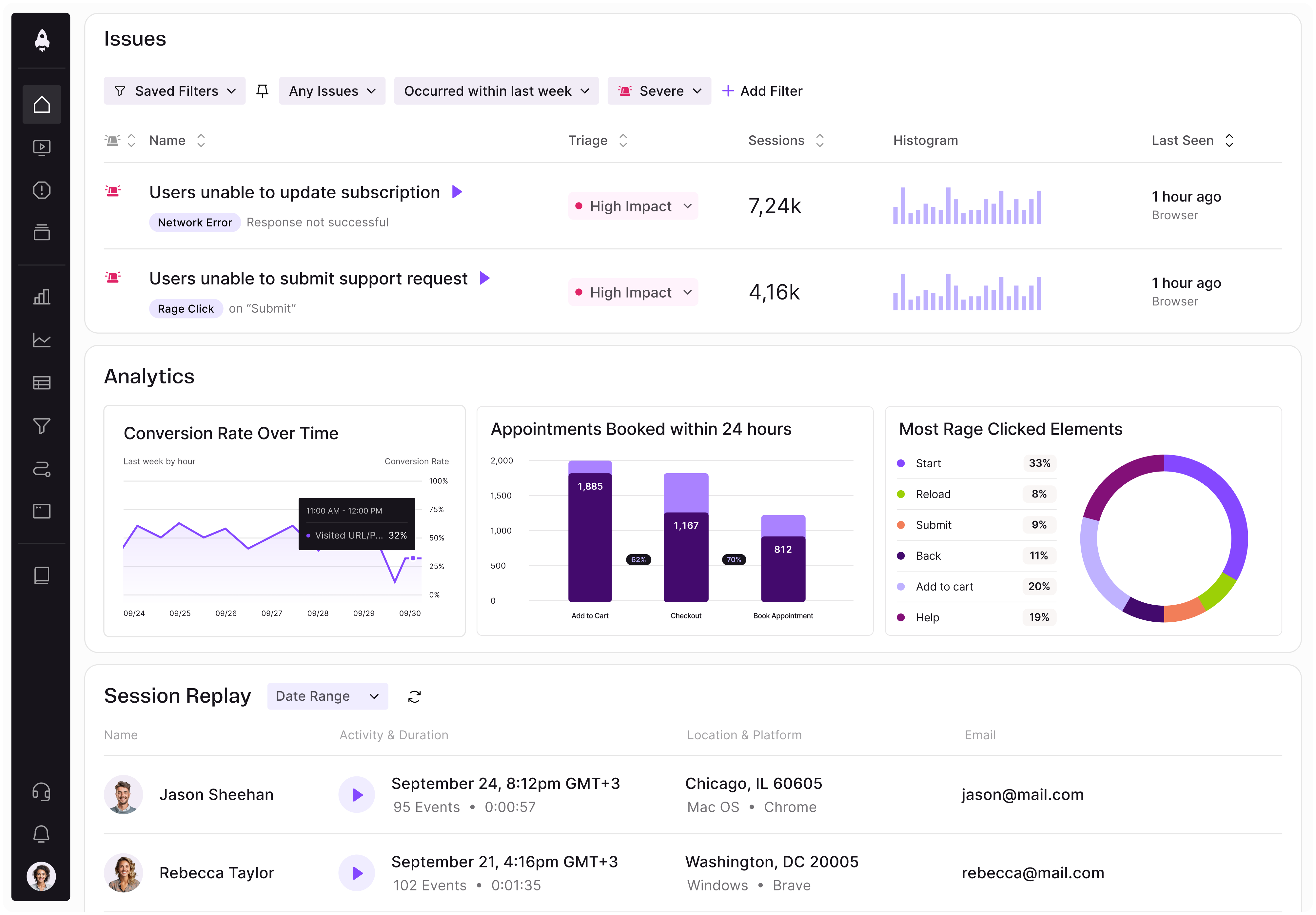
LogRocket identifies friction points in the user experience so you can make informed decisions about product and design changes that must happen to hit your goals.
With LogRocket, you can understand the scope of the issues affecting your product and prioritize the changes that need to be made. LogRocket simplifies workflows by allowing Engineering, Product, UX, and Design teams to work from the same data as you, eliminating any confusion about what needs to be done.
Get your teams on the same page — try LogRocket today.

Learn how to choose and adapt product management frameworks based on your product stage, constraints, problem type, and business context.
Learn when streaks improve retention, when they create fragile engagement, and how PMs can design healthier systems around user progress.
A technical debt register brings transparency and clarity as to what type and how much debt you have and can be used to monitor and review your debt ratio.
Memos don’t have to be complicated. Just keep them clear, concise, and focused on actionable items. More on that in this blog.


