A skilled PM should be versed in various quantitative analysis methods to make better product decisions.

One of the most common ways to analyze products and look for new insights is to conduct a correlation analysis.
In this guide, we’ll define what correlation analysis is, demonstrate how to conduct such an analysis, and list common mistakes to avoid.
Correlation analysis is a statistical method that helps us identify relationships between two variables.
In other words, a correlation analysis helps us determine whether changing variable A (for example, time in an app) can influence variable B (for example, users’ spending).
There are two ways to identify relationships between variables:
The main difference between these tools is what type of outcome they can assess:
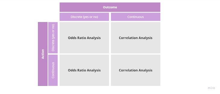
We use odds ratio analysis to identify how variables impact an outcome that’s discrete. Discrete outcomes can be answered in a yes-or-no manner. An example could be 30-day retention. Did a user retain after 30 days: yes or no?
If your output variable is continuous — that is, it cannot be answered in a yes-or-no fashion (for example, users’ spending) — correlation analysis is your best bet.
Correlation analysis is an advanced statistical topic. Calculating the correlation coefficient mathematically is a daunting task.
The correlation coefficient formula is:
r = n ∑ X Y − ∑ X ∑ Y ( n ∑ X 2 − ( ∑ X ) 2 ) ⋅ ( n ∑ Y 2 − ( ∑ Y ) 2 )
Luckily, you don’t have to master advanced mathematics to perform a correlation analysis. An Excel spreadsheet is more than enough.
All you need to do is to use the =correl function:
=correl(output variables, input variables)
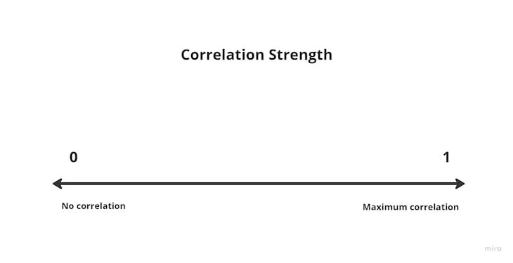
A result is a number between -1 and 1:
Now, let’s demonstrate correlation analysis with a practical example.
Let’s say you manage an in-app customer support chat and you are interested in whether resolving issues faster leads to higher customer satisfaction. If that conjecture is true, you might use this insight to inform your roadmap and prioritize reducing the customer support contact time to drive satisfaction.
There are three steps to testing that hypothesis:
For starters, all you need are two columns of data.
Let’s start with the input variable, which is the time spent talking to customer support in the chat. In our case, since the interactions tend to be quick, let’s measure it in seconds.
The output variable is satisfaction. Let’s use a monthly 1–10 NPS survey sent to users:
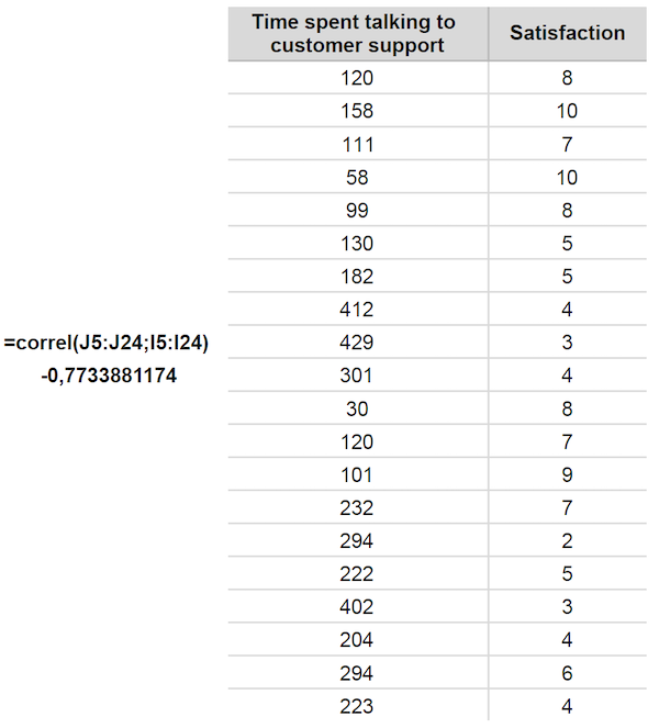
After collecting this data, we just need to use the =correl() function. First, highlight the satisfaction (output variable we want to affect) and then the time spent talking to customer support (the input variable we want to improve).
Correlation coefficient (r) = -0.77
The correlation of -0.77 suggests a negative correlation. The longer people talk to customer support (higher input variable), the lower the overall satisfaction (lower output variable).
Although this seems to support our initial hypothesis, we shouldn’t stop here. We still need to stress-test our findings.
The next step should be to measure how reliable the actual correlation is.
To do that, we use R-squared calculation (r2). r2 represents the amount of variation between variables that can be explained by the correlation coefficient.
To put the statistical nitty-gritty aside and simplify a bit, r2 tells us how trustworthy our correlation results are. When we square our correlation coefficient, we’ll get a number between 0 and 1:
Here, 0 means our correlation results are weak and probably not trustworthy, and 1 means it’s a perfect correlation.
Back to our example, if we square our -0.77, we’ll get:
r2 = -0.772 = 0.59
That means our correlation is relatively reliable but far from perfect. Let’s keep that in mind when drawing conclusions and planning the subsequent bets.
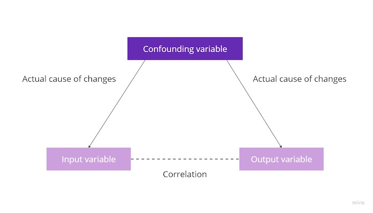
Now, let’s avoid the most common correlation analysis mistake: confusing correlation for causation.
The fact that two variables are correlated doesn’t necessarily mean that one variable directly influences the other. There might be another variable we don’t consider that impacts both input and output variables:
Let’s look at an example. There’s a strong correlation between the amount of ice cream consumed and the number of drownings. The more ice cream people consume, the more they drown.
But does that mean those drownings are caused by eating ice cream? Should we ban ice cream?
Of course not. The fact is, there’s another variable that influences both ice cream consumption and drowning rates: the temperature.
On the one hand, the higher the temperature, the more ice cream people consume. On the other hand, increased temperature encourages more people to swim in the ocean, which, in turn, leads to a higher number of drownings:
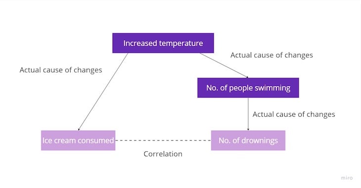
Although ice cream consumption and the number of drownings are correlated, there are at least two more variables that cause the correlation. So, even if we decided to ban eating ice creams altogether, the number of drownings wouldn’t decrease — even though these variables are strongly correlated.
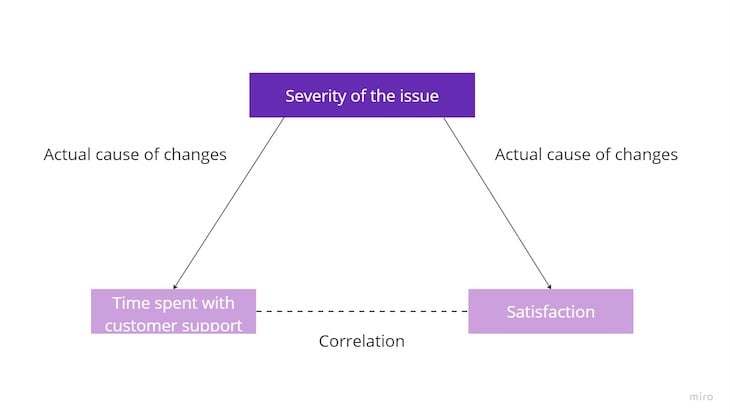
In our customer support example, a hidden confounding variable might also exist.
For example, it could be the severity of the issue. The higher the severity, the lower the satisfaction and the more time customer support needs to resolve the issue. Reducing the time spent with customer support wouldn’t necessarily mean higher satisfaction if the severity of the problems is still high:
You can identify causation by running a series of experiments.
First, hypothesize other variables that could impact your analysis and run a correlation analysis on them. Then, run small experiments on these variables to notice which one actually moves the needle.
You can also benefit from qualitative research, such as customer interviews, to better understand the context and formulate more robust hypotheses.
At the end of the day, correlation is just an insight into what to focus on, and it’s rarely enough to draw strong conclusions.
Correlation is a powerful and relatively simple analysis tool. It helps you determine whether changes in one variable predict changes in another variable.
Although correlation analysis is an advanced statistical topic, in reality, all you need is Excel or Google Sheets and a simple =correl() formula.
However, remember to also check correlation strength and search for confounding variables.
Correlation doesn’t necessarily mean causation. If you are looking for truly valuable insights, you need to dig deeper, consider multiple variables and run a set of experiments to spot which variables actually cause other variables to move.
After all, although eating ice cream and drowning are correlated, it doesn’t mean banning ice cream would save people’s lives.
Featured image source: IconScout

LogRocket identifies friction points in the user experience so you can make informed decisions about product and design changes that must happen to hit your goals.
With LogRocket, you can understand the scope of the issues affecting your product and prioritize the changes that need to be made. LogRocket simplifies workflows by allowing Engineering, Product, UX, and Design teams to work from the same data as you, eliminating any confusion about what needs to be done.
Get your teams on the same page — try LogRocket today.

Great product managers spot change early. Discover how to pivot your product strategy before it’s too late.

Thach Nguyen, Senior Director of Product Management — STEPS at Stewart Title, emphasizes candid moments and human error in the age of AI.

Guard your focus, not just your time. Learn tactics to protect attention, cut noise, and do deep work that actually moves the roadmap.

Rumana Hafesjee talks about the evolving role of the product executive in today’s “great hesitation,” explores reinventing yourself as a leader, the benefits of fractional leadership, and more.


