Editor’s note: This article was last updated on 16 December 2021.

Similar to Electron, NodeGUI is an open source framework for building cross-platform native desktop applications with JavaScript and CSS-like styling. You can run NodeGUI apps on Mac, Windows, and Linux from a single codebase.
What differentiates NodeGUI from Electron is that it is powered by Qt5, which is excellent for performance and memory, but it does force one to use their components instead of HTML like with Electron.
In this article, we’ll explore the NodeGUI framework with our main focus being on the React NodeGUI module, which enables developers to build performant native and cross-platform desktop applications with native React and powerful CSS-like styling.
We’ll develop a system utility monitor application that will work on Linux, Mac, and Windows operating systems. We’ll also use the react-node-gui-starter project to bootstrap our application and get up and running quickly.
To follow along with this tutorial, be sure to have the following:
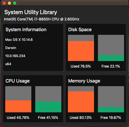
We’ll build a simple application that dynamically displays an operating system’s CPU, memory, and disk space, as well as some additional statistics related to the operating system.
You can access the code for this project on this GitHub repo. The end result will look like the following image:
First, run the following code in your terminal application, which will clone the starter application:
# Clone this repository
git clone https://github.com/nodegui/react-nodegui-starter

# Go into the repository
cd react-nodegui-starter

# Install dependencies
npm install
We need to install one more npm package that will allow us to access our system’s information:
npm i node-os-utils
node-os-utils is an operating system utility library. Some methods are wrappers of Node.js libraries, and others are calculations made by the module.
The starter application offers a few npm scripts that we can run:
"build": "webpack -p",
"start": "webpack && qode ./dist/index.js",
"debug": "webpack && qode --inspect ./dist/index.js",
"start:watch": "nodemon -e js,ts,tsx --ignore dist/ --ignore node_modules/ --exec npm start"
For development, we’ll run the following command:
npm run start:watch
Running the command above will launch the application and also allow for hot reloading. You may have noticed a new window load, which is the cross-platform React NodeGUI desktop application.
First, we want to create a globals.ts file, where we’ll store global information related to our application. In the src directory, create a directory called helpers. Within helpers, create a file called globals.ts and add the following code:
const colors = {
    red: '#FF652F',
    yellow: '#FFE400',
    green: '#14A76C'
}

const labels = {
    free: 'Free',
    used: 'Used'
}

export const globals = {
    colors,
    labels
}
In the code snippet above, we create two objects, colors and labels, which we’ll add to the
globals object then export. Notice that we only use the colors and labels variable names in the globals object, which is the Object property value shorthand in ES6.
If you want to define an object whose keys have the same name as the variables passed in as properties, you can use the shorthand and simply pass the key name.
The export statement is used when creating JavaScript modules to export functions, objects, or primitive values from the module, so they can be used by other programs with the import statement.
Next, we’ll use the globals.ts file in the systemDetails.ts file, which we can also create in the helpers directory:
// Import External Dependencies
const osu = require('node-os-utils')

// Destructure plugin modules
const {os, cpu, mem, drive} = osu

// Import Globals
import { globals } from "./globals"

// Use ASYNC function to handle promises
export const systemDetails = async () => {
    // Static Details
    const platform = cpu.model()
    const operatingSystem = await os.oos()
    const ip = os.ip()
    const osType = os.type()
    const arch = os.arch()

    // CPU Usage
    const cpuUsed= await cpu.usage()
    const cpuFree = await cpu.free()

    // Memory Usage
    const memUsed = await mem.used()
    const memFree = await mem.free()

    // Disk Space Usage
    const driveInfo = await drive.info()
    const memUsedPercentage = memUsed.usedMemMb / memUsed.totalMemMb * 100
    const memFreePercentage = memFree.freeMemMb / memFree.totalMemMb * 100

    const systemInformation = {
      staticDetails: {
        platform,
        operatingSystem,
        ip,
        osType,
        arch
      },
      cpuDetails: {
        cpuUsed: {
          usage: cpuUsed,
          label: globals.labels.used,
          color: globals.colors.red
        },
        cpuFree: {
          usage: cpuFree,
          label: globals.labels.free,
          color: globals.colors.green
        }
      },
      memoryDetails: {
        memUsed: {
          usage: memUsedPercentage,
          label: globals.labels.used,
          color: globals.colors.red
        },
        memFree: {
          usage: memFreePercentage,
          label: globals.labels.free,
          color: globals.colors.green
        }
      },
      driveDetails: {
        spaceUsed: {
          usage: driveInfo.usedPercentage,
          label: globals.labels.used,
          color: globals.colors.red
        },
        spaceFree: {
          usage: driveInfo.freePercentage,
          label: globals.labels.free,
          color: globals.colors.green
        }
      }
    }
    return systemInformation
}
We require the node-os-utils npm package, which we’ll use to get all our system information. node-os-utils relies mainly on native Node.js libraries, making it very compatible with NodeGUI.
Next, we use JavaScript ES6 destructuring to assign variables to functions that we’ll use from the node-os-utils package.
We import the globals object that we created ourselves. Just like we used the export statement in the globals.ts file, we now use it again, but this time, we’ll export the ASYNC function systemDetails.
The node-os-utils library mostly uses JavaScript with ES6 promises to return data, allowing us to retrieve that data using an async/await function. With async/ await, we can write completely synchronous-looking code while performing asynchronous tasks behind the scenes. I have personally found that using async/await functions leads to very clean, concise, and readable code.
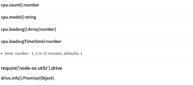
To get our system’s information, we’ll use the node-os-utils library and the await operator in front of function calls that return a promise. In the node-os-utils libraries description, you can see exactly what each function call returns:
We then use all the values returned from the function calls to create the systemInformation object, which is returned by the systemDetailsfunction. Now, we’re ready to use systemInformation and create the application interface.
At this stage, our application does not look like much, but we’re about to change that. In the src directory, create a components directory and add the following three component files:
InnerContainer.tsxstatsColumn.tsxstatsRow.tsxNext, we need to update the index.tsx file in the src directory. To start, let’s remove all the code that we won’t use for our application, leaving us with an clean index.tsx file, as below:
// Import External Dependencies
import {Window, Renderer, View, Text} from "@nodegui/react-nodegui"
import React, { useState, useEffect } from "react"

// Import System Details
import { systemDetails } from "./helpers/systemDetails"

// Application width and height
const fixedSize = { width: 490, height: 460 }

// Function React Component
const App = () => {
  return (
    <Window minSize={fixedSize} maxSize={fixedSize} styleSheet={styleSheet}>
      <View id="container">
        <Text id="header">System Utility Monitor</Text>
      </View>
    </Window>
  )
}

// Application Stylesheets
const styleSheet = `
  #container {
    flex: 1;
    flex-direction: column;
    min-height: '100%';
    align-items: 'center';
    justify-content: 'center';
  }
`

// Render the application
Renderer.render(<App />)
If you’ve worked with React Native before, the syntax above might seem familiar; similar to React Native, we don’t have the freedom to work with HTML. Instead, we work with predefined components like View and Text provided by the framework.
In the code above, we once again import modules and functions using the JavaScript ES6 destructuring syntax. We then declare a constant, fixedSize, which we will use to assign a minimum and maximum width to our application window.
Next, we’ll create a functional React component where we’ll build the application. We won’t cover the basics of React, so if you aren’t familiar with React Hooks, be sure to check out a few tutorials.
If you want to go deeper into React theory, check out this article detailing the intricacies of React functional components. Also, check out the official React documentation on React Hooks, which is available from React ≥v16.8 and are an excellent addition to the framework.
The first component from the NodeGUI React framework is the <Window/> component. A QMainWindow provides a main application window. Every widget in NodeGui should be a child or nested child of QMainWindow. QMainWindow in NodeGui is also responsible for FlexLayout calculations of its children.
We provide the <Window/> component minSize, maxSize, and styleSheet props. The styleSheet constant is declared on line 22. Nested within the <Window/> component is a <View/> component. A QWidget can be used to encapsulate other widgets and provide structure. It functions similar to a div in the web world. Within the <View/> component is a <Text/> component, a QLabel provides ability to add and manipulate text.
We then declare a styleSheet constant, which is a template literal string. Template literals are string literals allowing embedded expressions. You can use multi-line strings and string interpolation features with template literals. In prior editions of the ES2015 specification, they were called template strings.
Not all CSS properties are supported by the NodeGUI framework, and in some cases, one needs to refer to Qt Documents to see exactly which one to use. Therefore, styling can be a bit tricky.
For example, the property overflow:scroll does not exist in Qt CSS, so one needs to implement other workarounds for this functionality, as per this GitHub issue thread.
Regarding Flexbox support, the NodeGUI framework supports all properties and all layouts as per the Yoga Framework, which is also used by frameworks like React Native and ComponentKit.
Lastly, we’ll render our application. Now that the base of our application is in place, we’ll need to integrate the system information and display it using the components we created.
Before we can use the system data, we will need an initial data object, which the application will use before being populated with data returned from the systemDetails function. In the helpers directory, create a new file initialData.ts and add the following code:
export const initialData = {
    staticDetails:{
      platform: 'Loading System Data...',
      operatingSystem: '',
      ip: '',
      osType: '',
      arch: ''
    },
    cpuDetails:{
      cpuUsed: {
        usage: '',
        label: 'Loading',
        color: ''
      },
      cpuFree: {
        usage: '',
        label: 'Loading',
        color: ''
      }
    },
    memoryDetails:{
      memUsed: {
        usage: '',
        label: 'Loading',
        color: ''
      },
      memFree: {
        usage: '',
        label: 'Loading',
        color: ''
      }
    },
    driveDetails: {
      spaceUsed: {
        usage: '',
        label: 'Loading',
        color: ''
      },
      spaceFree: {
        usage: '',
        label: 'Loading',
        color: ''
      }
    }
  }
As you can see, this mimics the systemInformation object, which is returned by the systemDetails function. Let’s add this to the index.ts file with as follows:
...
// Import System Details
import { systemDetails } from "./helpers/systemDetails"
import { initialData } from "./helpers/initialData"
...
React Hooks are probably one of my favorite developments in the JavaScript ecosystem within the last couple of years, allowing for clear, concise code that is easily readable and maintainable.
Let’s start by implementing the React setState Hook that we imported earlier. Add the following code inside the App functional React component:
  // Array destructure data and setData function
  const [data, setData] = useState(initialData)
There is a lot to unpack here, especially if you are new to React Hooks. To learn more, I recommend checking out the following video:
If we console.log() the data constant, we’ll see that our initialData object has been assigned to the data constant. Now, let’s use some destructuring again to assign the variables we’ll need for the static data within our application:
  //Get Static Data
  const {platform, operatingSystem, ip, osType, arch} = data.staticDetails
Currently, the data constant is still pointing to the initialData object we created. Let’s use the useEffect() Hook to update our state with data from the systemsDetail function. We can do so by adding the following code to the index.tsx file, right after the useState() Hook:
...
const [data, setData] = useState(initialData)

useEffect(() => {
  const getSystemData = async () => {
    const sysData : any = await systemDetails()
    setData(sysData)
  }
  getSystemData()
})

//Get Static Data
...
Now, if we console.log() the data constant, we’ll see that it is constantly being updated with new data. Be sure to read up on the useEffect Hook and async/await functionality.
We can add the following code below the application header, which will display the system platform:
<Text id="subHeader">{platform}</Text>
Now, we’ve laid the base foundation for our application. All we need is the construction and decoration.
Let’s start by replacing the styleSheet constant in the index.tsx file with the following code:
// Application Stylesheets
const styleSheet = `
  #container {
    flex: 1;
    flex-direction: column;
    min-height: '100%';
    height: '100%';
    justify-content: 'space-evenly';
    background-color: #272727;
  }
  #header {
    font-size: 22px;
    padding: 5px 10px 0px 10px;
    color: white;
  }
  #subHeader {
    font-size: 14px;
    padding: 0px 10px 10px 10px;
    color: white;
  }
`
So far, we’ve used pretty standard CSS styling, but we’ll see some edge cases as we proceed. Let’s populate our first component, the StatsRow.tsx file, with the following code:
// Import External Dependencies
import React from 'react'
import {View} from "@nodegui/react-nodegui"

export const StatsRow = (props: { children: React.ReactNode; }) => {
  return (
      <View id="systemStats" styleSheet={styleSheet}>
          {props.children}
      </View>
  )
}

const styleSheet = `
  #systemStats {
    width: 470;
    height: 180;
    flex: 1;
    flex-direction: row;
    justify-content: 'space-between';
    margin-horizontal: 10px;
  }
`
Note the props.children prop and the syntax for using it with TypeScript above. Let’s import the StatsRow component by adding the following code to the index.tsx file:
...
// Import Components
import {StatsRow} from "./components/StatsRow"
...
We’ll use the StatsRow component to create two rows in our application, but before we use it, let’s first populate the innerContainer.tsx by adding the following code:
// Import External Dependencies
import React from 'react'
import {View, Text} from "@nodegui/react-nodegui"

// Set Types
type InnerContainerColumnProps = {
    title: string
}

export const InnerContainer: React.FC<InnerContainerColumnProps> = props => {
  // Desctructure props
  const {title, children} = props

  return (
      <View id="innerContainer" styleSheet={styleSheet}>
          <Text id="headText">{title}</Text>
          <View id="stats">
            {children}
          </View>
      </View>
  )
}

const styleSheet = `
  #innerContainer {
    height: 180;
    width: 230;
    background: #111111;
    border-radius: 5px;
  }
  #stats {
    flex-direction: row;
    align-items: 'flex-start';
    justify-content: 'flex-start';
  }

  #headText {
      margin: 5px 5px 5px 0;
      font-size: 18px;
      color: white;
  }
`
Note that we’ve covered most of the code above already, but we need to take some extra measures to accommodate TypeScript in our React components. Add the following code to the index.tsx file:
...
// Import Components
import {StatsRow} from "./components/StatsRow"
import {InnerContainer} from "./components/InnerContainer"
...
Let’s finish up our final component, StatsColumn.tsx, before tying it all together in the index.tsx file. I’ll break up the code into two parts, which we should combine; the first part is the component without the styles, and the second part is the styles:
// Import External Dependencies
import React from 'react'
import {View, Text} from "@nodegui/react-nodegui"

// Set Types
type StatsColumnProps = {
    label: string,
    usage: number,
    color: string
}

export const StatsColumn: React.FC<StatsColumnProps> = props => {
    // Destructure props
    const {usage, color, label} = props

    // Create Label with usage amount and percentage
    const percentageTextLabel = `${label} ${Math.round(usage * 100) / 100}%`

    // Create Dynamic Style Sheet
    const dynamicStyle = `
        height: ${usage};
        background-color: ${color};
    `

    return (
        <View id="statsContainer" styleSheet={statsContainer}>
            <View id="columnContainer" styleSheet={columnContainer}>
                <View id="innerColumn" styleSheet={dynamicStyle}></View>
            </View>
            <Text id="statsLabel" styleSheet={statsLabel}>{percentageTextLabel}</Text>
        </View>
    )
}
We use this component to create the graph effect, as you can see on the final application screen grab. We pass the label, usage, and color props to the component, which we’ll use to dynamically update the component.
Underneath the previous code block, go ahead and add the following code snippet:
const statsContainer = `
    #statsContainer {
        height: '140';
        text-align:center;
        justify-content: 'center';
        align-items: 'center';
        justify-content: 'space-between';
        width: 100%;
        flex: 1 0 100%;
        margin-horizontal: 5px;
    }
`

const columnContainer = `
    #columnContainer{
        height: 100%;
        flex: 1 0 100%;
        flex-direction: column-reverse;
        background-color: #747474;
        width: 100%;
    }
`

const statsLabel = `
    #statsLabel {
        height: 40;
        color: white;
        font-size: 14px;
        width: 100%;
        qproperty-alignment: 'AlignCenter';
        color: white;
    }
`
Another way to create styleSheet blocks is by declaring each style property as its own constant. However, the method you use doesn’t make much of a difference, it’s more of a developer preference.
You may also have noticed the CSS property qproperty-alignment:'AlignCenter';, which is a Qt property used to align text. It took me some time to figure this out, so you can use this Qt style sheet reference should you encounter another caveat like this.
Let’s import our final component into the index.tsx file:
// Import Components
import {StatsRow} from "./components/StatsRow"
import {InnerContainer} from "./components/InnerContainer"
import {StatsColumn} from "./components/StatsColumn"
Add the following styles to the styleSheet constant in the index.tsx file:
...
  #subHeader {
    font-size: 14px;
    padding: 0px 10px 10px 10px;
    color: white;
  }

  #headText {
    margin: 5px 5px 5px 0;
    font-size: 18px;
    color: white;
  }
  #infoText {
    padding: 5px 0 0 5px;
    color: white;
  }
  #informationContainer {
    height: 180;
    width: 230;
    background: #111111;
    border-radius: 5px;
  }
...
Now, let’s add the first bit of meat to our application. Below the <Textid="subHeader"> component in the index.tsx file, add the following code:
...
<StatsRow>
   <View id="informationContainer" styleSheet={styleSheet}>
      <Text id="headText">System Information</Text>
      <Text id="infoText">{operatingSystem}</Text>
      <Text id="infoText">{osType}</Text>
      <Text id="infoText">{ip}</Text>
      <Text id="infoText">{arch}</Text>
    </View>
</StatsRow>
...
Because of a caveat where the styles are not inherited by children components, we need to reference the styleSheet in the <View id="informationContainer"> even after referencing it in the main <Window> component.
You’ll notice that now, for the first time, our application is starting to resemble an actual application. Let’s add the code for creating the charts. Below the useEffect() Hook, add the following code:
const renderCpuDetails = () => {
  const cpuDetails = data.cpuDetails
  return Object.keys(cpuDetails).map((key) => {
      const stat = cpuDetails[key]
      return <StatsColumn label={stat.label} usage={stat.usage} color={stat.color}  />
  })
}

const renderMemoryDetails = () => {
  const memDetails = data.memoryDetails
  return Object.keys(memDetails).map((key) => {
      const stat = memDetails[key]
      return <StatsColumn label={stat.label} usage={stat.usage} color={stat.color}  />
  })
}

const renderDriveDetails = () => {
  const driveDetails = data.driveDetails
  return Object.keys(driveDetails).map((key) => {
      const stat: any = driveDetails[key]
      return <StatsColumn label={stat.label} usage={stat.usage} color={stat.color}  />
  })
}
In the code above, we loop over the respective object keys, then use the values as props for the <StatsColumn/> component.
We can then use these functions in our code by updating the index.tsx file with the following:
<StatsContainer>
    <View id="informationContainer" styleSheet={styleSheet}>
      <Text id="headText">System Information</Text>
      <Text id="infoText">{operatingSystem}</Text>
      <Text id="infoText">{osType}</Text>
      <Text id="infoText">{ip}</Text>
      <Text id="infoText">{arch}</Text>
    </View>
  <InnerContainer title={"Disk Space"}>
    {renderDriveDetails()}
  </InnerContainer>
</StatsContainer>
<StatsContainer>
  <InnerContainer title={"CPU Usage"}>
    {renderCpuDetails()}
  </InnerContainer>
  <InnerContainer title={"Memory Usage"}>
    {renderMemoryDetails()}
  </InnerContainer>
</StatsContainer>
In the above code, we execute the three previously declared functions, which, in turn, render the Disk Space, CPU Usage, and Memory Usage columns.
In this article, we explored the NodeGUI framework and the React NodeGUI module by building a system utility monitoring application that dynamically displays our operating system’s CPU, memory, and disk space, in addition to some statistics related to the operating system. Now, you should be familiar with the strengths if NodeGUI as an alternative to Electron. I hope you enjoyed this article!
Install LogRocket via npm or script tag. LogRocket.init() must be called client-side, not
server-side
$ npm i --save logrocket

// Code:

import LogRocket from 'logrocket';
LogRocket.init('app/id');
// Add to your HTML:

<script src="https://cdn.lr-ingest.com/LogRocket.min.js"></script>
<script>window.LogRocket && window.LogRocket.init('app/id');</script>
Would you be interested in joining LogRocket's developer community?
Join LogRocket’s Content Advisory Board. You’ll help inform the type of content we create and get access to exclusive meetups, social accreditation, and swag.
Sign up now
Get to know RxJS features, benefits, and more to help you understand what it is, how it works, and why you should use it.

Explore how to effectively break down a monolithic application into microservices using feature flags and Flagsmith.

Native dialog and popover elements have their own well-defined roles in modern-day frontend web development. Dialog elements are known to […]

LlamaIndex provides tools for ingesting, processing, and implementing complex query workflows that combine data access with LLM prompting.

 Learn more →

4 Replies to "Exploring NodeGUI and React NodeGUI: Electron alternatives"
Can NodeGUI connect to a database? I’ve spent some time on Google and haven’t found any information about it. Thanks.
I couldn’t make any sense of the final step – but got it working using the following code
“`
//Get Static Data
const {platform, operatingSystem, ip, osType, arch} = data.staticDetails
return (
System Utility Monitor
{platform}
System Information
{operatingSystem}
{osType}
{ip}
{arch}
{renderDriveDetails()}
{renderCpuDetails()}
{renderMemoryDetails()}
“`
`npm run start:watch` has been changed in the `react-node-gui-starter` to `npm run debug`
Thhanks for a great read