If you’ve been keeping up with the latest CSS developments, you’re probably pretty excited about the future of responsive web development. Container queries are one of the most exciting additions to CSS that has most frontend developers talking. If you’re unfamiliar with container queries, you can read about them in the link above.

Much of the excitement about container queries has been focused on container size queries. But there is an even more exciting side of container queries that most developers do not know about: container style queries. In this article, we’ll be looking at everything you need to know about style queries.
This article assumes that you have a basic understanding of at least one programming language, preferably CSS, and access to an experimental browser like Chrome Canary.
In this article, we’ll cover:
Without further ado, let’s get right down to it.
Container queries work like media queries, but they allow you to query a component directly based on its size or style rather than the device’s viewport. If you’d like to read more about how to query a container based on its size, refer to the link above. Most developers use container queries to query a container based on its size, like this:
.card {
  /* query the inline-direction size of this parent */
  container-type: inline-size;
  display :block;
  background: blue;
}

@container (min-width: 600px) {
  .card {
    /* styles to apply when the card container is greater than or equal to 600px */
    display: flex;
    background: green;
  }
}
The above code queries the card container based on its size, and effects change only when the card has a width of 420px or above.
Style queries work the same way, but they allow you to query the computed values or style of a parent element within a query container and then apply the styles to the children based on their parent.
In simpler terms, you can use style queries to query a container based on its style rather than just its size. Here’s how it works:
@container style(color: purple) {
      /* styles to apply when the card container has a color of purple */
  .card {
    /* To change the background to green: */
    background: green;
  }
}
The above code will change the background of a card or section to green if the parent section has the color purple. Unlike size queries, where you have to establish an element as a query container with the container-type tag, all elements are considered a query container for style queries unless otherwise noted.
Next, we will look at where and when to use style queries.
CSS style queries can query non-inheritable styles of a parent container and apply the said style to the children. Non-inheritable styles in CSS include height, width, border, margin, padding, etc. To see how this works, let’s create a card:
<!DOCTYPE html>
<html lang="en">
<head>
  <meta charset="UTF-8">
  <meta http-equiv="X-UA-Compatible" content="IE=edge">
  <meta name="viewport" content="width=device-width, initial-scale=1.0">
  <title>Document</title>
  <link rel="stylesheet" href="style.css">
</head>
<body>
    <div class="card">
      <div class="cardheader">
        <img src="https://images.unsplash.com/photo-1657664042448-c955b411d9d0?ixlib=rb-1.2.1&ixid=MnwxMjA3fDF8MHxwaG90by1wYWdlfHx8fGVufDB8fHx8&auto=format&fit=crop&w=1032&q=80" class="card-img" alt="">
      </div>
      <div class="card-body">
        <h5 class="title">A card</h5>
        <p class="text">Lorem ipsum dolor sit amet consectetur adipisicing elit. Sint facere, neque fugit rem recusandae libero aliquid do</p>
        <button class="btn">Get started</button>
      </div>
    </div>


</body>
</html>
Now, let’s style the card:
.card{
    width:400px;
    padding: 20px;
    border-radius: 4px;
    border: solid 3px red;
    background-color: blueviolet;
    border-color: red;
}

.card-header{
    margin: -20px -20px 0 -20px;

}

.card-img{
    width: 100%;
    height: auto;
}

.title {
    font-size: 1.5rem;
    margin-bottom: 0.5rem;
}

.btn{
    border: solid 2px;
    width: 100%;
    padding: 0.75rem 1rem;
    border-radius: 4px;
    background-color: lightblue;
    color: black;
    font-weight: 600;
    cursor: pointer;
    border-color: black;
}

.btn:hover{
    background-color: brown;
}
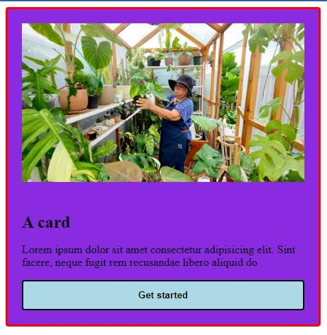
The above code will look like this:

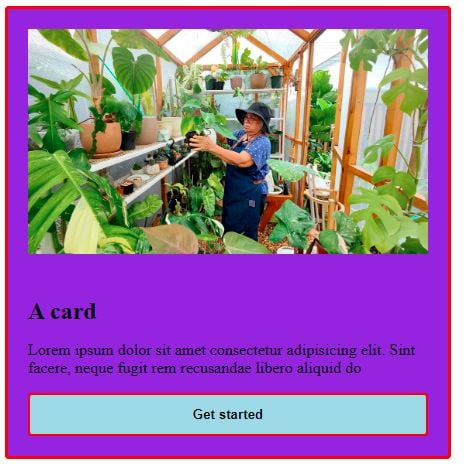
If we want the border color of the card to be inherited by the button, we’ll run the following code:
@container style(border-color: red) {
  .btn {
    border-color: red;
  }
}
The result will look like this:

Unlike size queries, style queries do not have a solid use case. Sure, they look cool, are new, and make your code look better, but they don’t solve any specific problems at the moment. Almost everything style queries do can be done with a class or data attribute.
For example, the above functionality can be achieved by targeting the button directly and assigning its border the color red or by creating custom variables and adding them to the button styling.
However, style queries can shine when combined with size queries, which is really only useful when using higher-order variables (custom properties). Here’s an example:
@container card (min-width: 600px) and style(--responsive: true) {
  /* styles for responsive components at a minimum width of 600px  */
}
Using style queries with size queries will allow you to apply specific logic, resulting in more flexible component-owned styling. It’s a handy trick that we may see become popular if style queries eventually ship.
As it stands, there’s still a lot of work to be done on style queries before they ship, if they ever do. Style queries have received many negative reviews from beta testers, but the most significant issue is the lack of specificity for non-custom CSS properties.
For example, no one understands how style(width: calc(…)) will behave or how style queries will deal with shorthand properties like style(color: inherit). These issues may cause significant problems in coding processes and may cause developers not to use style queries.
While there may be some solutions to these problems being worked on, style queries are not likely to ship with size queries until these issues are resolved because container size queries still retain a lot of functionality without style queries.
For now, there are no polyfills available for style queries. The only polyfill that exists for container queries only covers container size queries, but nothing has been done yet for container style queries at the time of writing.
If you’d like to do the CSS world a favor and create a polyfill for style queries, here’s a guide you can use.
While style queries may not be the best thing to happen to responsive web design since media queries, they still have a lot of potential. They may yet become valuable for developers if all their issues are sorted out when they ship.
As web frontends get increasingly complex, resource-greedy features demand more and more from the browser. If you’re interested in monitoring and tracking client-side CPU usage, memory usage, and more for all of your users in production, try LogRocket.

LogRocket lets you replay user sessions, eliminating guesswork around why bugs happen by showing exactly what users experienced. It captures console logs, errors, network requests, and pixel-perfect DOM recordings — compatible with all frameworks.
LogRocket's Galileo AI watches sessions for you, instantly identifying and explaining user struggles with automated monitoring of your entire product experience.
Modernize how you debug web and mobile apps — start monitoring for free.
Hey there, want to help make our blog better?
Join LogRocket’s Content Advisory Board. You’ll help inform the type of content we create and get access to exclusive meetups, social accreditation, and swag.
Sign up now
Compare Firebase Studio, Lovable, and Replit for AI-powered app building. Find the best tool for your project needs.

Discover how to use Gemini CLI, Google’s new open-source AI agent that brings Gemini directly to your terminal.

This article explores several proven patterns for writing safer, cleaner, and more readable code in React and TypeScript.

A breakdown of the wrapper and container CSS classes, how they’re used in real-world code, and when it makes sense to use one over the other.