The CSS Working Group (CSSWG) has recently published an updated working draft of the CSS Values and Units Level 4 specification — a document describing CSS grammar definition and value types.

This update brought a few interesting features, among which are new viewport units. Let’s see what they are and how they work!
We’ll start with a quick revision of the current viewport-relative units.
Viewport-percentage length units, or so-called viewport-relative units, are CSS units relative to the initial containing block, a rectangle where the root (<html>) element is located. The block itself is based on the viewport’s size (usually the browser window or iframe), hence the name of the units’ category.
In this category, there are four units you should already be familiar with:
vw – 1% of the viewport’s widthvh – 1% of the viewport’s heightvmin – smaller of vw or vhvmax – larger of vw or vhThe above units are available in all modern browsers, with support going back to IE 10 (except for the vmax unit).
You’ll usually see the units in action for page elements such as modals, overlays, and others, powering full-screen experiences.
Now, apart from the above four units, the new specification actually defines two others: vi and vb. They’ve been a part of Level 4 for quite a while, but still aren’t supported by any well-known browser. Still, they exist, meaning that eventually browsers will support them, so it’s worth knowing how they’re meant to work.
Both units are dependent upon the writing-mode property, making their values bound to the user’s language direction.
vi – 1% of the viewport’s size in the inline directionvb – 1% of the viewport’s size in the block directionIn languages written horizontally, like English, the units are equivalent to vw and vh, respectively. For vertically-written languages, like Japanese, the units are switched, making vi equal to vh and vb to vw.
Before we get to the new units, we first need to understand why they are being introduced.
The problem lies in the User-Agent interface, a.k.a., the browser’s UI.
While browsers usually have access to large screen estate on desktop, the same can’t be said for mobile. That’s why mobile browsers often minimize their UI — like the search bar — to save space when the user scrolls.
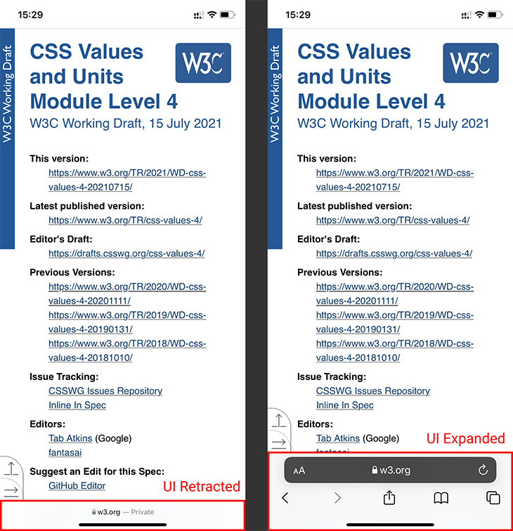
This allows for more content to be visible on the screen at one time, but introduces a problem: how should viewport-relative units be implemented?
Historically, the units’ actual values were shifted to adapt to the browser’s current UI state. This proved to be bad for user experience due to content constantly shifting while the user was scrolling.
So, Safari, Chrome (about a year later), and the other browser vendors changed this behavior to make viewport-relative units dependent on the viewport size when the browser’s UI is minimized. This fixed some issues but introduced new ones.
Now, using 100 with any viewport unit meant risking part of the page being hidden by the browser’s UI when it was maximized. This, in turn, led to such practices becoming an anti-pattern on mobile, forcing developers to implement JavaScript workarounds.
That’s where the new units and specification updates step in.
In truth, the new units aren’t really new. Instead, they’re just variants of the already-existing units we’ve covered above, differentiated by viewport sizing.
Let’s see what that means.
The current units starting with v* are now officially known as UA-default viewport-percentage units, and their implementation of viewport size depends on the User-Agent. This means that the behavior of these units can differ between browsers while keeping in mind the current, unofficial, industry standard.
So, to reiterate — nothing new here. The vh, vw, vmin, vmax, vb, and vi units remain as they were in the specs before the change. This ensures backward compatibility.
Now, things get interesting when we get into large and small viewport-percentage units. As the name implies, these units put specific requirements on how the UA should size its viewport.
For large viewport units, the viewport must be sized to allow for the largest possible viewport, assuming any dynamic browser UI is retracted. This allows the developer to make their designs fill the entire viewport while keeping in mind that the browser UI could overlap at least part of it.
This large viewport variant starts with lv* and includes lvh, lvw, lvmin, lvmax, lvb, and lvi.
For small viewport units, it’s the exact opposite. In their case, the viewport must be sized assuming any dynamic interface is expanded, determining the smallest possible viewport. This ensures that the developer’s designs fill the entire viewport when the UA interface is expanded, while possibly leaving empty spaces when the UI is retracted.
This small viewport variant starts with sv* and includes svh, svw, svmin, svmax, svb, and svi.
Lastly, there are also dynamic viewport-percentage units. These will allow developers to use the “historical” behavior where the viewport sizing — and thus units values — depend upon whether the browser interface is expanded or retracted.
While this means more control and choice for developers, this variant comes with a warning.
Using it can cause the content to shift, degrading the UX. Other things to consider are the performance hit and possible animations during recalculations. Those can either improve or further degrade the UX, depending on UA’s implementation.
The dynamic viewport variant starts with dv* and includes dvh, dvw, dvmin, dvmax, dvb, and dvi.
Overall, the new viewport-relative units in the specification mean developers have more precise control over the decisions they make about how their designs should behave in relation to their users’ viewports.
However, with great power comes great responsibility. When the new units eventually arrive in browsers, for developers, it’ll mean not only one more thing to control but also one more thing to keep in mind. While vendors will definitely do their best to implement the units wisely, it’ll now be even more important for developers to ensure and deliver a good user experience than before.
As web frontends get increasingly complex, resource-greedy features demand more and more from the browser. If you’re interested in monitoring and tracking client-side CPU usage, memory usage, and more for all of your users in production, try LogRocket.

LogRocket lets you replay user sessions, eliminating guesswork around why bugs happen by showing exactly what users experienced. It captures console logs, errors, network requests, and pixel-perfect DOM recordings — compatible with all frameworks.
LogRocket's Galileo AI watches sessions for you, instantly identifying and explaining user struggles with automated monitoring of your entire product experience.
Modernize how you debug web and mobile apps — start monitoring for free.
Would you be interested in joining LogRocket's developer community?
Join LogRocket’s Content Advisory Board. You’ll help inform the type of content we create and get access to exclusive meetups, social accreditation, and swag.
Sign up now
This guide walks you through creating a web UI for an AI agent that browses, clicks, and extracts info from websites powered by Stagehand and Gemini.

This guide explores how to use Anthropic’s Claude 4 models, including Opus 4 and Sonnet 4, to build AI-powered applications.

Which AI frontend dev tool reigns supreme in July 2025? Check out our power rankings and use our interactive comparison tool to find out.

Learn how OpenAPI can automate API client generation to save time, reduce bugs, and streamline how your frontend app talks to backend APIs.

 Learn more →
