Visx is a collection of React-based data visualization tools developed by Airbnb. Visx, which stands for visualization component, is not a visualization library — rather, it is a collection of primitives or components that can be mixed together to create a custom visualization library based on a project’s requirements.
Though built on the popular D3 visualization library, Visx delegates the DOM manipulation work to the React library. Meanwhile, D3 is mostly used for calculations. The advantage of this is that it mitigates the bugs that can creep in when two libraries struggle for control of the DOM.
Visx is not opinionated, which means it can fit into any React app regardless of the architecture. It’s also pure React, which means it is easy to learn. Also, you can always import what you need from the Visx toolbox and thus keep your codebase small and performant.
Visx is very stable and reliable. Its development started more than 3 years ago at Airbnb with the sole goal of unifying the visualization stacks across the company. It has been in use internally at Airbnb for more than 2 years.
The Replay is a weekly newsletter for dev and engineering leaders.
Delivered once a week, it's your curated guide to the most important conversations around frontend dev, emerging AI tools, and the state of modern software.
According to the Airbnb engineering team, the primary goals of Visx are performance, learnability, and expressivity. This is a very rare combination that is simply nonexistent in any other React-based frontend visualization libraries at the time of writing this article.
While D3 is a vet when it comes to building expressive visualizations in React, it has a very steep learning curve. A React developer cannot just get up and running with it based on previous experience in React. There are other visualization tools that address the learnability issue, like React-vis, but this comes at the expense of expressivity and sometimes performance. Hence, Visx is not an aimless show of engineering might by Airbnb. It actually solves a huge problem for React engineers who build visualization applications.
Getting started with Visx is fairly easy. You just have to be familiar with the Visx components and their properties. These components are normal React components.
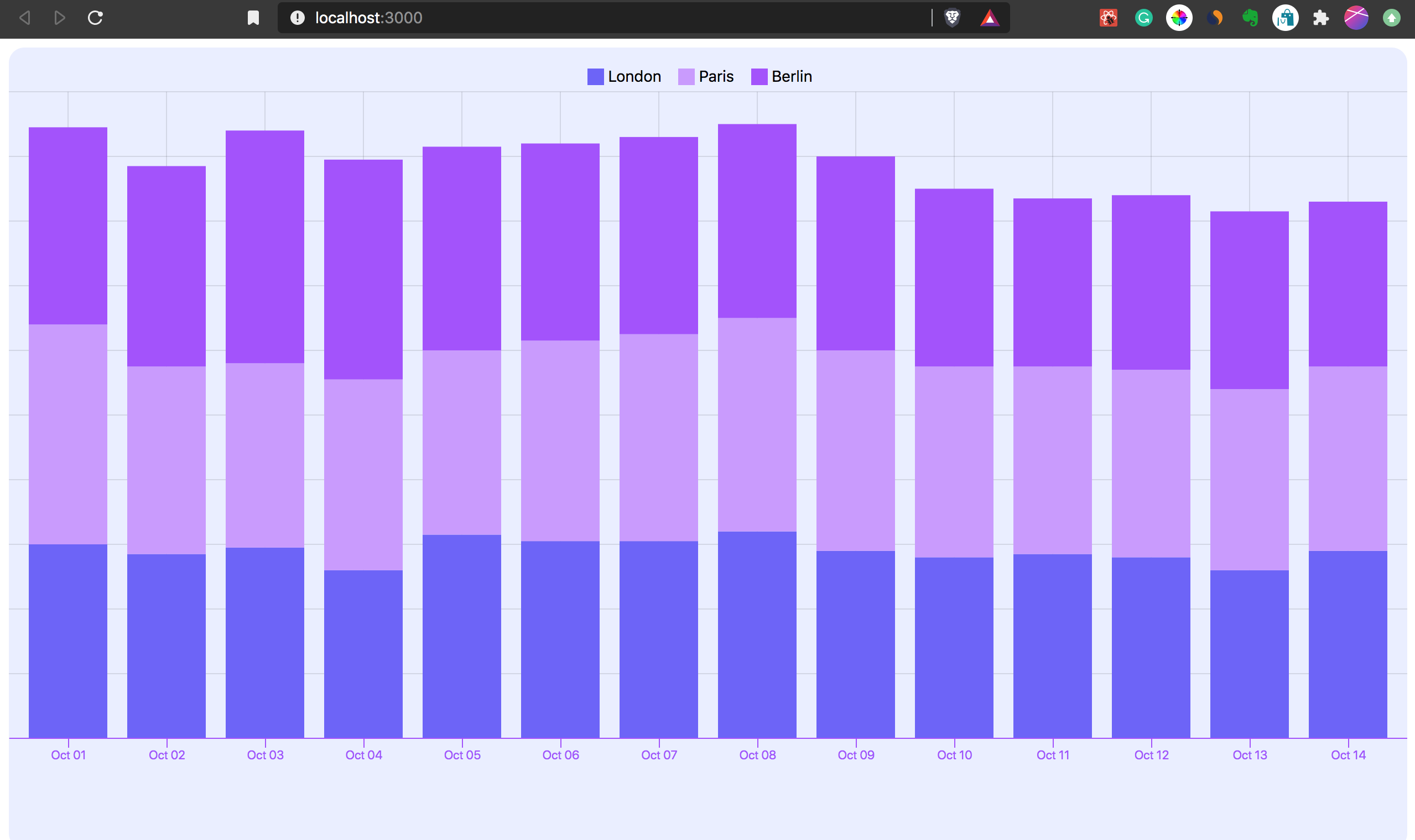
In this example, we will be building a vertically stacked bar chart that shows the daily average temperatures over a period of fourteen days for three European cities: Paris, London, and Berline. The code is available on Github.
The first step of the installation process is to install the create-react-app boilerplate. Run npx create-react-app visx-chart to get started.
The next step is to install the Visx packages. Since Visx is a collection of Primitives, quite a number of packages will be installed that will serve as the building blocks for the chart we’re going to create today.
Go to your project’s root directory and run the command below to install the packages. Always remember to replace yarn add with npm install if you are using npm to manage your application’s packages.
yarn add @visx/shape @visx/group @visx/grid @visx/axis @visx/scale @visx/tooltip @visx/legend @visx/responsive
Below is a summary of the purposes of each of the installed packages:
@visx/shape contains different forms of shapes that are used in data visualization. For this example project, the stacked vertical bars will be obtained from this package.
@visx/group is a simpler implementation of the SVG <g /> element that is used to group other SVG objects.
@visx/grid contains components that are used to create gridlines in charts.
@visx/axis contains components used in drawing axes for charts. It’s really flexible and thus can be customized.
@visx/scale is a collection of “functions that help you map your data values to the physical pixel size that your graph requires”; according to the Visx documentation.
@visx/tooltip contains Hooks, components, and other utilities needed to simplify the addition of tooltip to a visualization.
@visx/legend a collection of components used in adding different types of legends to a visualization.
The final step in the package installation process is to run yarn add d3-time-format to install the d3-time-format package that helps in converting the date and time in the data to be visualized to the preferred format.
@visx/responsive makes visualizations responsive.
The chart component contains all the logics and components put together to produce the final vertically stacked bar chart. Create a file named TemperatureBarStack.js in your application’s src directory and paste the code below in it:
import React from "react";
import { BarStack } from "@visx/shape";
import { Group } from "@visx/group";
import { Grid } from "@visx/grid";
import { AxisBottom } from "@visx/axis";
import { scaleBand, scaleLinear, scaleOrdinal } from "@visx/scale";
import { timeFormat, timeParse } from "d3-time-format";
import { useTooltip, useTooltipInPortal, defaultStyles } from "@visx/tooltip";
import { LegendOrdinal } from "@visx/legend";
import "./index.css";

const purple1 = "#6c5efb";
const purple2 = "#c998ff";
const purple3 = "#a44afe";
const background = "#eaedff";
const defaultMargin = { top: 40, right: 0, bottom: 0, left: 0 };
const tooltipStyles = {
  ...defaultStyles,
  minWidth: 60,
  backgroundColor: "rgba(0,0,0,0.9)",
  color: "white"
};

const data = [
  {
    date: "2020-10-01",
    London: "60",
    Paris: "68",
    Berlin: "61"
  },
  {
    date: "2020-10-02",
    London: "57",
    Paris: "58",
    Berlin: "62"
  },
  {
    date: "2020-10-03",
    London: "59",
    Paris: "57",
    Berlin: "72"
  },
  {
    date: "2020-10-04",
    London: "52",
    Paris: "59",
    Berlin: "68"
  },
  {
    date: "2020-10-05",
    London: "63",
    Paris: "57",
    Berlin: "63"
  },
  {
    date: "2020-10-06",
    London: "61",
    Paris: "62",
    Berlin: "61"
  },
  {
    date: "2020-10-07",
    London: "61",
    Paris: "64",
    Berlin: "61"
  },
  {
    date: "2020-10-08",
    London: "64",
    Paris: "66",
    Berlin: "60"
  },
  {
    date: "2020-10-09",
    London: "58",
    Paris: "62",
    Berlin: "60"
  },
  {
    date: "2020-10-10",
    London: "56",
    Paris: "59",
    Berlin: "55"
  },
  {
    date: "2020-10-11",
    London: "57",
    Paris: "58",
    Berlin: "52"
  },
  {
    date: "2020-10-12",
    London: "56",
    Paris: "58",
    Berlin: "54"
  },
  {
    date: "2020-10-13",
    London: "52",
    Paris: "56",
    Berlin: "55"
  },
  {
    date: "2020-10-14",
    London: "58",
    Paris: "57",
    Berlin: "51"
  }
];
const keys = ["London", "Paris", "Berlin"];

const temperatureTotals = data.reduce((allTotals, currentDate) => {
  const totalTemperature = keys.reduce((dailyTotal, k) => {
    dailyTotal += Number(currentDate[k]);
    return dailyTotal;
  }, 0);

  allTotals.push(totalTemperature);
  return allTotals;
}, []);

const parseDate = timeParse("%Y-%m-%d");
const format = timeFormat("%b %d");
const formatDate = (date) => format(parseDate(date));

const getDate = (d) => d.date;

const dateScale = scaleBand({ domain: data.map(getDate), padding: 0.2 });
const temparatureScale = scaleLinear({
  domain: [0, Math.max(...temperatureTotals)],
  nice: true
});
const colorScale = scaleOrdinal({
  domain: keys,
  range: [purple1, purple2, purple3]
});

let tooltipTimeout;

export default function TemperatureBarStack({
  width,
  height,
  event = false,
  margin = defaultMargin
}) {
  const {
    tooltipOpen,
    tooltipTop,
    tooltipLeft,
    hideTooltip,
    showTooltip,
    tooltipData
  } = useTooltip();

  const { containerRef, TooltipInPortal } = useTooltipInPortal();

  if (width < 10) return null;

  const xMax = width;
  const yMax = height - margin.top - 100;

  dateScale.rangeRound([0, xMax]);
  temparatureScale.range([yMax, 0]);

  return width < 10 ? null : (
    <div style={{ position: "relative" }}>
      <svg ref={containerRef} width={width} height={height}>
        <rect
          x={0}
          y={0}
          width={width}
          height={height}
          fill={background}
          rx={14}
        />
        <Grid
          top={margin.top}
          left={margin.left}
          xScale={dateScale}
          yScale={temparatureScale}
          width={xMax}
          height={yMax}
          stroke="black"
          strokeOpacity={0.1}
          xOffset={dateScale.bandwidth() / 2}
        />
        <Group top={margin.top}>
          <BarStack
            data={data}
            keys={keys}
            x={getDate}
            xScale={dateScale}
            yScale={temparatureScale}
            color={colorScale}
          >
            {(barStacks) =>
              barStacks.map((barStack) =>
                barStack.bars.map((bar) => (
                  <rect
                    key={`bar-stack-${barStack.index}-${bar.index}`}
                    x={bar.x}
                    y={bar.y}
                    height={bar.height}
                    width={bar.width}
                    fill={bar.color}
                    onClick={() => {
                      if (event) alert(`Clicked: ${JSON.stringify(bar)}`);
                    }}
                    onMouseLeave={() => {
                      tooltipTimeout = window.setTimeout(() => {
                        hideTooltip();
                      }, 300);
                    }}
                    onMouseMove={(event) => {
                      if (tooltipTimeout) clearTimeout(tooltipTimeout);
                      const top = event.clientY - margin.top - bar.height;
                      const left = bar.x + bar.width / 2;
                      showTooltip({
                        tooltipData: bar,
                        tooltipTop: top,
                        tooltipLeft: left
                      });
                    }}
                  />
                ))
              )
            }
          </BarStack>
        </Group>
        <AxisBottom
          top={yMax + margin.top}
          scale={dateScale}
          tickFormat={formatDate}
          stroke={purple3}
          tickStroke={purple3}
          tickLabelProps={() => ({
            fill: purple3,
            fontSize: 11,
            textAnchor: "middle"
          })}
        />
      </svg>
      <div
        style={{
          position: "absolute",
          top: margin.top / 2 - 10,
          width: "100%",
          display: "flex",
          justifyContent: "center",
          fontSize: 14
        }}
      >
        <LegendOrdinal
          scale={colorScale}
          direction="row"
          labelMargin="0 15px 0 0"
        />
      </div>
      {tooltipOpen && tooltipData && (
        <TooltipInPortal
          key={Math.random()}
          top={tooltipTop}
          left={tooltipLeft}
          style={tooltipStyles}
        >
          <div style={{ color: colorScale(tooltipData.key) }}>
            <strong>{tooltipData.key}</strong>
          </div>
          <div>{tooltipData.bar.data[tooltipData.key]}℉</div>
          <div>
            <small>{formatDate(getDate(tooltipData.bar.data))}</small>
          </div>
        </TooltipInPortal>
      )}
    </div>
  );
}
Here’s the explanation for the code above:
Pre-installed @visx packages and CSS styles for the visualization were imported.
import React from "react";
import { BarStack } from "@visx/shape";
import { Group } from "@visx/group";
import { Grid } from "@visx/grid";
import { AxisBottom } from "@visx/axis";
import { scaleBand, scaleLinear, scaleOrdinal } from "@visx/scale";
import { timeFormat, timeParse } from "d3-time-format";
import { useTooltip, useTooltipInPortal, defaultStyles } from "@visx/tooltip";
import { LegendOrdinal } from "@visx/legend";
import "./styles.css";
This is where important style attributes for the visualization are defined.
Also, the data to be visualized (i.e, data) is supplied along with the keys array that contains labels for each temperature value. These keys will be mapped to the appropriate segment of the stacked chart and also used in the creation of the chart’s legend.
const purple1 = "#6c5efb";
const purple2 = "#c998ff";
const purple3 = "#a44afe";
const background = "#eaedff";
const defaultMargin = { top: 40, right: 0, bottom: 0, left: 0 };
const tooltipStyles = {
  ...defaultStyles,
  minWidth: 60,
  backgroundColor: "rgba(0,0,0,0.9)",
  color: "white"
};

const data = [...];
const keys = ["London", "Paris", "Berlin"];
Here the data is prepared for the chart. The temperatureTotals array contains the sum of the average temperature across the three cities for each day. The sum of daily temperatures across the three cities determines the height of the stacked bar for each day.
The formatDate() function will transform the dates to a more readable format — in this scenario, it’ll change 2020-10-14 to Oct 14.
const temperatureTotals = data.reduce((allTotals, currentDate) => {
  const totalTemperature = keys.reduce((dailyTotal, k) => {
    dailyTotal += Number(currentDate[k]);
    return dailyTotal;
  }, 0);

  allTotals.push(totalTemperature);
  return allTotals;
}, []);

const parseDate = timeParse("%Y-%m-%d");
const format = timeFormat("%b %d");
const formatDate = (date) => format(parseDate(date));

const getDate = (d) => d.date;
@visx/scale is based on the d3-scale package. It contains functions that take in data and return visual values. Below, the scaleBand() takes care of the horizontal properties of the bars, i.e, the width and the padding. The scaleLinear() takes care of the vertical attributes of the bars. Finally, the scaleOrdinal() takes care of the mapping of individual cities to a set of predefined colors. You can read more about scales in d3 here.
const dateScale = scaleBand({ domain: data.map(getDate), padding: 0.2 });
const temparatureScale = scaleLinear({
  domain: [0, Math.max(...temperatureTotals)],
  nice: true
});
const colorScale = scaleOrdinal({
  domain: keys,
  range: [purple1, purple2, purple3]
});

let tooltipTimeout;
This is the React function component that will return a vertically stacked bar chart. A couple of props – width, height, event and margin will be passed into it from the ParentSize component (more on this later).
Also, useTooltip contains properties and functions that help in setting up the display of the physical characteristics of the tooltip. Additionally, we set up useTooltipInPortal Hooks, which render the tooltip in a portal.
export default function TemperatureBarStack({
  width,
  height,
  event = false,
  margin = defaultMargin
}) {
  const {
    tooltipOpen,
    tooltipTop,
    tooltipLeft,
    hideTooltip,
    showTooltip,
    tooltipData
  } = useTooltip();

  const { containerRef, TooltipInPortal } = useTooltipInPortal();
  ...
}
Here, the component is set to return null if the width is not up to 10px.
Also:
if (width < 10) return null;

  const xMax = width;
  const yMax = height - margin.top - 100;

  dateScale.rangeRound([0, xMax]);
  temparatureScale.range([yMax, 0]);
This is where most of the primitives are put to use. The visualization is SVG-based. As a result, we need to use a parent SVG element for the chart. The rect element takes care of the rectangular background of the chart. The Grid component is responsible for the grid lines drawn in the chart’s background.
Group, as described earlier, helps in creating a container around a collection of SVG elements. The BarStack component renders data to be visualized in a vertically stacked bar chart. It also manages events to which the generated bars are subscribed. AxisButtom is used to customize the bottom axis of the chart.
LegendOrdinal is used to set up the chart legend and finally, the TooltipInPortal component will manage the display of tooltip.
return width < 10 ? null : (
    <div style={{ position: "relative" }}>
      <svg ref={containerRef} width={width} height={height}>
        <rect
          x={0}
          y={0}
          width={width}
          height={height}
          fill={background}
          rx={14}
        />
        <Grid
          top={margin.top}
          left={margin.left}
          xScale={dateScale}
          yScale={temparatureScale}
          width={xMax}
          height={yMax}
          stroke="black"
          strokeOpacity={0.1}
          xOffset={dateScale.bandwidth() / 2}
        />
        <Group top={margin.top}>
          <BarStack
            data={data}
            keys={keys}
            x={getDate}
            xScale={dateScale}
            yScale={temparatureScale}
            color={colorScale}
          >
            {(barStacks) =>
              barStacks.map((barStack) =>
                barStack.bars.map((bar) => (
                  <rect
                    key={`bar-stack-${barStack.index}-${bar.index}`}
                    x={bar.x}
                    y={bar.y}
                    height={bar.height}
                    width={bar.width}
                    fill={bar.color}
                    onClick={() => {
                      if (event) alert(`Clicked: ${JSON.stringify(bar)}`);
                    }}
                    onMouseLeave={() => {
                      tooltipTimeout = window.setTimeout(() => {
                        hideTooltip();
                      }, 300);
                    }}
                    onMouseMove={(event) => {
                      if (tooltipTimeout) clearTimeout(tooltipTimeout);
                      const top = event.clientY - margin.top - bar.height;
                      const left = bar.x + bar.width / 2;
                      showTooltip({
                        tooltipData: bar,
                        tooltipTop: top,
                        tooltipLeft: left
                      });
                    }}
                  />
                ))
              )
            }
          </BarStack>
        </Group>
        <AxisBottom
          top={yMax + margin.top}
          scale={dateScale}
          tickFormat={formatDate}
          stroke={purple3}
          tickStroke={purple3}
          tickLabelProps={() => ({
            fill: purple3,
            fontSize: 11,
            textAnchor: "middle"
          })}
        />
      </svg>
      <div
        style={{
          position: "absolute",
          top: margin.top / 2 - 10,
          width: "100%",
          display: "flex",
          justifyContent: "center",
          fontSize: 14
        }}
      >
        <LegendOrdinal
          scale={colorScale}
          direction="row"
          labelMargin="0 15px 0 0"
        />
      </div>
      {tooltipOpen && tooltipData && (
        <TooltipInPortal
          key={Math.random()}
          top={tooltipTop}
          left={tooltipLeft}
          style={tooltipStyles}
        >
          <div style={{ color: colorScale(tooltipData.key) }}>
            <strong>{tooltipData.key}</strong>
          </div>
          <div>{tooltipData.bar.data[tooltipData.key]}℉</div>
          <div>
            <small>{formatDate(getDate(tooltipData.bar.data))}</small>
          </div>
        </TooltipInPortal>
      )}
    </div>
  );
Replace the CSS code in the index.css file with the code below:
html,
body,
#root {
  height: 100%;
  line-height: 2em;
  font-family: -apple-system, BlinkMacSystemFont, "Segoe UI", Roboto, Oxygen,
    Ubuntu, Cantarell, "Open Sans", "Helvetica Neue", sans-serif;
}
Visx has utilities to make visualizations responsive. ParentSize is one of them. It passes the width and height of the parent component down to the wrapped component. To implement this project, replace the content of the index.js file with the code below:
import React from "react";
import ReactDOM from "react-dom";
import ParentSize from "@visx/responsive/lib/components/ParentSize";

import TemperatureBarStack from "./TemperatureBarStack";

ReactDOM.render(

    {({ width, height }) => (

    )}
  ,
  document.getElementById("root")
);
Don’t forget to run start the React application with yarn start.
Visx is definitely a game changer for React developers when it comes to data visualization because of its learnability and expressivity. However, since the decision to build it with React was apparently influenced by the fact that React is Airbnb’s main frontend library, it might take forever to see a similar visualization package developed.
Install LogRocket via npm or script tag. LogRocket.init() must be called client-side, not
server-side
$ npm i --save logrocket

// Code:

import LogRocket from 'logrocket';
LogRocket.init('app/id');
// Add to your HTML:

<script src="https://cdn.lr-ingest.com/LogRocket.min.js"></script>
<script>window.LogRocket && window.LogRocket.init('app/id');</script>

Learn how to test Nuxt apps with Vitest, @nuxt/test-utils, runtime mocks, server route mocks, and Playwright e2e tests.

I had four weeks to build a complete app from scratch using AI tools like OpenCode and Claude Opus: here’s how it went.

Learn how to build a reusable Vue 3 table engine that powers tables, cards, and lists with shared sorting and pagination logic.

Compare the best React chart libraries for 2026, including Recharts, Nivo, visx, Apache ECharts, MUI X Charts, and more.
Hey there, want to help make our blog better?
Join LogRocket’s Content Advisory Board. You’ll help inform the type of content we create and get access to exclusive meetups, social accreditation, and swag.
Sign up now