The Flutter team recently shipped a new stable version of its awesome cross-platform mobile framework. This new version includes a lot of new upgrades, including improved mobile performance, reduced app sizes, Metal support on iOS devices, new Material widgets, and so on.

Among these new features, the one that really caught my eye was the new animations package. Based on Google’s new Material motion specification, this package allows developers to implement animation patterns in mobile app development.
According to the documentation, “This package contains pre-canned animations for commonly desired effects. The animations can be customized with your content and dropped into your application to delight your users.”
In this article, I will discuss what’s in the new animations package and how to use it in your app to create more beautiful UI interactions. A basic knowledge of Flutter and Dart should be enough to follow this article — with all that said, let’s get started!
According to the Material Design website, “The motion system is a set of transition patterns that can help users understand and navigate an app.” Basically, Material’s motion spec consists of common transition patterns that allow for meaningful and beautiful UI interactions.
At the time of writing this article, Material motion packages/libraries are available for use in native Android development and Flutter development. In Flutter, this comes in the form of the animations package.
There are currently four transition patterns available in the package:
We will now take a look at how to implement these transition patterns with Flutter and the animations package.
First you have to create a new Flutter app. I usually do this with the VSCode Flutter extension. Once you’ve created the Flutter project, add the animations package as a dependency in your pubspec.yaml file:
dependencies:
  flutter:
    sdk: flutter
  animations: ^1.0.0+5
Now run this following command to get the required packages:
flutter pub get
With our new Flutter app set up, let’s begin to write some code.
According to the Material motion spec, “The container transform pattern is designed for transitions between UI elements that include a container. This pattern creates a visible connection between two UI elements.” The container acts as a persistent element throughout the duration of the transition.
You can watch some examples of the container transform in action in the animations package docs. As you can see, during the transition, there’s a common element: the container, which holds the outgoing and incoming element and whose dimensions and position change.
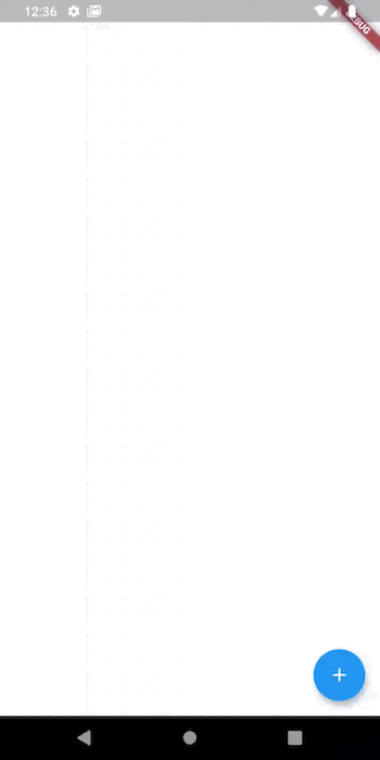
To implement the container transform, we can use the OpenContainer widget provided by the animations package. OpenContainer allows us to define the content of the container when it is closed (the initial content) and the content of the container when it is opened. We can also define other properties, such as color and the elevation of the container in both the closed and opened states.
The code for implementing the container transform looks like:
void main() {
  runApp(
    MaterialApp(
      home:TestingContainer(),
    ),
  );
}

class TestingContainer extends StatelessWidget {
  @override
  Widget build(BuildContext context) {
    return Scaffold(
      body: Container(),
      floatingActionButton: OpenContainer(
        closedBuilder: (_, openContainer){
          return FloatingActionButton(
            elevation: 0.0,
            onPressed: openContainer,
            backgroundColor: Colors.blue,
            child: Icon(Icons.add, color: Colors.white),
          );
        },
        openColor: Colors.blue,
        closedElevation: 5.0,
        closedShape: RoundedRectangleBorder(
          borderRadius: BorderRadius.circular(100)
        ),
        closedColor: Colors.blue,
        openBuilder: (_, closeContainer){
          return Scaffold(
            appBar: AppBar(
              backgroundColor: Colors.blue,
              title: Text("Details"),
              leading: IconButton(
                onPressed: closeContainer,
                icon: Icon(Icons.arrow_back, color: Colors.white),
              ),
            ),
            body: (
              ListView.builder(
                itemCount: 10,
                itemBuilder: (_,index){
                  return ListTile(
                    title: Text(index.toString()),
                  );
                }
              )
            ),
          );
        }
      ),
    );
  }
}
As you can see, our OpenContainer has two named parameters (among others) called closedBuilder and openBuilder. Both of these parameters take a function that returns a widget.
The function takes in an object of type BuildContext and a function that either opens the container (in the case of closedBuilder) or that closes the container (in the case of openBuilder). The widget returned in the closedBuilder is the content of the container in its closed state, and the widget returned in the openBuilder is its content in the opened state. The result should be:
According to the docs, “The shared axis pattern is used for transitions between UI elements that have a spatial or navigational relationship. This pattern uses a shared transformation on the x, y, or z axis to reinforce the relationship between elements.” So if you need to animate the navigation along a particular axis, the shared axis transition pattern is the one for you.
You can get a better idea of what I mean by watching the animation in action on the package docs page.For the implementation of the shared axis transition pattern, the animations package provides us with the PageTransitionSwitcher and the SharedAxisTransition widgets.
The PageTransitionSwitcher widget simply transitions from an old child to a new child when its child changes. You should always give each child of the PageTransitionSwitcher a unique key so that Flutter knows the widget now has a new child. This can easily be done with a UniqueKey object.
Aside from the child parameter, the PageTransitionSwitcher also has other named parameters: duration, for setting the duration of the transition; reverse, which takes a Boolean value and decides whether or not the transition should be “played backwards”; and transitionBuilder, which takes a function that will return a widget.
In our case, we will return a SharedAxisTransition widget. In the SharedAxisTransition widget, we can set the transitionType (whether we want to transition along the x-axis, y-axis, or z-axis). We also have the animation and secondaryAnimation parameters, which define the animation that drives the child’s entrance and exit and the animation that drives the transition of a new child on top of the old one, respectively.
The code for implementing the SharedAxisTransition looks like this:
void main() {
  runApp(
    MaterialApp(
     home: TestingSharedAxis(),
    ),
  );
}

class TestingSharedAxis extends StatefulWidget {
  @override
  _TestingSharedAxisState createState() => _TestingSharedAxisState();
}
class _TestingSharedAxisState extends State<TestingSharedAxis> {
  bool _onFirstPage = true;
  @override
  Widget build(BuildContext context) {
    return Scaffold(
      resizeToAvoidBottomInset: false,
      body: SafeArea(
        child: Column(
          children: <Widget>[
            Padding(
              padding: const EdgeInsets.all(8.0),
              child: Row(
                mainAxisAlignment: MainAxisAlignment.spaceBetween,
                children: <Widget>[
                  FlatButton(
                      onPressed: _onFirstPage == true
                          ? null
                          : () {
                              setState(() {
                                _onFirstPage = true;
                              });
                            },
                      child: Text(
                        "First Page",
                        style: TextStyle(
                            color: _onFirstPage == true
                                ? Colors.blue.withOpacity(0.5)
                                : Colors.blue),
                      )),
                  FlatButton(
                      onPressed: _onFirstPage == false
                          ? null
                          : () {
                              setState(() {
                                _onFirstPage = false;
                              });
                            },
                      child: Text(
                        "Second Page",
                        style: TextStyle(
                            color: _onFirstPage == false
                                ? Colors.red.withOpacity(0.5)
                                : Colors.red),
                      ))
                ],
              ),
            ),
            Expanded(
              child: PageTransitionSwitcher(
                duration: const Duration(milliseconds: 300),
                reverse: !_onFirstPage,
                transitionBuilder: (Widget child, Animation<double> animation,
                    Animation<double> secondaryAnimation) {
                  return SharedAxisTransition(
                    child: child,
                    animation: animation,
                    secondaryAnimation: secondaryAnimation,
                    transitionType: SharedAxisTransitionType.horizontal,
                  );
                },
                child: _onFirstPage
                    ? Container(
                        key: UniqueKey(),
                        color: Colors.blue,
                        child: Align(
                          alignment: Alignment.topCenter,
                          child: Text("FIRST PAGE"),
                        ),
                      )
                    : Container(
                        key: UniqueKey(),
                        color: Colors.red,
                        child: Align(
                          alignment: Alignment.topCenter,
                          child: Text("SECOND PAGE"),
                        ),
                      ),
              ),
            ),
          ],
        ),
      ),
    );
  }
}
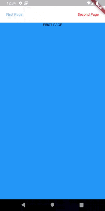
In the code block above, we defined a private Boolean variable called _onFirstPage, which is true if we are on the first page and false otherwise. We also used the value of _onFirstPage to define the value for the reverse parameter of the PageTransitionSwitcher. This allows the PageTransitionSwitcher to “pop” the second page off when switching back to the first page.
The result should look something like this:
The fade through transition pattern is used to transition between UI elements that are not strongly related to one another. Check out the docs page to see how this transition pattern looks.
The implementation of the fade through transition pattern is very similar to that of the shared axis transition pattern. Here, FadeThroughTransition is used instead of SharedAxisTransition. Here’s the code for a simple implementation of the fade through pattern in Flutter with the animations package:
void main() {
  runApp(
    MaterialApp(
     home: TestingFadeThrough(),
    ),
  );
}

class TestingFadeThrough extends StatefulWidget {
  @override
  _TestingFadeThroughState createState() => _TestingFadeThroughState();
}
class _TestingFadeThroughState extends State<TestingFadeThrough> {
  int pageIndex = 0;
  List<Widget> pageList = <Widget>[
    Container(key: UniqueKey(),color:Colors.red),
    Container(key: UniqueKey(),color: Colors.blue),
    Container(key: UniqueKey(),color:Colors.green)
  ];

  @override
  Widget build(BuildContext context) {
    return Scaffold(
      appBar: AppBar(title: const Text('Testing Fade Through')),
      body: PageTransitionSwitcher(
        transitionBuilder: (
          Widget child,
          Animation<double> animation,
          Animation<double> secondaryAnimation
        ){
          return FadeThroughTransition(
            animation: animation,
            secondaryAnimation: secondaryAnimation,
            child: child,
          );
        },
        child: pageList[pageIndex],
      ),
      bottomNavigationBar: BottomNavigationBar(
        currentIndex: pageIndex,
        onTap: (int newValue) {
          setState(() {
            pageIndex = newValue;
          });
        },
        items: const <BottomNavigationBarItem>[
          BottomNavigationBarItem(
            icon: Icon(Icons.looks_one),
            title: Text('First Page'),
          ),
          BottomNavigationBarItem(
            icon: Icon(Icons.looks_two),
            title: Text('Second Page'),
          ),
          BottomNavigationBarItem(
            icon: Icon(Icons.looks_3),
            title: Text('Third Page'),
          ),
        ],
      ),

    );
  }
}
What we are doing here is pretty basic; we are rendering a new child depending on the index of the BottomNavigationBarItem that is currently selected. Notice that each child has a unique key. Like I said earlier, this allows Flutter to differentiate between the different children. Here’s what the result should look like:

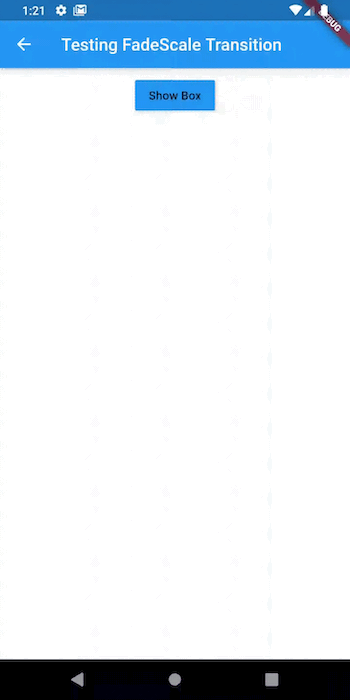
This transition pattern is used when an element needs to transition in (enter) or transition out (exit) of the screen, such as in the case of a modal or dialog.
To implement this in Flutter, we will have to make use of the FadeScaleTransition and an AnimationController to control the entrance and exit of the transition’s child. We will make use of our AnimationController status to determine whether to show the child widget or hide it.
Here’s what an implementation of the fade transition looks like in code:
void main() {
  runApp(
    MaterialApp(
     home: TestingFadeScale(),
    ),
  );
}

class TestingFadeScale extends StatefulWidget {
  @override
  _TestingFadeScaleState createState() => _TestingFadeScaleState();
}
class _TestingFadeScaleState extends State<TestingFadeScale>
    with SingleTickerProviderStateMixin {
  AnimationController _controller;
  @override
  void initState() {
    _controller = AnimationController(
        value: 0.0,
        duration: const Duration(milliseconds: 500),
        reverseDuration: const Duration(milliseconds: 250),
        vsync: this)
      ..addStatusListener((status) {
        setState(() {});
      });
    super.initState();
  }
  @override
  void dispose() {
    _controller.dispose();
    super.dispose();
  }
  bool get _isAnimationRunningForwardsOrComplete {
    switch (_controller.status) {
      case AnimationStatus.forward:
      case AnimationStatus.completed:
        return true;
      case AnimationStatus.reverse:
      case AnimationStatus.dismissed:
        return false;
    }
    return null;
  }
  @override
  Widget build(BuildContext context) {
    return Scaffold(
      appBar: AppBar(
        title: const Text('Testing FadeScale Transition'),
      ),
      body: Column(
        children: <Widget>[
          Padding(
            padding: const EdgeInsets.all(8.0),
            child: Row(
              mainAxisAlignment: MainAxisAlignment.center,
              children: <Widget>[
                RaisedButton(
                  onPressed: () {
                    if (_isAnimationRunningForwardsOrComplete) {
                      _controller.reverse();
                    } else {
                      _controller.forward();
                    }
                  },
                  color: Colors.blue,
                  child: Text(_isAnimationRunningForwardsOrComplete
                      ? 'Hide Box'
                      : 'Show Box'),
                )
              ],
            ),
          ),
          AnimatedBuilder(
            animation: _controller,
            builder: (context, child) {
              return FadeScaleTransition(animation: _controller, child: child);
            },
            child: Container(
              height: 200,
              width: 200,
              color: Colors.blue,
            ),
          ),
        ],
      ),
    );
  }
}
As you can see, the FadeScaleTransition widget has a named parameter called animation, which takes in an AnimationController. The result should look like this:
showModal functionThe animations package also comes with an appropriately named function called showModal, which (as the name suggests) is used to display a modal.
showModal takes in various arguments, some of which include: context, which is used to locate the Navigator for the modal; builder, which is a function that returns the contents of the modal; and configuration.
The configuration parameter takes in a widget that extends the ModalConfiguration class, and it is used to define the properties of the modal, such as the color of the barrier (parts of the screen not covered by the modal), duration, enter and exit transitions, and so on.
Here’s what the showModal function looks like in code:
void main() {
  runApp(
    MaterialApp(
      home: TestingShowModal(),
    ),
  );
}


class TestingShowModal extends StatelessWidget {
  @override
  Widget build(BuildContext context) {
    timeDilation = 20;
    return Scaffold(
      body: Center(
        child: RaisedButton(
          color: Colors.blue,
          child: Text(
            "Show Modal",
            style: TextStyle(
              color: Colors.white
            ),
          ),
          onPressed: (){
            showModal(
              context: context,
              configuration: FadeScaleTransitionConfiguration(),
              builder: (context){
                return AlertDialog(
                  title: Text("Modal title"),
                  content: Text("This is the modal content"),
                );
              }
            );
          }
        ),
      ),
    );
  }
}
In the code block above, we used the FadeScaleTransitionConfiguration as our configuration argument. The FadeScaleTransitionConfiguration is a predefined class that extends ModalConfiguration and is used to add the properties of a fade transition to our modal.
With the SharedAxisPageTransitionsBuilder, FadeThroughPageTransitionsBuilder, and the pageTransitionsTheme parameter of our MaterialApp theme, we can override the default transition animation that occurs when we switch from one route to another in our Flutter app.
To do this with the SharedAxisPageTransitionsBuilder:
void main() {
  runApp(
    MaterialApp(
      theme: ThemeData(
        pageTransitionsTheme: const PageTransitionsTheme(
          builders: <TargetPlatform, PageTransitionsBuilder>{
            TargetPlatform.android: SharedAxisPageTransitionsBuilder(
                transitionType: SharedAxisTransitionType.horizontal),
          },
        ),
      ),
      home: HomePage(),
    ),
  );
}
And to do this with FadeThroughPageTransitionsBuilder:
void main() {
  runApp(
    MaterialApp(
      theme: ThemeData(
        pageTransitionsTheme: const PageTransitionsTheme(
          builders: <TargetPlatform, PageTransitionsBuilder>{
            TargetPlatform.android: FadeThroughPageTransitionsBuilder()
          },
        ),
      ),
      home: HomePage(),
    ),
  );
}
As I have shown you, the animations package is great for adding useful UI interactions and transitions to your Flutter app. You can get the full source code of the examples shown here.
Install LogRocket via npm or script tag. LogRocket.init() must be called client-side, not
server-side
$ npm i --save logrocket

// Code:

import LogRocket from 'logrocket';
LogRocket.init('app/id');
// Add to your HTML:

<script src="https://cdn.lr-ingest.com/LogRocket.min.js"></script>
<script>window.LogRocket && window.LogRocket.init('app/id');</script>
Hey there, want to help make our blog better?
Join LogRocket’s Content Advisory Board. You’ll help inform the type of content we create and get access to exclusive meetups, social accreditation, and swag.
Sign up now
This guide walks you through creating a web UI for an AI agent that browses, clicks, and extracts info from websites powered by Stagehand and Gemini.
This guide explores how to use Anthropic’s Claude 4 models, including Opus 4 and Sonnet 4, to build AI-powered applications.

Which AI frontend dev tool reigns supreme in July 2025? Check out our power rankings and use our interactive comparison tool to find out.

Learn how OpenAPI can automate API client generation to save time, reduce bugs, and streamline how your frontend app talks to backend APIs.

 Learn more →
