
Editor’s note: This article was last updated by Saleh Mubashar in February 2025 to include the new scroll-state CSS feature, which was released in January 2025.
Interactive user interface features, like scroll-aware UI state, can improve website user experience but often pose challenges regarding performance optimization. This is largely because most interactive UI functionalities are implemented using JavaScript.
CSS-only solutions can reduce the workload on the rendering pipeline when compared to JavaScript, which works on the main thread. However, there are limitations to what can be achieved solely with CSS.
In this article, we’ll explore how animation-timeline enables scroll-linked animations without JavaScript and discuss how it can help strike a balance between the level of interactivity and system performance. We’ll also touch on the new scroll-state container queries, which allow styling elements based on their scroll behavior.
The Replay is a weekly newsletter for dev and engineering leaders.
Delivered once a week, it's your curated guide to the most important conversations around frontend dev, emerging AI tools, and the state of modern software.
Scroll-aware user interface state enables developers to create native-like interactivity on web interfaces. This is a popular approach for improving website user experience.
“Scroll-aware state” may seem like an obscure term, but it’s just a fancy way of saying “scroll-driven UI” — it’s a UX pattern that responds dynamically and adaptively to the user’s scrolling action on a webpage.
Here’s an example of how a scroll-aware UI looks and behaves:

This UX pattern is often used in combination with JavaScript APIs such as the Intersection Observer API, or third-party packages to monitor, calculate, and store the state of a user’s scroll progress and position. This position can then trigger CSS animations or styles that transform the appearance, behavior, or visibility of elements or components on a webpage.
Scroll-driven UI designs can be as simple as a scroll-snap, fixed positioning, or even a parallax effect made solely with CSS. They can also be more complex. With the recent additions to the CSS scroll-driven animation specification, it’s now possible to achieve the same results as complex animations made with JavaScript using only CSS.
A scroll-aware UI can range from a simple scroll-snap effect to an element that gets animated when it is scrolled into view by a user or when a user scrubs forward or backward in direct response. There are several ways to implement this kind of UX pattern.
A simple scroll-snap is the most common type of scroll-aware UI. Implementing this effect is as easy as adding a scroll-snap-type: y or position: fixed one-liner property to a container to get a result like this:
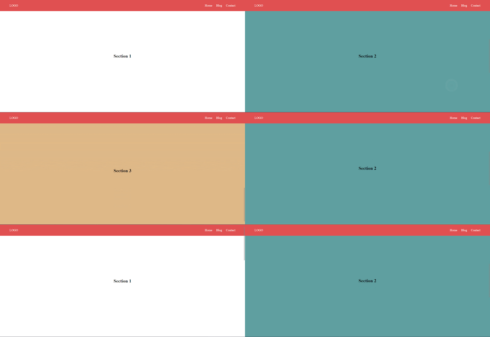
This type of scroll-aware UI is simple to implement, but there’s far more you can do beyond our basic example. For a more comprehensive understanding of how these properties work and how to use them, check out “How to style scroll snap points with CSS” and “Build a custom sticky navbar with CSS.”
The latter example is not an easy case of slapping a CSS property to a container; it requires calculating a user’s scroll distance on a webpage and detecting when an element comes into view. CSS is not capable of such functionality, so scroll-driven animations with CSS are basically an impossible feat — or were at the time that article was written.
A new set of APIs that work in conjunction with the Web Animation API (WAAPI) and the CSS Animations API were recently introduced to the CSS scroll-driven animations specification to facilitate the implementation of declarative scroll-driven animations using only CSS. These APIs are an addition to the list of animation timeline property values that provide a new and accessible way of controlling the progress of CSS animations:
To understand how these timelines work, let’s first look at what an animation timeline entails.
animation-timeline propertyThe CSS animation-timeline property is used to specify the timeline that controls the progress of a CSS animation. Before the introduction of the scroll and view progress timelines, we only had access to the default document timeline.
The document timeline was brittle, lacked customization options, and progressed continuously from the webpage’s initial load. Webpage animations automatically started when the page loaded, and continued for the specified animation duration. Before the availability of scroll and view progress timelines, there was no flexibility to control this behavior.
The animation-timeline property accepts any of the following values: scroll(), view(), or auto, and is assigned to an element that has an animation preset. For example, to rotate a box element when a user scrolls up or down the webpage, you’d have an animation preset like the following before adding the animate-timeline property and a specific value:
  #box {
    animation-name: box;
    animation-direction: alternate;
    /* animation timeline with any of the accepted values */
  }

  @keyframes box {
    from {
      transform: rotate(0deg);
    }
    to {
      transform: rotate(360deg);
    }
  }
This will cause the box to animate as expected, but it will use the specified timeline instead of the default document timeline:

The scroll progress timeline operates based on the scroll position of a scrollable element, which may be referred to as a scrollport, scroller, or source. Since the timeline is tied to the container of the animating element, its timing progresses only when the container’s scroll position undergoes changes.
The container’s scroll position is indicated in percentages, with the initial scroll position represented as 0% and the end scroll position as 100%. This is in contrast to the default document timeline, which continues progressing either for the specified duration or for the duration that the webpage remains open (if no duration is specified).
There are two ways to define a scroll timeline:
The anonymous method is the default method and the quickest way to define a scroll timeline. If you use the scroll() function and assign it as the value for the animation-timeline property, the scroll progress timeline will select the nearest scroller ancestor and leverage its timeline:
animation-timeline: scroll();
The scroll() function accepts two optional arguments: <scroller> and <axis>. The <scroller> argument is used to reference the source (i.e., the scrollable element or container) and its scroll position that will drive the progress of the timeline. Here are its accepted values:
nearest: Selects the nearest scrollable ancestor of the current elementroot: Selects the root element of the document, such as the <html> elementself: Selects the current element itself, if it is scrollableThe <axis> argument is used to specify the scrollbar direction that will be used to provide the timeline. Here are its accepted values:
block: Uses the measure of progress along the block axis of the scroll containerinline: Uses the measure of progress along the inline axis of the scroll containery: Uses the measure of progress along the vertical axis of the scroll containerx: Uses the measure of progress along the horizontal axis of the scroll containerThe scroll() function’s default value uses the nearest scroller and block axis values:
animation-timeline: scroll(nearest block);
The above code will bind the animation to the root scroller on the block axis.
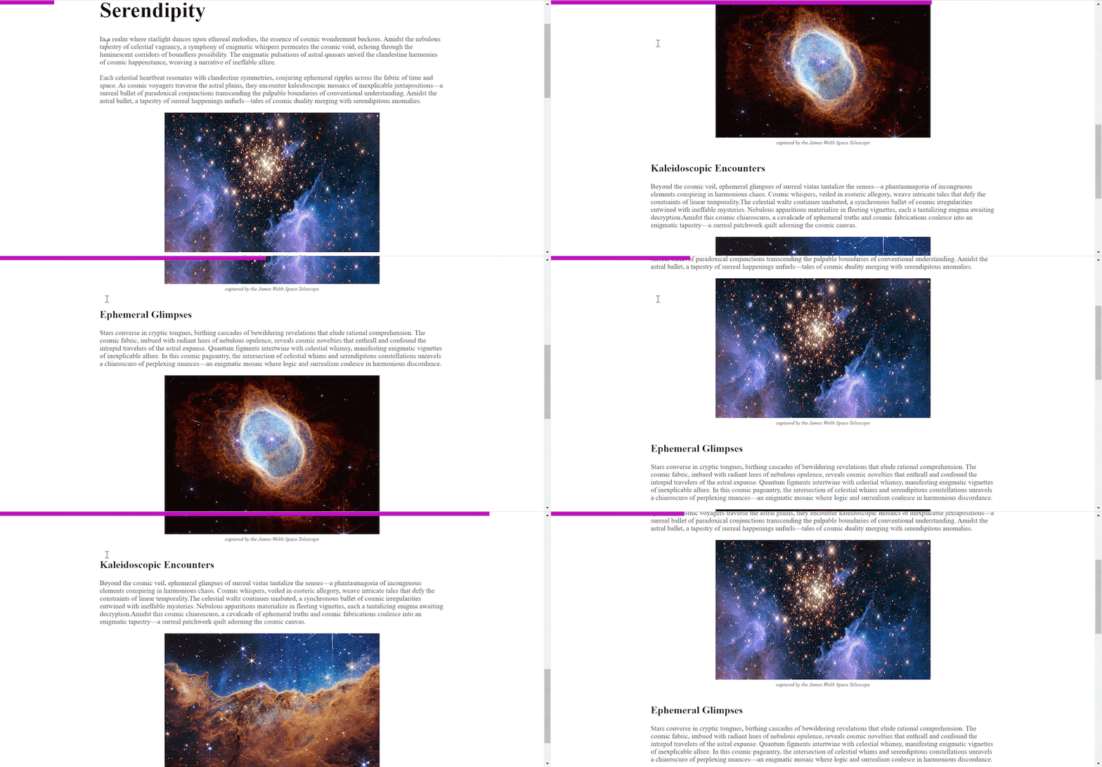
The scroll progress timeline can be used for different scroll-aware designs, but the most practical use case is a reading progress indicator. This is easy to create using the anonymous scroll progress timeline, like so:
    <main>
      <section>
          <article>
          ...
        </article>
      </section>
      <div id="progress"></div>
    </main>

#progress{
    width: 100%;
    height: 10px;
    background-color: #c00bc0;
    position: fixed;
    top: 0;
    left: 0;

    transform-origin: 0 50%;
    animation: progress linear;
    animation-timeline: scroll();
}
In this code, we fix the reading progress indicator to the top of the viewport and scale it forward and backward on the x-axis based on the scroller’s position. Here’s the result:
The named scroll position timeline offers explicit control over scroller selection. Instead of relying on automatic lookup by the API, it allows you to assign unique identifiers, or names, to specific containers with scrollbars.
This approach aids in pinpointing and utilizing the scroll progress timeline of the identified container. This method is especially useful in cases where the webpage has multiple timelines and the anonymous automatic lookup doesn’t suffice.
To implement a named scroll position timeline, set the scroll-timeline-name property on the desired scroll container with a name value of your choice. Ensure the value has a -- prefix, like so:
scroll-timeline-name: --my-timeline;
Similar to the anonymous scroll timeline, you can adjust the axis using the scroll-timeline-axis property. This property uses the same values as the <axis> argument in the anonymous method:
scroll-timeline-axis: block;
Unlike the animation-timeline property, you can combine the scroll-timeline-name and scroll-timeline-axis properties into a single shorthand property: scroll-timeline. This means you can define both properties at the same time, instead of having to do so separately.
Here’s an example that demonstrates how named scroll progress works:
.source {
    scroll-timeline-name: --my-timeline;
    scroll-timeline-axis: inline;
  }
You can simply write:
.source {
    scroll-timeline: --my-timeline inline;
  }
You can update the base markup of the previous demo and add another scroll container to the page:
<div id="galaxies" style="--num-images: 3">
  <div id="galaxy-container">
    <div class="galaxy_progress"></div>
    <div class="andromenda galaxy_entry">
      <img src="./andromeda.jpg" />
    </div>
    <div class="pinwheel galaxy_entry">
      <img src="./pinwheel.jpg" />
    </div>
    <div class="milky-way galaxy_entry">
      <img src="./milky.jpg" />
    </div>
  </div>
</div>
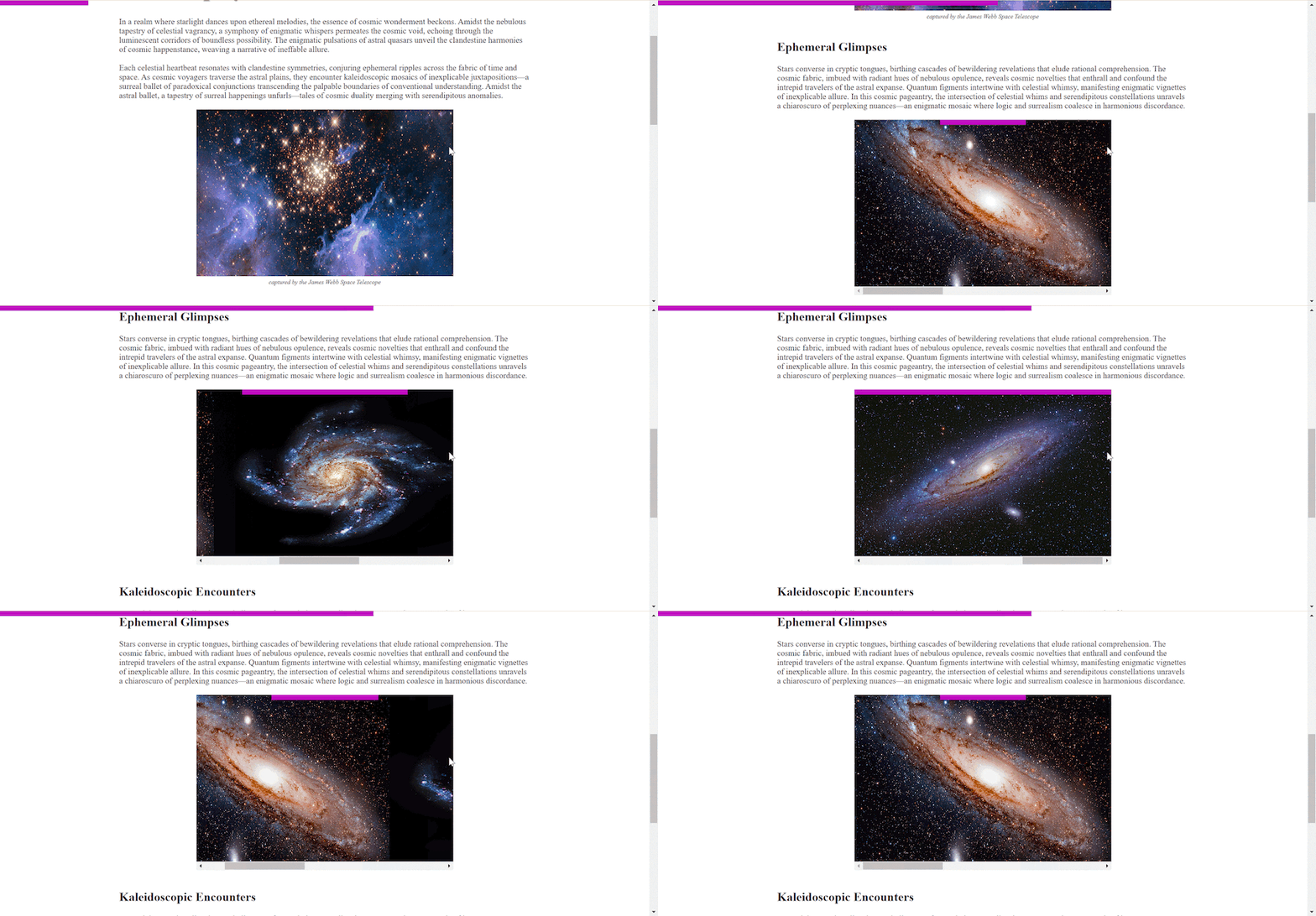
In this code, we create a galaxy-container with three child images and a galaxy_progres element, which will be positioned absolute to the galaxies container.
Next, let’s give the galaxy-container an identifier and an inline axis using the scroll-timeline shorthand property. Then, we’ll attach it to an animating element (this case, the galaxy_progress element) using the animation-timeline property:
#galaxy-container{
    overflow-x: scroll;
    scroll-snap-type: x mandatory;
    display: flex;
    scroll-timeline: --galaxies inline;
}

@keyframes galaxies_animation {
    to { transform: scaleX(1); }
  }

.galaxy_progress {
    position: absolute;
    top: 0;
    left: 0;
    width: 500px;
    height: 10px;
    background-color: #c00bc0;
    transform: scaleX(calc(1 / var(--num-images)));

    animation: auto galaxies_animation linear forwards;
    animation-timeline: --galaxies;
  }
Here we set an identifier, --inner_timeline, to the .inner-container and reference it with the animation-timeline property on the .gallery-progress animation. Here’s the result:
It may seem counterintuitive to use a named scroll progress timeline here since an anonymous progress timeline could have easily used the nearest ancestor container with a scrollbar using the scroll(nearest inline) argument (the .inner-container, in this case).
But, since the .gallery-progress is absolutely positioned, the animation timeline would have skipped the .inner-container and used the root scroller, which is the nearest ancestor that is relatively positioned.
The nearest argument considers the element that can affect its size and position. Since the .gallery-progress element is absolutely positioned, and its nearest parent is not relatively positioned, it will jump to the nearest ancestor that is relatively positioned and use its timeline.
The default behavior of animations linked to the scroll and view timeline is to attach to the entire page’s range. For the scroll timeline, this spans from 0% to 100% scrolled. For the view timeline, it covers the period from an element’s initial visibility at one edge to its appearance at the opposite edge.
The animation-range property comes into play when you need to customize these values and override the default behavior. You can use the animation-range property to bind a scroll or view timeline animation to specific start and end ranges on the timeline:
animation-range: <range-start> <range-end>;
If you only want an animation to run for the first 40% of the webpage and end at 80%, you can define it as follows:
animation-range: 40% 80%;
The animation-range can also be specified in view height (vh) values, like so:
animation-range: 40vh 80vh;
The animation-range property accepts different values depending on the timeline it is used with. The example above will only work for the scroll progress timeline, as the specified values are within the range of the scroll progress timeline’s start and end values. We’ll look at how to define an animation range for the view progress timeline later in this article.
The view progress timeline is also linked to the scroll position of a container but in relation to an element’s progress within the container. Simply put, it’s the relative position of the element in the scroller that determines the progress of the timeline. The timeline progress begins the moment an element first intersects with the scroller and ends when the element no longer intersects the scroller.
The view progress timeline is similar to the Intersection Observer API in JavaScript. You can use both the anonymous and names methods to create the view progress timeline.
To create an anonymous view progress timeline, you’ll use the view() function and pass it as the animation-timeline value:
animation-timeline: view();
The view() function accepts the <axis> argument and an optional <view-timeline-inset> argument. The <axis> argument is identical to that used in the scroll() function; it is used to define which axis to track, and it accepts the same values.
The <view-timeline-inset> argument is used to specify an offset value to adjust the bounds when an element is considered to be in (or outside of) the view. The offset value can be positive or negative.
It’s easy to add a view progress timeline to any webpage animation using the anonymous method. As an example, you can use the following code to make the images on our demo page fade in when they’re scrolled into view:
@keyframes image-reveal {
    from {
        opacity: 0;
        clip-path: inset(0% 30% 0% 30%);
     }
    to {
        opacity: 1;
        clip-path: inset(0% 0% 0% 0%);
    }
  }

  .images {
    animation: image-reveal both;
    animation-timeline: view();
  }
With this simple code, every image element on the webpage fades in as it intersects with the viewport:
You can create a named view timeline using the same method employed for the scroll timeline. Just set an identifier (or name) and an axis with the same properties and values, but replace the scroll prefix with view:
.nested-container{
    view-timeline-name: --image-reveal;
    view-timeline-axis: block;
}

@keyframes image-reveal {
    from {
        opacity: 0;
        clip-path: inset(0% 30% 0% 30%);
     }
    to {
        opacity: 1;
        clip-path: inset(0% 0% 0% 0%);
    }
  }


.nested-images{
    animation: image-reveal both;
    animation-timeline: --image-reveal;
  }
This code will create the same visual output as the anonymous method but for the nested scroller and its child images.
The animation range value varies depending on the timeline in use. In the case of the view timeline, it accepts a range name value rather than a percentage value. Here are the acceptable range name values for the view timeline:
cover: Sets the view timeline range to values that ensure the element is fully covered by the scroller during the view timelineentry: Sets the start value of the view timeline range to 0% and sets the end value to the percentage of the element’s visibility when it’s inside the scrollerexit: Sets the start value of the view timeline range to the percentage of the element’s visibility when it’s inside the scroller and sets the end value to 100%entry-crossing: Sets the start value and end value of the view timeline range to the percentage of the element’s visibility when it is first visible at one edge of the scroller and when it is fully visible inside the scroller, respectivelyexit-crossing: Sets the start value and end value of the view timeline range to the percentage of the element’s visibility when it‘s inside the scroller and when it reaches the opposite edge of the scrollbar, respectivelycontain: Specifies that the animation will start and end within the bounds of the scrollportThese range names are often combined with a range offset when defining the range-start and range-end values for the animation-range property. The range offset is a percentage value that is used to determine the position of an element in relation to the range name it is combined with.
For example, if you want it to intersect with the scrollport, set the range-start value to entry 50%. This way, the animation will start and progress to 50% before it enters the viewport. The same approach applies to the range-end value:
animation-range: entry 25% cover 50%;
Chrome 133 introduces scroll state container queries. This makes it super easy to style elements based on their scroll-related states — such as when an element becomes sticky, snaps into place, or overflows — without relying on JavaScript or animation-timeline. With scroll state container queries, you can now directly query and respond to an element’s scroll state in CSS.
To get started, define the container using a new value for the container-type property:
.container {
  container-type: scroll-state;
}
Next, select the child or element within that container to apply your styles:
@container scroll-state(<scroll-state-type> : <scroll-state>)
The scroll-state-type defines the category, while scroll-state represents its value. The possible types are:
And it can be used like this:
> .child {
  @container scroll-state(stuck: top) {
    /* Styles */
  }
}
In this example, the styles are applied to the .child element once it reaches (or is scrolled to) the top.
The stuck feature checks if a sticky container is fixed to a specific edge (e.g., top, left, block-start, or inline-end). Multiple values can match across axes (e.g., top and left), but not along the same axis (e.g., left and right). This only works if the position of the element is sticky. For example:
@container scroll-state((stuck: top) and (stuck: left)) { ... }
A common use case is adding shadows or changing styles for a navbar once it becomes stuck at the top. Previously, JavaScript was needed to toggle classes and check if the navbar was sticky.
For example, to add a shadow to a sticky navigation bar:
.nav-container {
  container-type: scroll-state;
  position: sticky;
  top: 0;

  > nav {
    transition: box-shadow 0.5s ease;
    @container scroll-state(stuck: top) {
      box-shadow: 1px solid #f1f1f1;
    }
  }
}
You can view the live demo here.
The snapped feature checks whether an element is aligned to a scroll-snap point within a snap container on a given axis. It works with snap containers that use CSS scroll snap, allowing you to style elements when they become the active snap target. The query values can specify the snap direction, such as x for horizontal snapping, y for vertical snapping, block for snapping in the block direction, or inline for snapping in the inline direction of the container.
To use the snapped feature, you need three elements:
scroll-snap-typescroll-snap-align and container-type: scroll-stateOne common use case is highlighting the currently visible item in a carousel, making it stand out from the rest. This can be done by dimming the non-snapped items or adding a style to the currently snapped ones. You can view a great demo of this made by the Chrome team, but first, let’s understand the code.
We start by setting up the scroll container with horizontal snapping:
section {
  overflow: auto hidden;
  scroll-snap-type: x mandatory;
}
Next, make the snap target a scroll-state container, enabling it to be queried for its snap state. Use scroll-snap-align: center to center the item when snapped:
section {
  overflow: auto hidden;
  scroll-snap-type: x mandatory;

  > article {
    container-type: scroll-state;
    scroll-snap-align: center;
  }
}
Finally, target the child elements of the snap target and set a transition for opacity. Using not scroll-state(snapped: x), reduce the opacity of items that are not currently snapped, effectively dimming them:
@container not scroll-state(snapped: x) {
  opacity: .25;
}
The scrollable feature checks if a scroll container has overflow content that can be reached through user-initiated scrolling. This allows you to style elements based on the scrollability of their container, such as showing shadows or indicators when scrolling is possible. The values are top, right, bottom, and left.
A common use case is to indicate scrollable areas with shadows. For example, this snippet animates shadows at the top and bottom when scrolling is possible:
@container scroll-state(scrollable: bottom) {
    --shadow-opacity: var(-shadow-color-opacity, 25%);
}
I have not gone into too much detail as scroll-state is not the primary focus of this article. However, if you need some more inspiration, check out these cool demos provided by the Chrome team.
Browser compatibility is a significant issue that you’ll encounter when implementing scroll-aware UI via CSS. Most of the new CSS APIs, and even some old ones, that provide an improved scope for scroll-aware UI design, are still experimental and do not yet have widespread support across different browsers. Both animation-timeline and seroll-state are fairly new and not compatible across the board just yet.
For example, at the time of writing, the scroll and view APIs are currently supported only in Chromium-based browsers as well as on Firefox browsers behind a feature flag. Similarly, scroll-state was introduced in February 2024 with Chrome 133, so there’s a long way to go before it is widely accepted.
One way to counteract browser limitations is using the @supports at-rule. This will run the CSS only when a particular condition is met. In this case, we can check whether a CSS property is supported or not.
@supports (container-type: scroll-state){}
Also, remember to keep accessibility in mind. Reduced motion preferences should be honored:
@media (prefers-reduced-motion: no-preference) {}
Another limitation is the performance and accessibility concerns that often arise when dealing with scroll-driven animations. The complexity and frequency of animations can lead to issues such as jank, lag, or even battery drain on certain devices. Furthermore, these animations can interfere with user scrolling experience as well as accessibility tools like screen readers and keyboard navigation.
One approach to mitigate these issues is to optimize the animations to ensure smooth performance without compromising user experience. Additionally, providing options to disable animations can enhance accessibility for users who might find them disruptive.
Another effective strategy is to use JavaScript polyfills. Polyfills extend the functionality of CSS features, allowing them to work in browsers that do not have native support. You can use JavaScript polyfills to improve compatibility and ensure that scroll-driven animations work consistently across different browsers.
The new CSS features for scroll-driven animations are powerful and declarative, but they are not yet widely supported by all browsers. To ensure cross-browser compatibility and accessibility, you can use JavaScript to enhance or polyfill the scroll-driven animations.
Several libraries and frameworks can help with this task, such as ScrollTrigger, ScrollMagic, Motion, and the good ol’ Intersection Observer API. These tools provide more options and flexibility to create complex and interactive scroll-driven animations with ease.
The concept of scroll-aware UI refers to various interactive elements on a webpage that dynamically adjust, stick, or snap into position as the scrollbar thumb moves. In this article, we explored building scroll-aware UI with only CSS using both animation-timeline and scroll-state in order to provide more interactivity and better user experience without negatively impacting system performance.
There are many ways to implement scroll-aware designs for your web applications. The possibilities are virtually endless, limited only by one’s imagination.
Happy hacking!
As web frontends get increasingly complex, resource-greedy features demand more and more from the browser. If you’re interested in monitoring and tracking client-side CPU usage, memory usage, and more for all of your users in production, try LogRocket.

LogRocket lets you replay user sessions, eliminating guesswork around why bugs happen by showing exactly what users experienced. It captures console logs, errors, network requests, and pixel-perfect DOM recordings — compatible with all frameworks.
LogRocket's Galileo AI watches sessions for you, instantly identifying and explaining user struggles with automated monitoring of your entire product experience.
Modernize how you debug web and mobile apps — start monitoring for free.

Why the future of DX might come from the web platform itself, not more tools or frameworks.

A hands-on test of Claude Code Review across real PRs, breaking down what it flagged, what slipped through, and how the pipeline actually performs in practice.
CSS art once made frontend feel playful and accessible. Here’s why it faded as the web became more practical and prestige-driven.

Learn how inline props break React.memo, trigger unnecessary re-renders, and hurt React performance — plus how to fix them.
Would you be interested in joining LogRocket's developer community?
Join LogRocket’s Content Advisory Board. You’ll help inform the type of content we create and get access to exclusive meetups, social accreditation, and swag.
Sign up now