react-native-picker-selectEditor’s note: This post was updated 27 January 2022 to improve the implementation of additional Android props and update the tutorial overall.

A picker is the mobile equivalent of a select element or component that is used to provide a dropdown or multiple choice options.
The React Native core once supported an inbuilt Picker component, but this is deprecated and is not recommended for usage anymore. It is however, recommended to use any of the community packages, and react-native-picker-select is one of these packages.
react-native-picker-select?react-native-picker-select is a React Native picker component that mimics the native select interface for Android and iOS. Although it emulates the native select interface, it allows developers to customize the interface as they see fit.
For iOS, by default, the react-native-picker-select component simply wraps an unstyled TextInput component. The developer is allowed to pass down styles to customize its look and feel. However, for Android, the default picker is used by default.
Android users can force it to use an unstyled TextInput by passing false to the useNativeAndroidPickerStyle prop. Further customization can now be done by passing down styles.
react-native-picker-select is feature-packed and ships with lots of props, which makes it very flexible and powerful. Let’s get started using it in the next section.
As with all npm packages, installation should be straightforward. However, react-native-picker-select comes with a gotcha, especially if you use expo.
To install it, simply run:
npm i react-native-picker-select
That should work, but sometimes you get the error below:
requireNativeComponent "RNCPicker" was not found in the UIManager error
You can resolve this error by running:
// React Native CLI
npm install @react-native-community/picker
npx pod-install

// Expo users
expo install @react-native-community/picker
Depending on your environment, running any of these commands will resolve the issue.
After installation, cd into the app directory and run:
npm install or yarn install
This will install all the needed dependencies. Then run:
npm start or yarn start
This starts a development server for your application, completing our development environment setup.
Now that we’ve set up our environment, we can jump right into how to use the react-native-picker-select library in detail.
react-native-picker-select componentIf you don’t want to go through the hassles of setting up a development environment, I have created a starter app for you. Just clone it by running:
git clone https://github.com/lawrenceagles/react-native-picker-demo
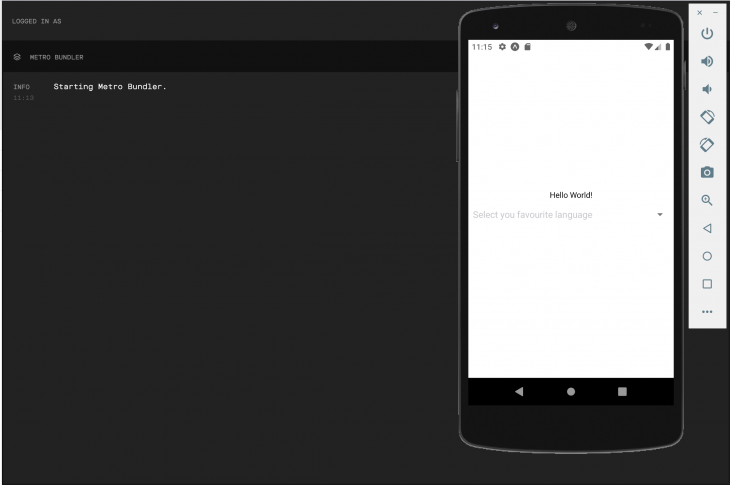
cd into the app folder and start the app as already stated. We are greeted with a hello world and a select component, as seen below.
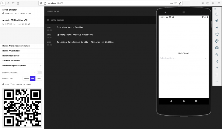
The app above shows the most basic usage of the react-native-picker-select package. Kindly consider the code below:
 import React from "react";
 import RNPickerSelect from "react-native-picker-select";
 import { StyleSheet, Text, View } from "react-native";
 export default function App () {
     return (
         <View style={styles.container}>
             <Text>Hello World!</Text>
             <RNPickerSelect
                 onValueChange={(value) => console.log(value)}
                 items={[
                     { label: "JavaScript", value: "JavaScript" },
                     { label: "TypeScript", value: "TypeScript" },
                     { label: "Python", value: "Python" },
                     { label: "Java", value: "Java" },
                     { label: "C++", value: "C++" },
                     { label: "C", value: "C" },
                 ]}
             />
         </View>
     );
 }
 const styles = StyleSheet.create({
     container : {
         flex            : 1,
         backgroundColor : "#fff",
         alignItems      : "center",
         justifyContent  : "center",
     },
 });
To work with react-native-picker-select, we must import the RNPickerSelect component:
import RNPickerSelect from "react-native-picker-select";
This component is then reused in our code to render the select view. It has myriad props and two of them are required:
items proponValueChange propWe’ll cover each of them now.
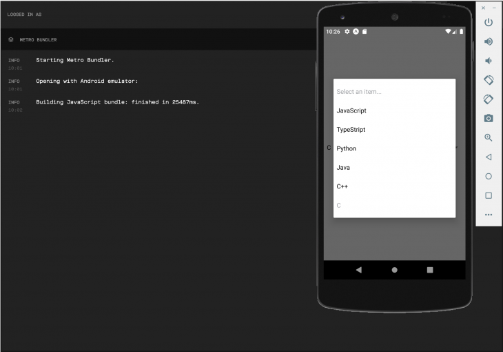
items prop[
{ label: "JavaScript", value: "JavaScript" },
{ label: "TypeScript", value: "TypeScript" },
{ label: "Python", value: "Python" },
{ label: "Java", value: "Java" },
{ label: "C++", value: "C++" },
{ label: "C", value: "C" },
]
This is an array of objects. Each item is an object with a label and value property. The items appear as options rendered to the user when the select component is clicked.
Consider the image below:
onValueChange proponValueChange={(value) => console.log(value)}
This is a callback function that returns the selected value and its index, which is useful because we can do a lot of work with the data returned from this callback.
Right now, we’re just logging the selected value to the console. But we can do some very interesting things with that data, like updating a component’s state.
useState and the items and onValueChange propsWe can set a component’s state with the selected data, as shown in the code below:
onValueChange={(value) => setState(value)}
As a result of this, we can use this data for further computations. Consider the code below:
import React, { useState } from "react";
import RNPickerSelect from "react-native-picker-select";
import { StyleSheet, Text, View } from "react-native";

export default function App () {
    const [ language, setLanguage ] = useState("");
    return (
        <View style={styles.container}>
            <Text>
                {language ?
                  `My favourite language is ${language}` :
                    "Please select a language"
                }
            </Text>
            <RNPickerSelect
                onValueChange={(language) => setLanguage(language)}
                items={[
                    { label: "JavaScript", value: "JavaScript" },
                    { label: "TypeScript", value: "TypeScript" },
                    { label: "Python", value: "Python" },
                    { label: "Java", value: "Java" },
                    { label: "C++", value: "C++" },
                    { label: "C", value: "C" },
                ]}
              style={pickerSelectStyles}
            />
        </View>
    );
}

const styles = StyleSheet.create({
    container: {
        flex: 1,
        backgroundColor: '#fff',
        alignItems: 'center',
        justifyContent: 'center'
    }
});

const pickerSelectStyles = StyleSheet.create({
    inputIOS: {
        fontSize: 16,
        paddingVertical: 12,
        paddingHorizontal: 10,
        borderWidth: 1,
        borderColor: 'gray',
        borderRadius: 4,
        color: 'black',
        paddingRight: 30 // to ensure the text is never behind the icon
    },
    inputAndroid: {
        fontSize: 16,
        paddingHorizontal: 10,
        paddingVertical: 8,
        borderWidth: 0.5,
        borderColor: 'purple',
        borderRadius: 8,
        color: 'black',
        paddingRight: 30 // to ensure the text is never behind the icon
    }
});
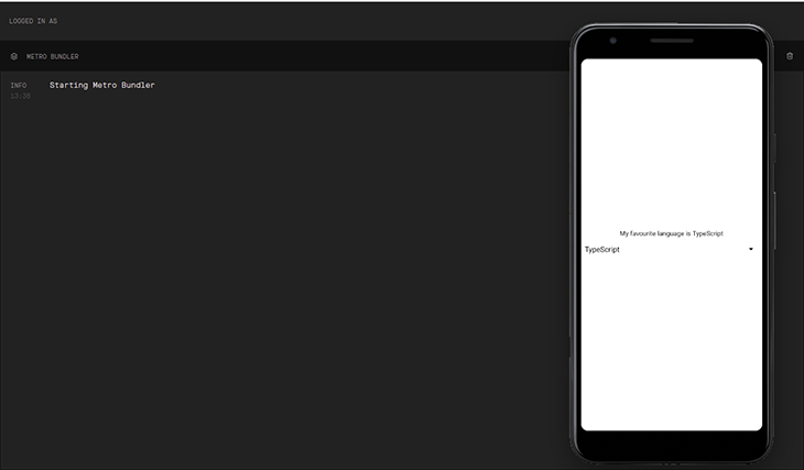
In the code above, when a user selects a value from the select component, we retrieve this value from the onValueChange callback function, and update the language state as seen below:
onValueChange={(language) => setLanguage(language)}
This then triggers a re-render and updates the view with the selected language. However, if no language is selected, a default text is rendered to the user:
<Text>
  {language ? `My favourite language is ${language}` : "Please select a language"}
</Text>
It is important to note that this is just a small application contrived to demonstrate the use of the react-native-picker-select. In complex cases, the data in state can be used for more useful purposes, such as to change the display language of the application.
Consider the image below:
react-native-picker-select propsThere are other optional props but for basic usage, the two above are required. Let’s look at some notable optional props:
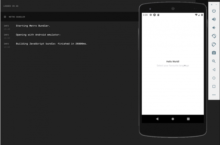
placeholder propuseNativeAndroidPickerStyle propplaceholder propConsider the image below. Before any item is selected, we see the select an item… default value displayed in the select component.
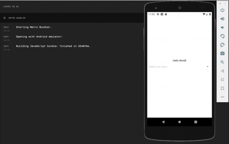
This is the placeholder prop in action. It is an object with both a label and a value property. However, the value of this object is null and the value of the label is "select an item...", as seen below:
{label: "select an item...", value: null } // the placeholder prop
We can make our app more interactive by passing it a custom placeholder object, like this:
<View style={styles.container}>
  <Text>Hello World!</Text>
  <RNPickerSelect
      placeholder={{ label: "Select you favourite language", value: null }}
      onValueChange={(value) => console.log(value)}
      items={[
          { label: "JavaScript", value: "JavaScript" },
          { label: "TypeScript", value: "TypeScript" },
          { label: "Python", value: "Python" },
          { label: "Java", value: "Java" },
          { label: "C++", value: "C++" },
          { label: "C", value: "C" },
      ]}
  />
</View>
This displays a more appropriate message to our users.
You can also disable the placeholder completely. If you would like to do that, just pass an empty object:
placeholder={{}} // disables the placeholder message
useNativeAndroidPickerStyle propThis is an Android-only prop that is specific to Android devices. It takes a boolean value, like we talked about earlier.
By default, react-native-picker-select emulates the native Android select. To prevent this, we can pass false, which forces the rendered select component to use an unstyled TextInput, making it behave more like its iOS counterpart by default.
Consider the code and image below:
<View style={styles.container}>
  <Text>Hello World!</Text>
  <RNPickerSelect
      onValueChange={(value) => console.log(value)}
      useNativeAndroidPickerStyle={false}
      placeholder={{ label: "Select your favourite language", value: null }}
      items={[
          { label: "JavaScript", value: "JavaScript" },
          { label: "TypeScript", value: "TypeScript" },
          { label: "Python", value: "Python" },
          { label: "Java", value: "Java" },
          { label: "C++", value: "C++" },
          { label: "C", value: "C" },
      ]}
  />
</View>
You can get more details on all props here.
react-native-picker-selectreact-native-picker-select features sundry properties that can be targeted for styling. All of these must be nested under the style prop. Some of these properties are platform-specific.
You can style the select component for both iOS and Android devices by targeting the inputIOS and inputAndroid properties, respectively.
Consider the code:
const customPickerStyles = StyleSheet.create({
  inputIOS: {
    fontSize: 14,
    paddingVertical: 10,
    paddingHorizontal: 12,
    borderWidth: 1,
    borderColor: 'green',
    borderRadius: 8,
    color: 'black',
    paddingRight: 30, // to ensure the text is never behind the icon
  },
  inputAndroid: {
    fontSize: 14,
    paddingHorizontal: 10,
    paddingVertical: 8,
    borderWidth: 1,
    borderColor: 'blue',
    borderRadius: 8,
    color: 'black',
    paddingRight: 30, // to ensure the text is never behind the icon
  },
});
This works, but because the iOS select component wraps around the unstyled TextInput by default, it provides a lot more style objects than the Android select component.
Style objects such as inputAndroidContainer, inputAndroid, and placeholder are not available by default for the Android platform. However, you can enable them by passing false to the useNativeAndroidPickerStyle.
You can get more details on styling in the react-native-picker-select documentation and see more styling implementations.
The react-naive-picker-select is a very powerful and easy to use React Native component.
Although it is not a full-blown form handling component, it is great at what it does. And it can make implementing select fields in our React Native applications an easy and fun task.
If you need more information on this awesome component, kindly visit their documentation.

LogRocket's Galileo AI watches sessions for you and and surfaces the technical and usability issues holding back your React Native apps.
LogRocket also helps you increase conversion rates and product usage by showing you exactly how users are interacting with your app. LogRocket's product analytics features surface the reasons why users don't complete a particular flow or don't adopt a new feature.
Start proactively monitoring your React Native apps — try LogRocket for free.
Would you be interested in joining LogRocket's developer community?
Join LogRocket’s Content Advisory Board. You’ll help inform the type of content we create and get access to exclusive meetups, social accreditation, and swag.
Sign up now
Not sure if low-code is right for your next project? This guide breaks down when to use it, when to avoid it, and how to make the right call.

Compare Firebase Studio, Lovable, and Replit for AI-powered app building. Find the best tool for your project needs.

Discover how to use Gemini CLI, Google’s new open-source AI agent that brings Gemini directly to your terminal.

This article explores several proven patterns for writing safer, cleaner, and more readable code in React and TypeScript.

 Learn more →

3 Replies to "How to use <code>react-native-picker-select</code>"
Hi, my picker don’t even show anything – just an arrow at the end and nothing!!!!
No placeholder, if I press it nothing happens.
Help me here!
It is not working in android
Invalid Hook Error on Android.