
Editor’s note: This article was last updated on 8 November 2023 to include advanced techniques to control overflow by using the overflow: clip and overflow-clip-margin properties.
Have you ever encountered a horizontal scroll bar on your screen because your web content didn’t fit? Or opened a modal to find the rest of the page (i.e., the background content) still scrolling? Have you tested your site with a different browser, and found that the page scrolls horizontally?
Chances are, you have. This issue is known as the scrolling overflow problem in CSS. In this article, we will delve into CSS overflow scroll, exploring the root causes of the issue and suggesting ways to effectively solve it.
The Replay is a weekly newsletter for dev and engineering leaders.
Delivered once a week, it's your curated guide to the most important conversations around frontend dev, emerging AI tools, and the state of modern software.
Before we look at what the CSS overflow property is, we first need to understand that everything in CSS is a box. We resize these boxes to fit our desired design by increasing or decreasing the height and width.
In the code and image below, we will outline our root HTML file in red to understand what we mean:
* {
  outline: 1px solid red;
}

The CSS overflow property specifies or controls what should happen to contents that are too large to fit in an element’s box. Content in overflowing boxes is either clipped or hidden, or scrollbars can be added to view the overflowing content.
The property works for both the horizontal and vertical axes. However, note that the property only works for block elements with a specified height and width:

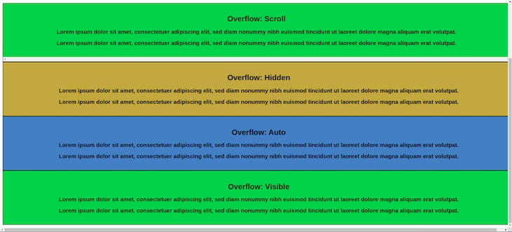
The four boxes above are the four common values of the overflow property. The fifth will be discussed later:
overflow property adds horizontal and vertical scroll bars so you can adjust or scroll the content if it’s too large to fit its boxNow that we have seen and understood what the CSS overflow property is, we can examine what causes the scroll problems, specifically horizontal scrolling issues, and how to fix them.
Viewport width, also known as vw, is one of the units of measurement for length in CSS. Understanding how to use this unit is important because using it incorrectly can cause horizontal scrolling. For example, adding a width of 100vw to page content, means it automatically makes up 100% of the width of the viewport plus the width of the scrollbar.
Ensure that the scrollbar is always visible to indicate that the content is outside or below the height of the viewport:
To fix this problem, avoid using vw for your max-width and use a max-width of 100% instead. This will transfer the width of the parent container to the width of the child container.
CSS Grid can also lead to the horizontal scrolling problem for two reasons: the use of percentages, and using pixels.
Let’s start with using percentages. In a scenario where you want to position four elements horizontally, we can use CSS Grid by writing the following code:
.grid-container {
  display: grid;
  grid-template-columns: repeat(4, 25%)
}
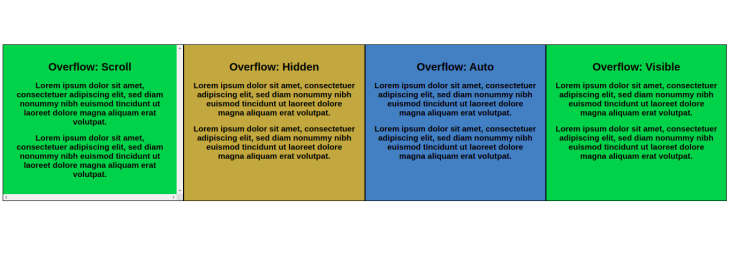
This works well because we give the four elements the same width of 25% (100/4):
Furthermore, assuming we want to space the items because they are clustered, we can add a grid gap of 10px:
.grid-container {
  display: grid;
  grid-template-columns: repeat(4, 25%);
  gap: 10px
}
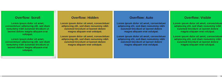
As a result, horizontal scrolling automatically occurs because the gap value is added to the width, exceeding 100%:
The next issue comes when using pixels; similar to the percentage example above, using pixels creates horizontal scrolling issues.
For example, imagine you want to apply the same grid to some containers but with pixels, because you want to specify your dimensions:
.grid-container {
  display: grid;
  grid-template-columns: 1fr 350px 350px 1fr;
  gap: 50px
}
While this won’t cause a scrolling problem on a desktop, it will cause a horizontal scroll issue on any smaller screen, such as a mobile phone. Why? Because the pixel width exceeds the mobile viewport width.
So, as a suggestion to fix this issue, avoid using pixels and percentages on smaller screens. Instead, use fractions and a media query on desktop screens to specify your distinct width.
Let’s see how we can utilize this:
.grid-container {
    display: grid;
    grid-template-columns: 1fr;
    gap: 50px;
}
@media (min-width: 600px) {
    .grid-container {
        grid-template-columns: 1fr 350px 350px 1fr;
    }
}
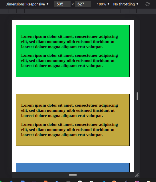
The images below use the grid-column specified in the media query on desktops and the default grid-column on lesser screens (1fr):

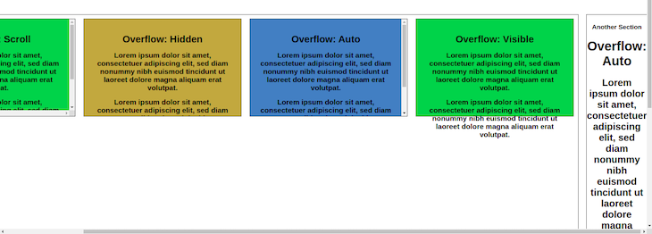
When using CSS flexbox, it is recommended to wrap your flex items. If we don’t, and we view the page on a smaller screen, the flex items may not fit the screen’s viewport, therefore causing the horizontal overflow issue:
.flex-container {
  display: flex;
}
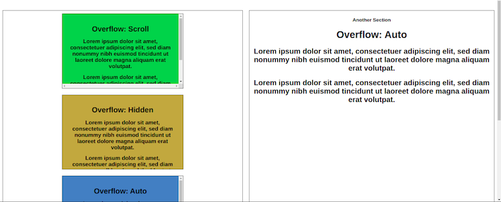
To solve this, you should always wrap your flex items. By adding flex-wrap to your flex items, the flex items will align themselves under one another to fit a smaller screen:
.flex-container {
  display: flex;
  flex-wrap: wrap;
}
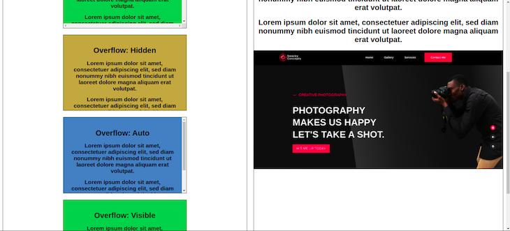
max-widthWhen an image’s width is greater than its parent box or container, the parent box enlarges so the image can fit. This sometimes causes the horizontal scrolling issue:
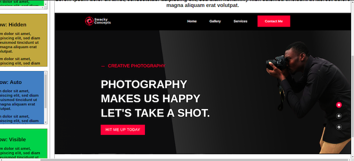
To fix this issue, simply add a max-width of 100% to the image. This style causes the image to take up the same width as the parent box, thus fitting into the parent container without enlarging it:
image {
  max-width: 100%
}
We have now seen the different scenarios where we can encounter the horizontal scrolling problem. We also saw how to fix these issues when we see them, but one thing is still missing.
Imagine you wrote numerous lines of code before you encountered the overflow scroll issue, and you can’t even tell what the issue is. What do you do? You try to debug the problem.
There are two ways we can fix the problem: debugging with CSS, or using DevTools.
Debugging with CSS is the most efficient way to get to the issue. To do this, add the outline style to the root of your CSS and see which box or container overlaps and causes the issue.
To debug using CSS, write the code below:
* {
  outline: 1px solid red;
}
From the image below, a red CSS outline can be seen in every box on your website, which you can identify to understand where and what the issue is on your website:

Similarly, you can also use the browser DevTools to debug the horizontal overflow issue. DevTools are a set of web developer tools built into your browser that allow you to test, create, and debug software and websites.
There are different ways to open up DevTools: You can either right-click on the webpage and click the Inspect option, or press the F12 key, Ctrl+Shift+I, or Ctrl+Shift+C.
You can then debug by deleting the contents of the webpage until you identify the problem. Then you can go to the CSS and make the necessary changes.
The issue of the overflow scroll does not only happen with the horizontal scroll but can also happen with modals.
For example, it isn’t a great user experience if you open a modal and the background contents continue scrolling. Ideally, background contents should remain fixed when you open the modal:
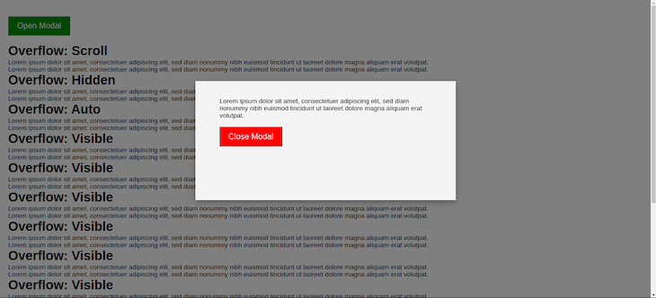
Below are two ways we can achieve this. One method is to set the position to fixed. While this can work, it returns the scroll position of the user to the top. So whenever the modal is opened, it takes the user back to the scroll top.
The other method is simply setting the overflow of the body element to hidden. Let’s see both in the example below:
const open = document.querySelector('#open-modal');
const modal = document.querySelector('.modal-container');
const closeModalBtn = document.querySelector('#close');

// open modal
open.addEventListener('click', () => {
  modal.style.display = 'block';
  document.body.style.overflow = 'hidden';
  // or
  // document.body.style.position = 'fixed'
})

// close modal
closeModalBtn.addEventListener('click', () => {
  modal.style.display = 'none';
  document.body.style.overflow = 'visible';
  // or
  // document.body.style.position = 'static';
})
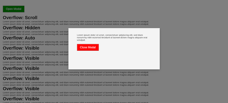
Similarly, another way to achieve this is by programmatically adding a new CSS class when the modal is open and removing the class when the modal closes.
Let’s first write the CSS for the class:
.modal-active {
    touch-action: none;
    -webkit-overflow-scrolling: none;
    overflow: hidden;
    overscroll-behavior: none;
}
Then, let’s add the class using JavaScript whenever we open the modal:
const open = document.querySelector('#open-modal');
const closeModalBtn = document.querySelector('#close');
const modal = document.querySelector('.modal-container');
// Open modal
open.addEventListener('click', () => {
    modal.style.display = 'block';
// add modal-active class
    document.body.classList.add('modal-active');
});
// Close modal
closeModalBtn.addEventListener('click', () => {
    modal.style.display = 'none';
// remove modal-active class
    document.body.classList.remove('modal-active');
});
In a scenario where the modal has some contents that are impossible to see, you can add the scroll behavior to the modal so you can scroll down to view the content:
.modal-content {
    overflow-y: auto;
}
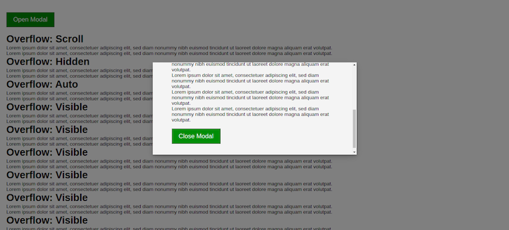
What we’ve seen so far is how to disable scrollbars using the fixed property or the overflow property. It’s possible you may not want to disable the scrollbar but only wish to hide the scrollbar. In such a case, you can make use of the --webkit-scrollbar pseudo-selector to hide it:
.modal-active::-webkit-scrollbar {
  display: none;
}
The --webkit-scrollbar is specific to WebKit-based browsers. There are other properties for hiding scrollbars across different browsers.
The overflow property is a shorthand property for setting the scroll behavior for horizontal and/or vertical direction. We can further specify the direction we intend to control the behavior with either the overflow-y property for vertical directions or the overflow-x property for horizontal directions:
.modal-content {
  overflow-y: scroll;
  overflow-x: hidden;
}
Overflow: clipThe fifth possible value for the overflow property is clip. This allows you to clip the overflow content at the overflow edge:
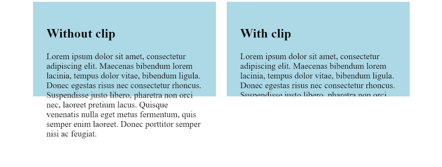
Using the overflow-clip-margin property, you can specify the distance by which an element, marked with overflow: clip, can extend beyond its bounds before it is clipped:
/* <visual-box> | <length> */
overflow-clip-margin: content-box 10px;
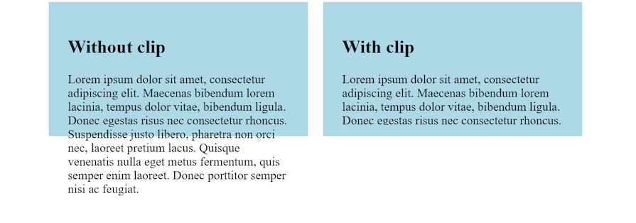
<visual-box> specifies the box edge to use as the origin of the overflow clip edge, offering three options. content-box refers to the boundary of the content area, padding-box, which is the default value, extends from the content’s outer edge to the border’s inner edge, and border-box spans from the padding’s outer edge to the margin’s inner edge.
The <length> values represent a value for the distance. It must be non-negative.
Now we have a clear understanding of the different factors that contribute to the CSS overflow scroll issues, and methods for fixing these issues.
It is also important to note the role that truncating text and breaking words can play when trying to avoid horizontal overflow scroll. These strategies can prevent lengthy, user-created text from exceeding or overflowing existing containers.
As web frontends get increasingly complex, resource-greedy features demand more and more from the browser. If you’re interested in monitoring and tracking client-side CPU usage, memory usage, and more for all of your users in production, try LogRocket.

LogRocket lets you replay user sessions, eliminating guesswork around why bugs happen by showing exactly what users experienced. It captures console logs, errors, network requests, and pixel-perfect DOM recordings — compatible with all frameworks.
LogRocket's Galileo AI watches sessions for you, instantly identifying and explaining user struggles with automated monitoring of your entire product experience.
Modernize how you debug web and mobile apps — start monitoring for free.

A step-by-step guide to building your first MCP server using Node.js, covering core concepts, tool design, and upgrading from file storage to MySQL.

Using security headers in your Next.js apps is a highly effective way to secure websites from common security threats.

A deep dive into April 2026’s AI model and tool rankings. We break down performance, usability, pricing, and real-world capabilities across 50+ features to help you pick the right tools for your development workflow.

A practical guide to Agent Browser CLI. Learn how AI agents navigate, snapshot, and interact with web pages using stable references, enabling efficient automation and exploratory testing.
Hey there, want to help make our blog better?
Join LogRocket’s Content Advisory Board. You’ll help inform the type of content we create and get access to exclusive meetups, social accreditation, and swag.
Sign up now