In the previous article, we created a GraphQL server with NodeJS and Express. We will now look to consume the endpoints in the server we created using a React Native mobile app. React Native allows us to develop applications that run on both iOS and Android devices. We’ll be using Expo to bootstrap our app, this will also allow us to be able to quickly build and deploy our application.

With Expo, we can also run our app on mobile devices or on the web browser. Before we get started, Expo needs to be installed globally, to do so, run:
npm install expo-cli --global
Now you are ready to get started.
To create the application, run this command:
expo init apollo-react-native-app
This will generate a sample app that you can access via the Expo app on your own smartphone without installing it. To do this you will need to download the app from the Apple appstore for iOS or the Google Play store for Android.
Start the application by running expo start in the terminal from the root directory of your project and it will show you a QR code that you can scan in the Expo app and view an instance of the React Native application. Pretty neat, right?
Now that we have the barebones set up for our app, let us work on hooking it up to GraphQL by configuring our Apollo Client.
The Apollo Client for React is a complete state management library that will take care of requesting, caching, and managing data provided by a GraphQL server like the one we built in Part 1. We shall set up the client at our application’s entry point, App.js . But first, we need to install the necessary dependencies by running the command below:
npm install apollo-client apollo-cache-inmemory apollo-link-http react-apollo --save
apollo-client— as mentioned above, this takes care of any data exchange with the server as well as state management and cachingapollo-cache-inmemory— as of Apollo Client 2.0 the caching functionality was abstracted to apollo-cache-inmemory to make use of the caching capabilities without the need to rely on Reduxapollo-link-http— this handles network requests such as fetching and sending datareact-apollo— will supply an ApolloProvider that will wrap around the app and take care of state management, similar to React’s Context APINow that we understand what each piece does in our app, let’s get to the setup. In App.js import these dependencies and set up your client like this:
import * as React from "react";
import { Platform, StatusBar, StyleSheet, View } from "react-native";

import { AppLoading } from "expo";

import { Asset } from "expo-asset";
import * as Font from "expo-font";

import { InMemoryCache } from "apollo-cache-inmemory";
import { ApolloClient } from "apollo-client";
import { HttpLink } from "apollo-link-http";
import { ApolloProvider } from "react-apollo";

import AppNavigator from "./navigation/AppNavigator";

//Define your client for your ApolloProvider connecting to your graphql server.
const client = new ApolloClient({
  // initialize cache
  cache: new InMemoryCache(),
  //Assign your link with a new instance of a HttpLink linking to your graphql server
  link: new HttpLink({
    uri: "https://graphql-server-node-js-103.herokuapp.com/graphql"
  })
});

const styles = StyleSheet.create({
  container: {
    flex: 1
  }
});

export default class App extends React.Component {
  state = {
    isLoadingComplete: false
  };

  loadResourcesAsync = async () => {
    await Promise.all([
      Asset.loadAsync([
        // load assets here
      ]),
      Font.loadAsync({
        // load fonts here
      })
    ]);
  };

  handleLoadingError = () => {
    // Any error handling can be done here
  };

  handleFinishLoading = () => {
    this.setState({ isLoadingComplete: true });
  };

  render() {
    const { isLoadingComplete } = this.state;
    const { skipLoadingScreen } = this.props;
    if (!isLoadingComplete && !skipLoadingScreen) {
      return (
        <AppLoading
          startAsync={this.loadResourcesAsync}
          onError={this.handleLoadingError}
          onFinish={this.handleFinishLoading}
        />
      );
    }
    return (
      <ApolloProvider client={client}>
        <View style={styles.container}>
          <AppNavigator />
        </View>
      </ApolloProvider>
    );
  }
}
In the client configuration above, our ApolloClient takes two arguments, cache which is an instance of inMemoryCache from apollo-cache-inmemory that handles data caching to speed up the app and link from apollo-link-http which is a terminating link that fetches GraphQL results from a GraphQL endpoint over an HTTP connection. For the purpose of this article, we have this linked to a deployed instance of our backend server but feel free to replace it with your own locally running server for your application if you wish.
The client configuration is then passed to the app through the ApolloProvider higher-order component as a client prop, allowing the application to gain all the functionality we set up above.
An additional component, AppLoading , has also been imported from Expo, it is a React component that tells Expo to keep the app loading screen open if it is the first and only component rendered in your app. This component can allow the application to load any assets needed by the application prior to starting it, this creates a better user experience.
It takes three props in our case:
startAsync (func) – A function that returns a Promise, and the Promise should resolve when the app is done loading the required data and assetsonError (func) – If startAsync throws an error, it is caught and passed into the function provided to onErroronFinish (func) – This is called when startAsync resolves or rejects. This should be used to set state and unmount the AppLoading componentYou may have noticed some additional setup in the code above, not to worry, we’ll go through exactly what each part of that does shortly.
We have an AppNavigator component in the setup above, this takes care of routing in our App with react-navigation. This is what we’ll be setting up next.
To do this, we need to install some dependencies first:
npm install react-navigation react-navigation-transistions
These two packages work together to allow our app to navigate between screens with smooth transitions, react-navigation handles routing and navigation while react-navigation-transitions allows us to create custom transitions between our screens.
Create a navigation folder at the root of your project and in it create three files AppNavigator.js, MainTabNavigator.js , and styles.js.
Just like before, we first declare our styles:
//styled.js
import styled from "styled-components/native";

const MenuStyle = {
  backgroundColor: "#fcfaf7",
  borderBottomWidth: 0,
  elevation: 0
};

const IconStyle = styled.Image`
  height: 24;
  width: 24;
`;

export { MenuStyle, IconStyle };
Next, we use createStackNavigator from react-navigation to provide a way for your app to transition between screens where each new screen is placed on top of a stack.
It takes two parameters, the first being an object containing our route configurations(routeConfig) and the second being the navigator configuration(StackNavigatorConfig):
//MainTabNavigator.js
import React from "react";
import { createStackNavigator } from "react-navigation";
import { fromBottom } from "react-navigation-transitions";
import { TouchableOpacity, View } from "react-native";

import HomeScreen from "../screens/HomeScreen";
import AddNoteScreen from "../screens/AddNoteScreen";
import { Images } from "../constants";
import { MenuStyle, IconStyle } from "./styled";

//Assign your goback navigator to variable call goBackHeader
const goBackHeader = goBack => (
  <TouchableOpacity
    activeOpacity={1}
    style={{ paddingHorizontal: 20 }}
    onPress={() => goBack()}
  >
    <View>
      <IconStyle source={Images.back} style={{ height: 15, width: 9 }} />
    </View>
  </TouchableOpacity>
);

const HomeStack = createStackNavigator(
  {
    Home: {
      screen: HomeScreen,
      navigationOptions: ({ navigation: { goBack } }) => ({
        headerStyle: MenuStyle
      })
    },
    NewNote: {
      screen: AddNoteScreen,
      navigationOptions: ({ navigation: { goBack } }) => ({
        headerStyle: MenuStyle,
        headerLeft: () => goBackHeader(goBack)
      })
    }
  },
  {
    transitionConfig: ({ scenes }) => {
      const nextScene = scenes[scenes.length - 1];
      if (nextScene.route.routeName === "NewNote") return fromBottom(550);
    }
  }
);

export default HomeStack;
For our routeConfig, we have two screens Home and NewNote, which we will create soon. Each screen is declared as an object which will have screen and navigationOptions within it. In this case, screen maps onto the React component to be rendered for that screen and navigationOptions which can be used to pass a number of options to each component.
We have passed two options below and they are:
headerLeft – A function that returns a React element to display on the left side of the header. When a function is used, it receives a number of arguments when rendered (onPress, title, titleStyle , and more)headerStyle – Style object for the headerOn the NewNote screen we pass the headerStyle as well as headerLeft where we map a back button component that we declared using the goBackHeader function. This component takes a goBack prop which we destructured from react-navigation’s navigate prop. goBack is a function that closes the active screen and moves back in the stack, similar to the back button on the browser.
Our StackNavigatorConfig is simply an object containing the transitionConfig which we use to create a custom transition that causes our new screens to come into view from the bottom up rather than horizontally (which is the default).
We then pass our HomeStack to createSwitchNavigator and pass that to createAppContainer to create an app container that will help with linking your top-level navigator to the app environment. The purpose of SwitchNavigator is to only ever show one screen at a time.
//AppNavigator.js
import React from 'react';
import { createAppContainer, createSwitchNavigator } from 'react-navigation';

import MainTabNavigator from './MainTabNavigator';

export default createAppContainer(
  createSwitchNavigator({
    Main: MainTabNavigator,
  })
);
You can read more about both createSwitchNavigator and createStackNavigator in the react-navigation documentation.
Our app will have a couple of reusable components that will make up its various screens, which is how we refer to pages when working with React Native. Consequently, we’ll look to build these components before we get to building the various screens of our app.
In our case, we have four main components we’ll be reusing across our application, Button, Card, TextInput, and KeyboardWrapper. Create a components folder in the root directory of the project and inside it create a folder for each of these components.
We also have some assets and constants that we’ll be using across the entire application. The assets are mainly fonts and images. Create an assets folder at root directory of the project by running mkdir assets and copy the contents of this folder into it. You can now import them for use in the application.
Create a constants folder as well, this will hold any constant variables that we may make use of in the application and help with easy reference.
Create a Colors.js file in the constants folder, this file will hold the colors that we make use of across the app and will look like this:
const white = "#ffffff";
const darkGray = "#595A5A";
const orange = "#FFA500";
const mediumGray = "#9B9B9B";
const strokeGray = "#E6E6E6";

export { orange, darkGray, white, mediumGray, strokeGray };
In the constants folder, create an Images.js and add the following code:
const Images = {
  more: require("../assets/images/more.png"),
  back: require("../assets/images/back.png"),
  menu: require("../assets/images/menu.png")
};
export default Images;
This makes it easier to import the images for use.
We’ll also have a Layout.js file where we will set the base layout of the application.
import { Dimensions } from 'react-native';

const width = Dimensions.get('window').width;
const height = Dimensions.get('window').height;

export default {
  window: {
    width,
    height,
  },
  isSmallDevice: width < 375,
};
You can make importing from the constants directory even easier by exporting the declared constants from an index.js file within the directory. Here’s how you can do it with the images:
import Images from "./Images";
export { Images };
Now that we have our major resources set up, let us get to creating the individual components that we will reuse.
Let’s create our first component, a Button component, create two files, index.js and styled.js in the Button directory. In styled.js place the following code, which will handle the base styling of the Button component with styled-components:
import styled from "styled-components/native";
const white = "#FFFFFF";

const baseButtonStyles = `
  letter-spacing: 0.5px;
  font-size: 12px;
  color: ${white}
`;

const ButtonStyle = `
  ${baseButtonStyles}
  background-color:#4A4A4A;
    color: ${white}
`;

const StyledButton = styled.TouchableOpacity`
  ${ButtonStyle}
  align-items: center;
`;

const StyledButtonText = styled.Text`
  color: ${white};
  line-height: 19px;
`;

const ButtonText = styled.Text`
  font-family: WorkSans-SemiBold;
  color: ${white};
  line-height: 19px;
  justify-content: center;
  align-items: center;
`;

export { ButtonText, StyledButtonText, StyledButton };
Now in index.js add this:
import React from "react";
import { ifIphoneX } from "react-native-iphone-x-helper";

import { StyledButtonText, StyledButton } from "./styled";

const Button = props => {
  const { title, ...rest } = props;
  return (
    <StyledButton
      activeOpacity={0.7}
      color={"#4A4A4A"}
      underlayColor={"#4A4A4A"}
      {...rest}
    >
      <StyledButtonText
        style={{
          ...ifIphoneX(
            {
              paddingTop: 27,
              paddingBottom: 50
            },
            {
              paddingTop: 27,
              paddingBottom: 26
            }
          )
        }}
      >
        {title.toUpperCase()}
      </StyledButtonText>
    </StyledButton>
  );
};

export default Button;
We import the styled-components we declared in styled.js and use them to create our button. You will also notice we have imported ifIphoneX from react-native-iphone-x-helper which helps us account for the difference in layouts of the iPhone X, XS, XS Max & XR. This method allows us to create stylesheets with the iPhone X in mind. Taking in two parameters, the first is the styling on iPhone X and the second is the regular styling and applies them accordingly.
Next, we will create our Card component which will be our main display component, we will use the card to display each note. Just as we did with the button, we shall first create our styled-components inside a styled.js:
import styled from "styled-components/native";
import {
  strokeGray,
  darkGray,
  white,
  mediumGray
} from "../../constants/Colors";

const CardContainer = styled.View`
  background-color: #d8d8d8;
  border-style: solid;
  width: 100%;
  padding: 16px 16px 16px 16px;
  text-align: center;
  border-radius: 9px;
  margin-bottom: 20px;
`;

const TimestampContainer = styled.Text`
  font-size: 10px;
  text-transform: uppercase;
  line-height: 12px;
  color: ${mediumGray};
  padding-top: 16px;
`;

const EditWrapper = styled.TouchableOpacity`
  margin-left: auto;
  margin-top: 5px;
`;

const EditIcon = styled.Image`
  height: 4px;
  width: 20px;
`;

const CardText = styled.Text`
  font-weight: 500;
  color: ${darkGray};
  line-height: 23px;
  font-size: 16px;
  width: 90%;
`;

const HeaderContainer = styled.View`
  display: flex;
  flex-direction: row;
`;

export {
  CardContainer,
  TimestampContainer,
  EditWrapper,
  EditIcon,
  CardText,
  HeaderContainer
};
We then import them into index.js just as we did for the button:
import React from "react";
import PropTypes from "prop-types";
import { Images } from "../../constants";

import {
  CardContainer,
  TimestampContainer,
  EditWrapper,
  EditIcon,
  CardText,
  HeaderContainer
} from "./styled";

const NoteCard = props => {
  const { onOptions, noteText } = props;
  return (
    <CardContainer>
      <HeaderContainer>
        <CardText>{noteText}</CardText>
        <EditWrapper onPress={onOptions}>
          <EditIcon source={Images.more} />
        </EditWrapper>
      </HeaderContainer>
      <TimestampContainer>1 hour ago</TimestampContainer>
    </CardContainer>
  );
};
export default NoteCard;
This component triggers the virtual keyboard on your mobile device, we use React Native’s KeyboardAvoidingView component which allows the view to move out of the way of the virtual keyboard by adjusting it’s size and position accordingly:
import React from "react";
import { KeyboardAvoidingView, Platform } from "react-native";
import { Header } from "react-navigation";
import { ifIphoneX } from "react-native-iphone-x-helper";
import PropTypes from "prop-types";

const KeyboardWrapper = props => {
  const { children } = props;

  return (
    <KeyboardAvoidingView
      behavior={Platform.OS === "android" ? null : "padding"}
      keyboardVerticalOffset={
        ifIphoneX ? Header.HEIGHT + 1 : Header.HEIGHT + 18
      }
      style={{ flex: 1 }}
    >
      {children}
    </KeyboardAvoidingView>
  );
};

KeyboardWrapper.propTypes = {
  children: PropTypes.node.isRequired
};

export default KeyboardWrapper;
This component will do just what its name suggests, act as an input for our text, complete with a placeholder. First, let’s declare our styles in styled.js:
import styled from "styled-components/native";

const BaseStyles = `

  border-width: 1px;
  border-style: solid;
  width: 100%;
  padding: 10px 16px;
`;
const InputStyles = `
  ${BaseStyles}
  font-size: 16px;
`;

const StyledTextArea = styled.TextInput`
  ${InputStyles}
  flex: 1;
  background-color: transparent;
  border-radius: 0;
  padding-left: 0px;
  border-width: 0;
  font-size: 20px;
  margin-bottom: 0;
  color: #ffffff;
  /* font-family: WorkSans-Regular; */
`;

export { StyledTextArea };
Now, let us create our placeholder, we wrap a Text element created using styled-components in a TouchableOpacity element created in a similar way. This allows the app to respond to you touching the placeholder by pulling up your keyboard for you to type in your notes:
import React from "react";
import styled from "styled-components/native";

const chGray = "#E6E4E3";

const RowContainer = styled.TouchableOpacity`
  flex-direction: row;
  width: 100%;
  background-color: ${chGray};
  border-radius: 30px;
  width: 100%;
  margin-bottom: 24px;
  padding: 8px 16px;
`;

const StyledTextInput = styled.Text`
  /* font-family: WorkSans-Regular; */
  color: #4a4a4a;
  opacity: 0.8;
  font-size: 14px;
  line-height: 22px;
`;

const TextPlaceHolder = props => {
  const { text, onHolderPress } = props;
  return (
    <RowContainer activeOpacity={1} onPress={onHolderPress}>
      <StyledTextInput>{text}</StyledTextInput>
    </RowContainer>
  );
};

export default TextPlaceHolder;
Now let us create our TextArea component which is where the text we type in will appear, we already created it in styled.js as StyledTextArea here we just pass some constants (specifically the placeholder text color) to it along with some props:
import React from "react";
import { mediumGray } from "../../constants/Colors";

import { StyledTextArea } from "./styled";

const TextArea = props => {
  const { ...rest } = props;
  return (
    <StyledTextArea
      keyboardAppearance="dark"
      placeholderTextColor={"#4a4a4a"}
      {...rest}
    />
  );
};

export default TextArea;
Now let us export everything in index.js for cleaner imports in other files:
import TextPlaceHolder from "./Placeholder";
import TextArea from "./TextArea";

export { TextPlaceHolder, TextArea };
Screens are the pages of our application, each made up of a number of components working together. Our application has two main screens. Just like our components, we will first use styled-components to define the styles of our screen elements inside a styled.js file:
import styled from "styled-components/native";

const Container = styled.View`
  flex: 1;
  padding: 20px;
  background-color: #fcfaf7;
`;

const NotesContainer = styled.View`
  flex: 1;
  background-color: #fcfaf7;
`;

const NotesWrapper = styled.View`
  padding: 20px;
`;

const PlaceholdeWrapper = styled.View`
  padding-top: 12px;
`;

const HeaderText = styled.Text`
  font-weight: 900;
  font-size: 36px;
  padding-bottom: 20px;
  color: #b89b72;
`;

export {
  Container,
  PlaceholdeWrapper,
  NotesContainer,
  NotesWrapper,
  HeaderText
};
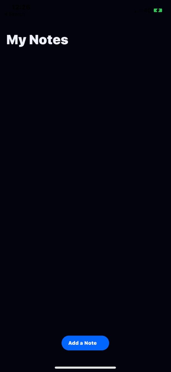
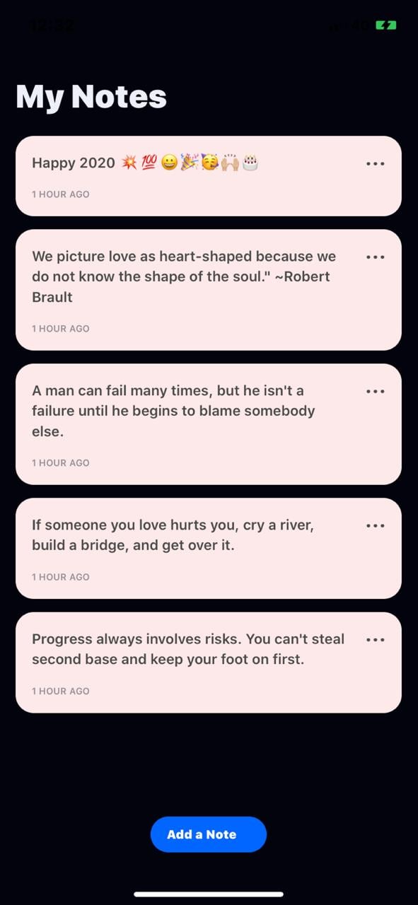
The HomeScreen will be the central screen where all the notes we have created will be displayed. This is where we will view and delete notes and when empty(no notes added) it will look like this for iPhone users:
Once notes are added it will then look like this:
Inside the screens directory, create a HomeScreen.js file which we will be working with for this.
First, let us import some components and dependencies for the screen as well as define our GraphQL query and mutation variables as GET_NOTES and DELETE_NOTE respectively. We do this to tell our API what pieces of data we would like returned for use:
import React, { Component } from "react";
import {
  ScrollView,
  FlatList,
  ActivityIndicator,
  View,
  Alert
} from "react-native";
import ActionSheet from "react-native-actionsheet";
//Import the Query component from react apollo that will responsible for retrieving data from your graphql server.
import { Query, Mutation } from "react-apollo";
//import gql from graphql-tag for making queries to our graphql server.
import gql from "graphql-tag";

import { Container, PlaceholdeWrapper, HeaderText } from "./styled";
import { Button, NoteCard, TextPlaceHolder } from "../components";

//Define your query variable which is the query responsible for retrieving data
//This will query all notes
const GET_NOTES = gql`
  query {
    notes {
      id
      text
    }
  }
`;

const DELETE_NOTE = gql`
  mutation DeleteNote($id: ID!) {
    deleteNote(id: $id) {
      id
      text
    }
  }
`;
Next, let us define our HomeScreen class component and add some utility functions which will be responsible for the following purposes:
_addNewNote — navigates the user to the New Note screen_renderItem — renders a notecard_showEditDeleteOptions — shops an edit/delete option for a given note as shown here: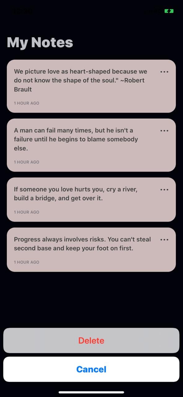
_deletePostPrompt — prompts the user to delete or cancel deletion of a note_deleteNote — prompts a GraphQL delete mutation on a given noteclass HomeScreen extends Component {
constructor(props) {
super(props);
this.state = {
noteId: null
};
}
_addNewNote = () => {
const { navigation } = this.props;
navigation.navigate("NewNote", {});
};
_renderItem({ item }) {
//Return the UI
// It will return a list of all notes
return (
<NoteCard
noteText={item.text}
onOptions={() => this._showEditDeleteOptions(item.id)}
/>
);
}
_showEditDeleteOptions = async noteId => {
await this.setState({ noteId });
this.deleteActionSheet.show();
};
_deletePostPrompt = noteId => {
Alert.alert("Delete Note ?", null, [
{
text: "Delete",
onPress: () => {
this._deleteNote({ noteId });
}
},
{
text: "Cancel",
style: "cancel"
}
]);
};
_deleteNote = noteId => {
<Mutation
mutation={DELETE_NOTE}
update={store => {
const storeNotes = store.readQuery({ query: GET_NOTES });
const data = storeNotes.notes.filter(note => note.id !== noteId);
store.writeQuery({
query: GET_NOTES,
data: { notes: [...data] }
});
}}
>
</Mutation>;
};
//render here
export default HomeScreen;
Notes are fetched and displayed using react-apollo’s Query component which takes in a query prop that is the description of the data we would like to fetch from our GraphQL API. It then conditionally renders UI as it’s child component depending on the data fetched as well as the error and loading states. We will include it inside our render function, we will replace the //render here comment with this:
render() {
  const { noteId } = this.state;
  return (
    <Container>
      <View>
        <ActionSheet
          ref={o => (this.deleteActionSheet = o)}
          options={["Delete", "Cancel"]}
          cancelButtonIndex={1}
          destructiveButtonIndex={0}
          onPress={index => {
            if (index === 0) this._deletePostPrompt(noteId);
          }}
        />
      </View>
      <ScrollView showsVerticalScrollIndicator={false}>
        <HeaderText>My Notes</HeaderText>
        <PlaceholdeWrapper>
          <TextPlaceHolder
            onHolderPress={() => this._addNewNote()}
            text={"Add new note"}
          />
        </PlaceholdeWrapper>
        <Query query={GET_NOTES}>
          {/* The props.children of the Query will be a callback with a response, and error parameter. */}
          {(response, error, loading) => {
            if (error) {
              return <Text style={styles.errorText}>{error}</Text>;
            }
            if (loading) {
              return <ActivityIndicator />;
            }
            //If the response is done, then will return the FlatList
            if (response) {
              //Return the FlatList if there is not an error.
              return (
                <FlatList
                  data={response.data.notes}
                  renderItem={item => this._renderItem(item)}
                />
              );
            }
          }}
        </Query>
      </ScrollView>
    </Container>
  );
}
}
In the case above, any data fetched from our endpoint containing notes are passed to the FlatList component that then renders a list of cards through the renderItem prop. The renderItem prop is typically a function that returns a React component to be rendered from a piece of data.
Notes are deleted using react-apollo’s Mutation component which takes a mutation prop that is a GraphQL document describing the details of the note to be deleted. It also takes an update prop which is a function that updates the cache to reflect the changes following the deletion of a note.
The AddNote is the screen that is responsible for taking in user input and using it to create a new note by passing the data to our GraphQL API. We will create it in a file:
import * as WebBrowser from "expo-web-browser";
import React, { Component } from "react";
import { ScrollView } from "react-native";
//import Mutation component for performing queries.
import { Mutation } from "react-apollo";
// import gql from graphql-tag to define your graphql schema
import gql from "graphql-tag";

import { NotesContainer, NotesWrapper } from "./styled";
import { Button, TextArea, KeyboardWrapper } from "../components";

const CREATE_NOTE = gql`
  mutation CreateNote($text: String!) {
    createNewNote(text: $text) {
      id
      text
    }
  }
`;

const GET_NOTES = gql`
  query {
    notes {
      id
      text
    }
  }
`;

class AddNoteScreen extends Component {
  constructor(props) {
    super(props);
    this.state = {
      note: ""
    };
  }

  _addNote = postAction => {
    const { note } = this.state;
    const { navigation } = this.props;
    return (
      <Button
        onPress={() =>
          postAction({
            variables: { text: note }
          }).then(navigation.goBack())
        }
        title={"Add new note"}
      />
    );
  };

  render() {
    const { note } = this.state;

    return (
      <KeyboardWrapper>
        <NotesContainer>
          <ScrollView>
            <NotesWrapper>
              <TextArea
                autoFocus
                value={note}
                returnKeyType="next"
                placeholder={"Jot Something"}
                //onChangeText is basically a simplified version of onChange,
                //so you can easily use it, without the hassle of going through event.target.value to get changed value.
                onChangeText={text => this.setState({ note: text })}
              />
            </NotesWrapper>
          </ScrollView>
          <Mutation
            mutation={CREATE_NOTE}
            update={(store, { data: { createNewNote } }) => {
              const data = store.readQuery({ query: GET_NOTES });
              store.writeQuery({
                query: GET_NOTES,
                data: { notes: data.notes.concat([createNewNote]) }
              });
            }}
          >
            {(postAction, { loading, error }) => {
              return this._addNote(postAction);
            }}
          </Mutation>
        </NotesContainer>
      </KeyboardWrapper>
    );
  }
}

export default AddNoteScreen;
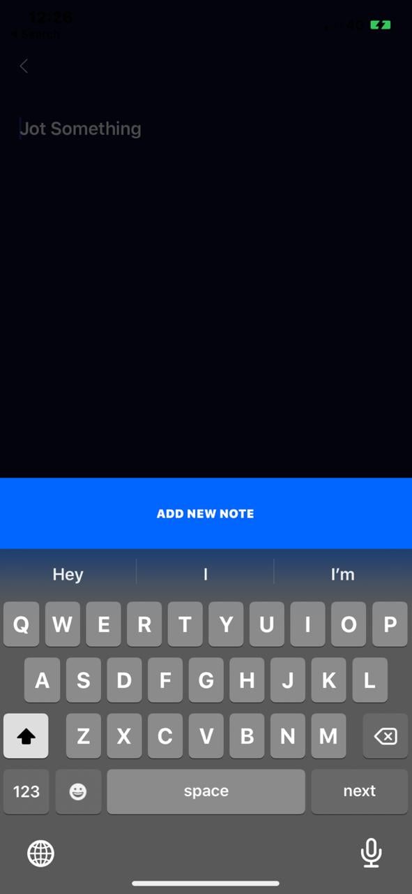
Here’s what the screen would look like with the placeholder prior to the user typing any text:
Our AddNoteScreen uses GraphQL’s Mutation component to create a new note, similar to how we deleted notes. In this case, the mutation prop is a GraphQL document containing the details of the new note to be created, it takes a text argument that is a string of text that will make up the contents of the note.
Mutation also takes an update prop similar to how it did when deleting a note that is responsible for updating the cache with the newly created note.
One major difference between the Query and Mutation components is their children. Query has React nodes as it’s children, rendering UI dependent on the result of running the query. Mutation, on the other hand, has a function as it’s children, this function triggers a mutation on our GraphQL API.
Here’s what your NewNote screen will look like once the text is typed in:

React Native and GraphQL work really well together to create a great mobile application. React Native allows developers to create “write once, run everywhere” applications because it’s compatible with both Android and iOS. GraphQL allows the application to only fetch specific pieces of information that they require, making them a lot more efficient. Overall, these two technologies are great options to consider when building mobile apps. You can play around with the information provided in this article and try to create an edit feature for the application we have built.
Install LogRocket via npm or script tag. LogRocket.init() must be called client-side, not
server-side
$ npm i --save logrocket

// Code:

import LogRocket from 'logrocket';
LogRocket.init('app/id');
// Add to your HTML:

<script src="https://cdn.lr-ingest.com/LogRocket.min.js"></script>
<script>window.LogRocket && window.LogRocket.init('app/id');</script>
Would you be interested in joining LogRocket's developer community?
Join LogRocket’s Content Advisory Board. You’ll help inform the type of content we create and get access to exclusive meetups, social accreditation, and swag.
Sign up now
Get to know RxJS features, benefits, and more to help you understand what it is, how it works, and why you should use it.

Explore how to effectively break down a monolithic application into microservices using feature flags and Flagsmith.

Native dialog and popover elements have their own well-defined roles in modern-day frontend web development. Dialog elements are known to […]

LlamaIndex provides tools for ingesting, processing, and implementing complex query workflows that combine data access with LLM prompting.