<selectedcontent> element improves dropdowns
Customizing a <select> element typically requires JavaScript, external libraries, and a lot of time to configure to taste. This is because the native element just doesn’t offer much flexibility. That’s the core issue.

We should be able to use plain HTML and CSS to change the look of the selected value, like adding an icon, formatting the text, or displaying extra content. But because that’s not possible right now, we’re left with no option but to not accept the limitations. That means more code, more complexity, and more potential bugs.
But the new <selectedcontent> HTML element could be about to change all of that.
<selectedcontent> is an experimental HTML element that gives developers control over how a selected option is displayed, using just HTML and CSS. In this article, we’ll explore what <selectedcontent> does, how it fits into the <select> element, and how to build a working prototype that shows off its potential.
The Replay is a weekly newsletter for dev and engineering leaders.
Delivered once a week, it's your curated guide to the most important conversations around frontend dev, emerging AI tools, and the state of modern software.
<selectedcontent>?Normally, when a user picks an option, the browser renders the selected value in its own rigid way. You can’t customize the layout, add icons, or style it meaningfully. And because you don’t get access to the internal structure, you’re stuck with what the browser gives you.
<selectedcontent> changes that. It provides a slot where the selected option’s content gets injected, and lets you define exactly what appears when the dropdown is closed without needing JavaScript or third-party hacks.
Here’s how the element works:
<select>, place a <button> as the first child<selectedcontent> element<selectedcontent>This opens the door to full design control: custom layouts, icons, and rich formatting, all while maintaining native behavior and accessibility.
Another benefit of <selectedcontent> is that it doesn’t require much code. Here’s a basic pattern:
<select>
  <button>
    <selectedcontent></selectedcontent>
  </button>
  <option value="html">HTML</option>
  <option value="css">CSS</option>
  <option value="js">JavaScript</option>
</select>
This approach is a big shift from how <select> has traditionally behaved. You can’t just style <select> and <option> directly to get this result; browsers don’t expose enough. But with <selectedcontent>, you finally get a real, stylable hook in the DOM to control how the selected item looks.
It’s not a full overhaul; you still can’t customize the open dropdown. But <selectedcontent> solves one of the most frustrating parts of working with <select>: making the selected value look the way you actually want it to.
<selectedcontent> in action: Building a demoLet’s see how <selectedcontent> behaves inside a <select> element with a working example.
We’ll build a quick menu prototype with HTML and CSS, using no JavaScript and no frameworks. We’ll have a dropdown option that shows content like an icon, name, description, and price. But when you select an option, the label appears in the collapsed <select>, clean and styled.
First, create an index.html file and add the following code:
<!DOCTYPE html>
<html lang="en">
<head>
    <meta charset="UTF-8">
    <meta name="viewport" content="width=device-width, initial-scale=1.0">
    <link rel="stylesheet" href="style.css">
    <title>Document</title>
</head>
<body>
    <form class="coffee-shop">
        <h2>☕ Artisan Coffee Co.</h2>
        <div class="subtitle">Crafted with passion, served with love</div>
        <p>
            <label for="coffee-select">Choose coffee:</label>
            <select id="coffee-select">
                <button>
                    <selectedcontent></selectedcontent>
                </button>
                <option value="">Please select your brew</option>
                <option value="espresso">
                    <span class="icon" aria-hidden="true">☕</span>
                    <span class="option-label">Espresso</span>
                    <span class="option-desc">Bold shot</span>
                    <span class="price">$2.50</span>
                </option>
                <option value="cappuccino">
                    <span class="icon" aria-hidden="true">🥛</span>
                    <span class="option-label">Cappuccino</span>
                    <span class="option-desc">With steamed milk</span>
                    <span class="price">$4.25</span>
                </option>
                <option value="latte">
                    <span class="icon" aria-hidden="true">🍼</span>
                    <span class="option-label">Latte</span>
                    <span class="option-desc">Creamy espresso</span>
                    <span class="price">$4.75</span>
                </option>
                <option value="mocha">
                    <span class="icon" aria-hidden="true">🍫</span>
                    <span class="option-label">Mocha</span>
                    <span class="option-desc">With chocolate</span>
                    <span class="price">$5.25</span>
                </option>
            </select>
        </p>
    </form>
</body>
</html>
Next, add a style.css file with the following styles:
 select,
        ::picker(select) {
            appearance: base-select;
        }
        * {
            box-sizing: border-box;
        }
        body {
            background: linear-gradient(135deg, #8B4513, #F4A460);
            font-family: Arial, sans-serif;
            padding: 20px;
        }
        .coffee-shop {
            background: rgba(255, 248, 240, 0.95);
            padding: 2rem;
            border-radius: 15px;
            max-width: 600px;
            margin: auto;
        }
        h2 {
            text-align: center;
            color: #8B4513;
            margin-bottom: 0.5rem;
        }
        .subtitle {
            text-align: center;
            font-style: italic;
            color: #A0522D;
            margin-bottom: 2rem;
        }
        p {
            display: flex;
            gap: 10px;
            margin-bottom: 1.5rem;
            align-items: center;
        }
        label {
            width: 120px;
            font-weight: bold;
            color: #654321;
        }
        select {
            flex: 1;
            border: 2px solid #D2B48C;
            background: #FFF8DC;
            padding: 12px;
            border-radius: 8px;
            font-size: 1rem;
            transition: 0.4s;
        }
        select:hover,
        select:focus {
            background: #F5DEB3;
            border-color: #CD853F;
        }
        select::picker-icon {
            color: #8B4513;
            transition: rotate 0.4s;
        }
        select:open::picker-icon {
            rotate: 180deg;
        }
        ::picker(select) {
            border: none;
            background: #FFFAF0;
            border-radius: 12px;
            box-shadow: 0 8px 25px rgba(139, 69, 19, 0.3);
            opacity: 0;
            transition: all 0.4s allow-discrete;
        }
        ::picker(select):popover-open {
            opacity: 1;
        }
        @starting-style {
            ::picker(select):popover-open {
                opacity: 0;
            }
        }
        option {
            display: flex;
            align-items: center;
            gap: 15px;
            background: #FFF8DC;
            border: 2px solid #D2B48C;
            padding: 10px;
            transition: 0.3s;
        }
        option:hover,
        option:focus {
            background: #DEB887;
            transform: translateX(5px);
        }
        option .icon {
            font-size: 1.8rem;
        }
        /* Hide certain elements when displayed in selectedcontent */
        selectedcontent .icon,
        selectedcontent .option-desc,
        selectedcontent .price {
            display: none;
        }
        .option-label {
            font-weight: bold;
            color: #8B4513;
        }
        .option-desc {
            font-size: 0.85rem;
            color: #A0522D;
        }
        .price {
            margin-left: auto;
            color: #CD853F;
            font-weight: bold;
        }
Check the result in your browser. It should look like this:
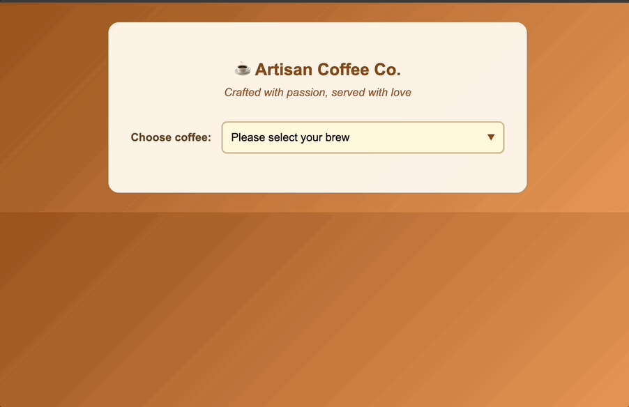
When a user selects an <option>, the browser clones that option’s content and injects it into the <selectedcontent> element. This is a one-time, shallow copy that includes the markup but no attributes or event listeners.
Because each <option> element contains multiple elements, the demo uses scoped CSS to control what gets shown in the collapsed view. Specifically, it hides everything except .option-label:
selectedcontent .icon,
selectedcontent .option-desc,
selectedcontent .price {
  display: none;
}
This keeps the selected value clean while still showing the full details when the dropdown is open.
All of this is enabled by the following:
appearance: base-select;
This line preserves the native dropdown behavior while unlocking new styling hooks like ::picker and ::picker-icon. You get full control over both the collapsed label and the open dropdown, with just CSS.
As of writing, <selectedcontent> is only fully supported in Chromium-based browsers starting with version 137. This includes:
Firefox has partial support beginning in version 139, but it’s either incomplete or hidden behind a feature flag. Safari, Opera, Samsung Internet, and all iOS browsers do not currently support <selectedcontent>.
In unsupported browsers:
<selectedcontent> is ignored entirely<button> inside <select> is treated as invalid HTML<select> may render incorrectly, especially if your CSS assumes the presence of <button> or ::picker supportIn practice, this means that users on unsupported browsers will see a default, unstyled <select>. Your custom icons, descriptions, and formatting within the <option> elements may be flattened into plain text or dropped entirely, depending on the browser’s parser.
See CanIUse for updated browser support.
<selectedcontent>Once browser support catches up, <selectedcontent> will have the potential to solve real pain points that have plagued form UI design for years. Here are a few places where this element could make a big difference:
<selectedcontent>, you can show full detail in the dropdown, and then cleanly style how the selected product is displayed, without using JavaScript templates or custom components<selectedcontent> to offer rich selects that are accessible and customizable out of the box, no JavaScript wrappers or component libraries required<selectedcontent> to hide and reveal extra metadata in a dropdown without requiring additional fields or expanding the layoutOnce <selectedcontent> and the related styling hooks become standardized, it could unlock a ton of real-world use cases that developers have been hacking around for years. I encourage you to experiment with <selectedcontent> as it’s a good way to see how you can use it in your own UI patterns.
The <selectedcontent> HTML element represents a shift in how we think about native form controls. For the first time, we’re getting access to parts of the <select> element that were previously locked away, and we can finally style them without resorting to brittle hacks or full re-implementations.
It’s early, experimental, and not ready for production, but the direction is promising. If <selectedcontent> is standardized, it could dramatically simplify how we build dropdowns, giving us native behavior, full styling control, and accessible markup all in one go. Until then, it’s a feature to watch, test, and maybe even prototype with. Because this time, native HTML might actually be catching up to what the web needs!

A hands-on test of Claude Code Review across real PRs, breaking down what it flagged, what slipped through, and how the pipeline actually performs in practice.

CSS art once made frontend feel playful and accessible. Here’s why it faded as the web became more practical and prestige-driven.

Learn how inline props break React.memo, trigger unnecessary re-renders, and hurt React performance — plus how to fix them.

This article showcases a curated list of open source mobile applications for Flutter that will make your development learning journey faster.
Hey there, want to help make our blog better?
Join LogRocket’s Content Advisory Board. You’ll help inform the type of content we create and get access to exclusive meetups, social accreditation, and swag.
Sign up now

 Learn more →
