Pop-up menus have become an important and common part of mobile applications today. A pop-up menu can be handy when we need to provide some menu options after a button is clicked, mainly so we don’t have to use an extra drawer navigator.

A pop-up menu is usually shown at the top of the element that’s triggering it, as shown below in this example from Twitter:
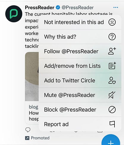
Pop-up menus are a great way to improve the UI of your React Native application. They provide an overflow menu as shown above, and these can be used as a secondary action for an item or a button.
In this article, we will be exploring how to create pop-up menus in React Native with different examples. We will create a basic pop-up menu, a custom pop-up menu with icons and dividers, as well as a pop-up menu with a scroll view (including icons and dividers as well).
To set up the development environment, we will be using Expo to bootstrap our project. First, we will run this command in the terminal:
npx create-expo-app rn-popup-menu
This will create an Expo project with the name rn-popup-menu.
Moving on, we will install the needed library for creating the pop-up menu. This library is react-native-popup-menu, found on its GitHub repo here:
npm install react-native-popup-menu --save
To start the project in the simulator/emulator, we will run the command npx expo start and select i for iOS and a for Android. Now, we should have this in the iOS simulator:
Next, we will create a folder named components. This is where we will create our different pop-up menu examples.
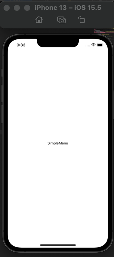
To create a basic pop-up menu that’s triggered by the click of a button, we will create a file called SimpleMenu.js in our component folder. The component will then be rendered in the App.js file:
// SimpleMenu.js
import { StyleSheet, Text, View } from "react-native";
import React from "react";

const SimpleMenu = () => {
 return (
   <View style={styles.container}>
     <Text>SimpleMenu</Text>
   </View>
 );
};

export default SimpleMenu;

const styles = StyleSheet.create({
 container: {
   flex: 1,
   backgroundColor: "#fff",
   justifyContent: "center",
   alignItems: "center",
 },
});
// App.js
import { StyleSheet, Text, View } from "react-native";
import SimpleMenu from "./components/SimpleMenu";

export default function App() {
 return (
   <View style={styles.container}>
     <SimpleMenu />
   </View>
 );
}

const styles = StyleSheet.create({
 container: {
   flex: 1,
   backgroundColor: "#fff",
 },
});
Now, this will be rendered in our simulator/emulator:
Next, to begin with the pop-up menu implementation, we’ll take a look at some of the inbuilt APIs for this library:
MenuProvider: this is an API that provides the methods to handle the pop-up menus imperativelyMenu: serves as the root menu component used to define menu names and other necessary eventsMenuTrigger: allows us to define the position of the displaying pop-up menuMenuOptions: encloses all the menu optionsMenuOption: a wrapper component for all menu optionsYou can read more about these APIs here. Now, we will make use of these APIs to create a SimpleMenu.js file:
// SimpleMenu.js
import { StyleSheet, Text, View } from "react-native";
import React from "react";
import {
 Menu,
 MenuProvider,
 MenuOptions,
 MenuOption,
 MenuTrigger,
} from "react-native-popup-menu";

const SimpleMenu = () => {
 return (
   <MenuProvider style={styles.container}>
     <Menu>
       <MenuTrigger
         text="Click for Option menu"
         customStyles={{
           triggerWrapper: {
             top: -20,
           },
         }}
       />
       <MenuOptions>
         <MenuOption onSelect={() => alert(`Save`)} text="Save" />
         <MenuOption onSelect={() => alert(`Delete`)} text="Delete" />
       </MenuOptions>
     </Menu>
   </MenuProvider>
 );
};

export default SimpleMenu;

const styles = StyleSheet.create({
 container: {
   flex: 1,
   backgroundColor: "#fff",
   justifyContent: "center",
   alignItems: "center",
   padding: 30,
   flexDirection: "column",
 },
});
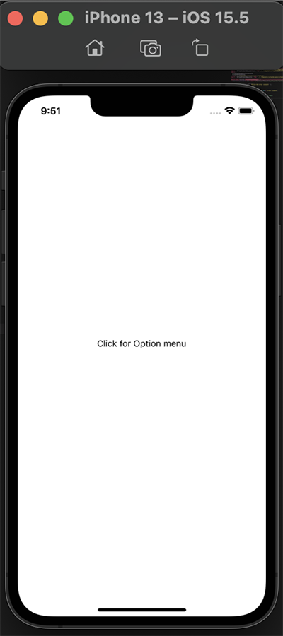
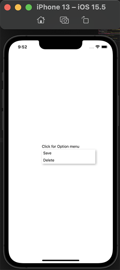
Here, we are creating a simple pop-up menu with the above APIs. MenuProvider wraps all the menu content. In MenuTrigger, we are passing the text option that we want to be displayed, which is Click for Option menu.
We are also using custom styles to define the MenuTrigger content style. MenuOptions has two MenuOption children; these are what will pop up when the MenuTrigger is clicked.
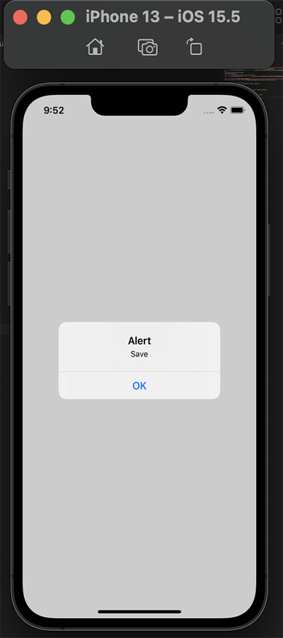
Lastly, the onSelect event triggers the menu option when it’s selected. We’ll display an alert message when we select each menu option:
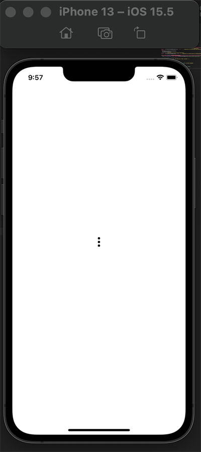
MenuTrigger and MenuOption can have personalized children, i.e. we can define the child structure the way we want alongside its styling. Let us use an icon in place of the text (Click for Option menu) for the MenuTrigger:
// SimpleMenu.js
import {
 Menu,
 MenuProvider,
 MenuOptions,
 MenuOption,
 MenuTrigger,
} from "react-native-popup-menu";
import { Entypo } from "@expo/vector-icons";

const SimpleMenu = () => {
 return (
   <MenuProvider style={styles.container}>
     <Menu>
       <MenuTrigger
         customStyles={{
           triggerWrapper: {
             top: -20,
           },
         }}
       >
         <Entypo name="dots-three-vertical" size={24} color="black" />
       </MenuTrigger>
       <MenuOptions>
         <MenuOption onSelect={() => alert(`Save`)} text="Save" />
         <MenuOption onSelect={() => alert(`Delete`)} text="Delete" />
       </MenuOptions>
     </Menu>
   </MenuProvider>
 );
};

export default SimpleMenu;
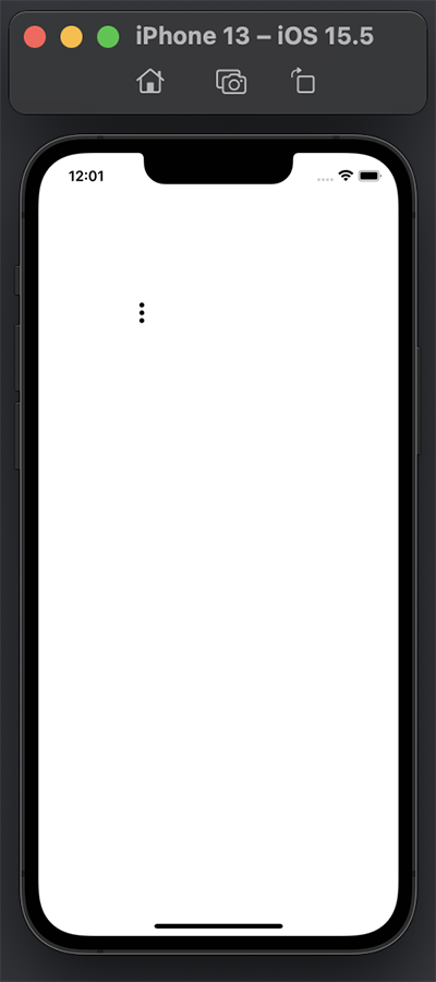
Now, we will have a menu icon displayed in our emulator/simulator that can be used to trigger the menu options:
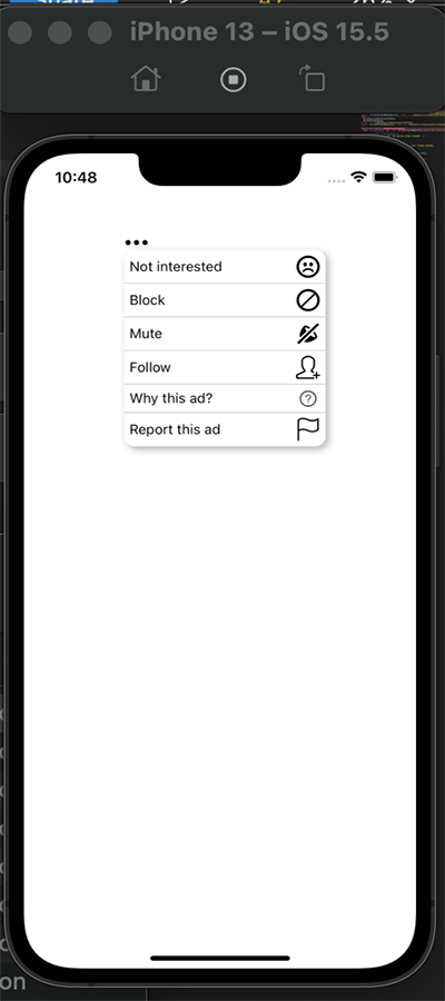
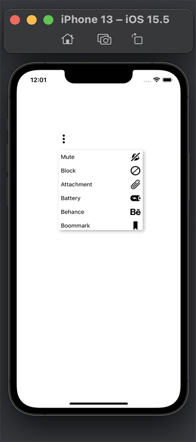
We can take the pop-up menu that we created a step forward, just like the example menu we displayed at the beginning of the article. To do this, we’ll customize the MenuTrigger and MenuOption to have a text divider and icon.
For this, we will create two new files CustomMenu.js and CustomContents.js. In CustomMenu.js, we will import the APIs as normal, create an icon for the MenuTrigger, and give it customStyles.
For MenuOptions, we will have six options that will be displayed. Each option will be a component created in CustomContents.js:
// CustomContents.js
import { MenuOption } from "react-native-popup-menu";
import { Text } from "react-native";
import { Entypo } from "@expo/vector-icons";
import { SimpleLineIcons } from "@expo/vector-icons";
import { EvilIcons } from "@expo/vector-icons";

export const Block = ({ text, iconName, value }) => (
 <MenuOption
   onSelect={() => alert(`You clicked ${value}`)}
   customStyles={{
     optionWrapper: {
       flexDirection: "row",
       alignItems: "center",
       justifyContent: "space-between",
     },
   }}
 >
   <Text>{text}</Text>
   <Entypo name={iconName} size={24} color="black" />
 </MenuOption>
);

export const Mute = ({ text, iconName, value }) => (
 <MenuOption
   onSelect={() => alert(`You clicked ${value}`)}
   customStyles={{
     optionWrapper: {
       flexDirection: "row",
       alignItems: "center",
       justifyContent: "space-between",
     },
   }}
 >
   <Text>{text}</Text>
   <Entypo name={iconName} size={24} color="black" />
 </MenuOption>
);
export const Follow = ({ text, iconName, value }) => (
 <MenuOption
   onSelect={() => alert(`You clicked ${value}`)}
   customStyles={{
     optionWrapper: {
       flexDirection: "row",
       alignItems: "center",
       justifyContent: "space-between",
     },
   }}
 >
   <Text>{text}</Text>
   <SimpleLineIcons name={iconName} size={24} color="black" />
 </MenuOption>
);

export const Why = ({ text, iconName, value }) => (
 <MenuOption
   onSelect={() => alert(`You clicked ${value}`)}
   customStyles={{
     optionWrapper: {
       flexDirection: "row",
       alignItems: "center",
       justifyContent: "space-between",
     },
   }}
 >
   <Text>{text}</Text>
   <EvilIcons name={iconName} size={24} color="black" />
 </MenuOption>
);
export const Question = ({ text, iconName, value }) => (
 <MenuOption
   onSelect={() => alert(`You clicked ${value}`)}
   customStyles={{
     optionWrapper: {
       flexDirection: "row",
       alignItems: "center",
       justifyContent: "space-between",
     },
   }}
 >
   <Text>{text}</Text>
   <SimpleLineIcons name={iconName} size={24} color="black" />
 </MenuOption>
);
export const NotInterested = ({ text, iconName, value }) => (
 <MenuOption
   onSelect={() => alert(`You clicked ${value}`)}
   customStyles={{
     optionWrapper: {
       flexDirection: "row",
       alignItems: "center",
       justifyContent: "space-between",
     },
   }}
 >
   <Text>{text}</Text>
   <Entypo name={iconName} size={24} color="black" />
 </MenuOption>
);
For each component here, we are destructuring three props: text, iconName, and value, coming from each of the components we passed to CustomMenu.js.
Basically, we’re displaying a text and an icon and using onSelect to fire an event when the option is clicked.
In the CustomMenu.js file, we are importing all the components (Block, Mute, Follow, Why, Question, and NotInterested) and using them as the MenuOptions child. Then, we pass the value for the three props we destructured earlier.
We also created a divider component and gave it its style:
import { StyleSheet, Text, View } from "react-native";
import React from "react";
import {
 Menu,
 MenuProvider,
 MenuOptions,
 MenuTrigger,
} from "react-native-popup-menu";
import { Entypo } from "@expo/vector-icons";
import {
 Block,
 Mute,
 Follow,
 Why,
 Question,
 NotInterested,
} from "./CustomContents";

const Divider = () => <View style={styles.divider} />;
const CustomMenu = () => {
 return (
   <MenuProvider style={styles.container}>
     <Menu>
       <MenuTrigger
         customStyles={{
           triggerWrapper: {
             top: -20,
           },
         }}
       >
         <Entypo name="dots-three-horizontal" size={24} color="black" />
       </MenuTrigger>
       <MenuOptions
         customStyles={{
           optionsContainer: {
             borderRadius: 10,
           },
         }}
       >
         <NotInterested
           text="Not interested"
           value="Not Interested"
           iconName="emoji-sad"
         />
         <Divider />
         <Block text="Block" value="Block" iconName="block" />
         <Divider />
         <Mute text="Mute" value="Mute" iconName="sound-mute" />
         <Divider />
         <Follow text="Follow" value="Follow" iconName="user-follow" />
         <Divider />
         <Why text="Why this ad?" value="why this ad" iconName="question" />
         <Divider />
         <Question
           text="Report this ad"
           value="Report this ad"
           iconName="flag"
         />
       </MenuOptions>
     </Menu>
   </MenuProvider>
 );
};

export default CustomMenu;

const styles = StyleSheet.create({
 container: {
   flex: 1,
   backgroundColor: "#fff",
   marginVertical: 100,
   marginHorizontal: 100,
 },
 divider: {
   height: StyleSheet.hairlineWidth,
   backgroundColor: "#7F8487",
 },
});
Now, we can check what we have:
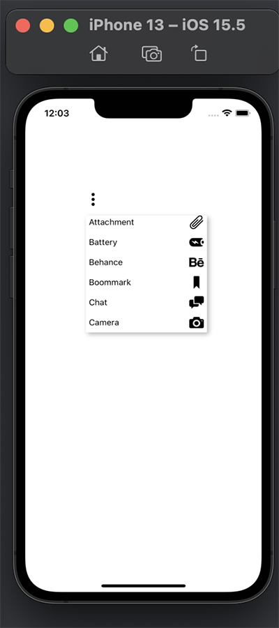
For the rendering of the pop-up menu with a scroll view, we can use either FlatList or ScrollView.
Just like normal, we will create a ScrollViewMenu.js file. We will also create a data.js file where we will be getting the data used for the scroll view. Inside this file, we will do the ScrollView implementation using both FlatList and ScrollView.
The data we will use to create the scroll view will be created in the data.js file:
// data.js
import { Entypo } from "@expo/vector-icons";
export const data = [
 {
   id: 1,
   name: "Mute",
   icon: <Entypo name="sound-mute" size={24} color="black" />,
 },
 {
   id: 2,
   name: "Block",
   icon: <Entypo name="block" size={24} color="black" />,
 },
 {
   id: 3,
   name: "Attachment",
   icon: <Entypo name="attachment" size={24} color="black" />,
 },
 {
   id: 4,
   name: "Battery",
   icon: <Entypo name="battery" size={24} color="black" />,
 },
 {
   id: 5,
   name: "Behance",
   icon: <Entypo name="behance" size={24} color="black" />,
 },
 {
   id: 6,
   name: "Bookmark",
   icon: <Entypo name="bookmark" size={24} color="black" />,
 },
 {
   id: 7,
   name: "Chat",
   icon: <Entypo name="chat" size={24} color="black" />,
 },
 {
   id: 8,
   name: "Camera",
   icon: <Entypo name="camera" size={24} color="black" />,
 },
];
For FlatList, we will import the data from the newly created data.js file and import the menu pop-up APIs. The array of data will be passed to the FlatList API component and will be mapped over so each item can be rendered in the scroll view:
// ScrollViewMenu.js
import { StyleSheet, Text, View, FlatList, ScrollView } from "react-native";
import React from "react";
import {
 Menu,
 MenuProvider,
 MenuOptions,
 MenuOption,
 MenuTrigger,
} from "react-native-popup-menu";
import { Entypo } from "@expo/vector-icons";
import { data } from "../data";

const ScrollViewMenu = () => {
 return (
   <MenuProvider style={styles.container}>
     <Menu>
       <MenuTrigger
         customStyles={{
           triggerWrapper: {
             top: -40,
           },
         }}
       >
         <Entypo name="dots-three-vertical" size={24} color="black" />
       </MenuTrigger>
       <MenuOptions>
         <FlatList
           data={data}
           keyExtractor={(item) => item.id}
           style={{ height: 200 }}
           renderItem={({ item }) => (
             <MenuOption
               onSelect={() => alert(item.name)}
               customStyles={{
                 optionWrapper: {
                   flexDirection: "row",
                   alignItems: "center",
                   justifyContent: "space-between",
                 },
               }}
             >
               <Text>{item.name}</Text>
               <Text>{item.icon}</Text>
             </MenuOption>
           )}
         />
       </MenuOptions>
     </Menu>
   </MenuProvider>
 );
};

export default ScrollViewMenu;

const styles = StyleSheet.create({
 container: {
   flex: 1,
   backgroundColor: "#fff",
   marginVertical: 200,
   marginHorizontal: 100,
 },
});
Now, we can check what we have in our simulator/emulator:
For ScrollView, the same process will be repeated except we’ll use the ScrollView API component:
import { StyleSheet, Text, View, FlatList, ScrollView } from "react-native";
import React from "react";
import {
 Menu,
 MenuProvider,
 MenuOptions,
 MenuOption,
 MenuTrigger,
} from "react-native-popup-menu";
import { Entypo } from "@expo/vector-icons";
import { data } from "../data";

const ScrollViewMenu = () => {
 return (
   <MenuProvider style={styles.container}>
     <Menu>
       <MenuTrigger
         customStyles={{
           triggerWrapper: {
             top: -40,
           },
         }}
       >
         <Entypo name="dots-three-vertical" size={24} color="black" />
       </MenuTrigger>
       <MenuOptions>
          <ScrollView style={{ height: 200 }}>
           {data.map((item) => (
             <MenuOption
               key={item.key}
               customStyles={{
                 optionWrapper: {
                   flexDirection: "row",
                   alignItems: "center",
                   justifyContent: "space-between",
                 },
               }}
             >
               <Text>{item.name}</Text>
               <Text>{item.icon}</Text>
             </MenuOption>
           ))}
         </ScrollView>
       </MenuOptions>
     </Menu>
   </MenuProvider>
 );
};

export default ScrollViewMenu;

const styles = StyleSheet.create({
 container: {
   flex: 1,
   backgroundColor: "#fff",
   marginVertical: 200,
   marginHorizontal: 100,
 },
});
Finally, we’ve successfully implemented a pop-up menu in React Native with a scroll view as seen in the simulator/emulator above!
I hope this article has given you the insight to build your own React Native pop-up menu designed for your preference!
They certainly come in handy when building mobile apps in React Native that have several options inside the pop-up menu. Pop-up menus allow the user to scroll to their preferred options as well.
Hopefully, this article also showed you how to implement icons in the pop-up menu, and use things like dividers.
You can check out the full code here.

LogRocket's Galileo AI watches sessions for you and and surfaces the technical and usability issues holding back your React Native apps.
LogRocket also helps you increase conversion rates and product usage by showing you exactly how users are interacting with your app. LogRocket's product analytics features surface the reasons why users don't complete a particular flow or don't adopt a new feature.
Start proactively monitoring your React Native apps — try LogRocket for free.
Would you be interested in joining LogRocket's developer community?
Join LogRocket’s Content Advisory Board. You’ll help inform the type of content we create and get access to exclusive meetups, social accreditation, and swag.
Sign up now
Not sure if low-code is right for your next project? This guide breaks down when to use it, when to avoid it, and how to make the right call.

Compare Firebase Studio, Lovable, and Replit for AI-powered app building. Find the best tool for your project needs.

Discover how to use Gemini CLI, Google’s new open-source AI agent that brings Gemini directly to your terminal.

This article explores several proven patterns for writing safer, cleaner, and more readable code in React and TypeScript.

 Learn more →

2 Replies to "How to create customized pop-up menus in React Native"
I cant get Entypo to work with MenuTrigger. Text works. When I put an Entypo child, I get an error as “Element type is invalid”.
Hi,
Please confirm you are using expo for this build. If yes import the Entypo icons from expo vector icons like this:
import { Entypo } from “@expo/vector-icons”;
Then use inside menu trigger component as follow: